8 Essential Design Tips To Get More Leads On Your Small Business Website
 A good friend of mine was kind enough to take me out for dinner this week since my birthday is coming up.
Over dinner, we discussed her new job.
She recently took charge of a non-profit summer camp program for kids with disabilities that has been losing revenue for the last few years.
From discussing with her, I realized how much "low hanging fruit" there is for companies like her's who need budget friendly solutions to their website marketing problems.
Usually, the problem for many small businesses like my friend's non-profit, is that they aren't doing any marketing in the first place!
It's a foreign idea either because customers were "easy" to find until now, they were lucky, or there's some other factor, like outside funding or another part of the business that helped to mask the real issue.
"But Matt, I can sell my business like no one else can. I go to all these events and I'm great at finding prospects and selling them in person."
Ok, wonderful. I can totally relate to that because that's how I grew my business in our first few years. But networking at events is closer to something like direct sales and it's completely dependent on your time.
This is why having a professionally designed website that's focused on converting visitors into leads or customers is paramount to building a sales engine for your business that churns out a steady stream of new customers.
Why? A website is:
- Scalable, so it doesn't affect your time where whether 10 people visit it or 10,000.
- Think of your website like an "infinite brochure" -- you never have to print more copies and the way they're handed out is completely automated.
- It's the foundation of your sales engine. Once you have it set up it's relatively easy to use to start driving a consistent and steadily growing number of leads through it each month.
"I understand all that and I have a website, Matt. And it's getting traffic but I'm not seeing results. I think I'll just focus on networking events instead, or maybe I'll add to the design at some point..."
I understand that perspective because I used think that way for a while too. But the fact is that billions of searches are being run on Google every single day for every industry and geographic location imaginable.
So if you have a website (even if it's very basic), and you have traffic (even if it's less than 1,000 visits per month), start by implementing these basic tips because they'll make a huge difference over time.
#1 - A call to action on every single page of your website
An obvious call-to-action button on every single page of your website is absolutely essential.
Without it, a visitor might otherwise wander around in circles and then leave your website without ever hitting key pages or steps in your sales funnel that could have lead to a purchase.
Think about it like this. Imagine your visitors are on a roadtrip as they are browsing around the internet. They come to your website at some point to make a pitstop, and maybe they want a snack. But what if they can't even find the DOOR to get into your convenience shop?
That's what it's like when a visitor isn't completely clear on what he or she needs to do next.
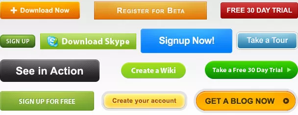
Here are three good examples of calls to action buttons. Notice the strong color contrast and how the text on the buttons themselves are benefit focused, not something generic like "click here."
#2 - An email opt-in form on your homepage
Your homepage is your most valuable piece of real estate on the web. It's also one of the most highly trafficked pages and where people go when they initially want to learn what your company is all about and how it might help them.
But the vast majority of people who come to your website won't buy and will simply leave and NEVER return.
For example, our blog has a decent and steadily improving retention rate. About 25% of our visitors are repeat visitors, the rest (75%) are first time visitors.
This is why building an email list is so critical to your success because it gives you a simple way to pull them back to your website, or follow-up with prospects 1-on-1 and in a way that has the highest likelihood of getting a response.
For inbound leads, I see a response rate to one-to-one email north of 80% and for our free weekly newsletter, a confirmed open rate over 30%.
This is why, according to the DMA (Direct Marketing Association) for every dollar spent on email marketing $44 is returned ON AVERAGE.
Think about that the next time you run ads to advertise... your Facebook page.
Moreover, if someone comes to your website and finds there enough incentive to input their email address, you can create an autoresponder to follow-up with them.
An autoresponder is an automated sequence of emails that can be used to educate prospsects and follow-up with potential leads until their convert or drop-out of the sales process.
Here are some great examples of opt-in incentives:
- Free report or case study (Hootsuite.com)
![Free report, social media, sales process.]() Free ebook (Smart Passive Income)
Free ebook (Smart Passive Income)![eBook guide to publishing, marketing.]()
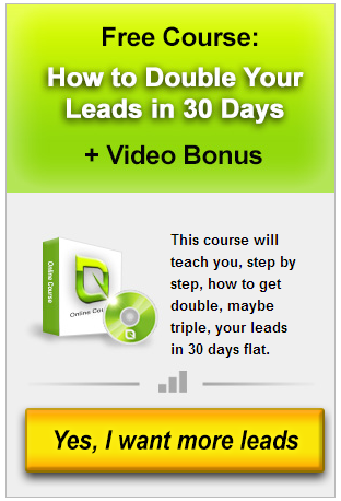
- Free course (Growbo.com blog, right sidebar)
![Free course: double leads in 30 days.]()
- Free video (Sam Oven's Consulting)
![Video interview: get priority access.]()
Or if none of those are a fit to start, you can simply say "join our newsletter" like a friend of mine does -- who I recently interviewed about getting Facebook likes -- on his website.
#3 - A dedicated landing page for your email list
Landing pages are an important part of any website that is designed to sell because they are one section devoted completely to persuading a visitor to take a specific action, such as clicking a button, filling out a form, entering his or her email, or buying.
Having a dedicated landing page for your newsletter won't pull in a huge amount of organic traffic from search engines by itself, but it can be incredibly effective when it comes to building your email list for the long run.
Think of all the different times you can reference it:
- When you write a guest post
- In the context of your own blog posts
- On your About Us page and Contact page
- When you get a press write up and they ask you for a link
- When networking with others and they offer to link back to you
By linking internally to this page or by placing links to it around the web, you're increasing the likelihood that visitors to your website will join your email list. But this begs the question considering the previous tip:
"Why would I want to have a dedicated landing page for my email list if I'm already placing an opt-in form on my homepage?"
It's logical to think that repeated exposure to something like an email opt-in form increases the likelihood that you'll sign-ups for it, right?
Well that's exactly what I proved in testing on our website. I was easily able to double my rate of email sign-ups from one month to the next simply by increasing the number of engagements or overall exposure the average visitor had to our email opt-in form.
In some cases I plugged our free course offer, in others, like at the bottom of this article, I simply invited people to join our weekly newsletter for more great articles.
So while you don't have to be as aggressive as me, having the dedicated landing page will yield interest in the form of more leads from your newsletter over time.
#4 - Define the problem, define your solution
Most businesses come into existence to solve a single problem.
To solve that problem, they offer a focused solution.
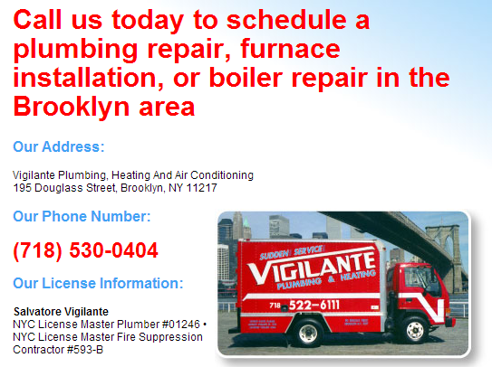
- Plumbing service - "If you have a clog or a leak that can't be fixed..."
- Child daycare - "While you're at work you need someone you can trust to take care of your child..."
- Web design service - "Get a website that's designed to sell and generate leads..."
- Food products - "Hungry?"
- Health supplements - "Keep the doctor and risk of sickness at bay..."
But over time, as a business grows, that simple message will change and evolve and may even get diluted as the company caters to more types of customers and offers a wider variety types of services or products.
So the message of "here's the problem, and here's our solution" get lost... Sometimes it's never even defined, unfortunately.
Without clear messaging visitors will abandon your website. According to Brian Clarke at CopyBlogger, 8 out of 10 people will read your headline, and only 2 out of 10 read the first paragraph.
For example, on Saber Blast we have a one sentence headline that does a decent job of clearly explaining what the product is and why we're offering (the problem i.e. Advertising, like Google pay-per-click is expensive).
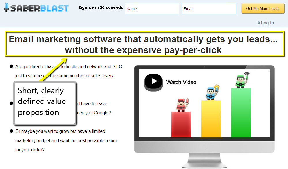 We even go into greater detail on defining the problem the product addresses with bullet points below the headline. I recommend this for every business so I'll say it again: don't be shy about writing in great detail about the problem. It shows the customer that you understand him / her which is key to building trust.
Treehouse (a company that teaches people how to do computer and web programming) is another example of a website with a good headline that explains their solution.
However, if I were in charge of their marketing, I would spend more time defining the problem (i.e. learning on your own is hard, and a degree in computer science technology will cost you an arm and a leg).
What's the 1-2 sentence explanation for your business? What's the problem your solving in the words of your customer?
#5 - A section on your website that clearly explains the benefits of your product or service
Maybe some of these tips seem obvious. Like this one.
And yet, only a fraction of small business websites actually include it on their site!
Sometimes I feel like a hammer and 99% of the websites out there are nails because all I see are pools untapped opportunity for growth. But luckily, you're not going to be like that since you're reading this article right? ;)
So yes, this one seems obvious, but a lot of business owners and marketers neglect it.
Maybe they feel "I've already got that base covered with our 'services' or 'how it works' page."
Here's how to know for sure. Ask yourself, is my website explaining features of our product or service? OR is my website bringing up specific points benefit related to the PROBLEM that my product or services tries to solve for the customer?
For example, this is a feature:
- We've partnered the best poultry suppliers to provide you a premium product since 1963. (Yawn... that's "nice" but largely I don't see "me," the customer, in this statement)
And this is a benefit:
- When you buy our poultry you get free weekly delivery and a reputation for quality that spans 50+ years. We're so confident your customers will love it, that we guarantee it. If there's any issue, just send it back at no charge to you. (This isn't perfect, but you can see the difference.)
Again, the major distinguishing factor between writing about benefits versus features is that benefits directly address how the core problem is solved for the customer and/or the positive manner in which value is delivered.
In other words, "This is why you should buy from us over anyone else."
By being benefit focused instead of just communicating features, you're talking directly with to your target customer in a way that is relevant to them (and it goes to the heart of WHY they are taking the time to read your website in the first place).
#6 - An explainer video
A few months ago, I would not have thought to include this tip here. But recently, I stumbled across a great blog on video marketing for business from Bryan Harris.
On the blog and in his course, he explains how he was able to create quality videos for various businesses for just $40 in some cases. Here's an example of what I mean:
What's "the catch"? Hard work, upfront. Bryan invested 10+ hours into creating a step-by-step outline for each video. After that was done, the cost of hiring a video editor to put together the pieces and animating it into a spectacular result was minimal.
So, budget is no longer an issue when it comes to creating a high quality video (which is awesome because I have friends who run businesses that charge $1500 - $5000 to create a solid explainer video).
"But why would I even want to have an explainer video on my website?"
Good question. In a recent article, I cited the case study of CrazyEgg.com and how video helped them generate more leads. Here's what I wrote:
Another way to take advantage of this fact that people are visual learners is to add a video....In a recent [test], Crazy Egg was able to increase it’s conversion rate by almost 64% as a result of adding a 2 and a 1/2 minute video to their page even though the script in the video was quite similar to what was already written on the page.
Another prominent example is DropBox.com. When they created their explainer video, their sign-up rate increased by 10% resulting in several thousand extra sign-ups per day. Here's what their explainer video looked like (note how they used the metaphor of the "magic pocket" to further clarify the concept):

"Matt, I run a small business. These companies aren't like mine and I don't have time."
If I told you had a high likelihood of increasing your lead generation rate between 2-10% by making a one-time investment of 8-20 hours -- would you do it, or at least delegate the task to someone you trusted?
Exactly.
#7 - A super simple contact form
Not too long ago I tried a new lead generation technique using direct mail. Ultimately, I stopped sending them because it proved to be too much work for too little return. It wasn't scalable.
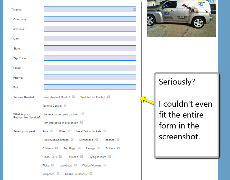
However, since part of the process involved reviewing a variety of small business websites I learned that many were shooting themselves in the foot with a hard to find, complete lack of, or overly complex contact form.
Here's an example:
Here's another example of a website that tries to push people sitting at their computer into the extra step of picking the phone to call them.
Sure, its not a lot of "work" per se, but giving people the option just to enter their name, email, and a short message could significantly increase their lead gen rate.
Finally, beware of using a CAPTCHA on your contact form if you're worried about spam submissions as in the example below. A CAPTCHA is what those fields are called where you're required to type in a set of numbers and letters from a computer generated image.
CAPTCHA's can kill your conversion rates. So if you're worried about spam, I recommend either using a form that's auto-generated with Javascript (i.e. go sign-up for a free account at Wufoo.com and use one of their embeddable forms).
Or if you have a developer on staff, here's another, slightly more technical option: tell him or her to add some blank "hidden" field to the form. This way, if a human is submitting the form, they will be blank, but if a robot spammer is submitting the form, they will be full and you can automatically discard the form entry.
The best rule of thumb for creating a contact form that converts is to keep it simple (3-5 fields at most) and test it occasionally to make sure it works.
Also, similar to the data I presented above on how I increased my email list sign-ups, you can experiment with placing your contact form in multiple pages of your website for an even higher contact conversion rate.
#8 - An FAQ section
I've written in detail in the not-so-distant past about the importance of having an FAQ section on your website and how it can grow your bottom-line.
An FAQ section is really just an opportunity to anticipate and address the needs of your target audience. Its purpose to reassure them (usually immediately prior to the purchase decision) and set clear expectations.
For example, with Growbo, before many of our clients buy from us they want to know the answers to questions like: "What's your design process like?... Will you include me in the process so I can give feedback?... Will you wait for my approval before launching the new site?... Can I pay with a credit or debit card?"
What are some of the key questions your customers most frequently ask you before making a purchase? How can you compile them into an FAQ that's "conversational" in nature?
Bonus (Advanced) Tip: Create an autoresponder
 I love autoresponders. It's a topic I'm looking forward to writing more about in the future.
Autoresponders are one of the simplest and coolest ways to follow-up with potential customers. The best part about it is because it's opt-in, your prospect benefits, and because you can set it up once and it runs automatically, you stand to save lots of time.
There are a few types of autoresponders:
- Educational - A free course, like the "Double Your Leads" course that I offer on the right-hand column of our blog here.
- "Hey did you forget something?" - If you're in the process of checking out to buy something but then leave the site, the website might automatically follow-up with you to remind you that you still have something your shopping cart.
- Content follow-up - This is like an automated newsletter. You create a sequence of emails.
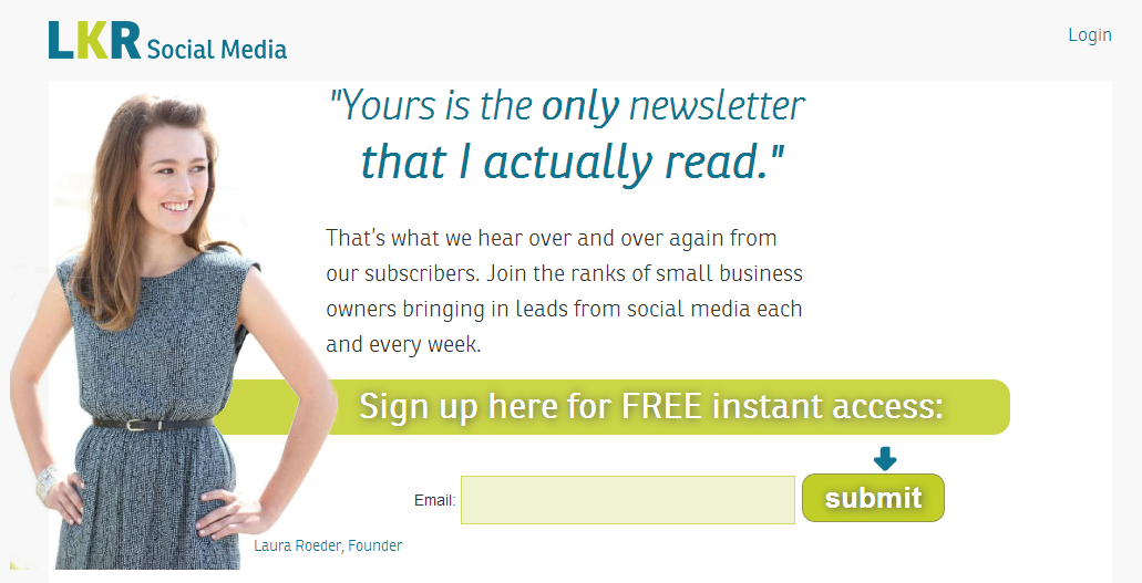
- Automated launch sequence - This is basically the idea that you sign-up for someone's newsletter, they send you some educational content, and then at the end "open up" their product for you to buy online for a limited time. Feel free to subscribe to Laura Roeder and her product Social Brilliant to get a better of what I mean here.
- Scheduling - If you're a service business you can automatically send subscribers an invitation to schedule an appointment with your business, either right after they sign-up or at set intervals.
There are a number of tools you can use to create an autoresponder. Growbo has it's own email marketing autoresponder product called Saber Blast which is affordable and simple to get up and running.
Conclusion
Even if you feel like a newbie to marketing these tips are easy to implement and, if they cost anything other than time, are very budget friendly. To review:
- Show your visitors where to click with call-to-action buttons -- lead them down the "rabbit hole" that is your sales funnel. Don't leave it up to chance.
- Constantly build your email list. Feature the opt-in form prominently on your homepage, blog, and on it's only dedicated landing page.
- Communicate clearly so (a) customers know what problem you can solve for them and (b) the specific benefits to hiring your firm or buying your product.
- Simplify your contact forms, and consider putting them in multiple places.
- Add an FAQ section, reassure your customers with it.
- Finally, setup an autoresponder to educate prospects and to stay in touch until they're ready to buy from you.
As always, thanks for reading. Make sure to subscribe to our newsletter for free weekly articles on building a sales engine in your business, and share this post with friends and colleagues via Facebook, Twitter, Google+ and LinkedIn.
What are some other advanced tips for getting a website to generate leads?
Image Credits:http://www.templates.com/blog/trendy-contact-form-designs/http://www.smartpassiveincome.com/autoresponder-series/http://getcreativewebdesign.com/blog/2010/03/http://blog.leadsquared.com/landing-page-call-to-action-buttons-that-convert/http://www.truinteractive.com/design/landing-page-design/http://www.thecreaticians.com/2011/05/18/how-to-sell-large-videos-through-a-size-limited-e-commerce-cart/
