7 Smart Tips to Get Marketing Insights from Your Competitors' Email Campaigns
There are new email marketing trends each year. And if you’re not up to current business practices, say goodbye to conversions. Testing new email marketing strategies is a must!
Sure thing, competitors do the same. So why not save time on research and adapt their ideas? But not every insight is worth your attention. So how do you pick the most promising ones?
Read this article to find seven parameters and a list of questions to analyze your competitors’ campaigns.
Tips to start the research: use three accounts with different info and preferences to sign up for their service and newsletter.
Want to delegate all your marketing and funnel work done—without the headaches of hiring? Download our free guide: 33 Marketing Projects You Can Delegate to Growbo and discover how to save 100+ hours a month, grow faster, and scale without the overhead.
1. Email Deliverability
The first thing to pay attention to is if competitors’ emails reach the inbox or are stuck in the spam folder. In the case of regular spam, analyze their email in terms of the best practices to follow.
| Email deliverability DO’s: | Email deliverability DON’Ts: |
|
|
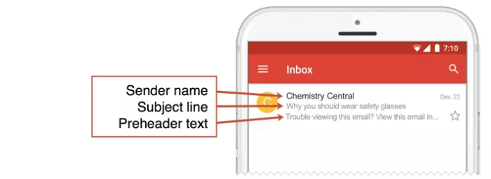
2. The Sender Name, Email Subject Line, and Pre-Header Text
These elements mainly affect the email open rate — the second step of your campaign’s success. As we know, people love to judge. Considering their laziness, it’s better to work well on your campaign’s first impression.
Thus, here are essential things to check in your competitors’ emails:
- The sender’s name should include a personal name. It is a matter of trust. For example, “Helen from HelpCrunch.”
- The subject line should:
- Be short. Here are stats proving that:
Pay attention to the first five words (that all that subscribers see on a phone).
- Include numbers. It’s a good attention-catcher in front of letters.
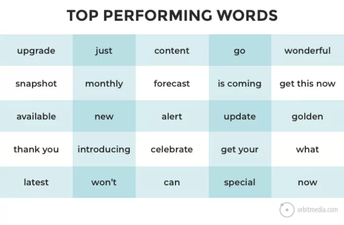
- Hook with engaging words.
- Repeat content from the competitor’s knowledge base, FAQ sections, or social media/blog post headers. Using ideas that perform well on other channels is a good practice.
Pre-header should:
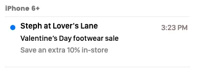
- Have a meaningful, finished idea.
- Include complementary info. For example:
- Be personalized with the recipient’s name.
- Be eye-catching. For example, with the help of emojis.
Time to move to elements that boost other email KPIs.
3. The Level of Email Personalization
That’s much more than greeting a subscriber by name. It includes subscribers’ behavior on a website or inside a product, item choices, and interests they mention in the sign-up form.
Ideal personalization says, “Wow, this brand gets me” from subject line to footer. Just like this email from the Truebill subscription managing service:
It’s built based on user behavior within a service.
But that is only one of the email types. To cover the entire email strategy of your competitors, check if they:
- Greet you by name
- Collect data about your preferences
- Send emails at a time that is convenient for you
- React to your cart abandonment, product choice, etc.
- Recommend products/features you like
- Localize emails according to your country
- React if you ignore long emails and engage with short only (or vice versa)
- Send you emails summarizing your experience with a product/service
- Use dynamic content
4. Email Campaign Design
Current design trends tell us that emails should be creative to stand out from the crowd. But, at the same time, they must be easy to scan and catch the most important things. Just like this one from the Carbon38 store:
The minimalist design makes it easy to get the main idea of the product and offer value. Everything matches the black and white brand color palette. Nothing distracts from the main action.
This is a brilliant example of HTML design we love. But there is a plain text trend and unforgettable interactive emails.
What’s suitable for your brand? Even marketing experts can’t answer it with 100% certainty.
But competitive analysis may help to see what is more prevalent in your industry. Pay attention to these elements:
- Where do they place a logo?
- How many colors do they use?
- What is the color of their CTA buttons?
- What is the column structure of the email body?
- Do they follow a company style in every campaign?
- What product images do they use? Or do they use GIFs? Video? How much?
- Do they use interactive elements?
- Do they use classic or custom fonts?
- Is it mobile-friendly?
5. Optimization for Mobile
Want to know if your competitors’ emails are mobile-friendly? Open their emails in Outlook, Gmail apps for Windows phones, and other apps to check the following things:
- Can you see the email subject and pre-header entirely?
- Is its font easy to read?
- Do the number of images in a mobile version of an email differ from its desktop version?
- Can you click buttons and links easily?
- Do images have ALTs?
- Is the design scalable or responsive?
6. Email CTA
Finally, we go to email campaign conversion drivers — call to action. The ideal CTA is short and clear. Customers understand what will happen after clicking a button.
Despite the word choice variety, there are common patterns you can notice and test. To find them in competitors’ campaigns, we advise answering the following questions:
- Is the CTA in the email a link or a button?
- How many CTAs are there in an email?
- What tone of voice do they use?
- Do they use specific colors to highlight it?
- Do they prefer creative copy, e.g., “Join the Family”?
- Where is a CTA placed — at the beginning, middle, or end of the email body?
- Do they appeal to the subscribers’ FOMO (fear of missing opportunities) with words like “today only,” “six days left,” etc.?
- Do they add value to the CTA (for instance, “Book Now To Help the Tigers”)?
- How long is it?
- Is it first person (“Get My Discount”) or generic (“Get a Discount”) phrasing they use?
- Do they personalize a CTA?
- Does it highlight a benefit?
- Where do they lead customers: to a knowledge base or a product landing page?
7. The Email Newsletter Frequency
In simple words, is it pushy or not? The perfect frequency of sending email campaigns changed. Seven years ago, marketers sent six emails per week. Today — one.
This number varies depending on your industry and audience preferences. Anything that is out of the norm can be a reason to mark emails as spam.
Regarding competitors’ analysis, check:
- How often are triggered, weekly, and promo emails are sent?
- Do they take your preferences into account?
- Can you manage email frequency? Here is an example from the Steam community:
How To Define What Really Works?
Want to delegate all your marketing and funnel work done—without the headaches of hiring? Download our free guide: 33 Marketing Projects You Can Delegate to Growbo and discover how to save 100+ hours a month, grow faster, and scale without the overhead.
Since you can’t see the competitors’ email campaigns performance metrics, there is no clear answer. What can you do? Systematically A/B tests different ideas. Measure email deliverability, open rate, number of bounced emails, click-through rate, conversion into registration, purchase, etc. Then, decide which one to scale. Easy!
About the Author:
Julia Serdiuk is an Outreach Specialist at HelpCrunch, an innovative platform to build relationships with customers. She is a seasoned traveler and yoga enthusiast who appreciates life and believes in the cloudless future of our planet.


