22 Lesser Known Tips & Tricks for Increasing Website Conversions (#9 has been huge for me)
 I was looking at Twitter yesterday and I noticed something.
I noticed that (a) there's a lot of content being created and (b) most of it is low quality junk.
Which is why I am proud to hit publish on a post like this.
Why? Because I know that this article is not short (it's detailed and specific), it's not low quality (it's researched with lots of examples), and it's not simply repeating what others have already said (there's new knowledge here).
This is one reason why our traffic has increased nearly 350% in the last month (more on that in an upcoming article...).
So it's my pleasure to share with you these website conversion tips, many of which I have implemented on this website and some which I personally discovered just by testing.
However, in case you're short on time and want to come back to this later you can enter your email below and I'll gladly send you a copy of this blog post to review at your convenience.
[wufoo username="petovera" formhash="qhyh7r80hc9mff" autoresize="true" height="260" header="show" ssl="true"]
"How do you define a website conversion?"

I've been an entrepreneur for nearly 8 years now. Both my current business, Growbo, and my previous startup were web-based.
In that time I've learned that there are two types of conversions: micro and macro. A micro conversion is where someone clicks-thru from an email link to a website, or a homepage to a how-it-works page, or perhaps even someone following you on twitter. Those are micro conversions.
A macro conversion is where someone opts in to your weekly newsletter, fills out a request for a consultation form, or decides to make a purchase. In short, with macro conversions you're building your email list or you're making a sale.
The focus of this article is on macro conversions because they are essential to building a sustainable business whereas micro-conversions often fall into the category of vanity metrics (they sound important, but fail to produce a more vital result: revenue).
"Where does a conversion happen?"
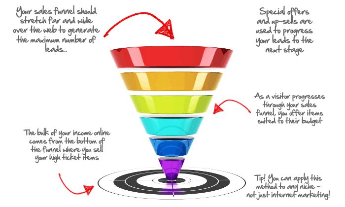
In the context of this article, a conversion happens on either:
- On your blog (usually just an email opt-in)
- On a landing page (a dedicated page either meant to get email opt-ins or sell a product)
- Within a website's sales funnel itself (both email opt-ins and purchases)
At the end of each tip, I'm labeled stated which scenario this situation is most applicable to in case you want to quickly browse for ideas for specific use-cases.
Want to know which ideas I think are the best tips from this list? Enter your email and I'll send you a note listing out my top 5 tip and tricks and why I believe they are the most important.
[wufoo username="petovera" formhash="q1m4nmsp030l1wr" autoresize="true" height="260" header="show" ssl="true"]
Each of the tips below were selected either because I know from first hand experience that they or the root principle behind them works, I was able to find a concrete example of them working for someone else on the web, and/or there is some statistical evidence or research which indicates it would work.
1 - "Less form fields usually mean a higher conversion rate, right?"
You might have heard this before, but I've found a non-obvious reason for it other than "more form fields require more work so less people fill them out" (duh). First, in support of that theory: a web design company tested two types of contact forms on their site. One form had 11 fields and the other has just 4. The form with 4 fields beat out the longer form resulting in an increase in 140% in contact form submissions (without a drop in the quality of the submissions).
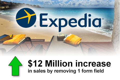
However, the non-obvious reason why your forms should be minimized to get more conversions is because the information requested could scare or confuse people. Case in point: Expedia increased it's website sales by $12 million in profit simply by removing 1 form field. The field was asking customers for their "company" name, which caused some people to put in the name of their bank (after all it was next to the credit card form) and then the bank's address, resulting in a credit card address verification error when the form was submitted.
Remember to take into account not just effort required to buy, but also the customers personal understanding when it comes to improving your conversion rate.
(Most applicable to Blogs / Landing Pages / Sales Funnels)
2 - "Most website visitors don't buy... How can I follow-up and educate them over time until they do?"
Auto-responders work well for this by automatically following-up via email. People are usually motivated to subscribe to an auto-responder because it teaches them how to do something.
For example, I created one teaching people how to build an email list of 10,000 subscribers in 3 months. As a result, I initially saw about 2-3% of subscribers convert to paying customers of Saber Blast after I rolled out the first version of the course (which wasn't anywhere nearly as polished as it is now). By giving people something they want to learn about positions you and your company as an expert and works to build trust.
(Most applicable to Blogs / Landing Pages / Sales Funnels)
3 - "Will customers be more confident in purchasing if I add a security logo like McAfee?"
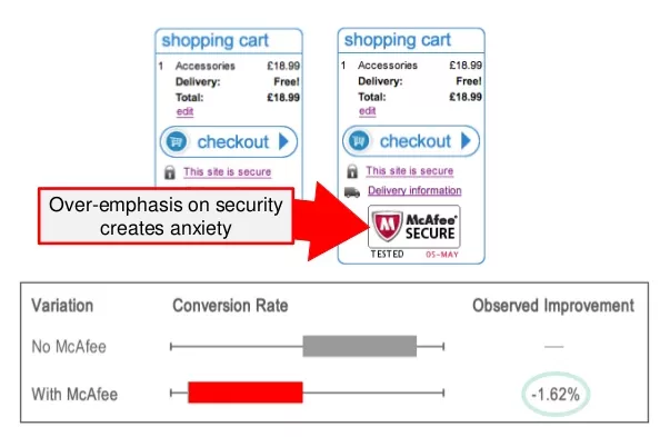
In a split test performed by Wider Funnel on one of their client's check out pages, including a McAfee security logo actually resulted in a lower conversion rate (-1.6%) than a page design that had no security logo. They inferred from this that showing the security logo caused anxiety in the mind of the buyer.
(Most applicable to Sales Funnels)
4 - "If I'm selling a product or service, a long landing page will convert better right?"
While it is true that you're likely to increase your conversion rate by making your landing page longer for paid products and services (mainly because you end up answering many of the key questions and concerns that visitors have), a test performed by Neil Patel and the Crazy Egg team says otherwise.
Longer form landing pages convert well, but keeping your copy concise and "removing the fluff" converts even better. For instance, the first redesign test of Crazy Egg resulted in a 30% increase in conversions. A second variation where the "fluff" was removed resulted in a 13% increase on top of the initial 30% improvement.
(Most applicable to Landing Pages / Sales Funnels)
[caption id="attachment_2468" align="aligncenter" width="480"]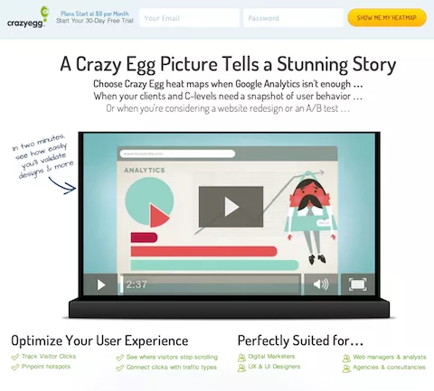 Saw a 13% increase in conversions by keep the long form landing page design but making the copy more concise.[/caption]
5 - In the words of Brennan Dunn, let visitors "choose their own adventure."
In other words, before or after someone subscribes to his email list he allows them to pick from multiple options based on what they feel they need the most help with. It's basically mass personalization.
For example, when you subscribe you would receive an initial email saying something like: "Click here if your biggest problem is how to price your services... or, click here if your biggest problem getting a steady flow of new clients in the door."
Though Brennan isn't revealing (I think) the exact conversion rate at this time, I can tell you that he is seeing a very significant number of people who join his newsletter converting to paying customers by purchasing his book.
(Quick side note: my video interview with Brennan on how to build an email list from scratch will be going live next Thursday. If you're interested, enter your email at the bottom of this post and I'll send you the link next week).
(Most applicable to Landing Pages / Sales Funnels)
6 - "Will adding press logos increase my conversions?"
Surprise! Not all press logos are created equal. Well, that is, depending on who your target market is composed of. In a test performed by ThumbTack.com, including press logos next to a key form increased conversions by 17% overall. However, when digging deeper and testing based which logos were displayed they found that their target audience trusted (or liked) certain press logos more than others. For their audience of local service professionals they found that including the USA Today logo actually hurt conversions by about 8%.
It make sense when you think about it since people either see news outlets covering a story in a way that is favorable or unfavorable to their view point.
(Most applicable to Landing Pages / Sales Funnels)
7 - "If I experiment with different text on my call to action buttons, what works best?"
Try writing down the one key benefit your offer will provide and in the first person point of view. For instance "Get Me More Leads!" is what we use on SaberBlast.com and there we have a ~2% lead conversion rate (not so impressive, I know, but we only launched recently).
However, just so you know this definitely has an impact take a look at this stat from a test performed by Unbounce. They used the tactic of writing in the first person, changing "Start your free 30 day trial" to read "Start my free 30 day trial."
(Most applicable to Blogs / Landing Pages / Sales Funnels)
8 - If you want a more email opt-in conversions, add more forms.
This tip is really simple and it works. 50% of the emails I collected this month here on the Growbo blog I collected in the last 2 weeks.
"So what?" The point is that in the first 2 weeks of the last month, my traffic spiked significantly for two other articles I had written. And yet, directly after that point, when I added the additional forms in several key places, even though the traffic for the following 2 articles was significantly lower I continued to collect opt-ins at a higher rate per visits.
Word of caution: If you use this tip, be smart not to overdue it to the point of hurting the design and user experience. After all, you've got to let people read your articles with bugging them too much!
(Most applicable to Blogs / Sales Funnels)
9 - Insert opt-in forms directly within your blog articles with some kind of content bonus incentive.
This is one of my personal tips and I'm recommending it to you as a way to drive email list conversions since (1) it has worked so well for me and (2) I don't see anyone else doing it.
I started doing this just a tiny, fun experiment with my first blog post and to my surprise it actually worked. So I've kept doing it. I use Wufoo to create and embed the forms. Their Wordpress plugin helps to simply the process as well.
Although my data on this tactic is not yet "statistically significant" since I haven't reach a certain number of conversion, I can say with confidence that it does work because I see people enter their email addresses into them on a daily basis.
What I've found that works the best is if you use them to offer something of added value. For instance, at the top of this post I offered to send you my top 5 picks from this list. Or, another way to add value to offer convenience, so in our last blog post I offered readers the ability to download some condensed notes on a video interview about how to sale one-on-one.
(Most applicable to Blogs)
10 - "Are there any quick hacks for getting more people to subscribe to my newsletter?"
If you want to build your email list, offer people the option to subscribe by connecting via LinkedIn's API or Facebook connect.
In a recent test, Neil Patel showed that with Facebook Connect as an option to subscribe, conversions increased by 24%.
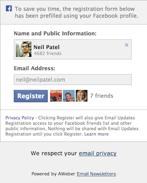
By the way, I also mention LinkedIn here since emails can be accessed through their API as well once a user gives permission. With Twitter emails are not provided.
(Most applicable to Landing pages / Sales Funnels)
11 - "Will making the email opt-in process 2 steps improve my opt-in rate?"
What if you didn't show email collection forms directly on the page? What if you required visitors to say "yes" by clicking and then show the email capture form in a popup--would that increase conversions?
Not too long ago the founder of LeadPages.net shared the results he saw from implementing this idea on their company website. The result was a 60% increase in opt-ins.
And although if you want to use his solution you have to pay for it, the good news is that if you're a developer it's not to difficult to code something like this into a Wordpress blog, maybe 2 hours of work. There may also be some Wordpress plugin alternatives I'm not aware of that also mimic this functionality.
(Most applicable to Blogs / Landing pages)
12 - Position a picture of someone looking at or pointing at the lead / email capture form
Research from LeadPages.net shows that on a landing page, if you can position a picture of someone looking at or pointing at the email capture form, that form's conversion rate will go up. Why? Because it focuses the attention of the visitor on the form; instinctually your eyes want to move to where she is looking.
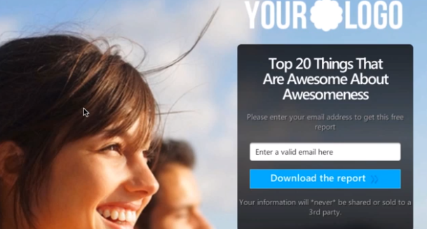
The reason I'm referencing LeadPages.net here again is because they are a highly credible source since they are able to look at data in aggregate across their entire platform to determine what will work on an almost universal level.
(Most applicable to Landing pages / Sales Funnels)
13 - "What is the a simple landing page offer I can make with a high conversion rate?"
Once again, I'm referencing Lead Pages here because they have a wealth of data to credibly show what are some of their highest converting pages.
The one pictured below is said to be their highest performing lead page because of the design and also because of the offer. People really love to know what tools you're using according to the data. Plus, the PDF listing out the tools, as the founder explained, was relatively quick and painless to create.
(Most applicable to Landing pages)
14 - "What are the professional bloggers and content marketers doing that works? What am I missing?"
On your blog on the side bar, simplify the elements there so that what is offered or advertised has a high contrast against a white background. This makes it stand out. Keeping the text to a minimum and using a large font size also makes me want to read it. It looks simple, inviting to the eye.
For example, check out the right side bars on Derrick Halpern's website (a blog with over 100,000 subscribers). Notice the simplicity in the design of those "ads" if you can even call them that. How inviting is that to the eye? Very inviting is the answer.
Second, similar example: check out SuperFastBusiness.com. It's a fairly popular blog and their right side bar "ads" are quite easy to read as well.
Compare that to the Eventual Millionaire by Jamie Tardy. Her side bar feels visually complex and my eyes don't want to float on over there. Now, granted, my own side bar on this blog could use some work too.
Why is this important?
I found a study from the University of Basil in Switzerland that focused visual complexity and how it affected our psychology. The study which involved showing subject 119 different websites concluded that "[o]verall websites with [low complexity] were perceived as highly appealing."
Bottom line: if people are turned-off from even looking at the parts of your website play a critical role in building your relationship visitors... consider simplifying, it's likely you'll get better results.
(Most applicable to Blogs)
15 - For timed or event triggered pop-ups, remove the "X" in the upper right hand corner.
Bounce Exchange has been one of the pioneers in the brave new world of lead generation through pop-ups.
For this reason, and because their technology is supposedly more advanced than others doing something similar in the market, I've keep an eye on the different types of design variations they test out.
For instance, I started to notice that the "X" to close a pop-up which appeared in the right hand corner would be hidden, and then appear a few seconds later. And now I've observed that the "X" is now completely gone from site (see screenshot below).
I assume this is because people are programmed to look and click in the upper right corner almost automatically. From this, it's reasonable to infer that they've noticed an increase in conversion when a user is force to evaluate the text on the popup and the two buttons presented.
Based on this, you should seriously consider testing the removal of your close button and see how it affects conversions.
(Most applicable to Blogs / Landing Pages / Sales Funnels)
16 - Design the key call(s) to action to follow the user down the page
For generating more leads from your blog, take a page from the book of the Smart Passive Income blog. If you visit one of their posts you'll notice that as you scroll down the page eventually a side panel of options appear in the side bar.
These serve to segment and further engage his audience until they end-up subscribing to his newsletter (which I did, I was enticed to read his free ebook).
17 - "How can I prevent or recapture abandoned orders?"
On your checkout page, recapture abandoned orders by automatically following up with someone via email using a tool like CartHook. Carthook and other remarketing solutions like it are still a fairly new technology.
After you embed a snippet of code on your website or ecommerce store, they go to work by listening for whenever an email address is entered (e.g. on a checkout page). Email is often one of the first form fields filled out so it makes sense that some percentage of people exit the checkout process at some point after that. When that happens, remarketing tools like Carthook will send a customizable sequence of automated follow-up emails, nudging prospects to complete their purchase.
My friend Jordan, who is the founder of CartHook, was recently able to recover $1500 in lost sales (per month) for an ecommerce client. So this type of remarketing definitely works.
(Most applicable to Sales Funnels)
18 - "If I want to build our email list, where should I put the opt-in boxes?"
For this one I'm going to point you directly to Derek Halpern's list of high converting places to add opt-in boxes on your blog.
In short, the key places are:
- The size bar above the fold
- Feature box at the top of the blog (when you're just looking at the site, not an individual blog post. When looking at an individual blog post there's another, small optin box at the top)
- After a single post
- Footer of the site
- On the about us page
- Lightbox popup
(Most applicable to Blogs)
19 - On guest blog posts, be strategic with the link in your by-line, or offer something custom to the audience.
Blog posts usually aren't so great at growing your business unless you do them on a massive scale.
Which is why I was intrigued when I started to read Maneesh Sethi's blog post about how a single guest post netted him over 1000 subscribers in a matter of about three weeks.
The "big idea" here is that on guest blog posts, within his "by-line," instead of linking to the homepage of your website, link to a landing page where people can go to get your newsletter or some free, relevant offer (example).
It sounds quite logical to me, and I can also tell you I have another friend who has done something similar. He told me privately that his guest posts were still fueling his growth since he was getting email sign-ups daily from it.
(Most applicable to Blogs / Landing Pages)
20 - "What the future of conversion optimization and how can I something to get an edge on it today?"
The future of conversion rate optimization lies in mass personalization. In other words, in the near future the same website address will look completely different to two different people. The website will self-adjust and self-optimize to provide what is calculated to be the most optimum experience for a visitor based on where each customer is at in the sales cycle, as well as a slew of other factors.
We are already seeing the start of this going on today, and it is extremely effective!
One way you could do this today is to track individual email subscribers and website visitors with cookies. For visitors, you would setup the site to emphasize your free courses or offers to with the goal of attracting them on to your email list. Then for people who are already subscribers, you would focus on showing them your your premium offers to consider buying ("Welcome back John. Did you know my book can help you do XYZ?").
If you look at Brennan Dunn's Planscope.io company blog you can see this strategy in action. Initially it will show you an ad in the upper right corner inviting you to join his newsletter list. However, after you subscribe, the ad changes to promote his book.
Although I cannot share with you any specific stats, I do know for a fact that this "adaptive marketing" approach is working well for him.
(Most applicable to Blogs / Landing Pages / Sales Funnels)
21 - "What is the most common, worthwhile conversion test you would recommend?"
Do you want to click or not? That the only question in the mind of a prospect when the homepage of your sales funnel is focused on one call to action.
Though it's important to be clear in your copy, it's also important to eliminate distractions that take away a customer's focus on the most important part of the page.
Here one simple test that proves the point.
Before:
After: a 45% boost in account starts.
(Most applicable to Landing Pages / Sales Funnels)
22 - "How can I optimize my pricing structure to convert better?"
In mid 2013, Ruben Gamez wrote a compelling article where he went into great detail about his decision to test and revise his pricing plans.
His main concern what that (a) customers were not being charged adequately based on the value they were receiving and (b) the pricing tiers were not designed in an intuitive way so as to appeal to individual customer segments.
After some qualitative survey research of his customer base, he revised the names of the plans to be specific to the type of customer who would typically buy that plan, or most likely fall into one of the three named categories.
The result? "Biggest revenue increase in a single month... Average revenue per user more than doubled."
This is instructive because it shows us the power of segmentation on a website.
Put another way: make your customers "see" themselves "in" your product.
(Most applicable to Landing Pages / Sales Funnels)
23 - (BONUS) How responding faster to support requests helps your conversion rate.
When I told some friends in a networking group that I'm a part of I was looking for some non-obvious tips on how to increase conversions, Derek Capo, a fellow entrepreneur, responded with a good suggestion and shot me this note on Facebook.
"Here's a perfect example of how 'speed kills' and drives conversions. In our company, Next Step China, many clients who started looking at us would tell us that our speed and detailed responses got them to NOT to look at other companies. For the ones that did look at other companies we won them over because they noticed our consistent, rapid response emails. It showed the difference between us and our competitor. It has worked to drive us more sales."
To help speed up response times, you can add a live chat widget like what Derek already has on his site (above). For instance, with EZ Texting.com customer support chat widgets were able to increase signups by 31%.
If you're going to go this route I recommend checking out Firefly for customer chat since it has some advanced features that allow a support rep the ability to see what the customer is doing, what page they're on and also guide them around the website in real-time.
(Most applicable to Sales Funnels)
"I want more..."
I had originally intended this article to have 99 tips and tricks. Unfortunately it's quite late (early morning?) here on the east coast. Though I would have loved to have all of those tips included here, I'm confident you've probably gotten value from the 22 listed above.
I will have the rest published in part or in whole next week.
If you enjoyed this article, I'd be happy to send you the the link when I publish parts 2 and 3. Simply type your email address in to the form below:
[wufoo username="petovera" formhash="q1osw818152hues" autoresize="true" height="260" header="show" ssl="true"]
Which tips are most relevant to your business? Leave a comment below and perhaps I'll tailor some of the tips and tricks in part II based on the feedback you give me.
If you enjoyed this article, go ahead and click to tweet it out, plus-one it on Google+, and post it on Facebook.
Image Credits:
http://www.flickr.com/photos/20738022@N00/327911794
http://www.flickr.com/photos/34316967@N04/4744866167
http://www.tiptopmarketer.com/salesfunnel/images/funnel.gif


