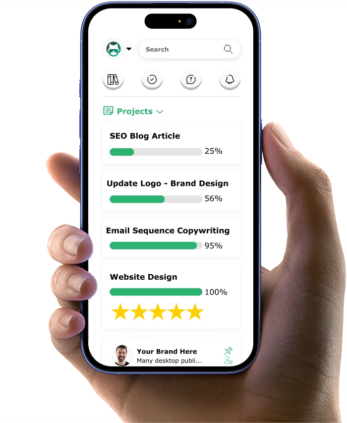
9 Easy Ways to Get More Clicks on Your Coaching CTAs

Is your coaching website's call-to-action (CTA) not getting the clicks you want? You've got great content, but those "Book a Call" buttons aren't working as hard as they should.
I get it. As a team who's helped hundreds of coaches, we've seen this challenge again and again. But here's the good news: small, simple changes often work better than big website overhauls.
Take Maria, a life coach from Boston. Her website had steady traffic, but few discovery calls. "I thought I needed to redo my entire site," she told me. Instead, we made three quick CTA tweaks. Within a week, her calendar started filling up.
In this practical guide, you'll learn how to make your coaching CTAs work harder for you. No tech skills needed - just clear, proven steps that any coach can use.
Here's what you'll discover:
- The "magnetic phrase formula" that makes prospects eager to click your buttons
- A little-known placement trick that catches eyes without being pushy
- The "trust trigger method" that turns visitors into booked calls
- A simple mobile fix that helps you catch leads others miss
- The "3-field formula" that gets more people finishing your forms
Ready to turn your website into a client-booking machine? Let's start with the most powerful CTA fix that takes just five minutes to do...
If you want to get your marketing work done for your business (or for your clients’), then you HAVE to learn more how you can delegate unlimited marketing projects & tasks without the headaches of hiring. Download this free guide: 33 Examples of Marketing Projects You Can Delegate to Growbo
Easy Way #1 Power Word Swaps for Your Coaching CTAs
You know those moments when you're looking at your call-to-action button, wondering why it's not getting the clicks you expected? The words you choose for your CTA can make a significant difference in how your coaching prospects respond. According to Wisernotify, using specific, clear CTAs can increase conversion rates by 161%.
Let's look at why certain words work better than others in your coaching CTAs. When you use generic phrases like "Submit" or "Click Here," you're missing an opportunity to connect with your potential clients. Instead, you want words that speak directly to what your coaching clients want to achieve. For example, replacing "Get Started" with "Begin Your Journey" helps your prospects visualize their transformation while keeping the message grounded and authentic.
The key to effective CTA word selection lies in understanding your coaching audience's motivations. Our article on copywriting guidelines suggests using action-oriented words that create a sense of ownership. When you swap "Book a Call" with "Reserve Your Strategy Session," you're not just changing words – you're giving your prospects a clearer picture of what they'll receive.
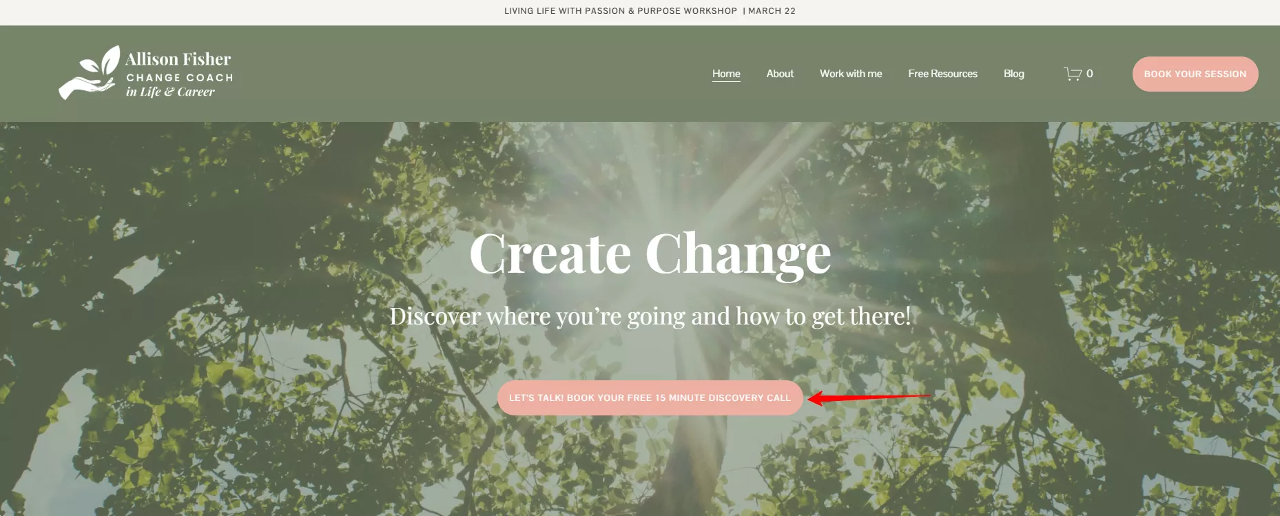
Here are some practical word swap suggestions for your coaching CTAs:
- Instead of "Learn More" → "See Client Success Stories"
- Replace "Sign Up" → "Start Your Growth Plan"
- Switch "Contact Us" → "Schedule Your Call"
- Change "Download" → "Get Your Free Guide"
Key Takeaways:
- Choose words that reflect your clients' desired outcomes
- Use action-oriented phrases that create ownership
- Keep language clear and specific to your coaching offer
As you implement these word changes in your CTAs, remember that the best results come from testing different variations with your specific audience. Now, let's look at how the right button colors can further enhance your newly optimized CTA text.
Easy Way #2 Button Color Quick-Fixes for Better Engagement
When you're looking to improve your coaching CTAs, the color of your buttons plays a crucial role in catching your prospects' attention. According to HubSpot, 85% of consumers say color is a primary reason why they choose to click on a button. This shows how a simple color adjustment can make your CTAs more noticeable and engaging.
The key to effective button colors isn't about following trendy design choices. Instead, you want to focus on creating clear visual contrast that makes your CTA stand out from the rest of your page. For example, if your website uses a predominantly blue color scheme, an orange or yellow button will naturally draw the eye without looking out of place.
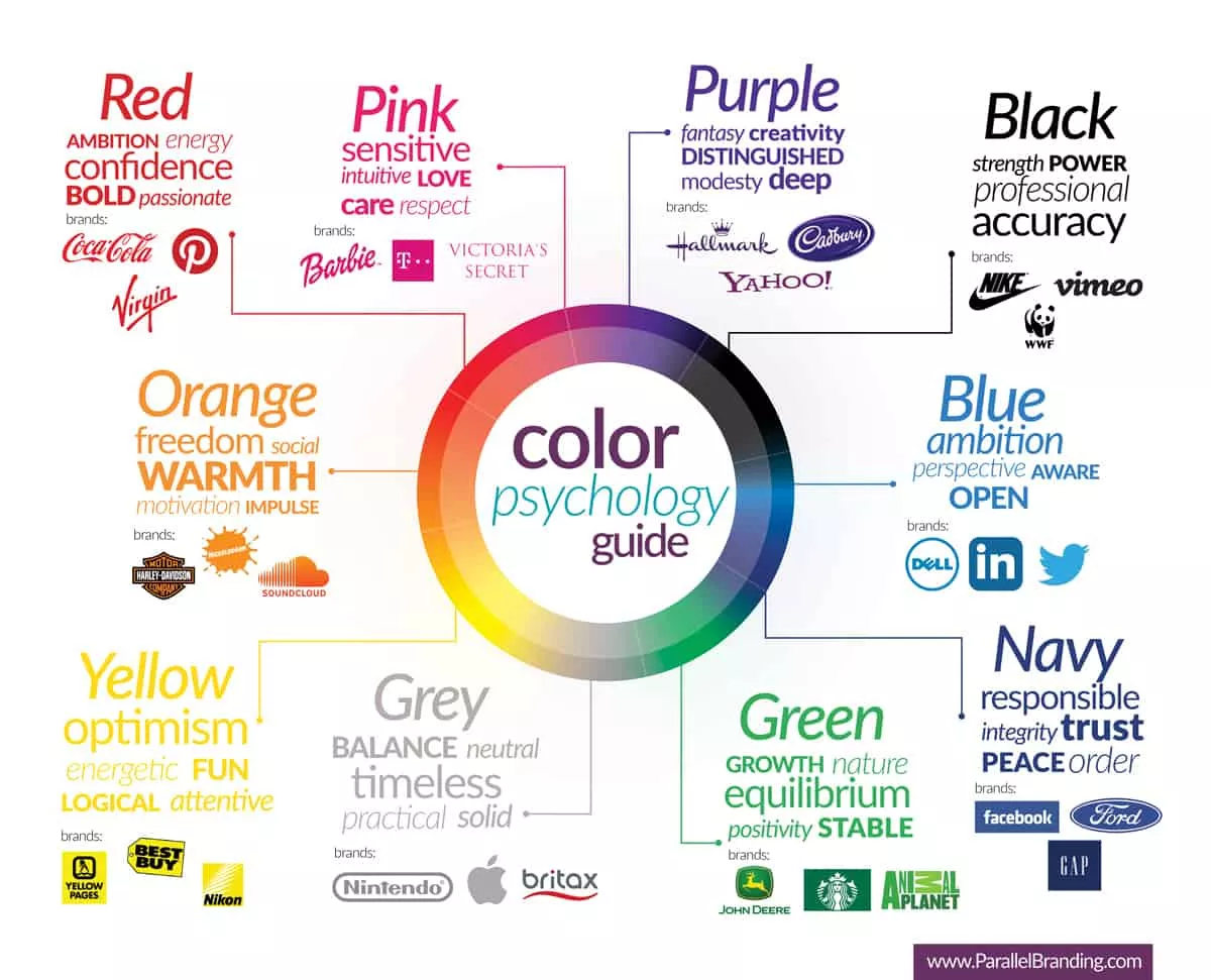
Your button color choice should also align with basic color psychology principles that resonate with your coaching audience. Blue often signals trust and reliability, while green can represent growth and progress. However, the most important factor is ensuring your button stands out visually on your page. Nielsen Norman Group shows that buttons with strong contrast ratios can increase click-through rates by up to 35%.
See the difference between the two pages:
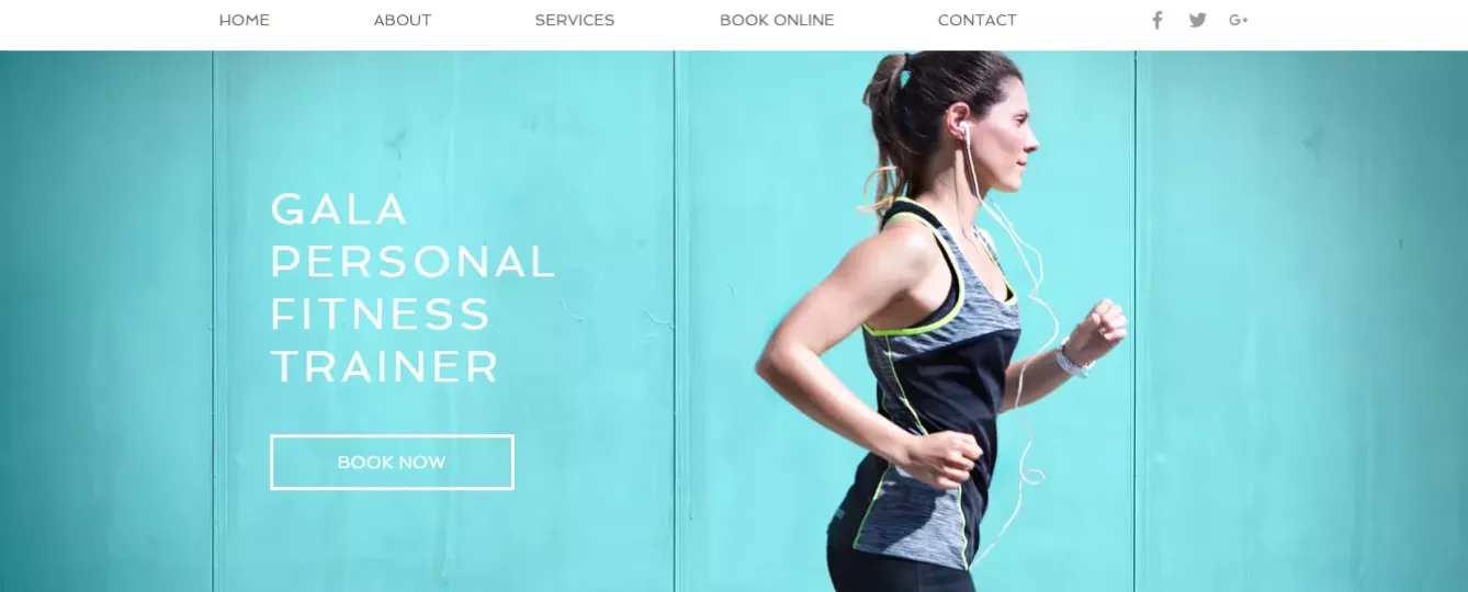
Here are practical color recommendations for your coaching CTAs:
- Use contrasting colors that stand out from your background
- Ensure text remains readable against your chosen button color
- Test different shades of the same color to find the best performer
- Maintain consistency with your brand's color palette
Quick Color Selection Guide:
- For trust-focused coaching: Deep blue or purple
- For personal development coaching: Green or teal
- For business coaching: Navy blue or dark orange
- For life coaching: Warm yellow or light green
Key Takeaways:
- Choose colors that create strong visual contrast
- Consider your coaching niche when selecting button colors
- Keep testing different options to find what works best for your audience
Now that you've optimized your button color, let's explore how size and spacing can make your CTAs even more effective.
Easy Way #3 Size and Space Adjustments for Maximum Impact
The size of your CTA button and the space around it can significantly impact how easily your coaching prospects notice and click on it. According to W3.org, buttons should be at least 44x44 pixels to ensure they're easily clickable on both desktop and mobile devices. This simple sizing adjustment can make a substantial difference in your conversion rates.
Think about the last time you tried to tap a tiny button on your phone – frustrating, right? Your coaching prospects feel the same way. When you give your CTA buttons enough breathing room, you make it easier for potential clients to take action.
The space around your CTA, often called white space or negative space, is just as important as the button size itself. When you surround your CTA with clean, uncluttered space, you help it stand out naturally on the page. This doesn't mean leaving large empty gaps – instead, think of it as creating a comfortable visual hierarchy that guides your prospects' attention to the action you want them to take.
Here are practical sizing guidelines for your coaching CTAs:
- Desktop button width: 200-250 pixels
- Mobile button width: 44 pixels minimum
- Padding around text: 20-30 pixels
- Space between CTAs: 50 pixels minimum
Quick Space Optimization Tips:
- Keep primary CTAs larger than secondary ones
- Maintain consistent button sizes across your pages
- Add extra padding for touch-screen accessibility
- Create clear visual separation from surrounding content
Key Takeaways:
- Size your buttons for easy clicking on all devices
- Use white space strategically to draw attention
- Maintain consistent sizing across your website
Now that your CTAs have the right size and space, let's look at how adding urgency can motivate more prospects to take action.
Easy Way #4 Urgency Phrase Addition That Drives Action
Adding the right urgency phrases to your coaching CTAs can significantly boost your response rates. According to recent conversion studies, CTAs with well-crafted urgency messages see a 35% increase in click-through rates. This isn't about creating fake pressure – it's about helping prospects understand the value of taking action now.
The key is using authentic urgency that aligns with your coaching offer. Instead of generic "Limited Time" phrases, focus on the real benefits of starting sooner rather than later. For example, "Start Your Journey Today" or "Next Session Opens This Week" creates natural urgency while maintaining your professional credibility.
Your urgency phrases should always connect to genuine deadlines or limitations. If you're offering a group coaching program with limited spots, communicate that clearly. Phrases like "5 Spots Remaining" or "Early Bird Rate Ends Friday" work well because they're based on real constraints.
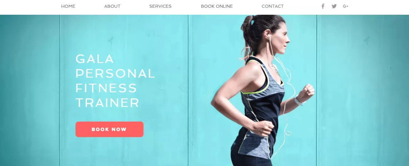
Effective Urgency Phrases for Coaches:
- Next Group Starts [Specific Date]
- Book Your Spot - Only [X] Places Left
- Schedule Before Rates Increase
- Join Today's Strategy Session
Easy Way #5 Social Proof Integration for Trust Building
When potential clients see that others trust your coaching services, they're more likely to take action. Adding simple social proof elements near your CTAs can provide the confidence boost needed to click. Think about including a brief client quote or success metric right above your CTA button.
Keep your social proof concise and relevant. A short testimonial like "Sarah helped me double my client base in 3 months" or a quick stat like "Join 500+ successful clients" can work wonders. The key is placing these trust indicators where they naturally support your call to action without overwhelming it.
Consider rotating different types of social proof to appeal to various prospect needs. Mix client results, professional credentials, and community size indicators to build a well-rounded trust foundation.
Quick Social Proof Elements:
- Brief success stories
- Number of clients served
- Recent client results
- Professional certifications
Easy Way #6 Mobile View Optimization for Better Results
With more people accessing coaching websites on mobile devices, your CTAs need to work flawlessly on smaller screens. According to recent studies, improving mobile load time by just 0.85 seconds can increase conversion rates by 7%.
Start by ensuring your CTA buttons are easily tappable on mobile screens. This means making them wide enough for thumb clicks and placing them where they're naturally accessible. Avoid putting CTAs too close to other clickable elements to prevent accidental taps.
Pay special attention to how your CTA text displays on mobile. What looks perfect on desktop might break into awkward lines on a phone screen. Keep your mobile CTA text short and impactful, using no more than 3-4 words when possible.

Mobile Optimization Checklist:
- Test tap targets on various devices
- Check text wrapping on different screen sizes
- Ensure quick loading times
- Verify contrast on mobile displays
Key Takeaways:
- Use genuine urgency based on real limitations
- Place relevant social proof near CTAs
- Optimize for mobile-first experiences
Let's move on to how you can simplify your forms to make it even easier for prospects to take action.
Easy Way #7 Form Field Reduction for Higher Completion Rates
The number of fields in your coaching forms can make or break your conversion rates. According to Incrementors, reducing form fields from 6 to 3 can increase conversion rates by up to 50%. This shows how important it is to ask only for essential information. We also tackled form optimization in this article.
Start by looking at your current forms with fresh eyes. Do you really need every field right now? For initial contact forms, stick to the basics: name, email, and maybe one question about their main goal. You can always gather more information during your discovery call or follow-up emails.
Consider using progressive profiling if you need more information. This means collecting basic details first, then gathering additional information over time. This approach feels less overwhelming to your prospects and often leads to better completion rates.
Essential Form Fields for Coaches:
- Name (single field instead of first/last)
- Email address
- Primary coaching goal
- Preferred contact time (optional)
Easy Way #8 Value Proposition Enhancement in Your CTAs
Your CTA should clearly communicate the value your coaching offers. According to recent studies, value-focused CTAs show a 30% higher conversion rate compared to generic buttons. Instead of "Submit," use phrases that highlight what your prospects will gain.
Think about what your coaching clients want most. Are they looking to grow their business? Improve their leadership skills? Your CTA should speak directly to these desires. For example, "Get Your Custom Growth Plan" is more compelling than "Schedule Call."
Remember to keep your value proposition specific and achievable. Avoid making promises that seem too good to be true. Focus on the immediate, tangible benefit your prospects will receive when they click your CTA.
Value-Focused CTA Examples:
- Claim Your Strategy Session
- Start Your Growth Journey
- Get Your Custom Plan
- Access Expert Guidance
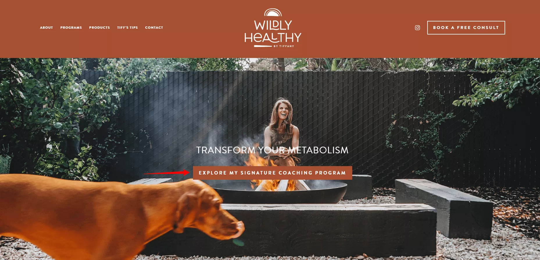
Easy Way #9 Placement Optimization for Better Visibility
Where you place your CTAs can significantly impact their effectiveness. According to CrazyEgg, CTAs placed within the first screen view get 84% more engagement than those below the fold.
Consider your prospects' reading patterns. Most people scan web pages in an F-shaped pattern, making the top and left side of your page prime real estate for CTAs. Place your most important calls to action where they naturally align with this reading pattern.
Don't forget about mobile placement. What works on desktop might not work on mobile screens. Test your CTA positions across different devices to ensure they're easily accessible without scrolling or zooming.
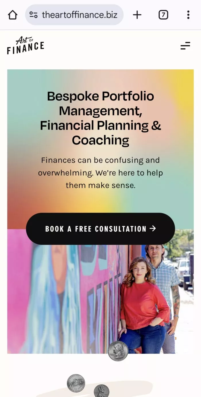
Strategic Placement Guidelines:
- Above the fold for primary CTAs
- After key benefit statements
- At natural decision points
- End of compelling sections
Key Takeaways:
- Simplify forms to essential fields only
- Focus on immediate value in CTA text
- Place CTAs where they're naturally visible
Now that you've optimized all these elements, you're ready to start seeing better results from your coaching CTAs.
If you want to get your marketing work done for your business (or for your clients’), then you HAVE to learn more how you can delegate unlimited marketing projects & tasks without the headaches of hiring. Download this free guide: 33 Examples of Marketing Projects You Can Delegate to Growbo
CONCLUSION
You've learned the practical ways to improve your coaching CTAs. These aren't fancy tricks - they're proven methods that can help more clients take action on your website.
Here are the key steps you can use right away:
- Write button text that matches what your clients want to achieve
- Choose colors that naturally catch attention
- Simplify your forms to just the essential fields
- Show real client results near your buttons
- Ensure easy clicking on all devices
Looking at this list, you might think "Great tips, but who has time to implement all this?"
That's exactly why our Growbo team is here. Instead of spending hours on these changes, let our marketing experts handle it for you. For $7, you get a 7-day trial where we'll improve your CTAs and take care of any other marketing tasks you need. Schedule a call today to get started.
What CTA changes have worked for your coaching business? Share below or visit Growbo to get these improvements done for you.
Keep Growin,’ Stay Focused,

Credit Images:
1 - https://www.allisonfisher.com
2 - https://parallelbranding.com
3 - https://uxplanet.org/designing-a-perfect-call-to-action-button-with-wix-c03cd20bc09f
4 - https://www.wildlyhealthybytiffany.com/
5 - https://cherylportermethod.com/
6 - https://www.gregfaxon.com/
7 - https://theartoffinance.biz/


