How To Boost Your Conversion Rate Instantly With Quality Assurance (Without Spending a Dime)

Have you ever heard that saying “the last shall be first?”
Something about it called my attention recently...
I was reading this book, “Extreme Ownership: How U.S. Navy Seals Lead and Win” the other day.
The author told the story of different groups of U.S. Navy Seals who were rowing and carrying their boats at night as part of a team exercise. The first ones to finish the race down the beach were the winners.
The leader of the team that was coming in the last place complained. He claimed that the conditions for his team were “unfavorable”.
The drill sergeant said “all right” and swapped him with the leader of the team who was coming in first.
The result? The boat crew that was originally losing and coming in last, was now coming in first.
The point of the story? There are no bad “unfavorable” teams, there are only bad leaders.
As the leader of your business, you want your team to ALWAYS win. And in order to do that you must deliver a quality experience to your clients (or customers) every time.
Sure, you could blame your team, just “accept” that it is what it is...
Or you can take responsibility for the quality they deliver and how well each team member reaches for high standards.
And that’s exactly why I wrote this article. With the relaunch of Growbo’s done-for-you service, I’ve recently taken full responsibility for delivering a great experience and results for our client.
And it’s already paying off big in the form of VERY happy clients. Here’s yet another unsolicited compliment from one of our clients yesterday:
“I feel like I’m in good hands and that I’ve made an extremely good decision bringing you guys on. And just wanted to thank you for your efforts.”
I'll show you how we’re doing this via a killer quality assurance process, and how you can do it too.
In this article, I will share with you the most effective tips on how to raise your team’s standards and the quality of the work. Also, you'll see some examples of what is working for us right now and for our clients. By the end of this article, you will have a clear view on how quality assurance drives more conversion, and how it is an essential expectation of any winning brand or team long-term.
Receive a copy of this article to read later
Importance Of Quality Assurance In Your Sales Funnel
If you are a leader who really wants your team to win, start by setting higher standards for EVERYONE.
What does that mean in practice?
I’ll tell you…
It means saying NO to anything that does not measure up—doesn’t look good, sound good, function right—whatever the issue or the “almost-there-but-not-quite!”...
It means saying, “No, we’re not sharing this / launching this. Go back and try again.”
In delivering work to clients, there is no room for “good enough”.
You will lose leads, sales, good team members (the ones who do care and do deliver quality work), and clients.
For example,
Also, nothing causes a worse impression than showing to your client a typo on your copy, a mistake in your newsletter, or poor design on your website. Those mistakes are equally bad for the relationship.
Here’s another example…
A couple of months ago, a content writer applied to feature his article in Growbo’s blog. When our editor & quality assurance expert visited his website to “check his background”, there was a huge TYPO.
We obviously dismissed him immediately.
Quality assurance MATTERS in your sales funnel.
Now imagine if your website has those same errors… How many leads would you lose because of that?
And how many more will you gain when you start to care about such details?
When we launched Growbo’s Done-For-You service a couple of months ago, we hired a copywriter.
He was not willing to get better and refused to reach out for the high standards bar. Even though the suggestions the editor and I made to make his copy were objectively better, the copywriter still refused to improve—and he had the ability.
What happened next? I removed him from the team.
This sort of decisive action used to be a not-so-easy decision for me to make though. I used to be very shy about correcting people... Or calling people out on their “bullsh*t”.
(Let’s face it, people test you to see what they can get away with.)
But now, with practice, I’m totally real with my team, and I call out sloppy work or if I know they are holding back. I did it this morning with our developer who’s coding something internally for us.
“Dude,” I said. “I’m concerned because these are very basic bugs you’re showing to me.”
And he knew it too, especially once we talked through it.
But the truth is that you should always be transparent with your team and properly communicate whatever you see it’s not working.
Anyway, if you want to boost your conversion rate instantly without spending a dime, apply the following quality assurance tips.
Want your website to meet the highest quality standards needed to convert, boost your sales, and generate more quality client leads without you lifting a finger?
Quality Assurance Tips For Copywriting:
1. Understand Who The Client Is—and Empathize in The Copy. Take into consideration what your client wants and asks for. Then, communicate it properly in the messaging. We share with our team a copy brief with all the information about a client’s business and market that we’ve gathered. This helps our copywriters quickly get into the proper frame of mind and speak to them “on their level”.
2. Clarity. “Be clear, not clever”. I constantly tell that to our copywriters when they use fancy words to try to sound “too smart”. In the past weeks, a copywriter wrote copy for an Interior Design company. The person tried so hard to sound clever, that at the end, she didn’t mention anywhere in the copy “Interior Design”... She was in training, but, in case you are wondering, she didn’t make the team.
3. Clear Headline. If you read “We crack your brand’s code”, what will you think? Hmmm, anyone? If you didn’t understand what that headline means, you are in the majority, because I didn’t either. That was the headline that a previous copywriter wrote to explain an advertising agency’s services (a client of ours). It was vague, unclear, and it didn’t add any value. By the way, don’t think we’ve hired 100 copywriters in the last 2 months. I’m only sharing some of the more useful stories I’ve experienced with going through 3 copywriters in that period.
Anyway, thanks to our quality assurance process, we polished the headline. It became…

A bit clearer, huh?
4. Follow a Proven Template. I’ve found common for issue even for experienced copywriter to not discuss the problem / pain points in detail of whatever solution we are selling. We permanently fixed this, by using a basic 10-step template for our copywriters so that every key elements that can boost conversions, is actually used. This is the same of several templates I give you in our 6-Figure Sales Funnel Training.
5. Accuracy. Always be accurate with the information you cite when writing copy for a client. All background details about the business and client must be correct and aligned with the selling strategy.
6. Right Tone For The Right Audience. Personalize the tone of the copy and speak directly to the audience who will read it. There is no such thing as a “generic tone”.
7. Crisp Sentences. Do not write copy with long sentences that are difficult to comprehend for readers. Also, long paragraphs are scary. We use a great tool to help writers write bite-sized sentences. Hemingway App points out the sentences, paragraphs and/or words that have simpler alternatives.

8. Typos and Grammar. Typos and grammar errors can make you lose leads. Always proofread your content before publishing it. When we have corrected typos from our website, that has always correlated with generating more sales and leads.
9. Easy-To-Digest Information. Pack the information you offer so the reader can digest it easily. Use videos, summaries, bullet points, FAQ sections, and any other elements that can make the reader’s experience more enjoyable.
Quality Assurance Tips For Design:
10. Elements of the Page Feel Integrated. Graphic / web design amplifies the copy and the whole website. When the elements from your landing page (text, headlines, logo, images, footer, sub-headlines, etc) are placed randomly or without care, your website won’t meet its goals. The experience must feel integrated, like the images aren’t “cookie cutter” or just “thrown” on the page for instance.
11. Consistency. Always be consistent with spacing, margins, colors, font styles, Call-To-Action buttons, font sizes, logo, and all elements on your website. Change your mindset from “no one’s gonna notice it” to “everyone will see it”. Make sure the space between headlines and text, between sections, and between images and the text are the same. Font style and font sizes must be consistent along the website. CTA buttons must have the same color and shape. You think your potential customers will not notice that the yellow CTA buttons below are not the same tone? Or that the green ones have different sizes and shapes?
The fact is, people are judging whether or not to do business with you / your brand based on what they see on the page. So make sure to put your best foot forward and keep the design consistent.


12. Use “Real” Photos of People, & Fewer Stock Photos. A repeating conversion pattern I noticed from creating our Proven Sales Conversion Pack product was that using an authentic photo instead of a stock photo converted significantly better, to the tune of 20-30%, or more.
In addition, people like to see faces on your website. For instance, try using less “fake” stock photos where everyone looks like models. For one of our clients, we are using a photo of him and his wife to feature it on his landing page.

13. Color Contrast. As I said before, a good design amplifies your copy. For instance, the color choice and the use of them is critical to your website. For instance, try using colors that contrast with your logo and the background you use.
For a landing page, our designer created the hero section below. First, the blue squares from the logo are invisible with the same color background, and the logo doesn’t stand out so well either. Second, the white text over the light blue background doesn’t contrast so well, therefore it’s hard to read. And third, the texture of the background image makes the text hard to read. The lines are distracting.

Thanks to our quality assurance process though, this hero section evolved to the one below.

The text stands out, it’s easy to read, and the logo contrasts with the background. Much better, right? Love that textured background… (Notice how the copy improved too).
14. Simple Background Photos. When placing text on a background image, use simple and clear images. This will make the text stand out and the image appreciated.
If you use a complex image (with lots of elements), or if you use too much blur effect or transparency layers, the text will be hard to read. In the image below, adding too much blur and cutting off people’s heads, made the image difficult to understand. If we want to properly reinforce what the copy is saying, then the right photo with the right “treatment” will work.

For instance, the background image below looks and works way better. Notice how it complements the copy (this example is from our reviews page).

15. Right Use Of Text. Make sure that the text you are adding on a background image makes sense. Avoid adding text on the people’s face like the images below… It’s awkward and just… not good.
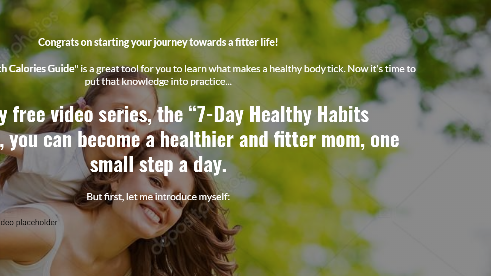

16. Connection Between Brand And Design. There has to be a connection between your brand, your logo, colors, and the font style and size you choose. Otherwise, your brand ideas will not be understood.
17. High-Resolution Images. Yes, I know it sounds obvious but I can’t explain to you how many websites I have visited that have had low-res images. This makes your brand look cheap and careless. Blurred numbers, pixelated faces, logo—avoid them like the plague!
Quality Assurance Tips For Content Writing:
18. Typos and Grammar. These are critical errors for anyone who consumes your information through sight. I had to fire a content writer a little while back because (among many other issues) she had typos everywhere. Always proofread your content before publishing it. I recommend you to use Grammarly, a great tool for catching grammatical errors. But if you have a writer who doesn’t know how to write impeccably, forget about tools. What you’ll need is a replacement for that position, because readers won’t trust something that is poorly written.
Another example of this: people are constantly emailing us asking links etc, to some new guide or article they created. 9 times out of 10, when I check out the article, it is riddled with typos and poor grammar. And if that’s the case, how good can the rest of the article be?
19. Bite-Sized Sentences. Long paragraphs will tire your reader no matter how interesting your content is. Use short, bite-sized sentences that are easy to read and understand like we do in Growbo.
See what I did there? :-D
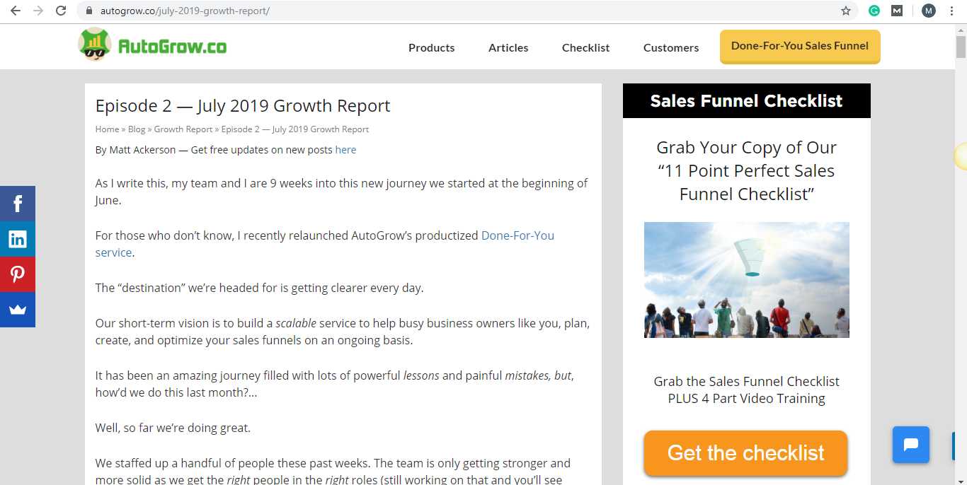
20. Clear Headline. The headline of your article or blog post must be clear and should convey value. No matter how many SEO and keywords you include in your headline, if it’s not clear, the reader will just leave your blog. Because who wants to read an article if the headline is not even clear?
21. Engaging Introduction. I can’t tell you how many articles from guest writers we receive weekly with no introductions in their article drafts. Obviously, none of those applicants have been admitted. In Growbo’s articles, we use the SAPP formula. This is the most persuasive way to write an engaging introduction: Story + Agreeable Statement to Transition + Preview + Promise (this is an upgraded version of a formula from Brian Dean over at Backlinko).
22. Clear Content. If you want to boost your sales, post clear, useful and valuable content. If you can’t post that often but are still providing quality content, your audience will come back.
23. Cite Credible Sources. Always cite sources to support the claims you are making, and make sure all the links work. Most guest writers who submit articles to us don't cite the sources and don't support claims. The other day our editor revised one article and 4 out of 5 links didn’t work, and some factually false claims were made. Imagine if readers saw that? No bueno, but that’s exactly why QA matters!
24. Conclusion. Good content must end with an informative conclusion. It should recap and review the most important points of your article. This is for people who only skim through your article and reads only the conclusion. Give them what they want, a brief summary of the content. Then they’ll often go back and read more of it.
25. Formatting of Elements. Right font size, font style, images, bullet points, headlines, sub-headlines—they all play an important role in content writing.
26. Right Tone. Know your audience so you can write specifically to them. The best way I have found for writing is by using a conversational tone. This keeps the reader interested and hooked, because you know a human and not a robot wrote it… yo.
Quality Assurance Tips For Web Development:
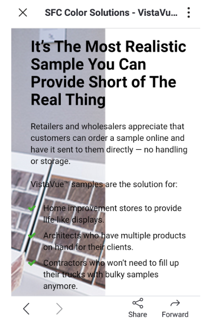
27. Mobile Optimization. Optimize your website for mobile devices. Check from a phone, tablet, and desktop to make sure everything is displayed correctly. Avoid mistakes like the one below.
28. Forms Work. When an opt-in form is submitted, make sure it works and redirects the prospect to the next steps. Our quality assurance expert recently reviewed a landing page that was submitted as “finished”, and one of the opt-in forms was not working. If we would have delivered this page to the client like this, it wouldn’t have converted for him. #QAforTheWin
29. Links. All links on your website most work and redirect the prospect to the right pages. Check them! Always. Don’t assume. And that goes double for newsletters… Before you hit send.
30. Page Online. Ensure that if you link your prospects to your website from an ad or a launch email, it is online and working. Sounds obvious, but random sh*t happens alllll the time. #QAallDayLong
31. Email Formatting. When you send a newsletter to your email list, make sure you proofread it for typos and that it has the right formatting. No double spacing or missing images.
32. Automated Emails with Right Timing / Scheduling. Sending email campaigns can be a pain in you know where because if you get ANYTHING wrong… you can’t undo it. But always make sure to schedule your newsletters in the correct timings so no unexpected emails arrive in your prospect’s inbox.
An example of this was a few years back where I wrote an updated version of our free Double Your Leads email course. But all the emails would send if the day of the week was Tuesday or Thursday… without a minimum wait time of 1 day in between. So what happened? People opted-in and got ALL 8 lessons + a few more emails all at once!
Luckily we noticed it pretty quick and only a few people received all those emails.
33. Budgets Are Set Up For Ads. Stick to your average daily ad budget.
Want Growbo to create a customized (and high quality) Funnel strategy Blueprint for your business?
Conclusion
Our principle of quality assurance means to taking ownership of all key details, and make the work great, not just “ok” or “good enough”.
Because that’s what it takes to GET RESULTS.
Your business will not succeed at the level you dream (and know) it could, if:
- (1) you don’t offer high-quality digital experience (as prospects move through your funnel) or
- (2) in terms of your work to your own clients.
The success of your business is built on team members taking responsibility and taking ownership...
The success of any team is possible with great leadership that upholds high-quality standards…
Remember that story of the Navy Seals from the intro above. It is possible, if you’re last, to be first. The only thing you need is the right leadership—particularly on this issue of Quality Assurance (QA) at every level of your funnel—because that will make your team WIN.
Now let me ask you, which areas of your sales funnel do you think need the most quality assurance?
Is it copywriting, design, web development, or content writing?
Let me know in the comments below, and remember, quality always WINS (And it’s inexpensive too)!
Keep Convertin’, Stay Focused,


