7 Design QA Checklist Steps That Cut Review Time

Ever finished a design project feeling totally confident, only to have your client point out mismatched fonts, wrong colors, and embarrassing alignment issues you somehow missed? Yeah, we've all been there.
After reviewing thousands of design projects over the years, we've learned something crucial: even tiny mistakes can absolutely crush client trust and damage your reputation.
Just ask Miriam, who owns a marketing agency. Her team had to revise nearly everything for a major client because of missed quality checks. Her solution? A simple checklist system that caught errors before they left the office.
This guide reveals the exact QA process used by top design teams to deliver flawless work every time. Here's what you'll discover:
- The "Triple-Check Method" that catches errors other designers completely miss
- A little-known device testing secret for perfect display across all screens
- The brand consistency framework that keeps clients coming back for more
- A simple file preparation technique that prevents technical nightmares
- The documentation method that turns your QA process into a reusable asset
So here’s the first thing you need to know…
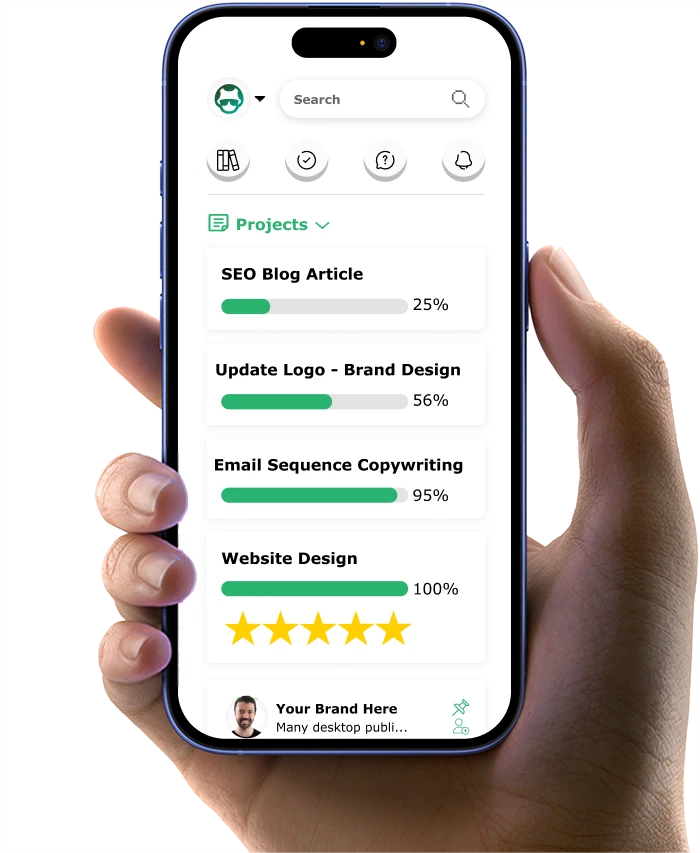
If you want to get your marketing work done for your business (or for your clients’), then you HAVE to learn more how you can delegate unlimited marketing projects & tasks without the headaches of hiring. Download this free guide: 33 Examples of Marketing Projects You Can Delegate to Growbo
QA Checklist Step #1 Brand Guidelines Verification
Your brand's visual consistency directly impacts how customers perceive and remember your business. According to Lucidpress, consistent brand presentation increases revenue by up to 33%. This is also amplified by 68% of businesses reporting more than 10% revenue growth due to brand consistency.

This makes brand guidelines verification your first and most crucial step in the design QA process.
You need a systematic approach to verify brand elements in every design piece. Start with your brand style guide - it's your quality control blueprint. Keep it accessible to your entire team and update it regularly. This living document should detail every aspect of your visual identity, from color codes to typography specifications.
Essential Brand Guidelines Verification Steps
Your QA process should begin with a thorough color check. Use digital color validation tools to ensure perfect matches across all design elements.
Typography consistency is your next critical checkpoint. Verify that all fonts match your brand specifications, including sizes, weights, and spacing. Pay special attention to heading hierarchies and body text relationships - these subtle details make a significant difference in maintaining professional quality.
Logo Usage Standards
Your logo deserves special attention in the QA process. Create a detailed checklist for logo placement, sizing, and clear space requirements. Remember to verify that your logo appears correctly across different backgrounds and contexts.
- Minimum size requirements for different platforms
- Clear space measurements around the logo
- Approved color variations
- Placement guidelines for various materials
Here is an example of a logo checklist:
![]()
Documentation plays a vital role in maintaining consistency. Keep detailed records of every brand guideline check you perform. This helps track common issues and improves your QA process over time.
Key Takeaways:
- Implement a digital color validation system
- Maintain an updated, accessible brand style guide
- Document all brand guideline checks for continuous improvement
As you move forward with your design QA process, remember that brand consistency forms the foundation for all other quality checks. Let's explore how proper layout assessment builds upon this foundation in the next section.
QA Checklist Step #2 Layout Assessment
Your design's layout serves as the framework for effective visual communication. Getting it right means following specific rules and measurements that ensure your message comes across clearly. According to studies, proper layout assessment reduces user confusion by 65% and increases engagement time with your content.
You'll want to start with your grid system - it's the invisible structure that holds your design together. Think of it as the blueprint for your visual elements. Check that all components align properly with your predetermined grid lines and spacing rules.
White Space Management
White space isn't empty space - it's a powerful design tool that guides your viewer's eye. According to HubSpot, designs with proper white space utilization improve reading comprehension by 38%. You need to verify that your spacing follows a consistent rhythm throughout your design.
Start by measuring the margins and padding between elements. Check that similar components maintain equal spacing relationships. Pay special attention to the space between paragraphs, images, and interactive elements - consistency here creates a professional, polished look.

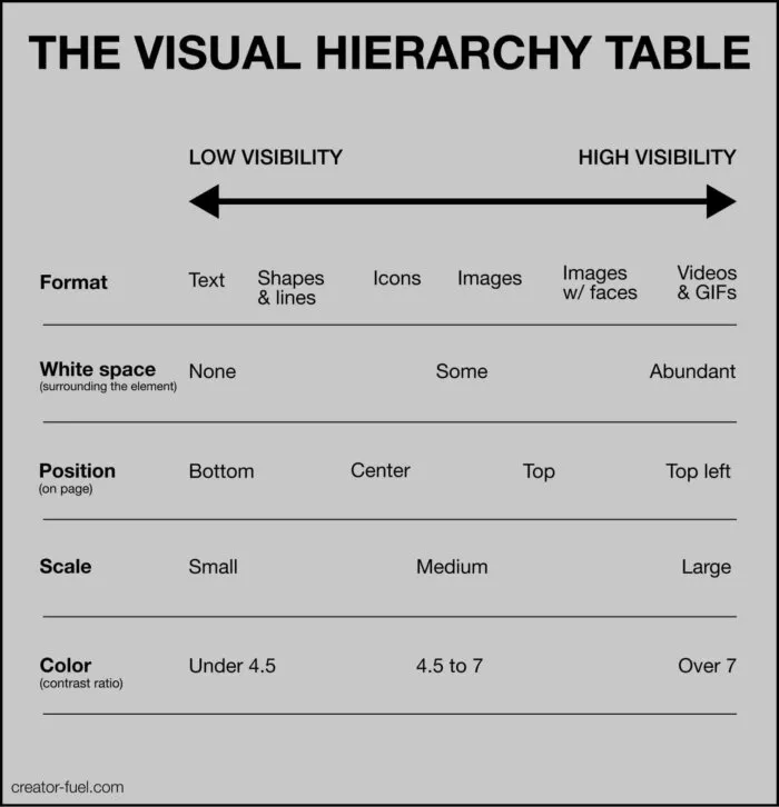
Visual Hierarchy Check
Your layout needs a clear visual hierarchy that guides users through your content naturally. Begin by verifying that your most important elements command appropriate visual weight through size, color, or positioning.
Use this practical checklist for hierarchy verification:
- Primary elements stand out clearly at first glance
- Secondary information supports without overwhelming
- Text headings follow consistent size progression
- Important calls-to-action maintain proper emphasis
Balance and Composition
Every element in your design should contribute to a balanced whole. Check that the visual weight distributes evenly across your layout. This doesn't always mean perfect symmetry - sometimes intentional asymmetry creates more engaging designs.
Use these measurement points to verify balance:
- Element distribution across the layout
- Color and contrast balance
- Text-to-image ratio
- Negative space distribution
Key Takeaways:
- Use a grid system as your foundation for consistent layouts
- Maintain measured white space relationships
- Verify clear visual hierarchy in every design
With your layout fundamentals verified, you're ready to move on to technical specifications - the next crucial step in ensuring your design meets professional standards.
QA Checklist Step #3 Technical Specifications Review
Your design's technical quality directly impacts its professional delivery and effectiveness. Proper technical specification reviews reduce file-related issues and speed up production workflows significantly.
You need to verify every technical aspect of your design files before they move forward. This means checking file formats, resolution quality, and color profiles. These elements might seem basic, but they're often the source of costly mistakes and delays.
File Format Standards
Start by confirming that you're using the right file format for each purpose. Different platforms and mediums require specific formats for optimal performance and incorrect file formats contribute to design implementation delays.
Use this format verification checklist:
- Web graphics saved as optimized PNG or JPEG
- Print materials prepared in CMYK PDF format
- Vector graphics preserved in AI or EPS files
- Source files organized with linked assets
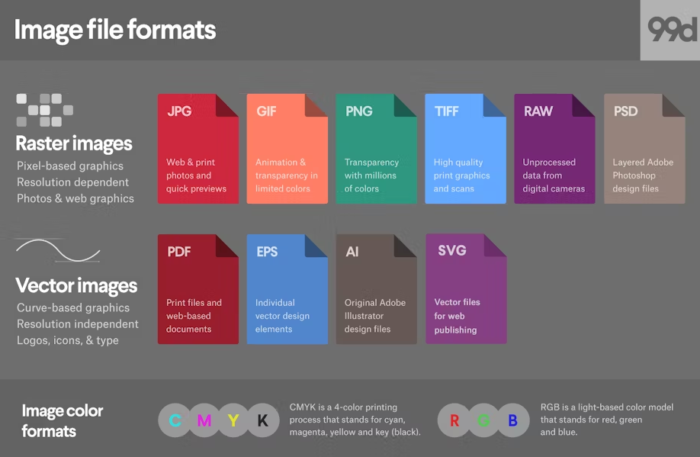
Here’s a more detailed guide on the types of image files that can be included in the checklist:
Resolution and Size Requirements
Image quality matters in every design project. Check that all your images meet the required resolution standards for their intended use. For print materials, verify 300 DPI resolution. Web graphics typically need 72 DPI for optimal loading speed while maintaining quality.
Pay special attention to these resolution checkpoints:
- Image resolution matches output requirements
- File sizes are optimized for their platform
- No pixelation in scaled images
- Consistent quality across all visual elements
Color Profile Management
Color accuracy ensures your designs look consistent across all mediums. Start by checking that your color profiles match your output requirements. Web designs should use RGB color profiles, while print materials need CMYK settings.
Follow these color management steps:
- Verify color profile consistency
- Check for color space conflicts
- Confirm proper color conversions
- Test color appearance across devices
Export Settings Verification
Your export settings determine how your final files perform in their intended environment. Double-check all export parameters before finalizing your files. This includes compression settings, metadata inclusion, and compatibility options.
Use this export verification list:
- Compression levels optimize file size and quality
- All necessary metadata included
- Proper layer handling for specific formats
- Platform-specific requirements met
Key Takeaways:
- Verify file formats match their intended use
- Confirm resolution requirements for each medium
- Maintain consistent color profile management
With your technical specifications verified, you're ready to move on to content quality control, where we'll ensure your design's message is as polished as its technical execution.
QA Checklist Step #4 Content Quality Control
Your design's content quality directly affects how well your message reaches its intended audience. Recent studies from HubSpot show that well-optimized content increases engagement by 55% and improves conversion rates significantly.
You need a systematic approach to content review that catches errors before they reach your audience. This means checking everything from copy accuracy to image quality, ensuring each element serves its purpose effectively.
Copy Review Protocol
Start with a thorough review of all text elements. Check for consistency in tone, messaging, and brand voice. Make sure headlines, body text, and calls-to-action align with your communication goals.
- Grammar and spelling verification
- Brand voice consistency check
- Message clarity assessment
- Call-to-action effectiveness review
Example of questions that can be included in your checklist:
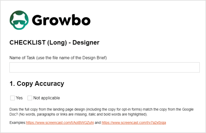
Image Optimization Process
Your visual content needs to be as polished as your copy. Verify that all images serve a clear purpose and meet quality standards. Check that they support your message without overwhelming it.
- Image relevance to content
- Alt text implementation
- Optimization for load time
- Visual consistency check
QA Checklist Step #5 Cross-Device Testing
Your designs need to work flawlessly across all devices and platforms. Start by creating a comprehensive testing matrix that covers all common devices and screen sizes. This systematic approach helps catch display issues before they affect your users.
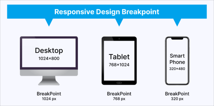
Designers use these breakpoints to make sure websites look good on all devices, from phones to large monitors. In simple terms, a breakpoint is like a trigger point that tells your website when to change how it looks.
Device Testing Protocol
- Desktop screen resolution checks
- Mobile device compatibility
- Tablet display verification
- Screen orientation testing
Pay special attention to how your design elements adjust across different screen sizes. Ensure that text remains readable and interactive elements stay accessible regardless of device type.
QA Checklist Step #6 Accessibility Compliance: Making Design Inclusive
Your designs must be accessible to all users, regardless of their abilities. Recent accessibility studies indicate that websites meeting WCAG standards see 35% broader user engagement.
WCAG 2.1 Implementation
Start with a thorough WCAG 2.1 compliance check. According to w3.org, “Web Content Accessibility Guidelines (WCAG) 2.1 covers a wide range of recommendations for making Web content more accessible. Following these guidelines will make content more accessible to a wider range of people with disabilities.”
Verify that your design meets all current accessibility standards. This includes checking contrast ratios, text scaling, and navigation options.
- Color contrast verification
- Text scaling tests
- Keyboard navigation check
- Screen reader compatibility
Focus on creating an inclusive user experience. Test your design with various assistive technologies to ensure it works for all users.
Navigation Accessibility
Your navigation elements need to be clear and usable for everyone. Check that all interactive elements are easily identifiable and operable through multiple input methods.
- Clear navigation paths
- Focus indicators
- Skip navigation options
- Touch target sizing
Key Takeaways:
- Implement thorough content review processes
- Test across multiple devices and platforms
- Ensure WCAG 2.1 compliance
- Verify navigation accessibility
With these elements verified, you're ready to move on to testing interactive elements, ensuring your design not only looks good but functions perfectly for all users.
QA Checklist Step #7 Ensuring Seamless Functionality
Your design's interactive elements need to work flawlessly to maintain user trust and engagement. According to recent UX research from HubSpot, properly tested interactive elements increase user satisfaction by 64% and reduce bounce rates significantly.
Start with a systematic check of all clickable elements. Every button, link, and interactive component needs to respond correctly and provide clear feedback to users.
Button and Link Testing
Check each interactive element individually. Verify that buttons and links not only work but also provide appropriate visual feedback. Users need clear indicators that their actions are being registered.
- Click state verification
- Hover effect consistency
- Touch response on mobile
- Loading state indicators
Form Functionality
Forms are often the most critical interactive elements in your design. Test each field, validation message, and submission process thoroughly. Field validation checks
- Error message clarity
- Auto-fill functionality
- Submission confirmation
If you want to get your marketing work done for your business (or for your clients’), then you HAVE to learn more how you can delegate unlimited marketing projects & tasks without the headaches of hiring. Download this free guide: 33 Examples of Marketing Projects You Can Delegate to Growbo
CONCLUSION
Let me show you something interesting about design QA - it doesn't have to be complicated. Throughout this article, we've covered the essential steps to ensure your designs meet professional standards every time.
Here are your practical next steps:
- Start with a simple brand guidelines document
- Create a basic technical specs checklist
- Use a grid system for consistent layouts
- Test designs across different devices
You know what's great? You don't need to build this QA system yourself. Our team at Growbo handles all these quality checks automatically with every design we deliver.
Ready to make design QA easier? Try Growbo for just $7 for 7 days. You'll get unlimited design requests with built-in quality assurance - no more worrying about missed details or inconsistent quality. Book your call today to get started.
Keep Growin,’ Stay Focused,
![]()
Image Credits:
- https://wisernotify.com/blog/branding-stats/
- https://www.eleken.co/blog-posts/design-qa-checklist-to-test-ui-and-prepare-for-design-handoff
- https://www.creator-fuel.com/blog/what-is-visual-hierarchy-in-design-explained-with-examples
- https://99designs.com/blog/tips/image-file-types/
- https://www.lambdatest.com/blog/mobile-website-testing/