7 Quick Wins in Your Email Marketing Strategy (#5 More Than Doubled My Opt-in Rate)
 Has anyone ever promised you "insane" results -- if you just buy their product?
If you're in business, chances are you've heard offers like that.
A couple of years go, I actually lost $4,000 on an offer like this. The individual pitching me was using an aggressive sales technique that played on my emotions.
He told me that I had a "middle class mindset" because I believed in incremental growth, rather than taking action that could result in massive, hockey-stick growth.
Learning from that poor investment decision -- since I saw zero results -- I decided to stick to my beliefs that the best way to grow a business is through steady, continuous tweaks and improvements.
Based on my testing as well as my observations of what has worked well for others, here are seven simple steps you can take right away to incrementally grow your business and grab some low hanging fruit in your email marketing strategy:

#1 - Email templates hurt your business and waste time
If you were to send me an email right now saying "hello" from your personal Gmail or Yahoo account -- would it include an email template? No, of course it wouldn't. After all, you just want to ask me a question or say hi.
So why is it that so many people and email marketing tools put an emphasis on templates and 1001 features that allow you to "drag-and-drop" your way to the perfect email design?
People react differently to email communications that appear to be corporate in nature than emails that are simply from, well, other people.
But don't take my word for it. Just look as far as your own inbox. Look back at emails you recently opened and read, and then compare that to emails you deleted, briefly skimmed, or marked as spam. You'll probably find something like an example similar to the one I found lurking in my spam folder from Costco.
It doesn't make sense to copy the design choices of emails that you and just about everyone else aren't reading.
This was also the reason why with Saber Blast we decided not to offer an email design editor unlike our competitors. We believe it complicates the process by holding people back from sending their first email campaign and seeing immediate, real-time results.
If you're not convinced, here's a statistic to consider: on our weekly newsletter where I'm not using any fancy template or design, I'm currently seeing an average open rate of 40%. Compare that to the average industry-wide open rate of about 16%.
Finally, the bonus benefits to having a plain text email design are:
- There is little to no need to worry about optimizing your emails to display consistently across a variety of email programs (gmail, hotmail, yahoo, outlook, etc.)
- With the exception of font choice and line width, there is little to no need to worry about optimizing your email for mobile devices.
So keep it simple, save time, and forget the fancy templates.
#2 - Short email subject lines increase open rates
Last week I performed a small experiment. I decided to change our email subject line from something short and simple (e.g. "snow") to something longer and more descriptive (e.g. "can a good habit build a 10,000 subscriber email list?").
The result? A 26% drop in open rates. Ouch. While I'll continue to experiment, I'm going to stick with a shorter subject line since that seems to have an undeniable positive effect.
Beyond my testing though, there is broader research that favors shorter subject lines for increasing open rates.
According to a metrics report compiled by Mailer Mailer as a result of studying 1.4 billion opt-in email newsletters, short subject lines between 4 and 15 characters had the highest open rates (see graphic below).
I would speculate that part of the reason this is the case is because shorter subject lines are less clear (which builds intrigue) and also more conversational.
Think about it, when was the last time you got an email from a friend with something lengthy like "Learn how to do XYZ in your spare time!" Obviously that's a promotion.
Another practical reason for short subject lines is because desktop-based email clients like Gmail have a limit of how many characters they display in the subject line, typically 40-60 characters. For mobile apps, the subject line restrictions are even more limited.
For mobile app displays, here are the exact stats:
- iPhone 5 - 38 characters in subject line before cut-off
- iPad - 39 characters
- Android (Samsung Galaxy S4) - 33 characters
- Windows (Nokia Lumia 800) - 38 characters
- Windows (Surface tablet) - 31 characters if held horizontally
#3 - Offer a clear incentive to subscribe & show social proof
If you understand that the power of building an email list is the critical component to building a captive audience online, then you want to do everything in your power to maximize email sign-up conversions on your website and blog.
"But shouldn't I just focus on driving traffic and then make direct offers to those visitors while they're on my website?"
The answer is no, and here's why. The vast majority of the traffic coming into your website, especially when you're just starting out and especially when you don't have an email list is new traffic. In other words, they are strangers, and more importantly you are a stranger to them. There's no relationship built yet and there there is little to no trust.
By focusing your attention on enticing someone to subscribe to your newsletter you are giving your business the opportunity to follow-up with that subscriber on an ongoing basis and build trust by giving value over time.
Here are the simplest ways to motivate a visitor to subscribe.
- Show who / how many people are already subscribed
- Offer a free report or educational course in exchange for subscribing (some marketers call this a "bribe")
For example, check out the example below from Jay Bear's website, Convince and Convert. On his blog this opt-in form is featured prominently and he uses both a free "gift" offer and a headline, which says how over 20,000 people have already subscribed. And 20,000+ people can't be wrong right?
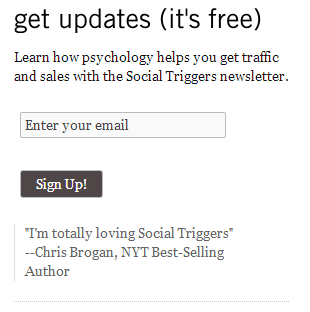
Another example from Derek Halpern's blog, Social Triggers, shows how instead of boasting about the size of his list, he just uses a testimonial from a credible figure (i.e. someone who, even if you don't know the name, is apparently a best selling author according to the New York Times).

Even if you're just starting out, and you don't have a sizable email list yet, you can use the above tactic. Just ask a friend with some relevant educational background or life accomplishment for a quote.
#4 - Develop a dedicated newsletter landing page
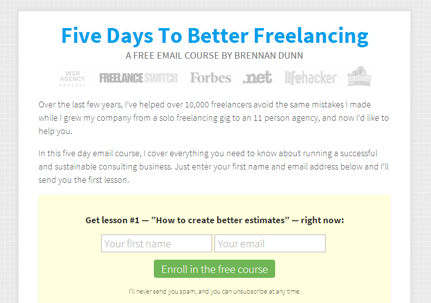
This tactic I learned from my friend Brennan Dunn who in record timing was able to build a large email list from scratch.
The low hanging fruit here is the development of a simple, focused landing page where the only action a visitor can take is to subscribe to your newsletter or hit "back" in their browser. This will pay dividends in the form of a steady stream of new email subscribers.
For instance, when you write a guest post and you are given the option to include a link usually at the end of your blog post, that link should ideally point back to your landing page. Again, the idea here is to focus relevant traffic on the highest point of leverage, which means growing your email list.
Other examples of when this landing page is useful:
- Someone wants to link back to you
- You want to link internally to the page as a call-to-action to subscribe
#5 - Add more email opt-in forms, with fewer fields.
For some readers, this may be one of those "duh" (common sense) suggestions. While it may seem obvious, I can also tell you that most marketers don't do it.
Take for example the form placement on the Growbo blog (which you're currently reading).
When I initially started blogging about 7 weeks ago, I observed we were receiving about one new email opt-in every other day. Not so great. So I decided to add a newsletter sign-up form at the end of each blog post, as well as the free course offer on the right side bar below. This seemed to help so I kept going.
I installed a simple Wordpress pop-up plugin, added an opt-in form to the Growbo.com homepage, and also added a "feature-box" at the top of the main blog-roll page.

I even tested including newsletter opt-in forms within an article's body, like right right here :D
[wufoo username="petovera" formhash="q12w4xn80seih2z" autoresize="true" height="260" header="show" ssl="true"]
As a result of adding these additional forms in key places I doubled my opt-in rate overnight.
Then earlier this week I tested something else out. Several of my opt-in forms included a second field requesting a visitors first name in order to subscribe. I took this out and the opt-in rate has again increased, this time by about 50%.
The key takeaway from this kind of optimization is that the more visibility you give and the easier you make it for people to subscribe to your newsletter, the more emails you will collect. This might not be universally true (there is a point where people will get fed up if you're too aggressive about) but it is easy to put into practice and it gets results.
#6 - Write in a casual, friendly tone
There are two kinds of marketing content on the web today. The kind written by a person and the kind written by people but in a cold, distant, and corporate tone of voice.
Which would you rather read?
Writing in an approachable tone of voice when you create your email newsletter content (just as you would in a blog post) is key to forming a bond with your subscribers.
Go back to the Costco example I discussed above. In emails like that where you barely open them before they are moved over to the trash bin, what is the tone of voice (if any)?
This is one of the key reasons why I start each of my weekly newsletters off with a personal anecdote. I want to connect with my subscribers by telling them something interesting and relevant. If I simply said, "This week Growbo launched a website and it was awesome and give me some referrals or buy our services please..." Who wants to read about that?
So while I represent my company, I'm still a person who's part of a larger brand and team... but I present myself as an individual and as "human" first.
Here are some quick tips on how to write like a human:
- Tell stories
- Practice by networking with people
- Ask questions
- Use "I" not "We"
- Write the way people speak, ya know? (ok, maybe not that casual)
- Quote and answer questions that people in your target audience ask. This makes your writing seem more like a conversation.
- Use images, audio, or video to supplement your text. Letting people see or hear you makes you (and your company) appear more real.
#7 - Send emails on a consistent basis
Although this tip is number seven, it's actually number one as far as importance. If you take away nothing else from this list of low hanging fruit, remember this one.
By sending out a newsletter at a regular, set interval, people have an expectation about when they will receive it, and as long as the quality of the message and content is high, they will anticipate it.
Most people are not able to be consistent with their email messaging for one or more of the following reasons:
- They lack the self-discipline
- They believe making a commitment to a regularly scheduled email update is too risky ("What if I miss it?" -- lamest excuse ever!)
- They are simply lazy (I speak from past experience here)
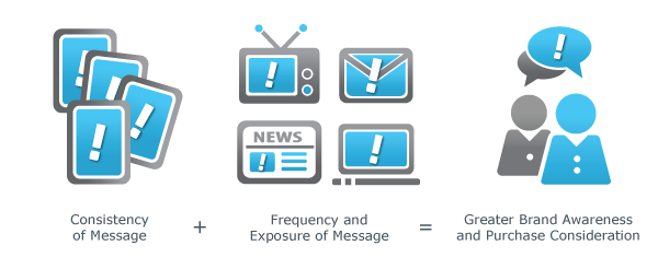
And while there is some anecdotal data on the subject of how consistent email marketing leads to growth, and many experts agree that repetition and regular follow-up can only help, I'd prefer to give you some hard data to support this tip. So here it is.

This graph shows traffic to our website in recent weeks, and each of the three peaks represent days when our newsletter was sent out. You'll notice a steady slope incline from one week to the next.
As a result of being consistent with creating quality articles, we see a jump in traffic each week and the overall increase that's consistently higher than the previous week.
This is in part because our email list is a captive, opt-in audience who are around 4x more likely to share our content via social media compared to cold inbound traffic. This sharing, in turn, attracts more traffic and even more social sharing and email subscribers.
It's also worth mentioning that in the past when I stopped being consistent with our email messaging and blogging routine, traffic dropped off significantly.
Conclusion
The bottom line to getting more from email marketing in your business is to be consistent about it, take simple, one-time steps that will grow your list for the long term, and keep it simple. Forget the fancy templates, corporate-speak, and elaborate subject lines.
If you want some 2 more advanced, quick wins (one that Noah Kagen, founder of App Sumo advises), enter your email address in below and I'll send them over.
[wufoo username="petovera" formhash="qxndph31gpong3" autoresize="true" height="260" header="show" ssl="true"]
What are some other email marketing quick wins that you're using in your business right now?
Image Credits:http://www.droid-life.com/2013/05/29/google-announces-new-gmail-inbox-experience-for-web-and-mobile-including-android-and-ios/http://www.eyelight.com/blog/article/marketing-tune-up


