11 Practical UX Methods Your Agency Must Use

In the world of digital marketing, websites are a powerful tool to use.
It's an important part of your branding as well as a way to engage with customers and potential consumers.
While it may seem simple enough, creating a positive user experience (UX) on your clients' site takes effort and planning.
Fortunately, there are many techniques that your developers and designers can use to improve this experience for users.
That way, they’ll want to stick around and hopefully become long-term customers.
After reading this article, you’ll come away with the following benefits:
- A little background on UX and why your agency should care about it.
- 11 practical website UX methods you can use to deliver a top-tier experience for your clients' website visitors.
- The consumer preferences that will serve as the basis for improving your clients' website’s UX design.
Before you become a master of UX design, you first need to know what it is and why you should care about it for your website.
Want to delegate all your marketing and funnel work done—without the headaches of hiring? Download our free guide: 33 Marketing Projects You Can Delegate to Growbo and discover how to save 100+ hours a month, grow faster, and scale without the overhead.
UX Background
UX refers to how users interact and engage with a product, service, platform, app or other extensions of a company.
For this resource, we’ll focus on practical UX methods for your clients' website (of course, you can apply these principles to your agency website too).
At the heart of website UX is design. Think of things like your color scheme, load time, navigation bar, user interface, use of imagery, and positioning of different sections of copy.
To put it simply, you’re aiming to make for the most optimal user experience possible.
And it’s a perpetual process that you should always be refining.
A website’s functionality is an incredibly influential factor in how consumers will perceive a brand.
It’s where prospects come to learn more about a company and make judgments on the value that could be had in making a purchase.
Shockingly, a new report from Top Design Firms found that 28% of small businesses don’t even have a website. That’s a whole lot of potential going down the drain.
Consumers expect the website to be easy to use. They should be able to find what they’re looking for with minimal effort.
And the content they see on your website should resonate with them.
But why should you care about website UX?
For one thing, 75% of consumers judge a brand based on its website design, as per Intechnic.
Moreover a single bad experience makes consumers 88% less likely to revisit a website, as claimed by Brightscout.

As superficial as it may seem, neglecting the UX design of your clients' websites will turn away potential customers.
According to a Forrester report, investing $1 in UX improvements yields, on average, $100 — for a 9,900% ROI.
Needless to say, improving website UX will be well worth the cost.
Consumers will see you as more credible.
In turn, they’ll be more likely to do business with you.
Practical Website UX Method for Agencies To Use #1: Usability Test
What better way to know how your website visitors interact with the website than observing them?
Well, with a usability test, you can do just that.
First, you ask some participants to navigate the website.
Then, you observe them in real time and ask them questions about their user experience.
With your findings, you’ll have a clearer understanding of what UX designs satisfy website visitors.
In one such case, research consultancy firm User Fountain carried out a website usability test for a school software client.
Each user was assigned a task — like booking a demo.
From there, the researchers could see how the users navigated the website and the journey they took to complete the task.
One key finding of theirs was the difficulty in finding out about pricing information.
So the team carried out an A/B test. One version had the site remain the same. And the other included a Pricing tab in the navigation panel.

With this usability test, the client saw a 34% increase in demo booking requests.
Practical Website UX Methods for Agencies To Use #2: Make Your Website Mobile Friendly
Not optimizing for mobile can spell doom for a client's website.
According to Statistsa, mobile makes up 54.8% of all global web traffic.
And Think with Google says 75% of consumers prefer a mobile-friendly site.
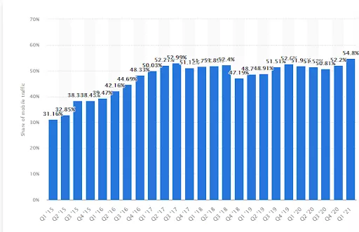
So if you want to use this practical UX method, then your agency must work on making the website load quickly on mobile.
Moreover, you need to account for mobile screen sizes when designing the layout and CTA buttons.
And remember to account for voice search when strategizing long-tail keywords.
Practical Website UX Method for Agencies To Use #3: Focus on an Effortless UI
When your prospects land on your website, they expect an easy-to-use interface.
According to Forrester, user interfaces (UI) can have a major impact on conversions.
In their study, they found that a UI tweak can cause a 200% difference in conversions.
If you’re not paying attention to your UI, your conversions may be suffering from poor user interfaces that could have easily been prevented.
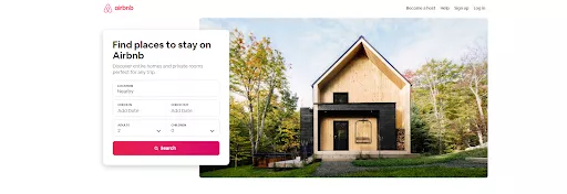
Airbnb.com is a great example of an effective UI.
On the homepage, booking options are front and center.
And it’s incredibly easy to search for your desired location and time spans.
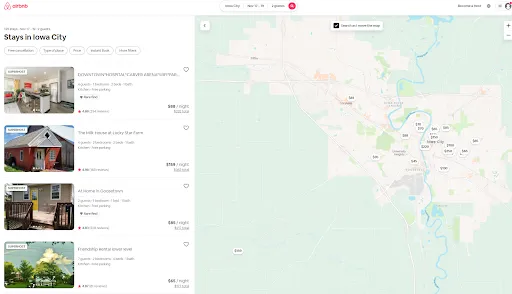
Once you enter your desired information, you’ll be taken to a new page that shows you a list of all compatible places to stay.
Additionally, there’s a map to the right for your reference.
Once you click on a place to stay, you’re presented with a gallery of high-quality photos.
And the “Reserve” CTA button sticks out with the red background color.
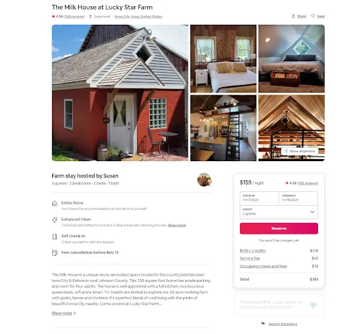
All in all, the Airbnb website is as easy to use and as informative as possible — making it user friendly.
It’s clear that Airbnb invested a lot in designing a top-tier UI.
Want to create a funnel or optimize an existing one for your agency? Growbo.com is the place to start by letting you delegate your marketing projects without the typical headaches of hiring. Start Your Free Trial Today.
Practical Website UX Method for Agencies To Use #4: Choose the Right Color Scheme
You only have one shot at a first impression.
And your use of color has a major influence on how consumers perceive your clients' websites.
As a practical UX method, you want to grab a website visitor’s attention right away.
According to Top Design Firms, 39% of consumers believe color is important to a brand’s website.
But not every color will work with your brand.
So you must take the time to study color psychology.
Get to know what emotions each color invokes.
For example, the color orange is associated with energy and enthusiasm.
That’s why it’s perfect for a company like Home Depot — it motivates consumers to be proactive and take initiative with home improvement.
Remember that your use of color can affect CTA buttons too.
In one case study, a company called Performable increased its click rate by 21% just with switching its CTA button color from green to red.

Practical Website UX Method for Agencies To Use #5: Have a Fast-Loading Website
Have you ever clicked on a search result only to be forced to wait? And wait. And wait some more?
Most likely, you moved on to another search result.
You expect to connect to a webpage quickly.
So do your website visitors.
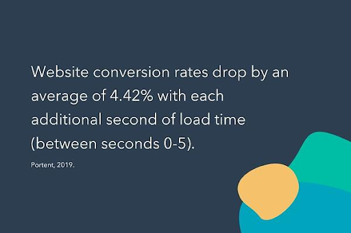
According to Portent, every additional second of load time for a website decreases your conversion rate by 4.42%.
That can add up quickly.
Moreover, Unbounce’s survey results revealed that 45.4% of consumers are less likely to make a purchase and 36.8% are less likely to return to a website that loads too slowly.
With these kinds of insights, it’s imperative that your agency makes page speed a priority.
Now that you see the importance of page speed in UX design, let’s take a look at the next practical UX method for your agency to use.
Practical Website UX Method for Agencies To Use #6: Include Business Contact Information
In 2015, Huff Industrial Marketing, KoMarketing and BuyerZone put together a consumer report on B2B buying behavior.
According to the survey results, 51% of B2B buyers think “thorough contact information” is an important element missing from many company websites.
A user-friendly website means the user can easily find the business’s phone number, email and address — don’t make them have to put a lot of effort into contacting you.
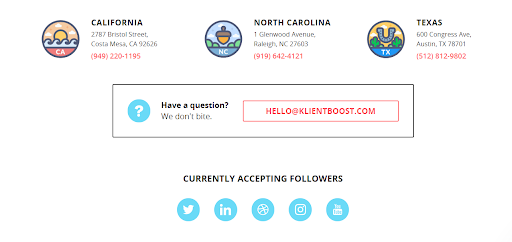
For example, KlientBoost includes the phone number and address to its three offices in California, Texas and North Carolina near the bottom of its homepage.
Further, there’s also an email address and social media profiles to click on too.
Such a simple thing yet many companies simply forget about it.
This example showed a marketing agency in particular, but this practical UX method can be applied to all your clients' websites too.
I mean, why make it any more difficult to contact your business than it needs to be?
Practical Website UX Method for Agencies To Use #7: Deliver a Personalized Experience
All the most successful marketing agencies make the buying experience as personalized as possible.
With personalization, content is more geared toward each individual website visitor’s tastes — leading to a greater chance for a conversion.
And consumers expect personalized offers.
As reported by Instapage, 74% of customers feel frustrated when website content isn’t personalized.
They also found that personalization influences 85% of homepage promotions and 92% of shopping cart recommendations.
At the heart of personalization is segmentation.
Some ways to segment your website visitors and serve them personalized content are by:
- Tracking pageviews
- Surveys
- Location
- Links clicked
- Past purchase history
- Referral source
- Tag and filter results
- Device type
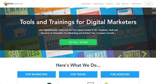
As one example of a personalized website, let’s look at DigitalMarketer.
According to Proof, a company that helps online businesses increase conversions, DigitalMarketer is a beta customer of theirs.
And by using Proof’s platform, DigitalMarketer’s homepage copy adjusts to be more personalized for the individual website visitor.
So someone at an agency will see a personalized copy when revisiting the website.
Below you can see the comparison between the vanilla version and the personalized version for an agency.

Practical Website UX Method for Agencies To Use #8: Include Testimonials and Reviews on Homepage
According to Fan & Fuel, 92% of consumers will delay buying your client's product if there are no user reviews.
Without user reviews, it can be hard for consumers to know if they’re actually making the right purchasing decision.
Ensure that you’re encouraging user reviews with every single purchase — and uploading some on your clients' websites.
And it appears that written reviews are more effective than star or number ratings.
From the same Fan & Fuel report, it was found that 73% of consumers prefer written reviews.
On the Growbo homepage, you don’t have to scroll down far before seeing a client testimonial.
And we even have video form of our client testimonials too to make it more impactful.

Before you get to the bottom of our homepage, you’ll find a couple more.
With these client testimonials, prospects can read and hear the details about the value Growbo can bring to their business.
You see, this form of social proof is a must-have in UX design as it positions your company as trustworthy.
Practical Website UX Method for Agencies To Use #9: Incorporate High-Quality Imagery
Just like color, imagery plays a major role in consumer first impressions of a website.
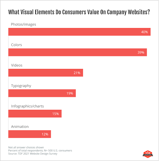
When Top Design Firms surveyed consumers on what visual elements they value on a company’s website, photos and images ranked 1st — with 40% of respondents citing their importance.
To grab a website visitor’s attention, you’ll need to include high-resolution images that are easy on the eyes and show off your client's products or services.
And imagery should be used for other website content too, such as blog posts.
Whenever you have the chance, try to turn large chunks of information into infographics that are more easily digestible and can increase web traffic by 12%, according to Wishpond.
Practical Website UX Method for Agencies To Use #10: Include Video Content
You can’t forget about video content either.
Humans process video much faster than text.
Also, consumers just enjoy it more.
As reported by Social Media Week, users spend 88% more time on websites with video. And your content will be more popular on social media when it gets shared.
Your video content could be especially useful for consumers in the research phase of the buyer’s journey.
When consumers want to learn more about your product or service, 69% of them prefer a short video.
Sales management platform Groove is a good example of implementing this practical UX method.
Once you’re on the homepage, one of the first things to pop out is the CT to “Learn More”. And from there, you’re directed to a page where you can watch a short video.


In the video, you learn more about how Groove can help sales teams save time.
To someone that’s skeptical about Groove, having a video front and center conveys confidence.
And it makes for a great user experience because it doesn’t take any effort for the website visitor to understand more about them.
Practical Website UX Method for Agencies To Use #11: Show Your Inventory Levels in Real Time
Nothing is worse than when you order a product online and a few days later you get an email notifying you that the product is out of stock.
If your client ships physical products, it’ll prove beneficial to include real-time monitoring of inventory levels.
According to the 2020 enVista Supply Chain Survey, 67% of consumers say inventory visibility is an important service to offer across stores, online and mobile.
Your agency needs to meet consumer demands — both for in-store shoppers and the increasing number of online customers.
In enVista’s survey, they also found that 48% of consumers desire the ability to order online for in-store pickup. In other words, they’d like to see if a company has a product in stock before taking the time to go to the store.
An added benefit to this practical UX method is that you’ll consequently be using FOMO (fear of missing out) in your UX design.

Conclusion
Want to delegate all your marketing and funnel work done—without the headaches of hiring? Download our free guide: 33 Marketing Projects You Can Delegate to Growbo and discover how to save 100+ hours a month, grow faster, and scale without the overhead.
If you want to take the web design of all your clients (or your own) from good to great, try implementing any of these 11 practical UX methods.
Regardless of what industry or organization you're clients are in, a better user experience can help drive sales and increase customer loyalty.
With the right team on board, it’s easy to implement pro-level UX practices that will have customers coming back time and again.
And if you don't have any developers, you should definitely read about 13 crucial hiring criteria for hiring developers.
But if you're ready to get going now and want to avoid the hiring process, consider outsourcing your website and other marketing projects to us.
Here at Growbo, we’re here if your agency is looking for designers who understand how to deliver a user experience that delights website visitors. Using our web-based app, you can simply tell designers what you want done — and you can watch your clients' websites turn into sales-generating machine that they were meant to be.
If you want to learn more about the Growbo platform, you can watch our demo.
Before you go,
Were there any UX methods that you want to try out?
Let me know in the comments below.
Keep Growin’, stay focused.
Mark


