8 Black Friday Landing Page Fixes: Convert More Sales

Your Black Friday landing page is like a retail store's front window - you've got seconds to make an impression.
Last year, I consulted for an e-commerce brand whose Black Friday landing page looked stunning but performed terribly. Despite spending $10,000’s on ads, they converted under 1% of visitors.
The culprit?
Basic landing page mistakes that could have been easily fixed.
One example: businesses lose 7% of conversions for every second their page takes to load. Data from Walmart’s website showed similar results, every extra second costing millions in sales.
On Black Friday, that's potential revenue slipping through your fingers. But here's the exciting part - you can identify and fix these issues fast, without breaking the bank.
In this article, you’ll learn:
- How to craft or refine your message so visitors decide to stay
- A counterintuitive design approach that prevents shopping cart abandonment
- The critical page speed secret that keeps visitors from bouncing
- How subtle CTA changes can dramatically boost click-through rates
- The navigation framework that helps customers find exactly what they want
Note: these tips also help you grow your conversions and revenue – even beyond Black Friday offers ;) let’s go…
If you want to
1. Make Your Message Simple and Clear = More Conversions
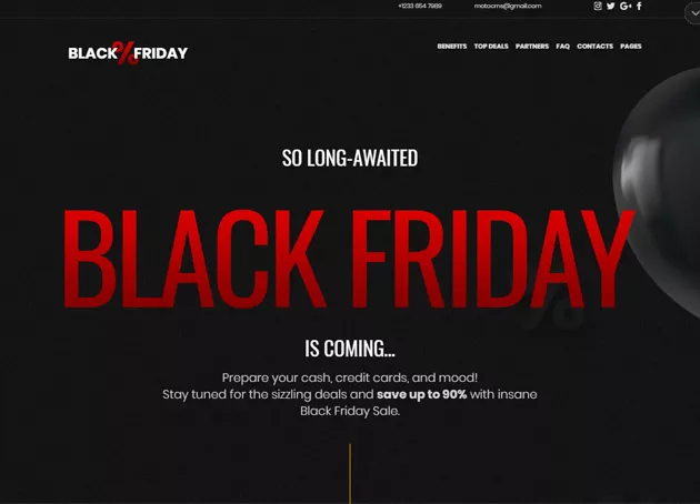
Your Black Friday landing page needs to communicate value instantly and effectively. Focus on presenting a single, compelling message that highlights your best offers and unique value proposition.
This approach helps prevent decision paralysis and guides visitors toward conversion.
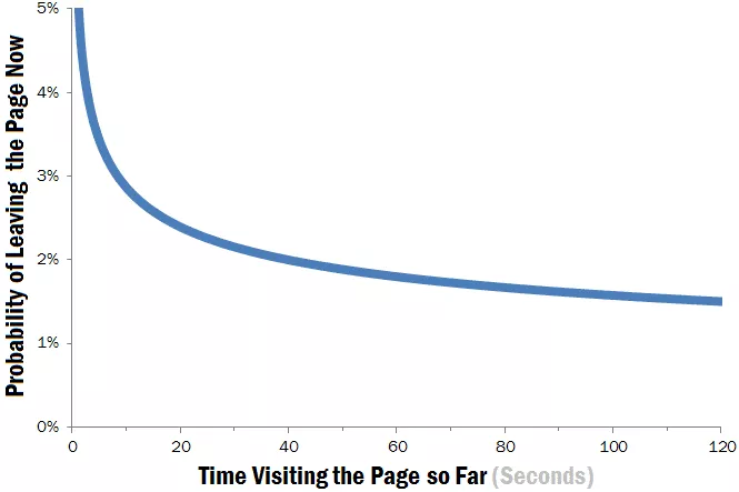
According to the latest Nielsen Norman Group eye-tracking studies, visitors typically spend only 10-20 seconds on a landing page before deciding whether to stay or leave. This brief window makes message clarity crucial for black Friday website optimization.
Potential buyers need to know: “What IS it?” and then “Is IT relevant to ME?”
A Hubspot study found that businesses with 10-15 landing pages increase leads by 55% compared to those with fewer pages (more segmentation and/or more nets in the sea = more fish). You probably don’t need that many just for Black Friday, but the point remains: each landing page must maintain a focused message for maximizing your black friday conversion rate.
2. Keep the UX Design Simple (For A Lower Bounce Rate)
Effective black Friday conversion strategies start with intuitive, user-friendly design.
Your landing page should guide visitors naturally through your offers while maintaining visual hierarchy and preventing info overload.
According to the most Google/SOASTA research, as page load time increases from 1 second to 5 seconds, the probability of bounce increases by 90%. This emphasizes the importance of maintaining simplicity in both design and functionality.
The Baymard Institute's 2023 research shows that 70% of online shopping carts are abandoned, with 17% citing 'too long/complicated checkout process' as the reason.
To counter this, implement a clean, straightforward design that minimizes distractions.
For example:
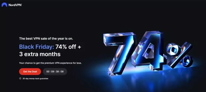
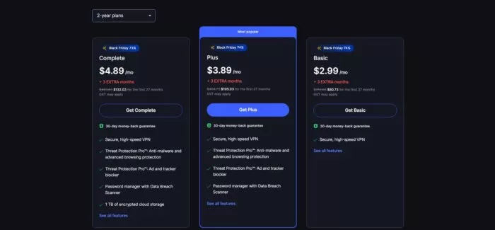
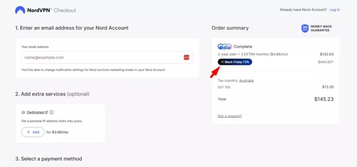
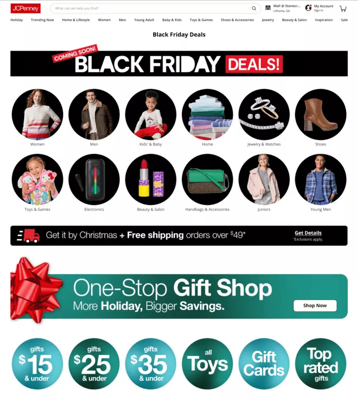
Do not try to stuff your Black Friday landing page with all product imagery upfront like this example below… oh boy… That’s a lot…
3. Make Your Pages Load FAST (Or Risk Losing Lots of Sales)
A web user won't spend a minute to wait until the content of your Black Friday website loads.
Page speed and performance are critical components of a landing page design.
Cloudflare reports that a 100-millisecond delay in website load time can hurt conversion rates by 7%.
According to Google, 53% of mobile site visits are abandoned if pages take longer than 3 seconds to load. Regular performance monitoring and optimization are crucial for Black Friday website optimization.
4. After It Loads Fast You’re Not Done: Run Page Loading Tests Regularly
It's important to keep a close eye on the page loading speeds, especially during the busy season of Black Friday sales. No matter what kind of changes you apply to the landing page design, make sure those do not slow down your site. Even if you didn't make any sort of changes recently, but you notice customers' activity drop or lower sales stats, then test the page loading speed. A tool such as Google PageSpeed reveals how well a web page loads on desktop and handheld devices.
5. Keeps CTAs Clear (i.e. They Should NOT Blend In!)
When it comes to the organization of calls to action on your web page, make sure that it’s easy to understand your main message for your visitors. The CTAs should be easy to access, even for first-time visitors. Your CTAs should be clear, and compelling, and create a sense of urgency without being overwhelming.
According to a HubSpot study, personalized CTAs perform 202% better than basic CTAs.
This demonstrates the importance of tailoring your action buttons to your specific offers and audience. Use easy-to-understand CTAs so that people can realize what to do next and what will happen as soon as they click through. (This is Law of Clarity in action.)
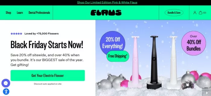
WordStream research shows that using first-person phrasing in CTAs (e.g., 'Get My Discount' vs 'Get Your Discount') can increase click-through rates by up to 90%.
6. Emphasize Benefits, Not Features: It’s Cliche But Even Veteran Markets Forget…
Clear communication of benefits is essential for Black Friday website optimization. Your value proposition should be immediately apparent and compelling to visitors.
Research by CXL Institute found that value propositions that focus on specific benefits rather than general features can increase conversion rates by up to 124%. A study by Nielsen Norman Group reveals that users spend 80% of their time looking at information above the page fold. These show that key benefits should be prominently displayed in this prime real estate.
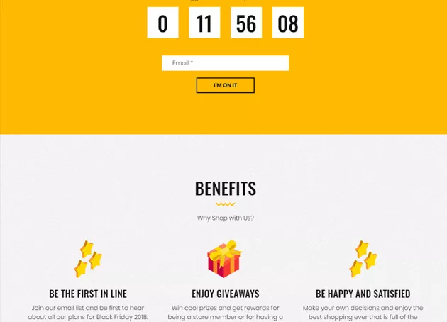
7. Navigation as Promotion (Highly Underrated Real Estate On Your Website For It’s Sales / Conversion Power)
Effective navigation is crucial for Black Friday conversion strategies. While simplifying navigation is important, completely removing it can hurt user experience and conversions.
According to Baymard Institute's research, 61% of users expect to find a site's main navigation menu in the header area. Maintaining familiar navigation patterns helps users feel confident in their shopping experience.
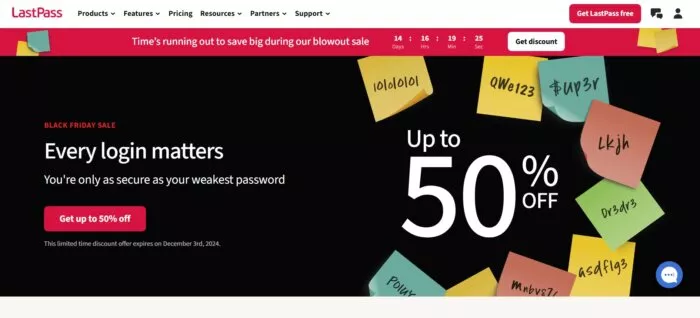
Research by Forrester shows that 50% of potential sales are lost because users can't find the information they're looking for, highlighting the importance of clear navigation structures.
8. Mobile Optimization (60% Of Your Traffic Is Mobile Bro!)
With over 60% of online shopping done through smartphones, your landing page must be flawlessly optimized for mobile devices. Ensure buttons are thumb-friendly, text is readable without zooming, and images load quickly on mobile data connections.
Your mobile conversion rate directly depends on how smoothly customers can navigate and complete purchases on their phones.
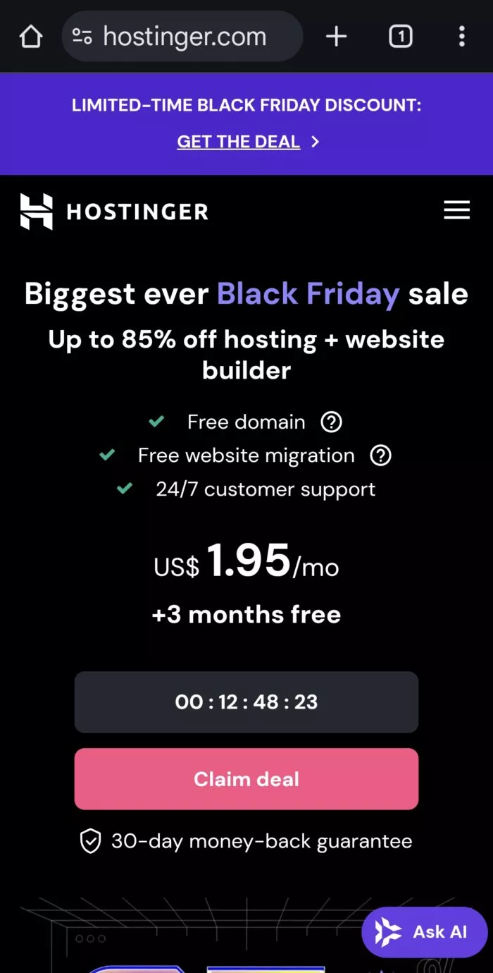
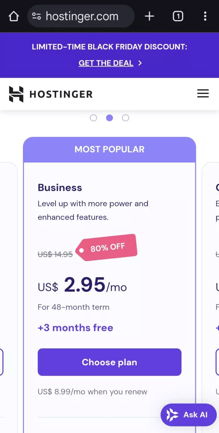
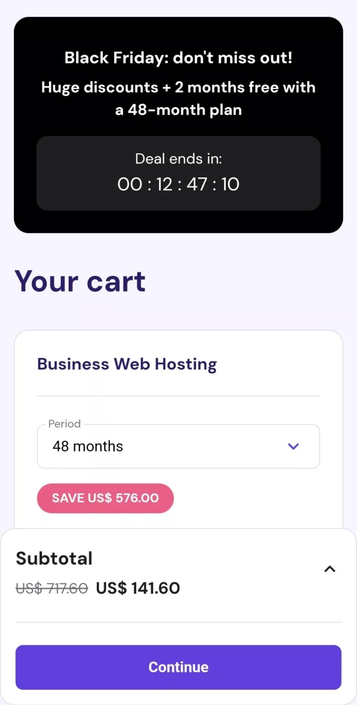
According to Insider Intelligence, mobile commerce sales are projected to reach $710 billion in 2025, representing 44.2% of retail ecommerce sales in the US. Studies by Mobile Marketing Association show that 73% of consumers will switch from a poorly designed mobile site to an alternative that makes purchasing easier.
Conclusion
If you want to
The success of your Black Friday and Cyber Monday campaigns depends entirely on your landing page's ability to convert visitors into customers. As we've explored, even small improvements in page speed, design clarity, and CTA optimization can dramatically impact your holiday season revenue.
In today's competitive e-commerce landscape, having an optimized landing page isn't just an advantage – it's essential for survival.
Here are the essential Black Friday landing page optimization takeaways:
- Craft a clear, compelling message that captures attention in the crucial first moments
- Implement mobile-first, fast-loading designs to prevent visitor abandonment
- Deploy strategic CTA placement with personalized messaging for better engagement
- Create simplified navigation and benefit-focused content for higher conversions
- Maintain regular page speed testing to ensure optimal performance
Feeling overwhelmed by the complexity of creating and optimizing your Black Friday landing pages?
Here's the good news: you don't have to do it alone. Growbo specializes in automating and executing all your marketing projects, including high-converting Black Friday landing pages, email sequences, and promotional campaigns. Get started with Growbo today.
What's your biggest Black Friday landing page challenge? Share in the comments below - whether it's page speed issues, mobile optimization struggles, or CTA performance. Let's discuss solutions that work
Keep Growin,’ Stay Focused,

Image credit:
https://www.nngroup.com/articles/how-long-do-users-stay-on-web-pages/


