How To Create A Sales Page That's Guaranteed To Convert [17 Tips Included]

Have you googled something recently—maybe a recipe you’re looking to cook this Thanksgiving—hoping to find the tastiest one and the one that requires less effort?
After searching for “how to create the perfect Thanksgiving stuffing” you end up getting dozens of “magic” formulas promising the perfect recipe.
But as you scroll down, you don’t know which source to trust. After all, those Google searches are that, “sources.”
You don’t know if those recipes will really help you cook that delicious (and of course, easy to make) stuffing you’re looking for.
Each magic recipe seems to have a successful superstar cook behind it, but who do you really trust?
Just like searching for a recipe, searching for “how to create the perfect sales page” online will show you different results. The recipe you’re looking for will depend on your audience—and you’ll have to test it to find out what they respond to best.
But whatever recipe or sales page you choose to follow, the important thing is to understand the reasoning behind the “ingredients” that go into it.
And today I’m taking that hassle off your table so you can stop searching for the magic formula to create your sales page.
In this article, I’ll share with you the 17 tips we at Growbo use to create the perfect sales page that’s guaranteed to convert leads into buyers.
No more searching over and over again to find that secret formula. Just follow these 17 tips proven to convert and start seeing a steady stream of revenue straight to your bank account
Now let’s start reviewing the tips.
How To Convert Leads Into Customers?
How many times have you wondered “why the heck am I not selling any of my products if they’re so great?”
Perhaps you’re selling a training course or a webinar or maybe info products. You’re advertising them in your website. They’re right there but nothing happens. And the worst part is you have no idea what’s going on.
Not even your lead magnet is being downloaded.
The answer is simple: you don’t have a high-converting sales page selling your products or services.
You already know that the goal of a landing page is to drive buyers’ decisions.
But wouldn’t it be great if you knew all the tips and secrets of writing high-converting sales pages so you can boost your revenue straight to your bank account?
It’s time to stop struggling to convert leads into customers and start following these easy but powerful 17 tips to create your sales page that’s guaranteed to convert.
Your sales page is the best place for you to explain to your site visitors your products or services.
For instance, if you’re selling products or services, your sales page is the perfect place to explain to your prospects…
- How they work
- Main features
- Benefits you get from using the products
- Price
- Problems or pain points they solve
- The solution your products offer
- Money-back guarantee or refund policy
Explain to your site’s visitors your products or services in such a clear way that they’d hardly refuse to buy from you.
But remember, be clear—not clever. If you don’t explain your products with clarity, your prospects won’t buy from you because why would they?
Your sales page must clearly explain all your products and services. If it’s not optimized for conversions, you’ll more likely lose money. And any marketing and advertising budget you’re spending to promote it will be simply wasted.
So without any further ado, let’s start reviewing the 17 tips that’ll make your sales page convert leads like crazy—it’s happened to us at Growbo and to the clients of our Done-For-You sales funnel service already!
Tip #1: Speak To Your Audience
The first thing you need to do is understand your audience.
You can’t talk to them if you don’t know them. So start by understanding who they are, their needs, their problems, and what they want.
It’s critical for you to know what they’re looking for when they visit your website. Because you want to give them what they need and want.
The better you know your audience, the stronger your sales page will be. And don’t forget to keep the tone conversational.
However, it’s not only about speaking to your audience. It’s also about getting the right language. For this, you can 1) speak directly to your customers using “you,” and 2) make them feel part of your company by using “we.”
Tip #2: Write A Clear Headline
So now it’s time to actually start writing your sales page.
And any well-made sales page starts with a well-made headline.
Write a clear headline that will tell your readers the single most important thing about your product or service.
Your headline should entice visitors to keep reading and it’ll be the first thing that’ll capture your prospects’ attention. For this, make it as clear as possible. Don’t let your prospects wonder. Explain to them in as much detail as possible why they should keep reading your sales page.
Also, don’t be afraid of the length of the headline. Don’t try to make it short. As long as your offer is clear, the length shouldn’t matter.
But don’t write a self-congratulating testament either. Prospects want to hear about them, not you.
And be sure to spend enough time on finding the right headline too. Because if you get the headline wrong, prospects will end up leaving—no matter how good your offer is.
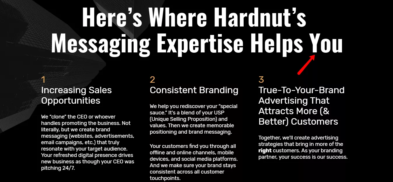
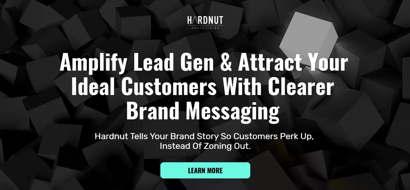
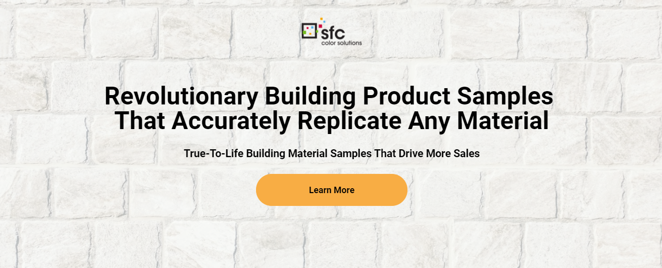
Here are some examples of clear headlines that can inspire you…
Tip #3: Write A Sub-headline That Supports Your Headline
Adding a headline to support your headline is a great way to explain in a more detailed way your products or services to your site’s visitors.
This is your opportunity to expand on what you’re selling, clarify whatever you’re saying in the headline, and hook the reader to keep reading.
What you propose in your sub-headline will be followed by a CTA. This will be the answer to your sub-headline—what do you want them to do with what they’re reading?
Here are some examples of clear sub-headlines that support the headline’s main idea.
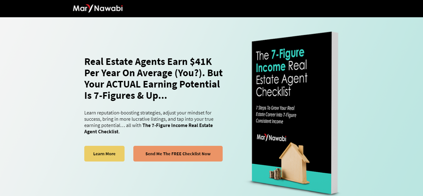
Tip #4: Add CTA Buttons To Invite Prospects To Click
Below your sub-headline add one or two call-to-action buttons. These will tell people what to do.
In other words, the CTA buttons’ purpose is to make your site’s visitors do whatever you want them to do—maybe you want them to learn more, download your lead magnet, watch a demo video, or book a call.
Think of the CTA as the answer to your sub-headline. You’ve proposed something to your audience with your sub-headline. What do you want them to do now?
For Growbo’s Done-For-You sales funnel service clients, we normally add 2 CTA buttons in the hero section because it’s converted really well—one invites the prospect to “learn more” and the other one next to it persuades the prospect to do something specific (book a consultation call, download a lead magnet, etc.).
One of the 313 case studies analyzed in the Proven Sales Conversion Pack shows that adding a clear call to action to your landing page can cause more visitors to convert by 250%.
Here are some examples of clear CTA buttons displayed under a sub-headline on a sales page…

Tip #5: Use Social Proof
If you want your prospects to buy from you, then you need to build trust with them. And what’s the best way to do that? Including social proof on your sales page.
Based on one of the 313 case studies analyzed in the Proven Sales Conversion Pack, adding social proof in the form of press logos, client logos, or testimonials can grow your conversion rate by 15.7%.
And this is because people look to buy from companies they trust.
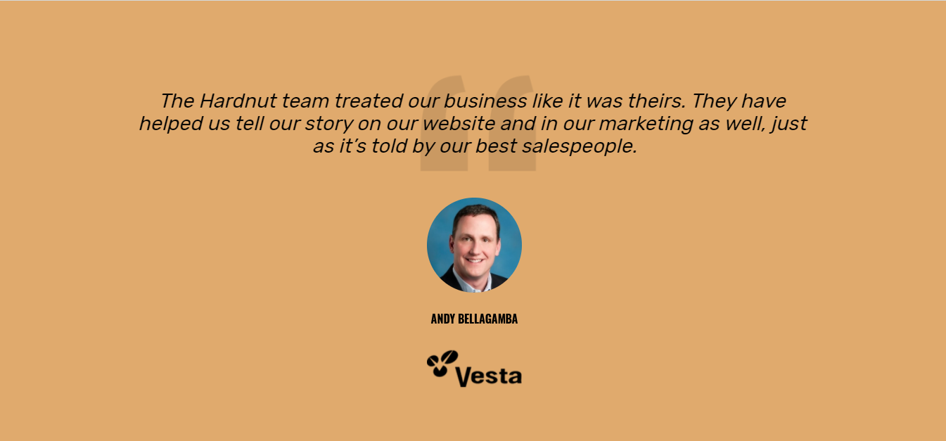
So go ahead and include a strip of the logos of companies you’ve worked with in the past. And don’t be shy to add some quotes from testimonials of past customers or clients. Anything that’ll enhance your reputation should be included in your sales page.
This is a great way to demonstrate that other people love working with us.
Here are some great examples of social proof in sales pages...


Tip #6: Introduce Pain Points
There’s nothing better for conversions than creating empathy with your readers, right? And a really great way to do so is by mentioning to them and reminding them of the problems they’ve been experiencing. This creates a connection with the reader where they think: “hey, that exact same thing has happened to me.”
Seeing their problems reflected and acknowledged by someone else makes them feel understood and hopeful that someone can help them—giving them the solution they’ve been looking for.
For instance, start with a brief story anecdote where you put yourself in your readers’ shoes.
You can also state a compelling fact or statistics that will capture your readers’ attention. Here’s an example of a shocking statistic on a sales page that without a doubt hooks readers…
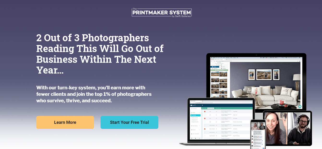
After introducing the problem(s) your readers struggle with—and that’s why they came to your site anyway, right?—list the main pain points they deal within their businesses, lives, jobs, etc.
This will make it easier for the readers to see the list of problems they deal with every day, and the solution they’ve been looking for in your site.
Then, agitate the pain points by “twisting the knife.” Go into more dramatic and vivid details and the consequences that those pain points listed above bring to their lives.
The idea is for you to tell your readers: “you can’t continue like this!” And then segue with: “That’s why we created this product or service for you…”
Tip #7: Add A Solution Statement
This is the moment when drum rolls will start sounding and you’ll introduce the desired solution to your prospects’ problems. It’s time to go into more detail about what your product is, and what it does. This is where you’ll reiterate the problems your visitors deal with and present your solution.
Clearly state what the solution to their problems is—that thing they’re waiting for to make all their pain points go away. The more descriptive and unique you can be, the better.
Writing copy for a sales page requires persuasion—you’re persuading people to convert. You know that, duh!
So start by telling people what you want them to do. Use strong verbs and an authoritative voice.
Focus on benefits more than features in your copy. See in the example below how the solution this business is offering to their audience is clear and compelling…
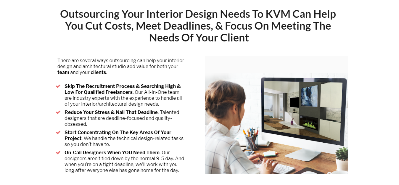
Show them how your product or service makes their life better. How will this product add value to their business? And be transparent, don’t try hooking prospects with false promises.
Tip #8: Explain Your Products Or Services’ Benefits
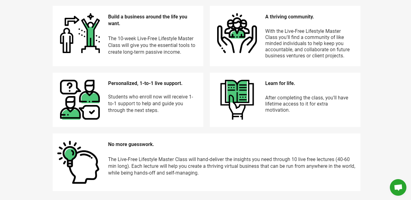
People are naturally interested in knowing how many different benefits they’d get by using your products or services. So this is a good opportunity for you to list down at least 3 or 5 of the main benefits or end results your customer would get by using your product or service.
Your prospects care more about what those will do for them than how many fancy attributes they have.
Bulleted and numbered lists are beneficial here because they attract attention to themselves. Structurally and visually, they just stand out. So, include your benefits as bullet points or broken down into boxes as in the example below.
Tip #9: Explain Your Products Or Services’ Features
This is a good place for you to list your product or service’s features. See in the example below how they divide their features into short and concise sections.
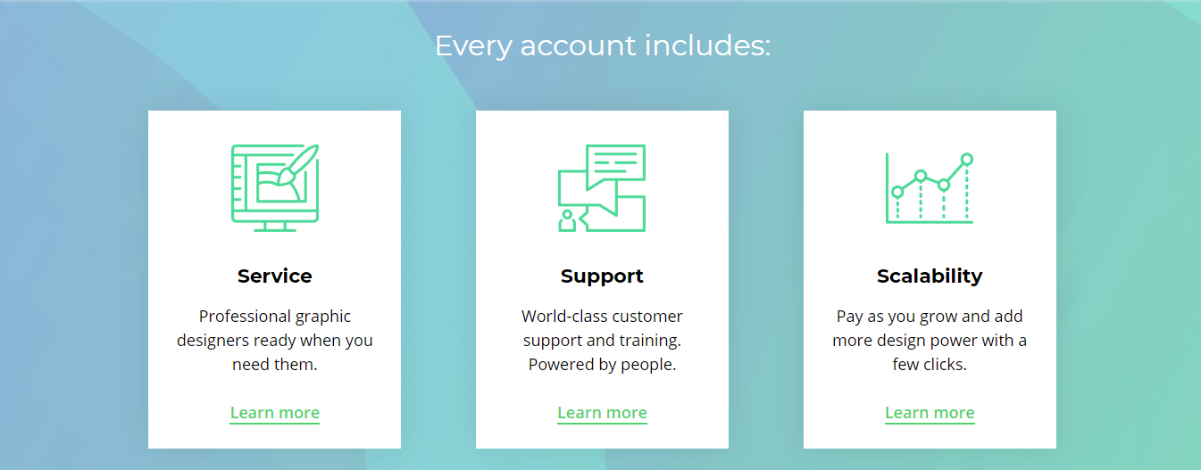
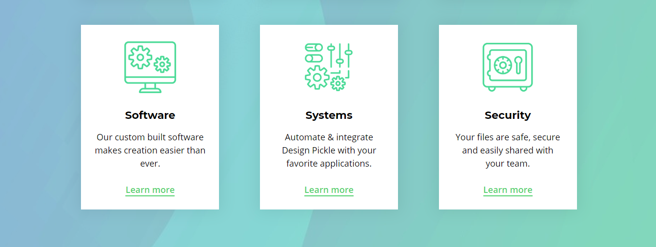
Remember, features are not benefits.
You already know that benefits are related to the positive end result your customer will get after trying your product or service. Features on the other hand are the distinctive attributes or aspects of your product or service.
Features answer how the benefit is delivered. For your sales page, list down the main features your product or service offers to prospects.
By writing detailed descriptions of each feature, you’ll have an easier time convincing shoppers to convert.
One tactic that we use in our sales pages is coupling the benefits and features sections together instead of listing them out separately.
For instance, instead of listing features like “Automatic Calendar Updating,” list the benefit first and use that as a way to introduce the feature. Like this:
“Save Massive Time Throughout The Day - Our Automatic Calendar Updating feature lets you skip the hassle of typing in every new calendar appointment by hand. Instead, it all happens 100% automatically!”
It’s a great way to keep your feature section focused on the prospect while talking about your product at the same time.
Tip #10: Add More CTA Buttons
You already added your 2 CTAs at the top of your page below the headline and sub-headline, right?
Now it’s time to add more buttons along your page. Based on one of the 7 Laws of Sales Funnel Physics—the Law of Repetition—say it again, and again (but don’t be uncool in the way you do it).
You should include at least 3 CTA buttons sections on your sales page—depending on the page’s length.
The buttons will make your site’s visitors buy at whatever point they become convinced. And the more buttons there are, the more chances they’ll buy.
Obviously you don’t want to scare your prospects with CTAs everywhere, but in a long-form sales page, there’s nothing wrong with multiple CTAs as long as they all lead to the same end goal.
Find the key sections where you’re giving compelling reasons to buy and BOOM, add a CTA button below to invite people to click and buy.
The idea is to continually reinforce and remind visitors why they’re on your sales page.
Tip #11: Explain How Your Product Or Service Works
So far you’ve already stated the problems your prospects experience, the solution your product or service brings, and the main features and benefits. But you haven’t explained yet how they work.
This section is very important because you’ll be explaining to your prospects about how easily your product can be used and how simply your service works. This is your opportunity to clarify those questions to them.
For instance, this is our “How It Works” section in Growbo’s homepage. See how we have the process broken down into 3 easy-to-follow steps?
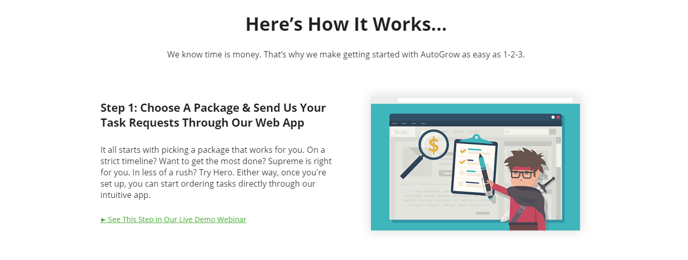
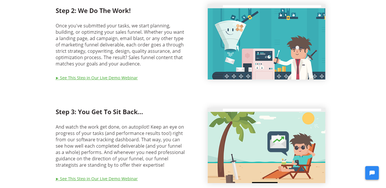
And you should do the same. Explain how your product or service works in 3 steps. Don’t use even numbers. Odd numbers actually convert better.
So list down your 3 easy steps, and VOILÁ, your prospects will know how to use the product or service they’ll buy from your site.
Tip #12: Add A Headline And Include Social Proof
Add a new headline including some social proof to build rapport and to build credibility.
This will make your prospects trust you even more because of the Law of Repetition, they’d be seeing one more time what you’re offering them and some social proof supporting it.
Tip #13: Include Research From Third Party
Adding research from a third party is an example of “borrowed” social proof, and is equally compelling.
For instance, consider adding vanity stats, business performance stats such as traffic, leads generated, money made for customers and clients, time saved.
Tip #14: Set Up Your Price Anchor
Determine how much your product or service costs and set up your price anchor.
One of the big sticking points for many prospects is the price. So try offering more than one price point.
If you have 3 different packages with 3 different prices, people will likely buy the middle one. For our Done-For-You service, we actually have 4 different packages and one in the middle is the most popular.
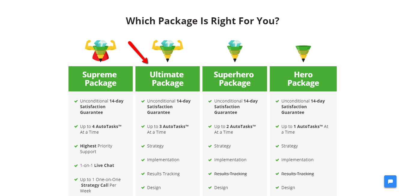
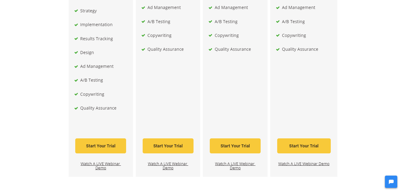
The price anchor states a higher number. For example, “a $3,500 value” keeps the focus on the pain “all those hours wasted guessing…” which serves as an anchor making the price appear cheaper.
A price anchor is usually very subtle for lead gen (services) pages, and directly stated for products or productized services where the price is actually shown.
Set your price anchor, introduce the deal, add your pricing table, and emphasize how affordable your product or service actually is.
Tip #15: Include A FAQ Section
If you want your sales page to convert leads instantly, include a Frequently Asked Questions section. This will help and guide your prospects to better understand your product or service, and it’ll also address any possible concerns they might have.
This is a fast way to disseminate information without distracting your prospects from the conversion.
You can keep this section to 4-8 questions with their answers and that should be more than enough. But remember to cover all possible questions that someone navigating through your site might have.
Tip #16: Include Risk Reversal
Adding risk reversal is a must in a high-converting sales page.
This gives people peace of mind and incentivizes their buying decision.
So consider including a 15, 30, or 60-day money-back guarantee (whichever you’re using), your refund policy, and/or whatever risk reversal that might give prospects more peace of mind.
Incentivize people to buy your product or service by adding scarcity. Because this can even translate to a 24.5% revenue boost just like it did for one case study from the 313 analyzed in the Proven Sales Conversion Pack.
Tip #17: Design Your Sales Page
So now that you have your sales page copy done, it’s time to move from the copywriting phase to design.
The most important thing on your sales page is the copy. But design also has a very important role in your page. It amplifies the copy and the whole website.
When the elements from your landing page (text, headlines, logo, images, footer, sub-headlines, etc.) are placed randomly or without care, your sales page won’t meet its goals. The experience must feel integrated, like the images aren’t “cookie-cutter” or just “thrown” on the page for instance.
A study by ConversionXL says that novelty keeps visitors’ attention. So you might want to consider varying the placement of images on your page so they’re not all on the same side and break up the page with different layout elements and styles.
So, even though you can just go for a basic, minimalist, and simple design, there has to be a connection between your brand, your logo, colors, and the font style and size you choose. Otherwise, your brand ideas will not be understood.
For your CTA buttons, don’t forget to make them big, noticeable, and with outstanding colors. And make them consistent throughout the page. They must have the same color and shape.
Forget about using a passive color that no one’s going to notice, or light font color on a light background.
You want your CTA buttons to be powerful and catch your readers’ attention.
See the difference below. Which one do you think gets more clicks?


Correct! The second one!
Also, don’t forget to make your sales page easy to digest. For this, consider using short sentences, avoid long paragraphs, use lists and bullet points, large headlines and sub-headlines, images, videos, and quotes.
Conclusion
So there you go. 17 actionable and proven tips you can follow to create your own sales page that’s guaranteed to convert prospects into buyers.
If you create a sales page following the 17 tips listed above, you won’t have to constantly be hustling to find prospective customers—they’ll come to you!
But keep in mind that traffic doesn’t mean much without conversions—you need your prospects to buy whatever product or service you’re selling.
Copywriting is key in the process of creating your sales page but other factors play an important role—like design, price anchoring, and social proof.
Now let me ask you, have you ever created a sales page or any other landing page? Have you included all the tips listed in this article? Which one have you missed?
Let me know in the comments below!
Keep funnelin', stay focused,
Mariana


