9 Prime Examples of B2B Opt-In Pages Done Right

A good opt-in page can make or break your B2B sales funnel.
You can have the best content in the world to give users, but they won’t share their contact information if your page isn’t optimized.
So you need to learn what gets people to click “Sign Me Up” (or something less generic).
If you’re lost on how you should be designing your opt-in pages, this resource is for you.
Today, you’ll read about:
- What an opt-in landing page is and why you should care so much about having one.
- 9 quality examples of opt-in pages from businesses just like you in the B2B space.
- How tiny changes can sometimes uplift your conversions in a radical way.
Before we tackle the list of opt-in pages, let’s define what they are and why they’re so crucial to master.
Want to delegate all your marketing and funnel work done—without the headaches of hiring? Download our free guide: 33 Marketing Projects You Can Delegate to Growbo and discover how to save 100+ hours a month, grow faster, and scale without the overhead.
What Is an Opt-In Page?
An opt-in page is a lead magnet landing page that’s designed to capture the personal information of a user in exchange for a piece of content.
But the content has to be free and valuable.
The main idea is to grow your email list so you can nurture your leads.
And some of the most common types of content that opt-in pages promote are:
- Industry and consumer reports
- White papers
- Guides
- Checklists
- Cheat Sheets
- Case studies
- E-books
If you don’t have valuable content for your B2B leads to access on your website, then you’re missing out.
As reported by the Chief Marketing Officer Council, 87% of B2B buyers say that online content has a major or moderate influence on their purchasing decision.
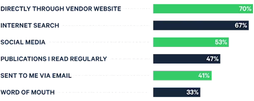
And 70% of B2B buyers locate content directly through a vendor’s website, according to FocusVision.
If you need help with generating lead magnet ideas, read this article.
Why Are Opt-In Pages Even Necessary?
Opt-in pages are necessary because, first, it’s a lead generation tactic.
Unless you plan to only use cold calling, you’ll need to capture the contact information of B2B buyers that show interest in your brand.
By providing a valuable form of content, you establish yourself as a trustworthy source.
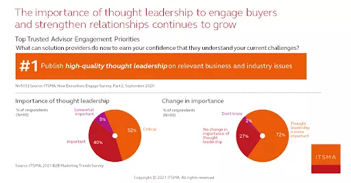
And according to the IT Services Marketing Association, 52% of executives believe thought leadership is critical, and 40% believe it’s important.
Besides generating leads, an opt-in page provides a great amount of insight into your marketing strategy.
As you analyze your results, you see what works and what doesn’t.
For example, if your agency generates a lot of traffic but a low percentage of conversions, then your opt-in page title might be great at promising value, but the page itself is fundamentally flawed.
Is the page load speed too slow?
Do you have too many clusters?
Are your calls to action not prominent enough?
Whatever it may be, you can do a little experimentation until you find the right balance.
In turn, you can use your newfound insights for other aspects of your online marketing.
Basically, you get a better read of your target audience.
Okay, now you’re probably wondering what the best practices are when it comes to opt-in pages.
Without further ado, let’s start with the first example.
Opt-In Page Example To Inspire Your Agency’s B2B Marketing #1: VMware’s “2020 Cybersecurity Outlook Report” Page
VMware is a multi-cloud solution provider based out of Palo Alto, California.
From apps to security, VMware offers a lot of value to companies in the digital space.
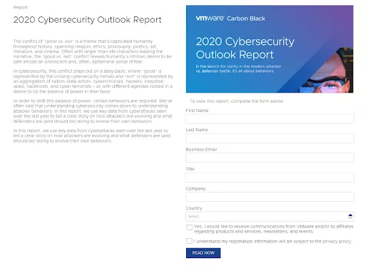
And for this example, we look at VMware’s opt-in page that offers a report on the state of cybersecurity and what the future holds.
Why This Opt-In Page Works
It’s not as aesthetically beautiful as a lot of other high-quality landing pages, but it gets the job done.
The value is conveyed clearly and all the content is above the fold (above the first page break when you first land on a web page).
Besides, the copy is what sells the report.
And it’s the opening that hooks the reader.
Delving into a deep subject matter on “good vs. evil” is a great way to grab the reader’s attention. It plays on your fears, which business keynote speaker Marcus Sheridan says can increase your sign-up conversions by as much as 80%.
Everyone can relate to the good-vs.-bad phenomenon.
You see, this is used as a segue into the dangers of cyberattacks.
The copy makes the reader want to learn more about the subject.
If someone didn’t already know about how important IT security is, then they know now. But it’s not enough to make a full judgement.
Instead, they need to download the report to learn more.
On the flip side, if someone already knows of the dangers of cybercriminals, then they’ll be eager to learn what trends took place in the past year and where things are going.
Opt-In Page Example To Inspire Your Agency’s B2B Marketing #2: NewtonX’s Webinar Page
NewtonX is a B2B research firm.
Using an AI-based approach, NewtonX identifies business professionals that will be the most useful for a company’s research needs and identify market opportunities.
For this opt-in page example, we’ll take a look at one of NewtonX’s webinar pages.
First of all, webinars are extremely influential in B2B marketing. According to BrightTALK, 91% of B2B buyers engage with webinars, making it more popular than any other form of content.
It’s a chance to show off your product or service in an engaging way or to just simply educate an audience.
So for that, good on NewtonX.
Why This Opt-In Page Works
To begin, this is the heading of the opt-in page.
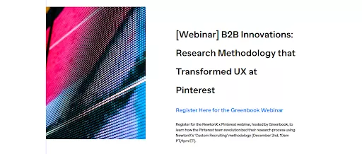
First off, “Webinar” is the first thing you read so that users know exactly what value they're getting if they’re to see the page promoted somewhere.
Then there’s the social proof included in the form of an interview with Pinterest staff.
Below is the summary section.
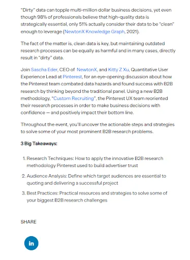
What I like about the summary section is the emphasis on “dirt data”. Even if you're unfamiliar with the term, it’s easy to understand.
With the use of research, NewtonX drives home the crippling effects of dirty data (problem agitation). In turn, the reader is more likely to take the threat more seriously.
Then there’s essentially a mini case study on how NewtonX improved Pinterest’s bottom line.
Also, there’s a LinkedIn social share that helps get more people to register for the event. Plus, LinkedIn is the go-to B2B social media platform where NewtonX’s target audience would be.
Finally, the last part of the page is a more robust CTA format.
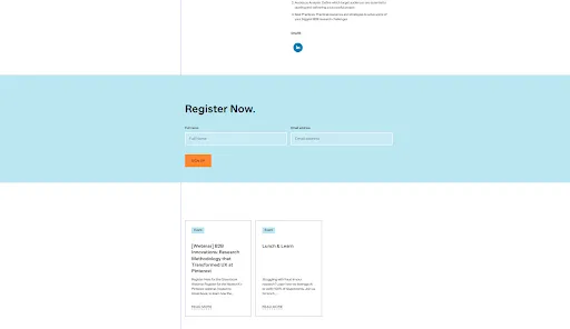
The light blue box contrasts well with the white background and the orange “sign up” button stands out.
Also, there’s no friction. All you need to do is exchange your name and email address.
Opt-In Page Example To Inspire Your Agency’s B2B Marketing #3: Signifyd’s “State of Commerce Report 2021” Page
Signifyd is an e-commerce platform that specializes in fraud protection.
Used by companies like Walmart and Samsung, it’s a trustworthy brand.
And to build even more trust, Signifyd created what they call a “pulse report.” For this opt-in page example, we’re looking at its “State of Commerce Report 2021.”
Why This Opt-In Page Works
Below is the top half of the page in which users make the download.
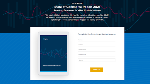
As you can see, in the background of the heading, there’s a design that captures the spirit of a “pulse report.”
The design portrays what appear to be some graphs, kind of like what you’d see on an electrocardiogram at a hospital.
It looks unique, adding to Signifyd’s branding.
Moving along, there’s a short summary that lets the user know exactly what to expect from the report.
Besides that, the CTA button catches your attention more than anything with the use of color contrast.
Then the bottom half of the page gives the reader a glimpse into the report.
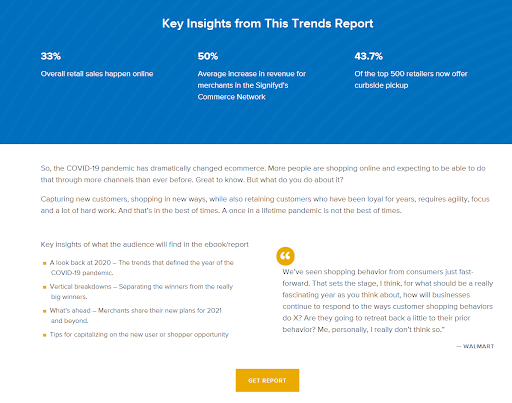
With some stats and insights listed in an easy-to-read format, you gain a sense for how the COVID-19 pandemic has shifted commerce.
Plus, there’s a quote from Walmart talking about consumer shopping behavior, which makes the report feel even more credible.
At the very end, there’s another CTA button. Only this time the button reads “Get Report” instead of “Download.”
See, it’s always important to follow up your “sneak peak” with a CTA since the problem is fresh on the mind. Don’t make the user scroll back up to the top of the page to download your gated content.
Opt-In Page Example To Inspire Your Agency’s B2B Marketing #4: Growbo’s “29 Examples Guide” Page
Now for this example, I feel like we’re being a little overconfident.
After all, we’re telling you that our opt-in page should inspire you.
But we had to include it since it’s some of our best work and we’re proud of it.
Besides, it’s got all the qualities of a high-converting opt-in page that you’d find elsewhere. So why not include it on the list?
Now to get into it…
With the Growbo platform, there’s a lot of things we can get done for agencies that sign up with us.
And in order to show potential clients all that we offer, we have a guide that outlines 29 different projects we can accomplish for them.
But, of course, we need a landing page for it.
Why This Opt-In Page Works
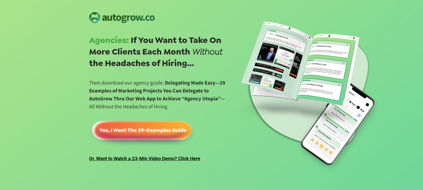
Right off the bat, our target audience knows this guide is for them.
“Agencies” is the first word that is read.
And the benefits of using the Growbo platform are the takeaways of the heading, which are taking on more clients and not having to worry about the hiring process.
Our shiny, orange CTA button works well with the green background to draw attention.
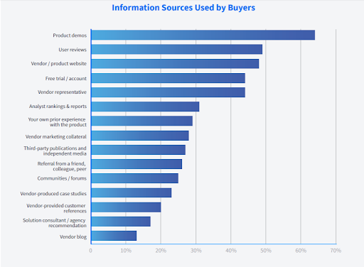
Then there’s the option for someone to jump to our demo instead. According to TrustRadius, more than 60% of B2B buyers use product demos in their purchasing journey.
Moving along, just below the fold there’s some social proof in the form of brand logos of clients we’ve helped.

Then the rest of the opt-in page agitates the problem that so many agencies face.
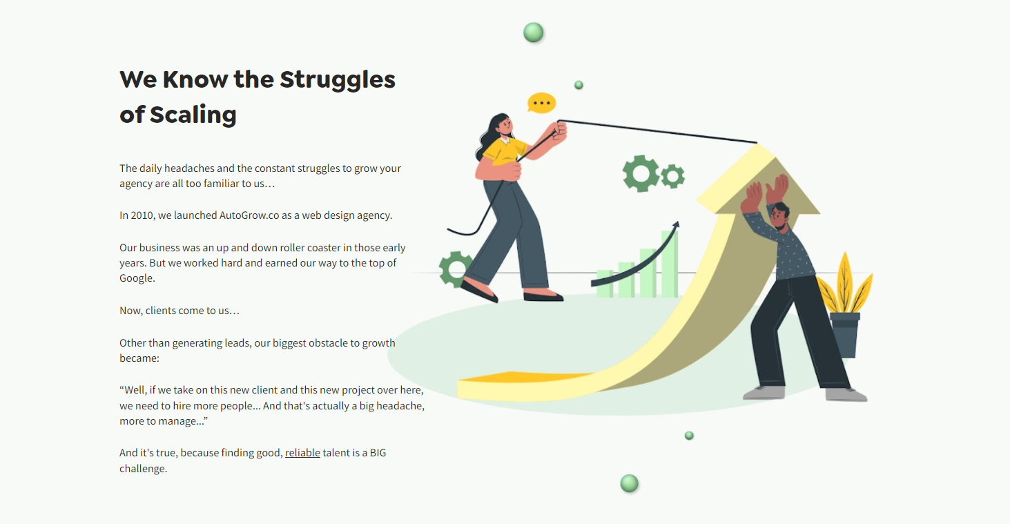
But then we follow that all up with a second CTA while the reader feels encouraged to learn more about finding a solution to said problems.

Want to get all your landing pages done with a short turnaround time and with professional-grade quality? Growbo’s designers and copywriters have been helping agencies like yours handle client marketing projects for over a decade. Check out our website and landing page examples.
Opt-In Page Example To Inspire Your Agency’s B2B Marketing #5: Jungle Scout’s FBA Calculator Page
Amazon has over 6 million sellers on its platform, according to Marketplace Pulse.
And if you’re one of them, then you’re aware of fulfillment by Amazon (FBA). If you don’t know about FBA, then it’s basic definition is the fees Amazon charges for picking, packing, shipping and delivering of your products to customers.
So here, we look at Jungle Scout’s opt-in page that provides great value for Amazon sellers wondering how much they’re really making off the mega marketplace.
You see, this example looks at a landing page Jungle Scout created where sellers can calculate their FBA costs for free. But the thing is, they need to provide their email address.
And there’s also an option for people that haven’t started selling on Amazon just yet but want to get a feel for their profitability if they choose to do so.
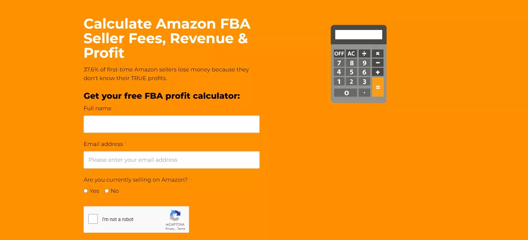
This is what the top of the page looks like:
Why This Opt-In Page Works
For starters, Jungle Scout takes advantage of its great brand colors. With a bright orange background, the white heading and black CTA contrast well on the page.
Then looking to the top right part of the page, there’s an animated calculator that makes the message more clear.
Plus the opt-in process looks incredibly simple as well as secure.
One thing I would remove here is the “I’m not a robot” checkbox. Although it’s just a click away, it adds an unnecessary layer of friction.
Something that makes this opt-in page example different from the previous ones is the length of the page.
Jungle Scout goes into great detail on what FBA is, how the calculator works, and what benefits you can expect from using it.
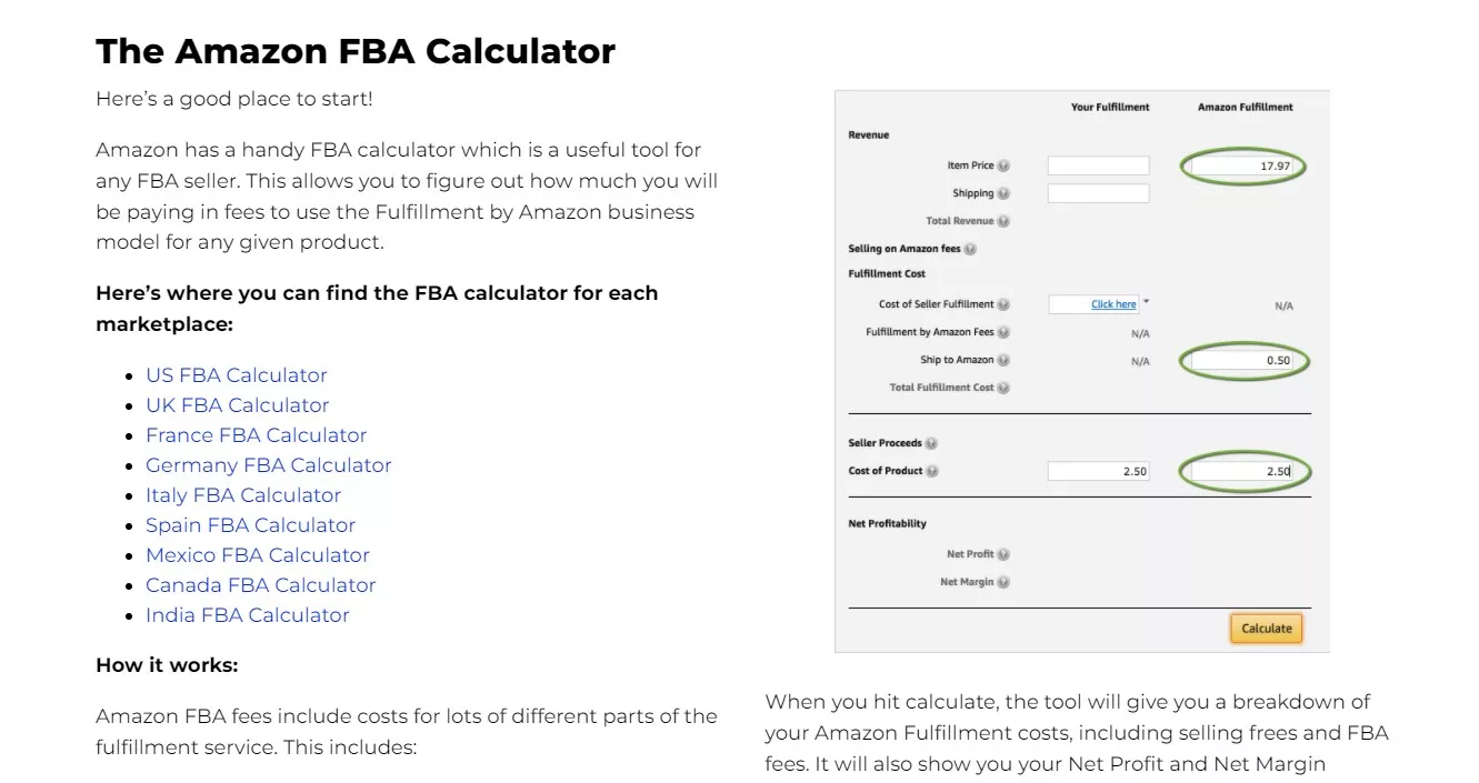
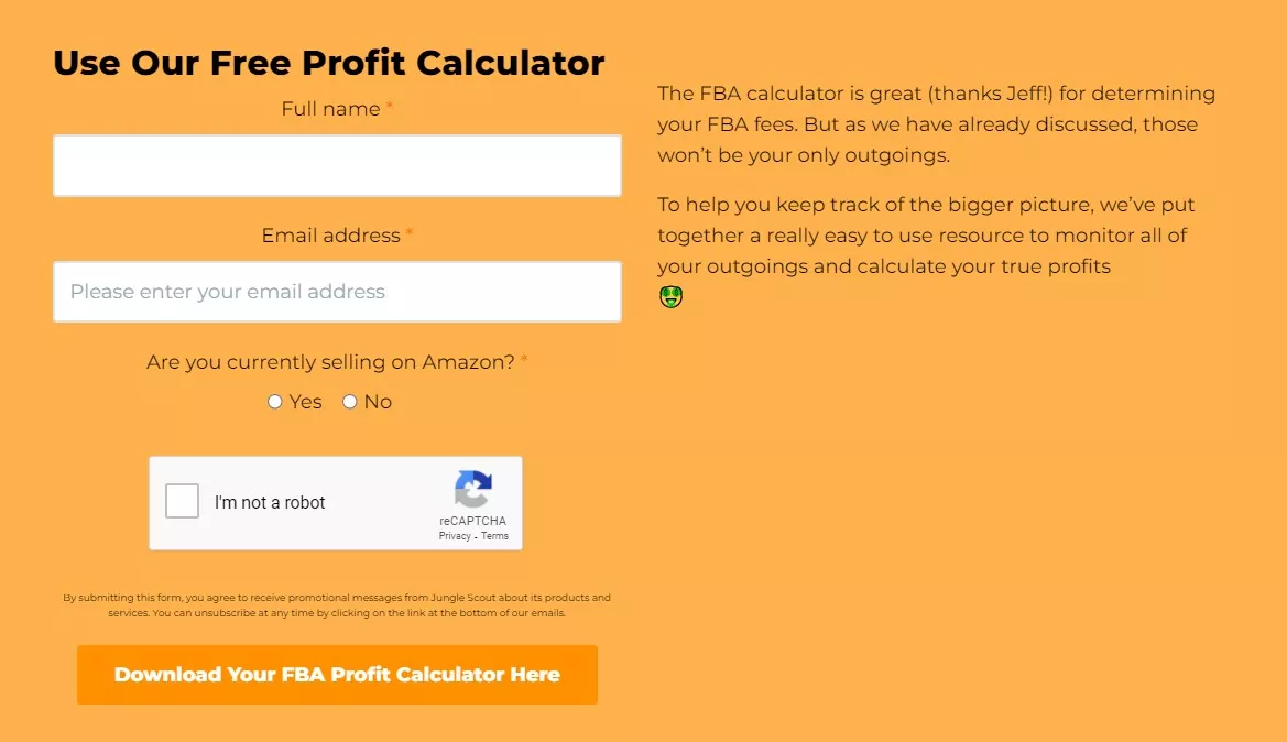
And there’s also two more CTAs throughout the page asking for the reader to exchange some info for access to the FBA calculator.
This one is in the middle of the page:
And this one is at the very end:
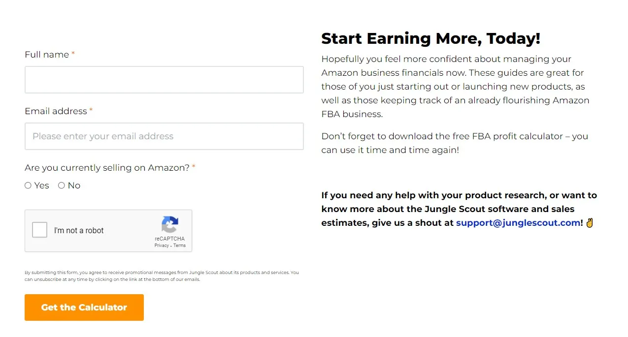
What I don’t understand is why Jungle Scout would add an extra form line for the second and third CTA forms. Perhaps it was just an oversight or there’s some strategic reason that I fail to see.
Nevertheless, this is a fine example of an opt-in page as it offers a unique value and provides every detail one would want to know about FBA costs.
Opt-In Page Example To Inspire Your Agency’s B2B Marketing #6: HubSpot’s “How to Master Facebook Marketing in 10 Days” E-bookPage
Facebook is an enormous marketing opportunity.
So it’s no surprise that there’s quite the appetite for Facebook-centric content among business professionals.
In fact, our highest-performing piece of content to date is an article called “How To Get 100,000 Facebook Likes for Free.”
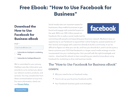
HubSpot decided to tap into the need for Facebook marketing skills with its “How to Use Facebook for Business” e-book.
According to HubSpot’s own research, e-books are the best type of content for landing page submissions.
Why This Opt-In Page Works
Right off the bat, the title is very effective.
Although the “free” part is always a fan favorite, “how to” titles are also a great asset.
From our own research and some other articles I’ve read across the internet, it’s evident that “how to” headlines receive a bit more attention than other headlines.
Of course, it’s not always the best headline to select.
But for this opt-in page example, it is because HubSpot wants to make it known that they’re going to teach you something.
Furthermore, the page uses bullets for scannability, the opt-in only requires an email address, and the light blue CTA button fits the Facebook theme.
Opt-In Page Example To Inspire Your Agency’s B2B Marketing #7: PTC’s Research Report Page
PTC is a Boston-based computer software company that helps businesses connect between digital and physical worlds.
Augmented reality (AR) solutions is one of PTC’s cornerstone features. For instance, they built a robotic car named Frida using kinetic AR.
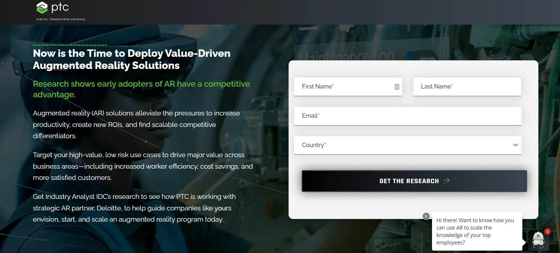
To drive demand for its AR services, PTC created a report on why it’s time for companies to invest in AR solutions.
Why This Opt-In Page Works
The simplicity is what makes this opt-in page so effective. Everything can be seen without scrolling down on the page at all.
And the dark background allows everything else to pop out at you.
With a bolded heading and green subheading, the reader sees why AR is so important for businesses.
Moreover, the form length is quite short so the reader experiences less friction.
One other thing to note is the use of a chatbot on the opt-in page.
With a chatbot, PTC’s website visitors can get some common questions answered quickly, and the company can generate as many as 182% more leads according to HubSpot.
Opt-In Page Example To Inspire Your Agency’s B2B Marketing #8: Gale’s “Keep Students on Track With Database Access” White Paper Page
Gale is part of a bigger company called Cengage. Its mission-aligned focus is on helping educators and students access important content.
In order to generate more B2B leads, Gale creates white papers.
And as found by Demand Gen, 49% of B2B buyers are willing to share personal information to access white papers.
For this specific example, they created a white paper that goes in-depth on how useful databases like Gale in Context are for increasing teacher success and student engagement.
But first, they need a landing page to accompany the white paper.
Why This Opt-In Page Works
What I like about this white paper download page is the use of imagery.
Images help draw emotion from people.
In one experiment, a company called Highrise once increased its landing page paid sign-ups by 47% by switching to a design with a person in the background.
First off, the featured image is a woman and a younger girl who look highly engaged with the learning experience at hand.
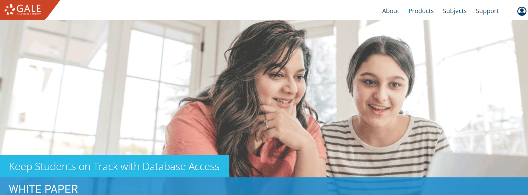
Whether the older woman is a tutor or a mother doesn’t really matter. The image represents a positive message of collaboration, which Gale is going for.
Furthermore, the blue color scheme highlights the content of the page.
Then at the bottom left of the page, there’s snippet images of the white paper itself.
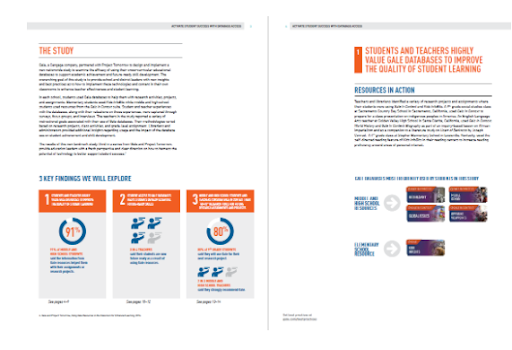
Again, this helps entice the reader a bit more.
And it makes sense considering humans are visual learners. We process images faster than text and remember images more easily too.
If you’re not already using images for your opt-in pages, then luckily for you, it’s a simple, little step to take. Even stock photos will do just fine.
Now, let’s check out the last opt-in page example.
Opt-In Page Example To Inspire Your Agency’s B2B Marketing #9: Attentive’s SMS Holiday Village Page
Attentive is a mobile messaging platform that allows businesses to communicate effectively with their subscribers.
The company has a huge resources library filled with industry reports, blog posts, examples of texting campaigns, events, and webinars.
But besides that, they also offer downloadable guides.
And that’s where we begin.
For this one, Attentive focuses on a 2021 holiday SMS strategy.
To be clear, there are two parts to this opt-in example since it’s a two-step process to access the guide.
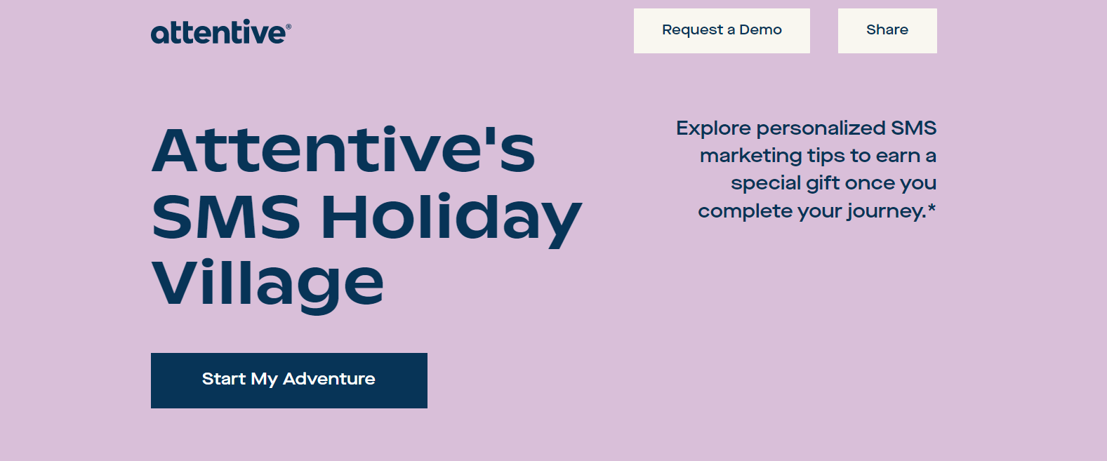
The first part is the landing page.
Why This Opt-In Page Works
The heading jumps out right away. It’s hyper-targeted to people looking to step up their SMS efforts for the holiday season.
Also, the “Start My Adventure” CTA button sounds very intriguing. It’s a lot more enticing than any generic CTA you usually see.
Besides that, there’s an option to share the guide page with others. That way, Attentive generates even more leads.
I also like the Christmas design that makes the page more emotional and relatable.
By the way, the reason why it’s an “adventure” is because you’ll be directed to a “holiday village” page where you click on different icons that reveal SMS tips for the holiday season.
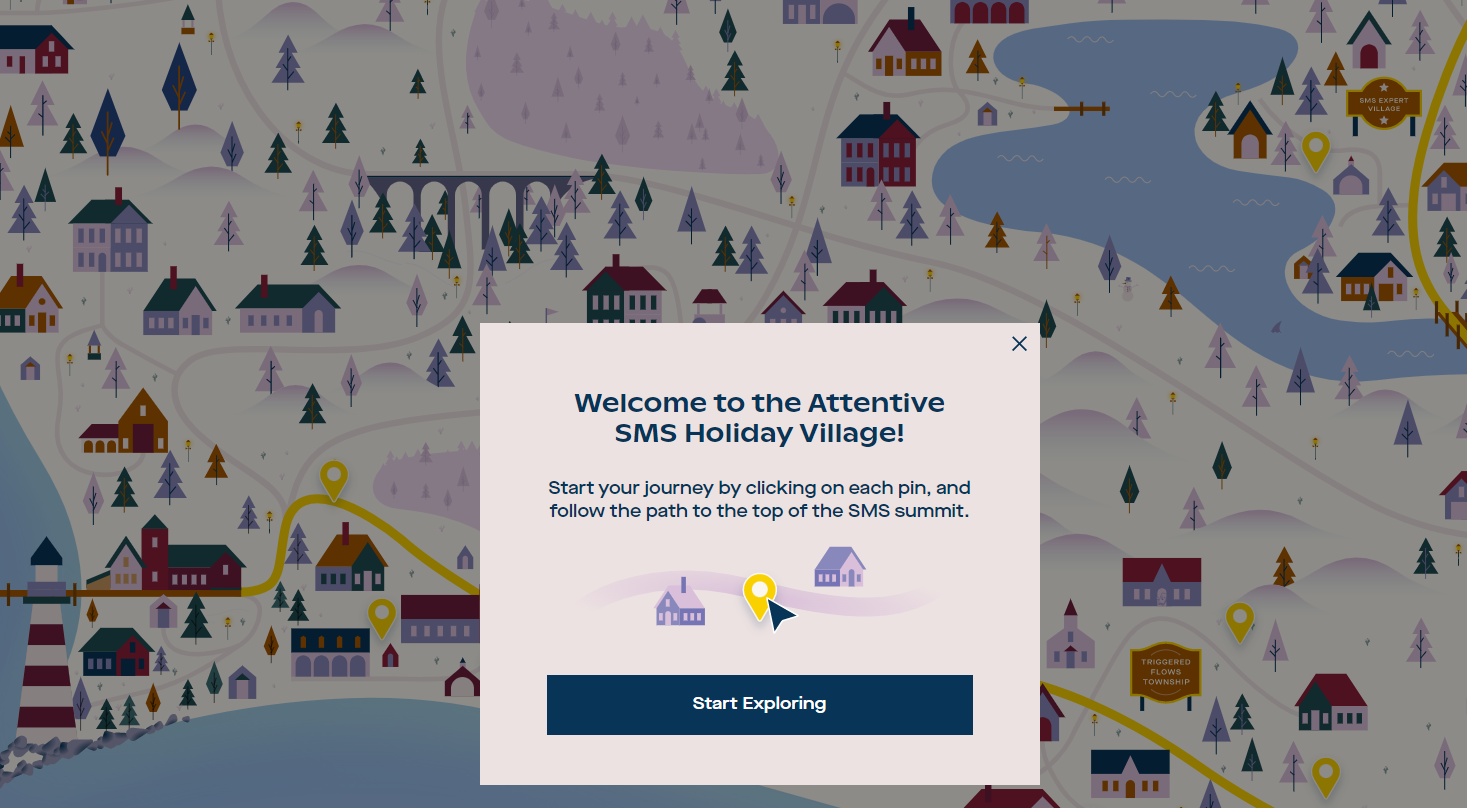
Before getting to the holiday village however, you first get directed to the following page after clicking the “Start My Adventure” CTA button from the landing page.
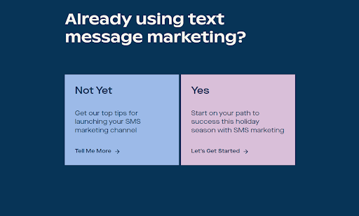
So Attentive asks if you’re already using text message marketing.
If you click “Yes,” then you’re not exactly Attentive’s target audience so you gain immediate access to the guide without filling out any information.
All you have to do is choose a marketing area that you’re most focused on so that your guide will be personalized for you.
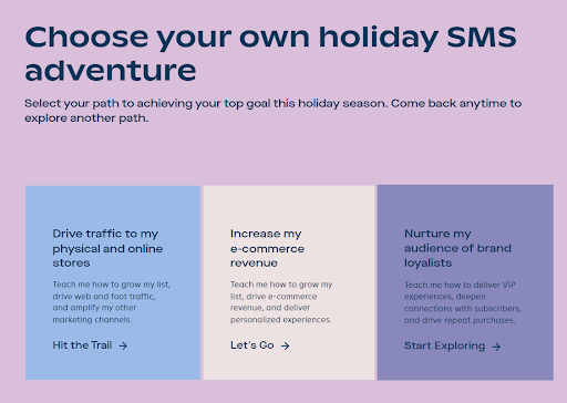
But if you’re new to text message marketing and you click on “Not Yet,” then Attentive sees you as a good lead.
With that, you’ll find yourself on a new page that asks for your email address. From there, you can access the guide once it’s sent to your inbox and you click on it.
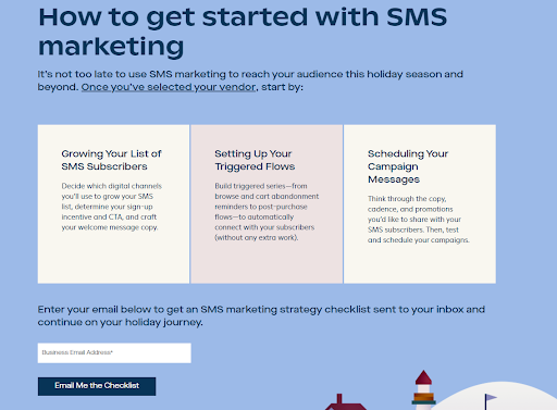
And voila! Attentive has created a new lead with their opt-in page by adding you to its email list.
Conclusion
Want to delegate all your marketing and funnel work done—without the headaches of hiring? Download our free guide: 33 Marketing Projects You Can Delegate to Growbo and discover how to save 100+ hours a month, grow faster, and scale without the overhead.
As an agency, generating more leads for your B2B sales funnel all starts with one thing: providing valuable content to prospective clients.
This can come in the form of white papers, checklists, guides, case studies or any other type of lead magnet you may use to engage our target audience.
But in order to drive demand for that content, your opt-in page needs to be up to snuff.
Because if there’s something off with your copy, CTA buttons, aesthetics or anything else, then you’ll see a high bounce rate.
And nobody wants to see that.
So your opt-in page needs to get your point across quickly, concisely and in a user-friendly way.
That’s where today’s article on 9 examples of opt-in pages provides value for you.
Now, I didn’t cover all the different types of content out there for opt-in pages, but there was definitely variety. And besides, the best practices for opt-in pages are applicable to every type of content.
For example, you always want to include:
- Prominent CTAs by using color contrast and enlarged font sizes
- Short field forms
- Imagery whenever it feels appropriate
- Highlighted details of your content to show value
There are some other things to consider on a case-by-case basis, but those are some of the main takeaways.
And if you choose to download this article as a PDF, you’ll never be lost with your opt-in pages since you’ll only be a click away from all the examples inside.
Now let me ask you …
Which opt-in page example was your favorite?
Let me know in the comments below.
Keep Growin’, stay focused.
Mark


