9 Smart, Online Branding Examples for You To Learn From

“You’re ripping yourselves off.”
Those are the words of one of our old clients.
And true, we offer aggressively low prices.
But we don’t like to think of it as “ripping ourselves off” so much as it’s our differentiation strategy.
Growbo is positioned as an affordable option for the digital marketing needs of small to medium-sized businesses.
More so than our competitors.
And going forward, we’ll have to rethink this.
Because down the line, we’ll also start targeting enterprises that could use a more robust offering.
So how will our sales team pitch a high-end package when our experience has only been in SMBs?
How will larger companies perceive Growbo?
These are questions about branding.
But what is branding?
And how can e-commerce startups like yours use it?
I want to dig deeper with this topic.
In this resource, you’ll learn about:
- What exactly branding even means.
- 9 smart online branding examples you can try for your e-commerce startup.
- Why these branding strategies work for each company.
Let’s kick off by defining what branding is…
Want to delegate all your marketing and funnel work done—without the headaches of hiring? Download our free guide: 33 Marketing Projects You Can Delegate to Growbo and discover how to save 100+ hours a month, grow faster, and scale without the overhead.
What Is Branding?
Branding is where a business tries to present its image in a way that distinguishes itself from its competitors.
So you can think of it as what makes your e-commerce business unique.
Sure, you might sell similar products and services as competitors, but your logo and content can have its own style.
But how do you achieve a distinguished brand identity in such a saturated market?
Well, there’s no one single thing that makes up successful branding.
Rather, there are multiple facets to it, such as :
- Logo Design
- Personality
- Company History
- Values
- Slogan
- Typography
- Packaging
- Fonts
Remember, branding is a perpetual process. Consumers are continuously being exposed to your business’ branding over and over again.
As business consultant Tom Goodwin puts it…
“Brands are essentially patterns of familiarity, meaning, fondness, and reassurance that exist in the minds of people.”

Back in 2007, market research firm Yankelovich estimated that the average person is exposed to 5,000 ad messages per day.
Now that number is up to between 6,000 and 10,000 per day, according to PPC Project.
So you must take your branding seriously if you want to set yourself apart and attract consumers.
Now that the definition has been explained in detail, let’s look at the first online branding example on the list.
#1 Smart Online Branding Example: Sun Bum’s Environmental Activism
The first smart online branding example comes from Sun Bum.
Sun Bum is an e-commerce retailer mostly known for selling sunscreen to consumers.
But over time, they’ve started offering other products such as lip balm and hair products.
As soon as you land on its website, you can immediately feel its differentiation.
Besides the easy-going surfer lifestyle aura on the website, much of its branding is focused on environmental sustainability.
And its About Us section discusses Sun Bum’s overall vision.
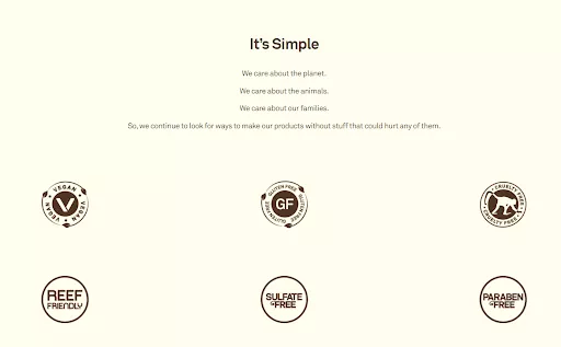
As can be seen from the screenshot, Sun Bum’s core values are about protecting our planet and everything that lives on it.
Clearly, Sun Bum wants its stance to be seen by its target audience.
And that’s a smart move when you consider the research.
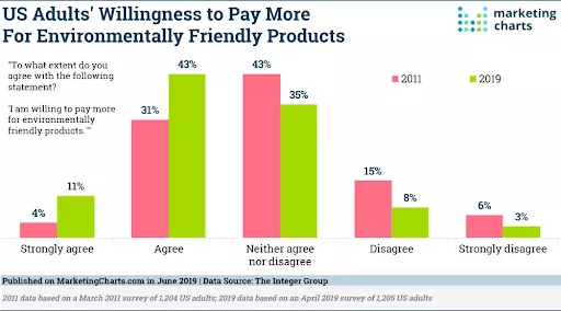
According to a study by a marketing agency, The Integer Group, 54% of US consumers are willing to pay more for environmentally friendly products.
Not only that, it’s a global preference too.
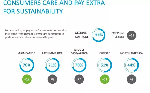
According to research from logistics company, SRC, the global average for consumers willing to pay more for sustainable products is 66%.
A lot of companies just hop on the bandwagon when it comes to sustainable products as a way to generate more sales.
But in Sun Bum’s case, it’s been its foundation since day one.
#2 Smart Online Branding Example: Zappos’ Outstanding Customer Service
According to advisory company Forrester, two-thirds of adult consumers say that the most important thing that a company must do is value their time.
So when your customers have questions that can’t be answered through your FAQs, then your customer service must step up to the plate. And always be on standby.
e-Commerce store, Zappos, is a perfect example of a company that uses customer service at the heart of its online branding.
According to its own blog post “10 Things to Know About Zappos Customer Service,” the company has focused on delivering the best possible service experience for its customers since its founding in 1999.
I mean, how many companies dedicate (at least) 3 blog articles just to the discussion of their customer service?
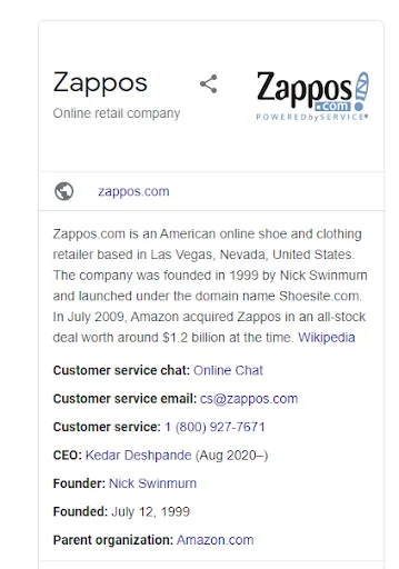
Now, here are a couple of screenshots of what you see when you Google “Zappos.”
Notice the contact information is readily available? And the 365-day return policy is prevalent?
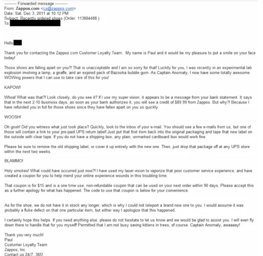
Just below is a cheesy, yet effective, example of how Zappos’ customer loyalty team goes above and beyond.
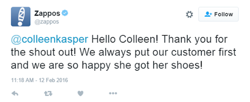
Then on social media, the Zappos team is outstanding when it comes to customer attention.
With this kind of customer service, it’s no surprise that 75% of Zappos’ sales come from returning customers, according to Inc.
Zappos’ online branding example is smart because it taps into a highly-demanded need from consumers.
Not a lot of companies live up to the “great customer service” that they promise.
They may be good. But definitely not above and beyond like Zappos.
#3 Smart Online Branding Example: Big Little Changes Its Name and Logo
Perhaps no aspect of your e-commerce startup's branding is as obvious as your name.
And the name of your company can be the difference between someone connecting with you or not.
So let’s look at an example of a complete branding overhaul.
In 2016, children’s sewing pattern company, Big Little, decided to make a radical change to its branding.
You see, the company wanted to capture an Earthy, yet childish style that would still resonate with adults who are the actual target audience.
But the name and logo were not quite capturing those vibes.
So they consulted a design team called Aeolidia.
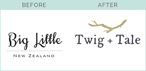
And they came up with the name Twig + Tale.
With that, they created a logo that embodies the spirit the company envisioned: a feeling of nature and storytelling.
According to the eCommerce owner, she saw a 530% increase in overall sales.
And a 613% increase in sessions.
#4 Smart Online Branding Example: Buffer’s Transparency
Buffer, the social media management platform, is all about transparency.
And it’s exemplified throughout its branding content.
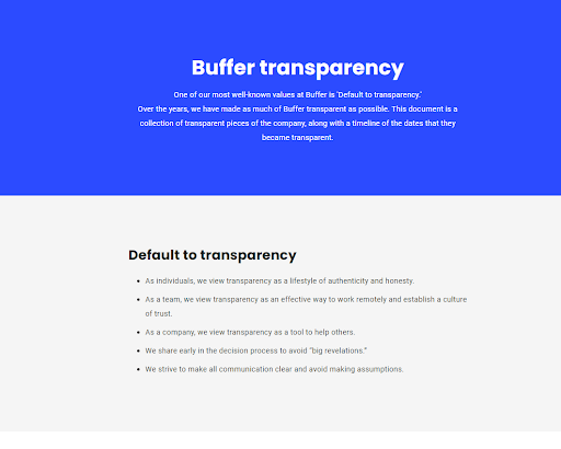
For example, the company has an entire "Buffer Transparency" page on its website.
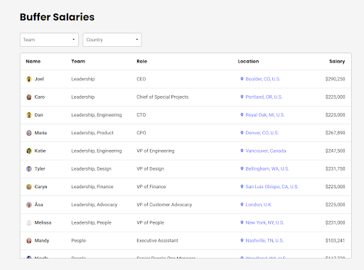
And they even share the salaries of all its employees, from customer advocates to CEOs.
Now, that’s truly unique.
More than that, Buffer releases all of its growth reports, a revenue dashboard, equal pay reports, and more.
And there’s a good reason why Buffer stresses transparency.
According to strategy consulting firm Accenture’s “To Affinity and Beyond” report, 66% of consumers cite transparency as something that attracts them to a brand.
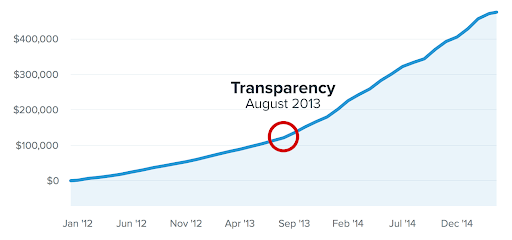
In August 2013, Buffer started its Open Blog - where the company shares as many transparent details with its audience as possible.
And, from there, sales just took off.
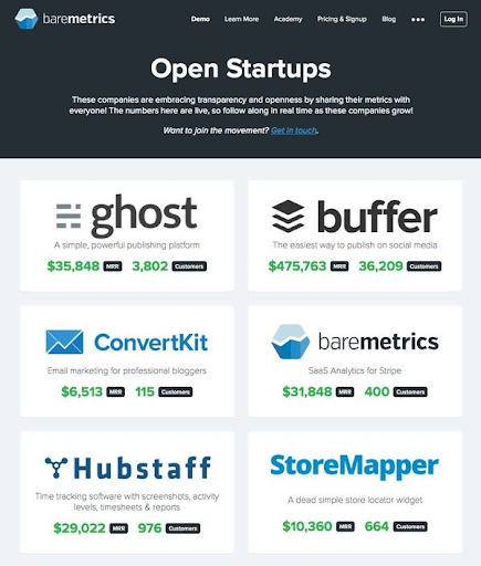
And it should also be noted that Buffer cheers on other companies that have adopted their philosophy.
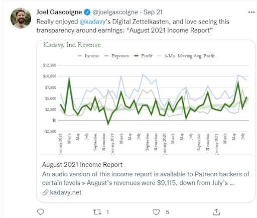
Below is CEO Joel Gascoigne supporting another company that is forthcoming with financial reports.
Gascoigne is doing well, as 70% of consumers feel more connected to a brand when they are active on social media, according to Sprout Social.
So, that's definitely something your e-commerce business needs to get on top of if you're not already.
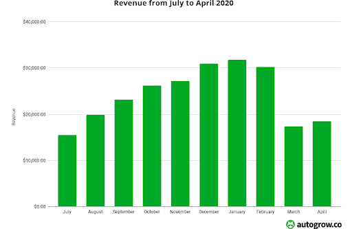
Growbo is also known to practice transparency through the publishing of our growth reports.
That way, our readers can follow our journey.
Okay, let’s proceed to the next online branding example.
#5 Smart Online Branding Example: Chobani’s Authenticity
In a survey from the user-generated platform, Stackla, it was shown that 86% of consumers say authenticity is important when it comes to deciding which brands to support.
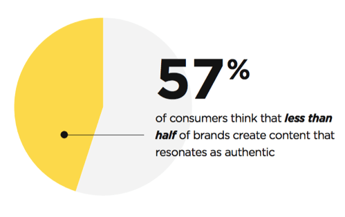
And there’s a great opportunity as 57% of consumers think most brands aren’t authentic
Greek yogurt giant, Chobani, is one such online branding example that makes use of authenticity.
If you head over to Chobani’s website, the copy talks a lot about its commitment to a better future.
Accordingly, there’s an “Impact” tab that allows you to check out several pages that talk about Chobani’s values.
Some of the tabs include environmental wellness, social wellness, diversity and inclusion, nutritional wellness, and more.
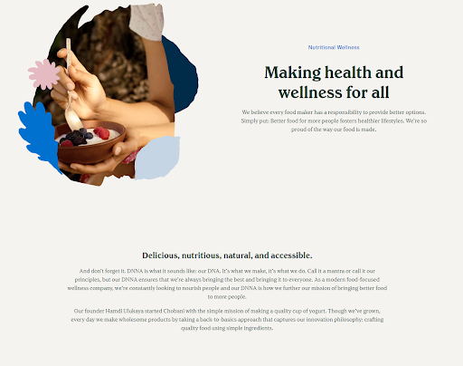
To illustrate, let’s look at its Nutritional Wellness Page.
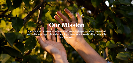
On the page, it talks about its commitment to delivering delicious, nutritious, natural, and accessible products.
You see, Chobani positions itself as a community leader.
Thereby, consumers see Chobani as a brand that makes a positive impact on our societies.
Not only does Chobani put its values front and center for everyone to see, its leaders actually demonstrate them too.
Over the years, Chobani has donated 55 million products and has provided 175 grants.
And here are some examples of Chobani’s social activism:
- In 2019, Chobani paid $47,650 toward the lunch debt owed by a Rhode Island school’s students
- Donated $20,000 to combat acts of hate toward the vandalized Anne Frank Memorial in Boise
- Launched the Milk Matters initiative which improves the quality of life for dairy farmers and cows
With these acts of kindness being picked up by online media outlets, Chobani is perceived as an authentic brand.
And to add to that, Chobani also uses social media to make its social impact visions apparent to consumers.
#6 Smart Online Branding Example: Carvana’s Use of Color
This next smart online branding example is all about the effects of color.
According to Forbes, you have 7 seconds to make a first impression.
And in a study by the University of Winnipeg, up to 90% of what consumers judge a brand design on is color.
So make sure the color scheme for your brand sits well with your target audience.
In a study from Marketo, they found that 95% of the top 100 brands use just one or two colors.
And the most used colors are:
- Blue (33%)
- Red (29%)
- Black or grayscale (28%)
- Yellow or gold (13%)
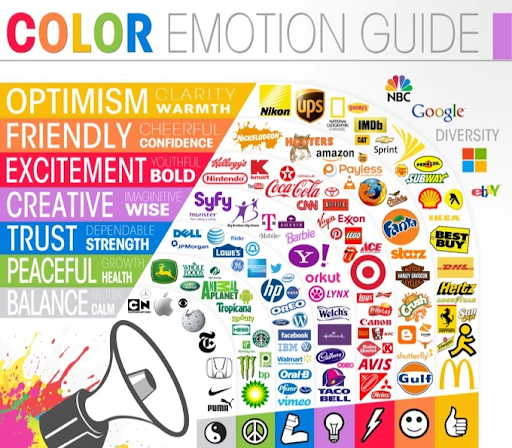
But when choosing brand colors for your e-commerce startup, it’s important to note that each color evokes different emotions.
For example, black is often used to advertise high-end vehicles. That’s because dark colors are associated with prestige.

For an online branding example where a company uses color effectively, just look at Carvana.
Since Carvana sells used vehicles through an online medium, it’s natural that consumers will often be hesitant.
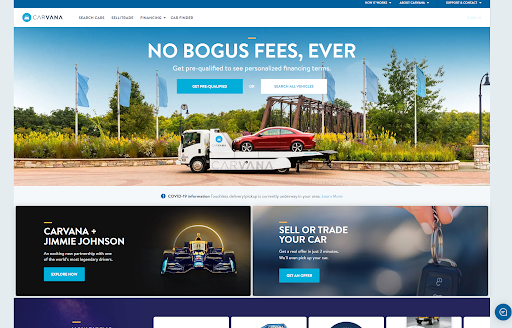
So, to ease the tension, Carvana uses the colors blue and gray.
You see, in color psychology, blue is associated with trustworthiness and reliability. And it’s also why a lot of financial institutions use it too.
Meanwhile, gray is associated with calmness.
If you had to pick a color scheme that would fit Carvana’s industry, you couldn’t have possibly done it better.
Because a color like green wouldn’t make a lot of sense for the brand. Unless they exclusively sold eco-friendly cars.
Now, nobody’s saying the color of your brand alone will dramatically affect your sales.
But you want to use a color scheme that aligns with what your buyer persona would be most receptive to. Take into account how you want consumers to feel about your brand.
Then, use color schemes that will invoke emotions that align with those feelings.
#7 Smart Online Branding Example: Black Wolf’s Humor on Social Media
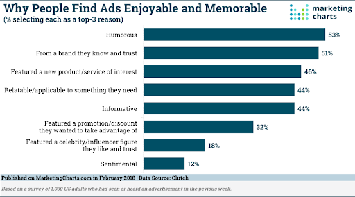
According to research carried out by ratings and reviews platform Clutch, 53% of consumers think humor makes ads more enjoyable and memorable.
And in a Sprout Social survey of 1,000 consumers, they found that 3 in 4 people appreciate humor from brands on social media.
But there’s a time and a place for brands to use humor.
For instance, Snapchat and LinkedIn users don’t want to see the humor.
Meanwhile, Facebook and Twitter are good platforms to use it.
But in general, humor is a desirable personality trait among consumers.
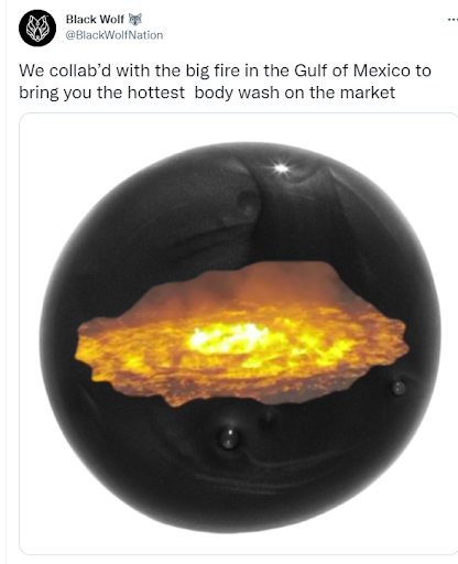
E-commerce skincare retailer, Black Wolf, makes frequent use of humor in its branding.
For example, when a major fire broke out off Mexico’s west coast, Black Wolf posted a tweet celebrating the “introduction” of the world’s hottest body wash.
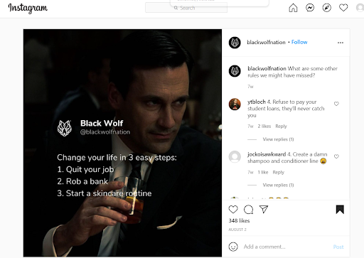
Then, over on its Instagram account, you can see them telling followers they can change their lives by quitting their jobs, robbing a bank, and starting a new skincare routine.
A pretty interesting combination.
And over on Facebook…
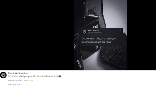
By using humor, Black Wolf is tapping into a fancy thing called peripheral route persuasion.
To put it another way, it’s basically emotional advertising.
And I could dedicate an entirely new article just to that.
The next online branding example comes from a company that’s the polar opposite of Black Wolf.
#8 Smart Online Branding Example: Rolex’s Luxurious Style
The legendary watchmaker, Rolex, has been synonymous with innovation and reliability since its founding in 1905 London.
As of July 2021, Rolex is the 5th most valuable luxury brand worldwide, according to Statista.

And because of Rolex’s focus on premium quality and expensive price points, it’s always caught the attention of the luxury consumer segment.
In fact, the most expensive watch ever sold was Paul Newman’s Rolex Daytona for $17.8 million.
Not only that, the next two most expensive watches in history were also Rolexes.
So how does Rolex make sure that its online presence targets the high-end consumer market?
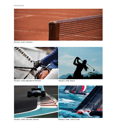
First, it does this by creating content that resonates with people in this segment on its website.
For example, when you head over to its website, there’s a lot of imagery that features sports more associated with the upper class, such as golf, tennis, and equestrianism (horseback riding)
And there’s even a section for yachting.
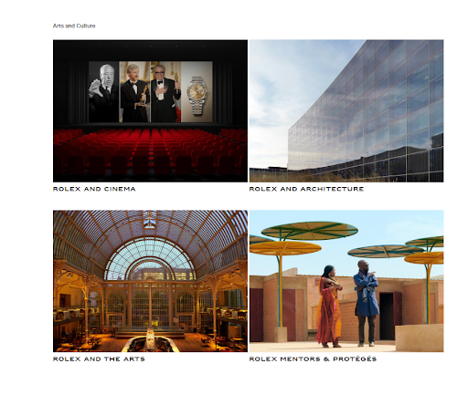
Additionally, Rolex makes a connection with the arts and culture too.
According to Statista, websites are the 2nd most popular way for millennial consumers to discover new products or trends.
But social media accounts for the most luxury item discoveries among millennials.
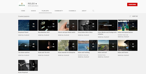
Over on its YouTube channel, Rolex creates playlists that, again, resonate with their buyer persona.
There’s a Rolex playlist that features sports and activities that pique the interest of Rolex’s target demographic..
Throughout its entire digital marketing strategy, Rolex consistently uses content that aligns with its target audience.
From the topics discussed on the website to the storytelling on Rolex.org, everything about the company’s branding aligns perfectly with the high-income consumer segment.
#9 Smart Online Branding Example: Starbucks’ Sense of Community
Outside of its 32,000+ cafes around the world, Starbucks manages to create a sense of community among its customers.
And social belongingness is one of the most powerful needs a human can have.
We all desire to be part of something bigger than ourselves.
In one study out of Florida State University, the researchers found that the less someone interacts with others on social media, the more likely they are to suffer from low self-esteem.
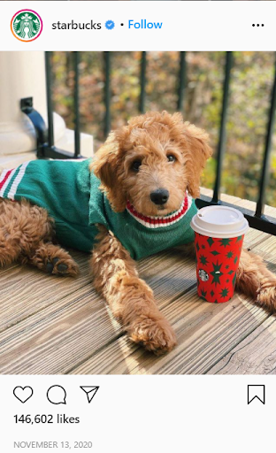
So one way Starbucks accommodates these needs is with user-generated content (UGC).
On Instagram, Starbucks always shares photos of its customers holding a cup of coffee.
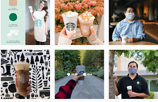
And sometimes, they even share photos of pets.
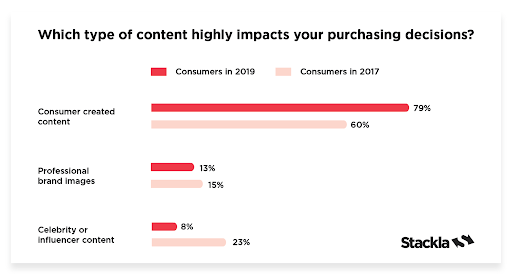
According to UGC platform Stackla, 79% of consumers say UGC influences their purchasing decision.
Moreover, they’re 2.4 times more likely to perceive UGC as authentic compared to branded content.
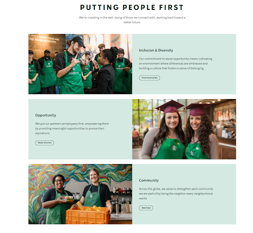
In addition to UGC, Starbucks discusses its community-driven culture on its website.
On the About Us page, it talks a lot about creating a culture where everyone is welcome.
From employees (called partners) to coffee farmers and customers around the world, Starbucks wants to positively impact everyone.
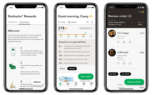
Lastly, Starbucks has a world-class loyalty program that makes consumers feel part of an exclusive club.
Customers signed up for the rewards program on the Starbucks app receive “Stars” as they make more purchases. It’s like a points system.
And after 25, Stars can customize a drink for free.
With 50, they can pair a coffee with a fresh pastry.
By the time they get to 400 Stars, they can get a signature cup or a bag of coffee to take home.
And if Starbucks’ Q4 Fiscal 2020 report is accurate, there are over 19 million Starbucks Rewards Memberships out there.
I think it’s safe to say it works.
Starbucks appeals to the most primitive of all emotions we have: the instinct to connect with others and feel like we belong to a larger group.
Think about it...not too long ago, our ancestors wouldn’t have lived for too long without social support.
Who would back you up if a tiger decided to take you on?
How would you get food when you twisted an ankle?
Although nowadays social support isn’t necessarily a requirement for survival, it’s still part of the core human DNA.
And Starbucks meets that need full-on with user-generated content and a great loyalty program.
Conclusion
Want to delegate all your marketing and funnel work done—without the headaches of hiring? Download our free guide: 33 Marketing Projects You Can Delegate to Growbo and discover how to save 100+ hours a month, grow faster, and scale without the overhead.
With so many other brands to compete with, it’s easy to feel like your e-commerce startup can’t stand out among consumers.
But with this article, you’ve seen 9 online branding examples that make companies differentiate themselves—and provide a unique selling point.
- Sun Bum’s focus on environmental sustainability
- Zappos’ outstanding customer service
- Big Little changed its name and logo design
- Buffer is centered around transparency
- Chobani feels authentic
- Carvana makes use of color psychology
- Black Wolf’s use of humor
- Rolex captures the luxurious lifestyle
- Starbucks creates a sense of community
Choosing how you want your business to brand itself can be tough.
But it’s even tougher to implement it.
If your startup already has branding nailed down, then that’s awesome!
I’m happy for you.
But if your company is struggling to create a brand image that resonates with your ideal customers, then don’t go at it alone.
You’ll need professional designers, copywriters, and strategists to see the best results.
So see your vision come to life using our web-based project management app.
And before you know it, your brand will carve out its own unique corner in your industry.
Thanks for reading!
And one last thing:
Have you tried any of these branding strategies before?
What were the results?
Let me know in the comments below.
Keep Growin’, stay focused.
Mark


