8 Form Optimization Tips To Boost Landing Page Leads

Is your landing page form optimization turning away potential customers? If you're getting traffic but losing leads at the form stage, you're facing a common but fixable problem.
We've spent years helping businesses fix their online forms. The pattern is always the same: great traffic, poor results. Just ask Tom, a software company owner we worked with 3 months ago.
"People visited our site, but barely anyone filled out our demo form," he told us. "It felt like watching potential customers walk into our store, look around, and leave without buying."
The thing is, fixing forms isn't complicated once you know what to look for. After helping hundreds of businesses improve their forms, I've found that success comes down to eight simple changes anyone can make.
In this guide, you'll discover:
- Learn the "3-Field Formula" that makes visitors want to complete your forms
- Master the trust-building secret that keeps visitors from hitting the back button
- Discover the mobile optimization trick that's missing from most forms
- Uncover the simple error message fix that stops form abandonment
- Find out how the "Progressive Reveal Method" keeps visitors engaged until submission
Let's dive in...
If you want to get your marketing work done for your business (or for your clients’), then you HAVE to learn more how you can delegate unlimited marketing projects & tasks without the headaches of hiring. Download this free guide: 33 Examples of Marketing Projects You Can Delegate to Growbo
Form Tip #1. Minimize Friction Points in Your Forms
You know that feeling when you're filling out a form and it seems to go on forever? Your potential customers feel the same way.
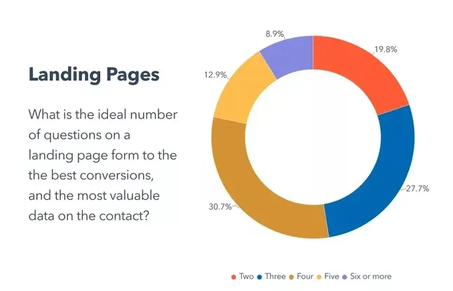
According to HubSpot, forms with just 3-5 fields have the highest conversion rates. This simple adjustment can make a significant difference in your form completion rates.
The math is straightforward - every additional field you add to your form creates another chance for users to abandon it. As explained in our article What is a Lead Magnet, you should only ask for information that's absolutely necessary for your next step with the lead.
For example, if you're offering a downloadable guide, you might only need an email address and first name.

Here's how you can reduce friction in your forms right now:
- Remove any fields that aren't essential for your immediate goals
- Use smart defaults where possible to speed up completion
- Place your most important fields first
- Break longer forms into logical step-by-step sequences
When reviewing your current forms, start by asking yourself: "What's the minimum information I need to help this person?" This approach typically leads to higher completion rates and better quality leads. Remember, you can always gather more information in follow-up interactions.
Key Take-aways:
- Limit your forms to 3-5 fields for optimal conversion rates
- Focus on collecting only essential information
- Consider breaking longer forms into multiple steps
Now that you've optimized your form length, let's look at how smart technology can make form completion even easier for your users.
Form Tip #2. Leverage Smart Form Technology
Smart form technology makes it easier for your visitors to complete forms, leading to better results for your business. According to Exatom, forms with auto-fill capabilities show 10-50% higher completion rates. This improvement comes from reducing the time and effort needed to submit information.
Implementing smart form features doesn't have to be complicated. Start with basic auto-fill capabilities that can pull information from browsers or previous form submissions. This simple addition helps prevent users from abandoning your forms due to repetitive data entry.
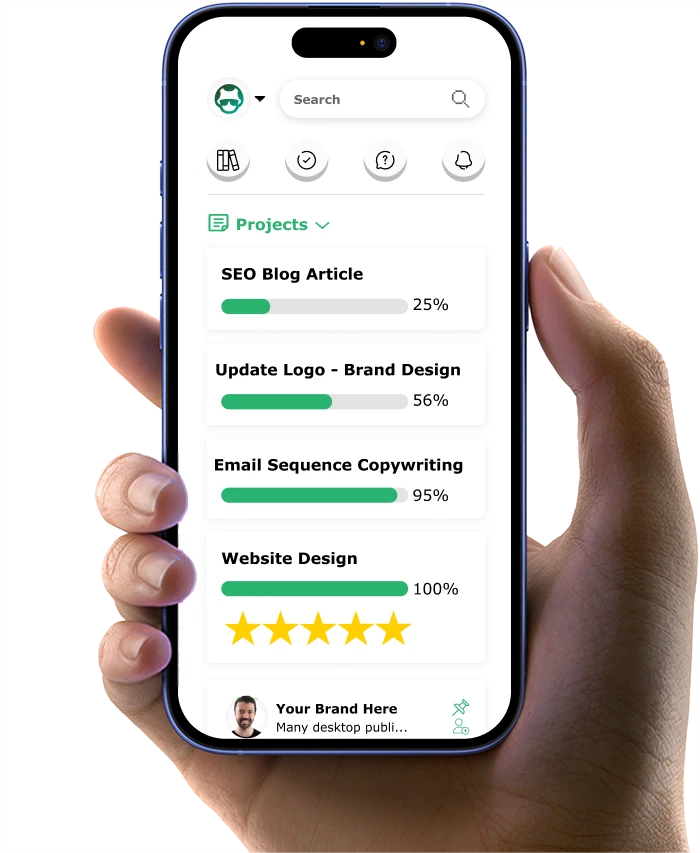
This is one of our forms that we use:
Here are practical ways to implement smart form technology:
- Enable browser auto-fill compatibility
- Add progressive profiling to gather information gradually
- Use smart default selections based on user location
- Implement real-time email validation
One effective approach is to use conditional logic in your forms. This means showing or hiding fields based on previous answers, creating a more personalized experience. For example, if someone selects "small business" as their company type, you can show relevant fields while hiding enterprise-specific questions.
Smart form features to prioritize:
- Auto-complete for common fields like email and address
- Inline field validation to catch errors immediately
- Smart defaults based on user data
- Mobile keyboard optimization for different field types
Key Take-aways:
- Auto-fill capabilities can increase form completion by 30%
- Start with basic smart features and build up gradually
- Use conditional logic to create relevant user experiences
Let's explore how these smart features work specifically on mobile devices, where most of your users will interact with your forms.
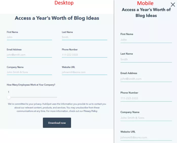
Form Tip #3. Mobile-First Form Design
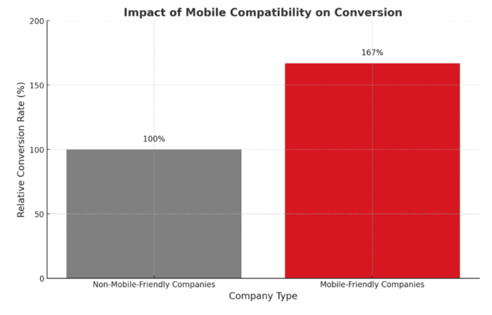
Your forms need to work perfectly on phones and tablets - there's no way around it. According to data, 80% of websites have implemented optimization as of 2024. And mobile-friendly companies are 67% more likely to convert.
Effective mobile form design focuses on thumb-friendly interactions. Think about how you use your phone - your thumb needs to reach all buttons and fields comfortably. When forms ignore this basic principle, users get frustrated and leave. Here is the form from Hubspot showing the difference between the form in desktop and mobile.
Here's what makes a form truly mobile-friendly:
- Large, easy-to-tap input fields (minimum 44x44 pixels)
- Sufficient space between clickable elements
- Clear, readable text (minimum 16px font size)
- Single-column layout for easy scrolling
The right input types make a big difference in user experience. For example, when someone needs to enter a phone number, your form should automatically bring up the numeric keyboard. For email fields, it should show the email-specific keyboard with the @ symbol readily available.
These practical adjustments help users complete your forms:
- Use appropriate input types (tel, email, number)
- Keep forms under one minute to complete
- Place labels above fields, not beside them
- Make error messages clear and easy to fix
Key Take-aways:
- Mobile optimization can increase form conversion by 81%
- Design for thumb-friendly interaction
- Use appropriate input types for different fields
With your forms now working well on mobile devices, let's look at how psychological triggers can further improve your conversion rates.
Form Tip #4. Implement Psychological Triggers
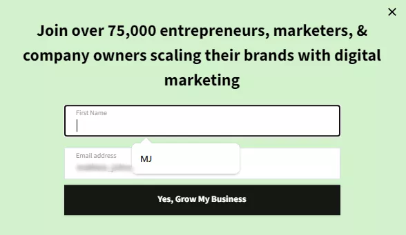
Small changes in how you present your forms can make a big difference in completion rates. According to different case studies, adding trust badges increases form conversions by 42%. In the examples in our article on trust seals, people need to feel secure when sharing their information.
Think about it from your users' perspective - they want to know their information is safe and valuable. Show security badges near sensitive fields like email or phone numbers. Add social proof elements like "Join 10,000+ satisfied customers" or "Used by companies like [recognized brands]" near your submit button.
Effective psychological triggers include:
- Security badges and SSL certificates
- Customer testimonials near form fields
- Progress indicators for multi-step forms
- Clear value statements about what users receive
Form Tip #5. Optimize Form Analytics
You can't improve what you don't measure. According to Insiteful, the average rate of form abandonment is estimated to be nearly 76%. With this, proper tracking helps identify exactly where users struggle.
Start by tracking basic metrics like completion rates and average fill time. Then dig deeper into field-specific data - which fields cause the most hesitation? Where do users commonly make mistakes? This information helps you make targeted improvements.
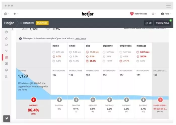
Key metrics to track:
- Form completion time
- Field-level error rates
- Abandonment points
- Device-specific completion rates
Form Tip #6. Perfect Error Handling
Nothing frustrates users more than unclear error messages. According to KlientBoost, real-time validation reduces form abandonment by 22%.
Good error handling means showing users exactly what went wrong and how to fix it. Instead of saying "invalid input," tell them "Please enter a valid email address ([email protected])." This specific guidance helps users correct mistakes quickly.
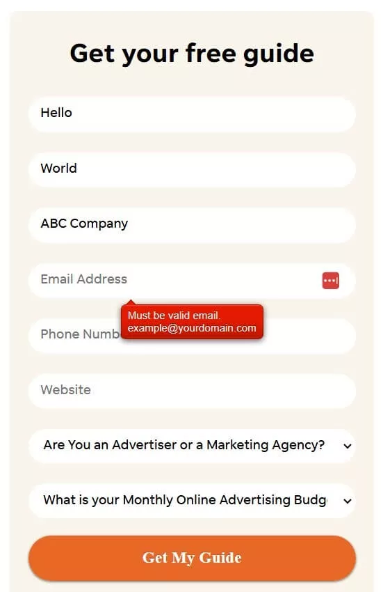
Error handling best practices:
- Show errors immediately after field completion
- Use clear, friendly language
- Highlight problem fields visually
- Provide examples of correct formats
Key Take-aways:
- Trust elements can boost conversions by 42%
- Track field-specific completion data
- Provide immediate, helpful error feedback
Let's look at how proper security measures can further build trust with your users.
Form Tip #7. Enhance Form Security
Security isn't just a feature - it's a necessity for your forms. FormStory shows that 27% of users abandon forms due to security concerns.
Start with the basics: SSL certificates and secure data transmission. Then add visible security elements that reassure users their information is protected. Remember to include clear statements about how you'll use and protect their data.
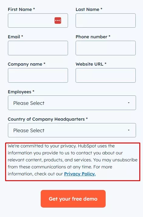
Essential security measures:
- SSL certification (HTTPS)
- CAPTCHA or reCAPTCHA integration
- Clear privacy policy links
- Data handling statements
Form Tip #8. Implement A/B Testing
Guessing what works best with your forms isn't effective. According to 99firms, A/B tested forms show 40% higher conversion rates.
Test one element at a time to understand what truly impacts your conversion rates. This might mean testing different button colors one week, then field labels the next. Keep detailed records of what works and what doesn't.
Elements to test:
- Button text and colors
- Field order and grouping
- Form length variations
- Different trust signals
If you want to get your marketing work done for your business (or for your clients’), then you HAVE to learn more how you can delegate unlimited marketing projects & tasks without the headaches of hiring. Download this free guide: 33 Examples of Marketing Projects You Can Delegate to Growbo
CONCLUSION
You've learned how the right mix of mobile design, security features, and user-friendly elements can boost your form completion rates. Let's turn this knowledge into action.
Here are your key next steps:
- Review your current forms on mobile devices
- Keep only 3-5 essential form fields
- Add visible security badges
- Write clear, helpful error messages
- Test one element at a time
Implementing these changes takes time and expertise. Instead of spending weeks figuring it out yourself, why not let our team handle it for you?
With Growbo, you'll get unlimited access to our marketing team. Think of it as having your own marketing department on demand - without the overhead costs. Book a call today to get started.
Have questions about form optimization? Share them in the comments below.
Keep Growin,’ Stay Focused,
![]()
Image Credits:
1 - https://blog.hubspot.com/marketing/landing-page-stats
2 - https://oddballmarketing.com.au/blog/how-many-websites-are-mobile-friendly-in-2024/
3 - https://blog.hubspot.com/marketing/mobile-form-design
4 - https://blog.hubspot.com/marketing/form-analytics