So Your Launch Sucked (Be Honest)

Picture this: It's 3 AM, and you're staring at your computer screen, bleary-eyed and frustrated. Your sales funnel, the one you spent weeks perfecting, is about as active as a sloth on a lazy Sunday. Sound familiar?
Trust me, I've been there. Just last year, my team and I were riding high on the excitement of our new AI platform, Growbo. We thought we had it all figured out - a groundbreaking product that would revolutionize how businesses handle repetitive tasks. But when we launched... crickets.
Here's the kicker: We're not alone in this struggle. According to Marketing Sherpa, a whopping 68% of B2B businesses haven't even identified their sales funnel. And it gets worse: 79% of marketing leads never convert into sales due to lack of nurturing. Ouch, right?
But here's where our story takes a turn, and where yours can too. We discovered that our user interface was the ghost in our machine, scaring away leads faster than a campfire story. What did we do? We rolled up our sleeves, listened to feedback, and transformed our UI from a haunted house into a welcoming home. And guess what? It worked. Research founds that clear communication can increase conversion rates by up to 113%, and we saw those numbers in action.
This is what we’re covering in today’s article (and video)—
- The common mistake we made and how you can avoid it
- Why user experience and clear communication are your secret weapons
- How to turn feedback into actionable improvements that skyrocket your conversions
Ready to exorcise the ghosts in your funnel and turn it into a conversion machine? Let's dive in.
Want to create a funnel or optimize an existing one for your business or your clients to scale your agency? We have
Setting the Stage
Before we dive into our epic funnel mistake, let’s talk about where we started. Spoiler alert: We were pretty excited about our new AI platform. But first, a little background.
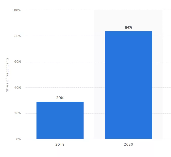
Growbo’s mission is simple: save business owners and marketers from the time-sucking vortex of repetitive tasks. We aim to automate these tasks with the help of AI. According to Salesforce, 84% of marketers were using AI in 2020, up from just 29% in 2018. Clearly, we were onto something.
Now, onto our grand plan. We had big goals. And why not? A study by CoSchedule found that marketers who set goals are 376% more likely to report success than those who don’t. We set out to conquer the world (or at least the marketing world) with our AI platform.
We shared a demo, got tons of sign-ups, and thought we were on the fast track to success. But, as you’ll soon see, things didn’t go exactly as planned. Let’s introduce you to our shiny new AI platform and how we thought it would change everything.
The Mistake
So, we had this shiny new AI platform, and we thought we were on top of the world. But then, reality hit us like a ton of bricks. Turns out, we made a pretty big mistake that almost tanked our funnel. Let’s break it down.
First off, we didn’t really nail down our sales funnel. According to MarketingSherpa, 68% of B2B businesses haven’t identified their sales funnel, and we were part of that statistic. This led to a significant loss in potential conversions and sales.
Then, our user interface (UI) was a mess. We thought it was fine, but users didn’t agree. Here is what it looked like before:
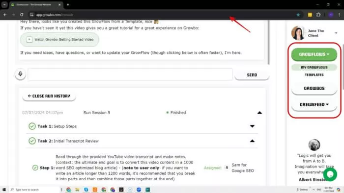
Take it from the Forrester Research that showed that a well-designed UI can raise your website's conversion rate by up to 200%, and a better UX design could yield conversion rates up to 400%. Clearly, our UI needed some serious help.
Our initial reactions? Panic, confusion, and a lot of head-scratching. We knew we had to fix this fast, but we weren’t sure where to start.
Identifying the Root Cause
We knew we had a problem butwe had to dig deep to find the root cause of our funnel fiasco.
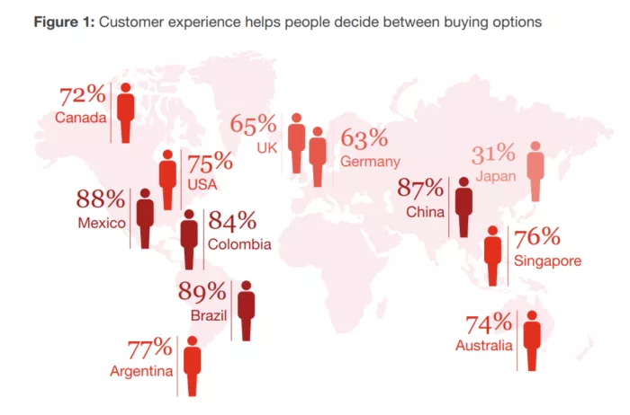
First, we turned to our users. According to PwC, 73% of consumers say customer experience is a big deal in their buying decisions. Yet, only 49% of U.S. consumers think companies actually deliver a good experience.
We gathered feedback from our users and team members. And they had a lot to say. This is also based on our experience before where we invited customer feedback which resulted in an increase in sales.
After sifting through all the feedback, we realized the core issue was our user interface. It was confusing and not user-friendly. No wonder people were dropping off! With this, we were ready to tackle the problem head-on and make things right.
The Solution
First on our to-do list is our user interface (UI). We knew it was confusing, and it was driving users away. According to Forrester Research, improving the UI of a website can boost conversion rates by up to 200%. Clearly, we were leaving money on the table.
We simplified the UI, making it more user-friendly and intuitive. No more confusing menus or hidden features. Everything was laid out clearly, and guess what? It worked.
This is what it looks like now:
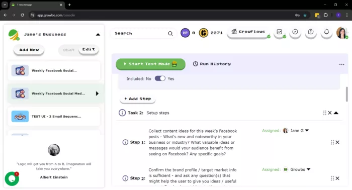
But we didn’t stop there. We realized that clear communication was just as important. A study by ConversionXL found that clear communication can increase conversion rates by up to 113%. So, we made sure our value proposition was front and center.
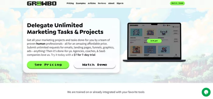
By addressing these two key areas, we turned things around. Our funnel was back on track, and we were seeing the results.
[yellowbox]Some companies don’t have the time (or the talent) to review their funnel. We can help. At Growbo, our sole purpose is to help you grow your business as fast as possible. Take the first step toward success with our expert assistance. Schedule Your Call today.
Results and Learnings
We made the changes and these are the results. First off, improving our user interface (UI) was a game-changer. According to Forrester, companies that improve their user experience (UX) can see a revenue increase of up to 15%. And we definitely saw a boost.
Next, we focused on keeping our customers happy. A study by Bain & Company found that increasing customer retention rates by just 5% can increase profits by 25% to 95%. We made sure our users were satisfied and engaged, and it paid off big time. Bain & Company.
By addressing these key areas, we not only fixed our funnel but also learned valuable lessons.
- Clear communication is everything. A study by Nielsen Norman Group found that users typically leave a webpage within 10-20 seconds. That means you’ve got to make your value crystal clear right away.
- The importance of continuous improvement. Report from the American Productivity & Quality Center (APQC) says “that 75% of top-performing organizations attribute their success to robust continuous improvement initiatives.” So, never stop tweaking and refining because there’s always room for improvement.
By focusing on these key areas, we not only fixed our funnel but also set ourselves up for long-term success. And guess what? You can do the same.
Conclusion
From our initial mistake to the lessons we learned, it’s clear that optimizing your sales funnel is crucial. But what about the future? Well, AI is going to play a big role in that.
Let’s recap the main points:
- Setting the Stage: We started with high hopes for our new AI platform, aiming to save time and automate repetitive tasks. The goal was to revolutionize how entrepreneurs and marketers handle their operations.
- The Mistake: We missed nailing down our sales funnel, leading to significant losses. Our user interface (UI) was also a mess, which drove users away.
- Identifying the Root Cause: By gathering feedback from users and team members, we realized the core issue was our confusing and unfriendly UI.
- The Solution: We improved our UI and focused on clear communication. These changes were crucial in turning things around.
- Results and Learnings: The improvements led to a significant boost in revenue and customer retention. We learned valuable lessons that can be applied to any business.
- Key Learnings and Takeaways: Clear communication and continuous improvement are essential. Always tweak and refine your processes to stay ahead.
What’s the takeaway here? Don’t wait to optimize your funnel. Start now. Use AI to automate tasks, improve your UI, and communicate your value clearly. And if you need help, Growbo is here for you.
Ready to fix your funnel and grow your business? Schedule your call today for better marketing solutions.
Keep Growin', stay focused,

Image credits:
1. https://heytony.ca/how-to-create-nurturing-content-for-facebook/
2. https://www.statista.com/statistics/1203315/ai-marketing/
3. https://www.pwc.com/us/en/advisory-services/publications/consumer-intelligence-series/pwc-consumer-intelligence-series-customer-experience.pdf


