How will the "Less is More" Technique Increase Your Conversions?
[caption id="attachment_9786" align="alignnone" width="500"] Courtesy : https://www.instantprint.co.uk/umbraco-media/1784/less-is-more.png[/caption]
“Less is more." The informal, overused adage really becomes significant when we talk about landing page optimization and conversion rate optimization (CRO).
Less links, distractions, “leaks” and options can lead to to increased conversion rates, leads and eventually, increased money in your pocket.
If you want to make your landing page perfect, you should ideally keep the options limited -- and in this case, less stands for ‘one’. In other words, your landing page should be created with a solitary goal in mind.
To make this happen, you need to understand quality conversion details, like the number of forms fields you should keep in the lead generation form and the number of social media sharing buttons you should incorporate on the blog to boost traffic flow. More importantly, you need to know what amount of ‘less’ is required to grow the conversion rate and the psychology of options.
Too many options drive people to a certain point where they are unable to choose anything. The same thing got reflected in the popular ‘jam study’ organized by Professor Sheena Iyengar. During some busy Saturday afternoons in an upscale grocery store, the team kept two sampling stations of jam in front of the shoppers, with one exhibiting 24 flavors and the other just 6 options.
The result was this: among all shoppers, a mere 3% bought from the first sampling station while 30% purchased at least one from the second.
The study proves that while the section that had more options attracted more observers, the actual sales were generated by the section with fewer options.
This psychology of option is highly applicable for online marketing as well.
Following are some proven techniques that you can use to increase your conversion and boost your ROI (Return on Investment).
Reduce Calls to Action
Any online marketer should definitely add some social media sharing buttons on their blog to share the content posted there. If you’re one of them, you should have a fair idea about the number of social media sharing buttons that your blog could have and how they would impact the social shares of your content.
You can consider using social media sharing buttons as small ‘Call to Action’ buttons. The more they are in number, the more they distract your readers. This way, they will ultimately end up sharing nothing at all.
[caption id="attachment_9784" align="alignnone" width="416"] Courtesy: https://vwo.com/blog/common-call-to-action-mistakes/[/caption]
Social Share Buttons
If you are in a dilemma while deciding upon the number of social media buttons or the particular buttons that you need to include, you should take the help of your referral traffic and audience demographics. Referral traffic shows you the source of your visitors and demographics show the networks on which your users are normally more active.
If your activity is significantly less or more on a certain network, you should take that account under consideration too. After all, your goal is to understand the browsing habits of your readers. You should include only those social buttons that are useful to them.
[caption id="attachment_9785" align="alignnone" width="500"] Courtesy: https://media.giphy.com/media/grNDsG4bMJRsI/giphy.gif[/caption]
Registration Options
In case of registrations options, the “less is more” phrase is highly applicable. If you give more registration options to your visitors, it’ll have a negative impact by decreasing the conversion rate.
On the other hand, limited and absolutely to-the-point registration process makes it much easier for the visitors to sign up. You should always remember that your main goal is to increase the conversion rate through various CTAs on your landing page.
[caption id="attachment_9775" align="alignnone" width="300"] Courtesy: Michael Flewelling[/caption]
Form Fields
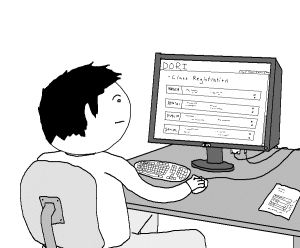
A number of form fields in your landing page play an extremely crucial role in increasing or decreasing the conversion rate. A lesser number of form fields means more lead generation. It's your call to decide whether you require more leads or leads of higher quality.
If you want to have more leads, you can keep the form simple and short but if you need more quality leads, it’s advisable to add some extra form fields. Whatever be the type you choose, always remember to test the form fields. Test the number of form fields and the entire information hierarchy.
[caption id="attachment_9778" align="alignnone" width="500"] So Many Fields! I'm Lazy ![/caption]
Visual clutter
“Visual clutter” irritates your site visitors. It’s very common among online marketers to add more content to the website in the form of special offers, benefits, testimonials, options etc. The sad reality is that all these elements actually create visual clutter and distract the users.
When your main aim is to increase the conversion rate, your focus should be on your target users. You need to help them focus only on what you feel is important (say, signing up for a newsletter, downloading a free software, registering with your site etc) for your business by cutting down on visual clutter.
[caption id="attachment_9776" align="alignnone" width="620"] Too many offers! Courtesy: http://i.dailymail.co.uk/i/pix/2009/09/20/article-0-030B972F000005DC-702_468x316.jpg[/caption]
Opt-in form rate
If one of your form pages is giving a conversion rate that matches your expectation, there's nothing to beat it. However, you may still have some chances to increase the opt-in rate of your web pages. It may happen that you’re missing some significant number of user clicks that could add some more conversion.
To figure this out, you can take the help of some powerful conversion rate expert tools that will dig out the exact problem and help you fix it.
[caption id="attachment_9779" align="alignnone" width="500"] Fix IT.[/caption]
Removing website distractions
“Less is more” holds true when we talk about website optimization. To make the website perfect, you need to make sure not to distract your site visitors and users with various links and similar elements.
For example, if you’re selling something through your website, you have to ensure a perfectly smooth process starting from the “add to cart” page to the “checkout” page without any distraction. You have to keep all the pages focused and eliminate every element that can cause a distraction to a user. Always remember that less distraction translates into better conversion rates.
[caption id="attachment_9780" align="alignnone" width="400"] Remove Distractions.[/caption]
Less Product Options and Promotions
Most new online marketers think that a longer product list will bring a robust conversion rate their way. However, the actual picture is absolutely different. A longer product list is found to decrease the conversion rate.
Remember the popular ‘jam study’ organized by Professor Sheena Iyengar that we had talked about earlier? It clearly showed that when you offer a lot of products to your customers, they have to understand the information, evaluate, compare with others and then decide. And they have to repeat this same process for each product and that’s really a lot of mental work.
That way, they often end up picking nothing and go to someplace else where the options are less. So, to increase the conversion rate, you should keep the promotions of products simple and targeted.
[caption id="attachment_9781" align="alignnone" width="300"] Product option[/caption]
Drop Down Lists
Drop down lists are normally included to minimize the user’s effort. Here too, you've to restrict the choices as lesser choices would help a user decide quickly. So, make sure to keep the options limited.
[caption id="attachment_9782" align="alignnone" width="360"] Courtesy: http://www.excelcampus.com/wp-content/uploads/2014/11/DependentDropdownListswithExcelDataValidationGIF.gif[/caption]
Rate Chart
It is a very common question among marketers to ask whether their rate of conversion is standard or not. To evaluate this, you have to use some powerful e-commerce conversion rate charts. However, you should not just focus on the present conversion rate. Rather, you should consider the steps that can be taken to increase it as well. You can increase the conversion rate of your website by decreasing the requisite steps to complete an action, thus gradually reducing the number of clicks. For this to happen, you should understand the conversion rates provided by the rate charts well and take the necessary steps, as and when needed.
[caption id="attachment_9783" align="aligncenter" width="450"] Rates[/caption]
Final words
“Less is more” doesn’t mean the elimination of products from your website or barely listing the top selling ones. Instead, you should organize your offerings efficiently to significantly increase your conversion rates. For streamlining the entire process, you can design specialized and specific categories for your products.
So, go ahead and drive your conversions north, with the "less is more” mantra.
Has streamlining your website had an impact on your conversion rates? Share any tips and tricks with other readers in the comments below!


