7 Examples of Zero Multipliers That Kill Conversions in Your Sales Funnel [+ How to Fix Them]
Sales funnels and relationships are similar.
Sometimes they work well and bring in happiness and wealth.
And sometimes they result in disappointment, headaches, and bankruptcy.
Sometimes relationships and sales funnel don’t work—even when you think you’re doing everything right.
You’re checking all the boxes.
You’re doing “everything” you’re supposed to do.
But still, no results.
So there’s nothing left to do. Right?
Wrong!
If something isn’t working in your business or in your personal life, you’re doing something wrong.
And you can fix it.
You can prevent errors that could be literally killing your conversions (or your relationship).
Today, instead of banging your head against the wall wondering what went wrong, I’ll help you out.
But only with your business...
With your personal life, you’re on your own .
In this article, I’ll show you…
- The 7 silent zero multipliers that are killing conversions in your sales funnel.
- How applying small—yet powerful tweaks to your landing pages’ elements can significantly up your conversions.
- Why not fixing these errors not only kills your conversions but costs you money, traffic, and leads.
I guarantee that if you take the minimal time or effort it takes to fix them today, you’ll see conversions skyrocket in no time.
Now let’s jump in!
In a rush? Want to download this article as a PDF so you can easily take action on it later? Click here to download this article as a PDF guide.

Zero Multiplier #1: Your CTA Buttons Don’t Work
A classic one!
Have you ever visited a page, scrolled up and down to see what they have to offer you, and finally been sold on it?
And then when you were finally ready to make the decision to opt in for their lead magnet, buy their products or services, and/or subscribe for their newsletter, your index finger clicks right on the CTA button and… nothing happened.
The button didn’t work.
You wasted your precious time on a website that didn’t care enough to have the call-to-action buttons properly set up.
So what do you do next?
You exit the window and never ever visit that website again.
Maybe as a punishment to them or just because you’re too disappointed.
Maybe a bit of both.
Now, if you’re the owner of that business, you just lost a potential customer.
You just lost a potential email subscriber. You just lost a lead. You lost an opportunity to make some well-deserved money.
And in all likelihood, you’ve probably lost 10s, 100s, or even 1000s just like it because of the same problem.
According to Hubspot, the top priority for marketers in 2020 is generating leads. So why would you not retain one?
Leads are valuable.
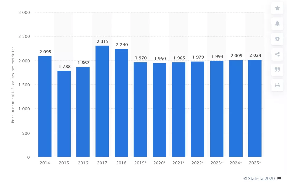
In 2019, the average annual prices for leads worldwide were $1,970 according to Statista.

Source: Statista
So what’s the point of having a beautifully designed website if your CTA buttons are broken?
What’s the point of your prospects clicking on them and not being redirected to the next step?
Remember, CTA buttons are high points of leverage.
They are the elements on your landing pages that make possible your prospects’ journey through one landing page to another one.
With misdirected CTAs, you’re essentially preventing your leads from buying your product or service. And why would you want to do that?
If you want to avoid these zero multipliers that can cost you thousands of dollars, before launching your website, ensure all CTA buttons work and redirect to the next page in order for you to take prospects down your funnel.
Don’t make your website go live before checking every single CTA button on your landing pages. Test them and double-check them.
Make sure they not only work but that they redirect you to the right page.
Then, you can hit “publish”.
Zero Multiplier #2: Opt-In Forms Don’t Work
It’s important that the copy on your opt-in form is compelling and incentivizes your target audience to take action. Otherwise, they may not fill out the form.
At this point, your prospects have clicked on your CTA buttons. And good job for that!
But now what?
You must ensure that after your prospects fill out your opt-in form, all the form fields actually work. Duh!
Sounds obvious but yet many websites make this error.
You can lose a lead if, for example, after filling out a form to download your checklist, no downloadable link is sent to your prospect’s inbox.
Or if for instance, they add their contact information to subscribe to your newsletter and never receive an email from you.
These errors are pretty common. I mean, who doesn’t make mistakes?
But it only takes one pair of eyes, common sense, and 15 seconds to test a form. It’s not that hard.
So errors like these are unacceptable. Especially when you have a team of marketing pros by your side.
At Growbo, we recently learned a lesson from a huge mistake.
And here’s what happened—and hopefully you’ll learn from this error too.
A designer set up a form on a landing page.
This was supposed to get people’s names, emails, phone numbers, and websites.
So anyway, what happened with the form was that the field that asked for the prospect’s website would only take as a valid answer a URL that would begin with “https://”.
You see, most people when asked to type their website, start with “www.” or skip that and just type the “abcdef.com” part. So no one was going to guess that they had to type “https://”.
But that wasn’t the only error.
The error message displayed when people wouldn’t add the “https://” on the field showed “Please enter your What is your current website or brand”.

Huh?
What does that mean?
It’s not solving the problem at all nor giving any guidance on what to do.
So that error cost Growbo between $30,000 - $100,000. And it all happened because:
1. The designer didn’t check the form.
2. The automation expert & apps manager didn’t check the form.
3. The project manager didn’t check the form.
4. It was not assigned to the QA specialist for review.
If you’re collecting a prospect’s contact information or you’re asking them to fill out a survey so you can segment your audience, how do you do that if your opt-in forms don’t work?
Test all the opt-in forms (exit intent pop-up, embedded widget, slide-in form) you connect to your CTA buttons.
Make sure everything is properly set up and that the prospect will be redirected to the next page.
And if you’re a bit skeptical about the importance of having your opt-in forms working properly, check out these stats from Hubspot:

Source: Hubspot
- 74% of marketers in 2019 were using forms for lead generation.
- 49.7% of marketers said that in 2019, forms were their highest converting lead generation tool.
- Forms with more than one step convert 86% higher.
- 40% of marketers use multi-step forms.
Sometimes A/B testing is the right guidance if you’re uncertain about which option will bring more results for your business.
For example, this case study analyzed in our Proven Sales Conversion Pack shows that utilizing a 3-field form increased ebook downloads by 120.39% to their website.
Before…

After…

More form fields usually mean more friction in the conversion process.
But in this case, it worked.
So no matter how many fields you have in your opt-in forms, you better ensure they work.

Source: Hubspot
You can be killing conversions by not setting up properly your opt-in forms.
They must work and redirect to the right pages.
And the automation should be properly set up so the prospect can get to the next step of your funnel.
Zero Multiplier #3: Email Automation Is Not Updated
Some people take for granted email automation and don’t check the automation trigger.
In fact, triggered emails delivered an average 75.1% higher open rate and 114.8% higher click rate according to the Data & Management Association.
Recently, we learned from another huge error.
Do you remember how we used to host weekly webinars of our service?
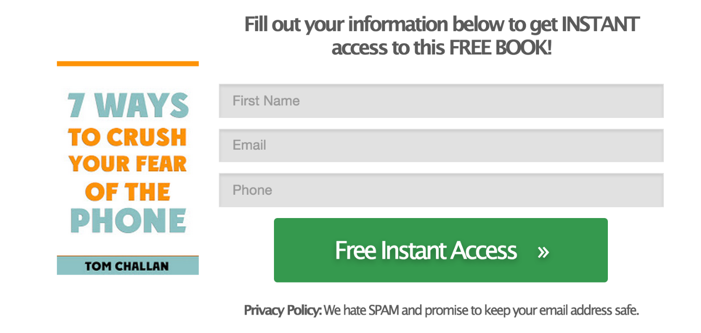
Well, if people couldn’t attend the live event, they could opt in to watch our on-demand demo video after filling out the form below.

The idea of having that form was to segment our audience and add the people into a specific bucket—”b2b demo” list.

Well, they were added to the “b2b demo list” after filling out the form but the list was not added as a trigger of the automation.
So after they would opt in, nothing happened.
They didn’t receive any of the follow-up emails we normally send to our subscribers to keep them interested in our content and service.
This error resulted in 128 contacts not receiving our email automation, therefore 128 leads were lost.
This error cost Growbo at least $6,600.
And all this happened because the automation expert & apps manager didn’t properly check the email automation.
Zero Multiplier #4: Each Landing Page Is Not Mobile Optimized
Nowadays, there’s a growing number of users who go online only via mobile devices.
The growth of the smartphone market never seems to stop.
According to Statista, more than half (52.6%) of worldwide web traffic came from mobile devices in 2019.

Source: Statista
And according to CNBC, by 2025, almost 72.6% of internet users will access the web via their phones.
That represents nearly 3.7 billion people worldwide.
This means that the desktop view of websites has been dethroned.
And this is no surprise to anyone.
We all carry around a phone all day long. Not a laptop. Don’t we?
So you better not only make your website desktop friendly, you must optimize each of your landing pages for mobile too.
For instance, avoid errors like these…

See how the location image takes up the entire screen? It looks fine on the desktop version but here on mobile, it’s confusing and off-putting.
Because if you’re looking to sell products or services on the web, online shopping via a smartphone represents 43% of internet users according to Statista.

Source: Statista
When you create a landing page, make sure all elements on your page are displayed correctly on mobile and most importantly, that they work.
Ensure that the text is easily readable, that CTA buttons and links are clickable, and that opt-in forms redirect to the right pages.
For instance, having a mobile-friendly dropdown menu can result in a 95% increase in revenue per visitor.
A sticky nav is fine too, but it’s better to collapse your nav choices into a hidden menu and label the icon as "menu".
Otherwise, you'll take up too much space which will make searching, finding, and buying your products or service more difficult.
And not only that, you should try to include a search option for people to easily find exactly what they’re looking for too.
Take Amazon as an example…

As a matter of fact, adding a search bar on mobile can result in an 18.73% improvement in completed orders.
It’s all about making it easy for your prospects to navigate through your site.
And having each of your landing pages optimized for mobile is as important as having them optimized for desktop.
Zero Multiplier #5: Unplayable Content
Coming across unavailable videos is annoying for anyone navigating through your site.
Take a look at the example below.

There are some types of videos like Flash that don’t work on all mobile devices.
This means the content can’t be played.
Hubspot’s survey shows that most people pay close attention to videos and that 45% of the people surveyed watch one hour or more a week of video content on different platforms like Facebook and YouTube.
And most importantly, people tend to thoroughly consume more and skim less with video content compared to text-based content.

Source: Hubspot
And according to Statista, the number of digital video viewers in the US is projected to pass 248.9 million video viewers in 2022.
So you need to make sure whatever video content you display on mobile is playable and has a supported format.
Doing so can prevent you from losing leads, money, and traffic.
Zero Multiplier #6: Fields in the Forms Are Not Required
Adding opt-in forms to your landing pages is a best practice for improving your conversion rates.
The number of fields you add to your forms will help you qualify leads for your business.
For example, adding just a field for the prospect’s name allows you to put their name into your newsletters’ subject lines.
And this best practice has been shown to increase email open rates.
According to Invesp, emails with personalized subject lines are 22% more likely to be opened.
But if you add a field for them to add their email address, BOOM, you’ll be able to reach out to them.
Now you have a way to nurture the relationship with that person.
There are many types of lead magnet pop-up offers guaranteed to convert email subscribers.
So whether you’re offering them your products or services, lead magnet, or anything in between, you’ve got their most useful contact info.
You can add as many fields as you consider necessary to segment your audience.
But wait a minute….
This all sounds great.
But what if people don’t leave their email address? How are you going to contact them again to turn them into customers?
You must add the required fields in your form.
This will be the only way you’ll make sure prospects will actually add their contact info.
Of course, they can always exit the opt-in form and leave.
That’s a possibility. But at least your purpose of getting their contact info won’t be ignored.
According to Nielsen Norman Group, using an asterisk to mark required fields is a common way to improve the usability of your opt-in forms.
And adding optional fields in your forms can make it pretty difficult for prospects to fill them out.
Here’s why:
- People don’t read instructions. If you add a low profile disclosure text saying which fields are required, prospects won’t see it. And after all, each field has a specific instruction (“Name”, “Last Name”, “Email Address”, etc.)—so why would your prospects need to read anything else?
- People forget instructions. Yes, even if the instructions are right there at the top of your form, people can forget them, especially if it’s a long form. And even if people wouldn’t forget the instructions, you’re making them work with their memory.
- People don’t have time to fill out the whole form. When forms are very long, people need to spend time they don’t have scrolling down and typing answers. If they’re interested in whatever it is you’re offering to them, they’ll skim through the form and fill out only the fields that are required to maximize time.
So the bottom line is you must mark required fields to make prospects know what contact info they really need to share, and so you can better segment your audience.
Not so long ago, a professional life and business coach for entrepreneurs we worked with was trying to segment his audience.
But his opt-in forms kept capturing irrelevant leads to get into a consultation call with him.
The problem was some of the fields (phone number and specific questions about the prospects’ businesses) weren’t required.
Therefore, all types of leads (including a homeless person) were requesting a consultation call with him.
After making some fields required, this coach was able to better qualify his leads.
He got to contact them (because now people had to leave their phone number) and make sure they were a fit for the consultation call.
Zero Multiplier #7: Not Having a Clear Call to Action Guiding Prospects to Take Action
The Law of Alignment and the Law of Visibility from the 11 Laws of Sales Funnel Physics play a major role here.
The first principle says that that which clearly lines up with other landing pages and with your prospects’ expectations is more likely to sell.
It refers to offering to your site’s visitors whatever they’re expecting to see and read about when they visit your landing pages.
Alignment deals with your customers’ intentions, questions, or context—and guides them through your funnel.
On the other hand, the Law of Visibility states that people will convert on offers that are highly visible.
And if prospects don’t see the offers, they won’t convert.
Simple.
And ultimately, your end goal is to take people to your key landing pages, right?
So sometimes a simple element on your landing page like your CTA buttons could be the cause of you leaking money.
And it all comes down to your CTA buttons not being visible and aligned.
For instance, to avoid this zero multiplier, meet people’s expectations by adding clear CTA buttons in your landing pages.
Be generous here.
Adding CTA buttons in strategic places on your landing pages will boost your conversions.
These will guide your prospects through your landing pages and eventually take them to your buy buttons.
Conclusion
Download the “7 Examples of Zero Multipliers That Kill Conversions in Your Sales Funnel [+ How to Fix Them]” so you won’t forget to take action on it later. Click here to download it now.
Zero multipliers are a threat to your business.
They kill conversions in your funnel and cost you money and traffic.
The thing is, they’re almost invisible.
They’re right there on your website but you don’t see them at first glance.
You need a magnifying glass—or someone from your team to find them.
But the truth is, you can and you will detect those errors so they don’t hurt your conversions.
And when you find them, fix them ASAP.
Most of them can take just a few minutes to correct them.
So one more time, let’s make sure these errors are not present on your site...
1. Zero Multiplier #1: CTA Buttons Don’t Work
2. Zero Multiplier #2: Opt-In Forms Don’t Work
3. Zero Multiplier #3: Email Automation Is Not Updated
4. Zero Multiplier #4: Each Landing Page Is Not Mobile Optimized
5. Zero Multiplier #5: Unplayable Content
6. Zero Multiplier #6: Fields in the Forms Are Not Required
7. Zero Multiplier #7: Not Having a Clear Call to Action Guiding Prospects to Take Action
And if you just can’t rely on someone on your team to fix this, then Growbo is here for you.
We are like project management software but with proven pros already inside, ready to work and to help prevent your business from a conversion massacre.
You just submit unlimited requests for emails, landing pages, funnels, graphics, ads—anything, and it’s all done for you.
We launch and/or optimize your funnel with zero errors so you can gain back traffic and bring in sales right to your pocket.
Because in the end, what matters the most for you and your business or agency is to keep on scaling. And that’s exactly what a flawless funnel should be like.
Now tell me something, how many of those zero multipliers have actually cost you money and traffic?
Is there one I didn’t include in this article?
Let me know in the comments below.
Keep Growin', stay focused.


