How to Grow Sales 32% By Increasing 'Depth' In Your Funnel
Listen on the go by downloading the audio of today’s video.
Join us on the journey to predictable growth. Each week we tackle a different level of your funnel, from traffic and email list growth to sales conversions and upsells. [thrive_2step id='19054']Sign up for our newsletter here[/thrive_2step] to get daily 10-minute #MattHacks videos.
- Today I’m going to discuss what to do when your sales funnel gets “stuck”
- What happens when you’re doing all the right things, but no one is buying?
- The fix is easier than you think.
Hey guys, how's it going? Matt Ackerson here, the founder of Growbo.com.
I just want to say thanks for being a subscriber and I hope that your day is going well.
In today’s video, I’m broadcasting to you live from beautiful Long Island, New York. I just got back from a year abroad, traveling through Latin America with my beautiful girlfriend.
We're getting ready to launch a new company with our first product. It's a really great refresher for me and I'm also learning a lot of new things that I look forward to sharing with you in the future.
Let’s Talk About Sales Funnels
Today, though, I’m going to talk about how to grow sales conversions in your sales funnel when they get stuck. When you've grown to a certain point and they just kind of plateau and you're not sure what should you be changing, what can you do?
What's holding sales back? Why aren't more people convinced by the value that you're offering them?
You look at your offer objectively, and maybe you're aware of what the competition is doing.
You feel that your audience is the right audience, you're targeting the right people, and they're coming in—but they just aren't buying.
You’ve plateaued and you can't seem to grow beyond it in terms of sales at the bottom of your funnel.
So what can you do?
A Question From The Audience
Let me tell you a quick story.
A little while back, when we were a productized sales funnel service agency, one of our clients emailed in requesting support and asking us to take a look at his landing page.
I was doing support that day, so I took a look at it.
His problem was just the quality of the design and the orientation of certain aspects on the page.
It’s memorable for me because he just sounded so desperate.
He said,
"Just tell me, why are people not converting on my page? It's setup. It makes sense to me. I feel like what am I offering is valuable, especially compared to the competition. I know what is working for them. Why is it not working for me?"
The Solution
I'll tell you the answer in the form of another story anecdote.
Last month, I was really proud to report 6 consecutive months of growth.
We stopped being a marketing agency and started selling our own products in 2017, and since then we’ve been unstoppable.
It’s really just a case of practicing what we preach.
We apply the auto growth funnel framework where we work on a different level of the funnel consecutively and just kind of go around in a loop, find the leaks, and fix them.
Take our Six-Figure Sales Funnel, for example. Sales were just okay when we first launched it a year ago.
Once I figured out the issue and made a change, sales increased by 34%.
So, what was the problem?
We needed a better quality design plus in-depth content (and this was also the answer to the question that our former client emailed in about where he felt like he was stuck).
Why Design Matters
Let me give an example because you might be like, “Well, duh. Obviously, you need a high-quality landing page if you want sales. Of course, Matt.”
Well, like this article says, using quality graphics conveys credibility and professionalism. And we weren’t quite hitting that mark.
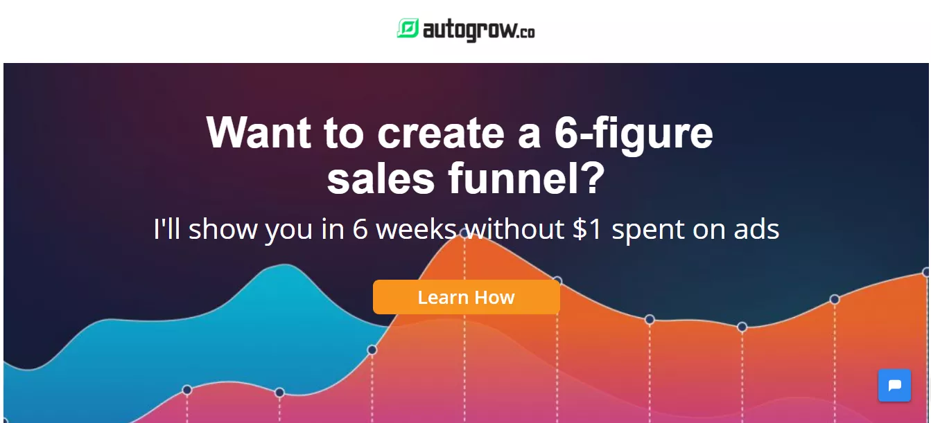
At the top of our first sales page from May, we had just a blank generic green background.

Some of the people watching this video may know what I'm talking about because they went through that launch funnel that we did.
A month later in June, when we relaunched it, the background looked much more premium.
It had two graphical charts with analytics sort of running parallel to each other. One of them goes up and then down, and then the other comes up.

It was a custom graphic and you could tell that it was a custom graphic.
That's what I mean by quality design.
What About Content?
So what do I mean by in-depth content?
In May I speculated that our audience wanted just bite-sized simple videos that weren't so in-depth. So the videos that I put out were between five to seven minutes in length.
They were just very, very simple.
And the sales page was also substantially shorter because of all the user testing that we did on our original sales page. A lot of the feedback said that at 4,000 words, it was way too long.
Now hindsight is 20/20.
Perhaps, I should have known that none of the people who bought from us had that feedback. None of them complained, "I'm considering buying it but there's just there's too much stuff here."
So anyway, for May, we had the shorter videos and we had the shorter landing page.
For June, we had a much longer landing page by about double the length, and the videos that we put out we're between 20 to 30 minutes each.
That's what I mean by in-depth content.
Final Thoughts
What I can tell you is that for every funnel that I have gotten my hands dirty with, whenever we got stuck or whenever I was taking an existing funnel and taking it to the next level, the deciding factor in the quantity of sales and the overall conversion rate was in quality design and in-depth content.
I'll end on this note:
All of the user testing that we did on our long landing page said, "Oh, this is too long."
But there was one user who said he scrolled down the page and scrolled down the page and he went back up and he said, "Hmm, this looks like a substantial offer, well thought out, looks like there's a lot of value here."
In other words, he was saying that because the landing page was long, it made the offer seem more thorough and more trustworthy.
So, if you feel stuck, you may want to evaluate the design foundation that you're working with.
- Is it cookie cutter?
- Does it look like a template?
- Is your copy generic?
- Are there typos?
- Are you making a very clear offer where you go in depth about the problem that you're solving?
- Do you offer a solution?
- Go over benefits?
- Create trust?
- Include a call-to-action?
- Do you break down the features, point-by-point?
That could be the thing that's really holding you back; in-depth content and quality of the design overall.
That's it for today's Matt Hack.
If you like this video, please let me know. I really appreciate any likes and shares and I love hearing from you, too.
If you'd like me to consider answering a question about creating your sales funnel or optimizing, I'll be happy to read your email or read your comment and consider it for a future Matt Hack video.
As always, be sure to subscribe to get daily Matt Hacks just like this one.
I’ll see you in the next video. And remember, my name is Matt Ack in the Matt hat, delivering you your daily dose of Matt Hacks.
Keep hustling. Stay focused.
Want more sales? Download my [thrive_2step id='18964']11-Point Perfect Sales Funnel Checklist[/thrive_2step] or invest in our Sales Funnel Blueprint which is currently discounted.


