Ultimate Guide to Creating a Lead Magnet Design in 9 Steps

During my first year in business, I woke up every day at 6 am to write content for my blog.
I’d sit in front of the laptop for hours. Fingers clacking away at the keyboard. Steamy coffee cooling to my right.
I started out by creating a list of blog post topics relevant to our target audience.
Then, I turned those titles into outlines and those outlines into articles.
After one month, our website’s traffic grew to 5,000 visits. But the company didn’t bring in any clients from this!
:: Bummer bro! ::
While it felt good to see those numbers rise, I was still banging my head on the wall (not literally) wondering what went wrong.
I realized then it wasn’t what I was doing. It was what I wasn’t doing.
I wasn’t offering a lead magnet.
So I started collecting the names and emails of my readers and sent them newsletters.
And I offered free downloads of my articles and different downloadable resources like checklists, free training, and templates in exchange for their email addresses.
The result? For every few hundred people who read my articles, I received a few dozen leads with a 4-5% conversion rate.
I was creating lead magnets and that was what generated leads. But I noticed yet another problem though: some leads were better than others.
And that’s when I started investing more not just in creating lead magnets, but in making sure the design made us look super professional.
So, in today’s article, I’ll show you:
- How to create an impeccable lead magnet design that gets your customers to actually hit the download button.
- Why your design matters for conversions and why it’s not all about the content of your lead magnet.
- And real-life examples of what to do and what not to do when creating your lead magnet design without the input of an expert designer.
It’s time to craft your high-converting lead magnet.
Ready? Start your timer...
In a rush? Want to download this article as a PDF so you can easily take action on it later? Click here to download this article as a PDF guide.

Why Is Your Lead Magnet Design Important?
That’s a great question whose importance most marketers, unfortunately, underestimate.
Lead magnets are important for your sales funnel because through them, you’re able to compile a large list of contact information and build your email list.
And with that information and email list, you can then reach out to prospects and nurture them until they come back to your site and buy your products or service.
If you’re a food lover, you’ll understand why a lead magnet is a piece of cake (literally).
When you bake a delicious chocolate cake (or vanilla because it’s more delicious actually), you hope that by offering someone a piece or slice of your cake, they’ll come back and ask you for more.
You want that to happen because you’re proud of what you baked and you’re confident it’s worth sharing it.
The same thing happens with your lead magnet.
When someone visits your website, you offer them a portion or a taste of your product or service through your lead magnet offer.
And when they download it and consume its value, they come back to you to buy your products or services.
But to get people to buy your products or services, your lead magnet must first be appealing. It must be attractive. It can’t be bland.
And the best way to make a great first impression with your prospective customers is to show them a well-designed lead magnet.
And this article will teach you that: how to create a high-converting lead magnet design.
You want to get as many prospects to notice and download your lead magnet as possible. And its design plays a big part in determining your lead magnet’s effectiveness and success.
You can create a beautifully designed landing page to promote your lead magnet. But if you don’t create an eye-catching lead magnet, prospects won’t download it.
Now, let’s go through the steps that show you how to create a lead magnet design that pops in less than 8 hours.
Step #1: Choose Which Type of Lead Magnet Aligns Best With Your Offer
Super important!
When creating your lead magnet design, you’ve first got to choose which type of lead magnet aligns best with your core offer.
This means, if for example, your business is in the healthy food and fitness industry, then it would make sense to create your lead magnet around the topic of food. Right?
You obviously wouldn’t offer a demo video related to cars (hopefully that doesn’t even cross your mind).
What would make the most sense is to offer a recipe book or a cooking tutorial on how to make healthy meals.
You see, we’ve created tons of lead magnets for our clients.
And right now through Growbo’s marketplace, you can order your customized lead magnet and we’ll create it for you regardless of your business industry.
Checklists
The simplest lead magnet that can get a lot of traction is a checklist.
I’ve taught you in the past how to create a checklist.
In our experience, this converts the best quality leads out of all the lead magnet types.
This is because they are easy to create, easy to consume, and require low commitment.
They also eliminate guesswork and prospects get value right away.
Checklists are high-converting because they can work across any business industry.
You can put together everything that your site’s visitor needs to know into one, actionable list.
See how in the example below, the title condenses 10 points on how to outsource AI software development?

Another reason why you should create a checklist and offer it to your audience is that you can literally turn anything into a checklist.
Have a training course?… Split the modules or lessons into several numbered steps.
Have an article in your blog post with the sky-high traffic?… Simplify fit into a series of bullet points with checkboxes.
Have a compelling ebook that you haven’t yet published?… Turn it into a solid checklist.
Checklists are easy to create.
Take a look at some of the ones we’ve created for different business industries…
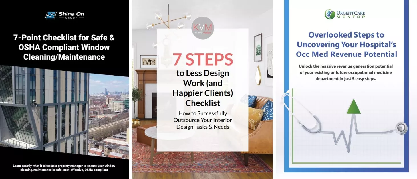
I know what you’re thinking. They’re gorgeous, right?
We designed them all and we can create your lead magnet too.
See how we used high-quality, yet subtle images that make the text of the title pop?
And see how we used high-contrasting colors so the cover stands out?
Ebooks
Oh I love this one.
And I love it so much that I actually created an ebook called “Productize & RELAX.”

Well, I never offered it as our lead magnet but definitely worth sharing the anecdote.
Ebooks make great lead magnets because they let you educate prospects on a topic in a more detailed and extensive way than checklists.
The more content you can give away for free the better.
But don’t worry.
You don’t have to write a 500-page informational guide on your topic to get people to opt in.
The great thing about lead magnets is that you don’t have to invest days and weeks into putting together a long and extensive resource.
You can simply turn a long and boring PDF document into a digestible ebook.
Make it easy to follow with bold headers and specific sections.
And finally, to get people interested in your lead magnet, you must design an attractive ebook cover like the one from my ebook.
Ebooks are a great choice.
In fact, in 2018, about 26% of American book consumers read an ebook according to Statista.
And between January and September of 2018, revenue from ebook sales in the U.S. amounted to just under 771 million U.S. dollars.
I’ll let those stats speak for themselves.
Training Videos
Online courses and video training help people learn and get better at a certain skill.
For example, our 6-Figure Sales Funnel training helps people create a lead gen funnel in 3 weeks.

According to Google, 70% of B2B buyers and researchers are watching videos throughout their path to purchase.
Creating an entire video course can take a lot of time, but it’ll certainly pay off in the long run.
For example, you can create a free 7-day course like the one below and send out one video each week.

This much content will have people signing up for your lead magnet in no time.
But your biggest consideration when choosing this type of lead magnet is to align it with your audience’s needs and relates to what you want to sell them.
Remember, unless your lead magnet is beneficial to your audience, they won’t opt in.
Other lead magnet types to consider creating are:
- Demo Videos
- Guides
- Free Shipping
- Report
- Coupon
- Cheatsheet
- Case Study
- Spreadsheet
- Webinars
- Toolkit/Resource List
- Templates
- Recipes
- Free Trial
- Audio File
- Discount
- Swipe Files
- Cookbook
- Inspirational Quotes
- Tutorial
- Transcripts
- Quiz/Survey
- Printable Poster
- Assessment/Test
- Plug-In or Web App
- Sales Material
- Desktop Wallpaper
- Catalog
Step #2: Create the Content for Your Lead Magnet
Before designing your lead magnet, make sure you have already written the content.
You can use Google Docs or Microsoft Word for that.
These are probably the easiest to use tools to create your content, and best of all, they’re free.
Creating your lead magnet content early in the process will let you focus only on the design.
I’d say the design of your lead magnet and its content are equally important.
And most people fail in this step because they underestimate the importance of each.
They spend hours, days, and weeks putting together awesome content but then they create a horrible design that results in the lead magnet not being downloaded.
And some marketers do the opposite.
After hiring an expert designer who can craft the most beautiful and perfect design, marketers forget the single most important thing their lead magnet should offer: value.
Step #3: Use the Best Tool to Create Your Lead Magnet Design
There are plenty of affordable and cheap tools out there to create your lead magnet design.
Here are some you can try:
- Canva: This is a friendly free graphic design software with paid content upgrades.
- Raw Shorts: Drag and drop explainer video software.
- Stencil: Its features aren’t as extensive as Canva, but you’re able to create images faster.
- Draw.io: Free flowchart and diagram builder.
- Ease.ly: Free infographic designer with paid upgrades.
- Piktochart: Web-based tool for creating charts in the form of infographics.
- Infogram: Turns data into a pretty visual.
- CamStudio: Screencasting program.
- MeetingBurner: Free webinar service.
- Typeform: A beautiful quiz/form creator that has a free option.
However, my top recommendation is without a doubt, Adobe Illustrator.
This is the tool our designers use at Growbo and here are some of the advantages of using it:
- Fast to learn and easy to use
- Works with artboards
- Easy saving .pdf process
- No need to have separate tools for creating clickable buttons
- Optimization for fast web view feature
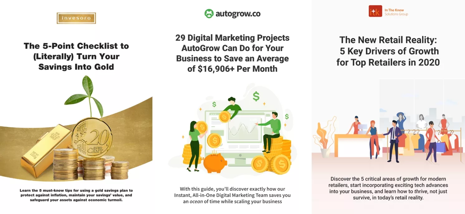
There are plenty of lead magnet examples out there. But here are some that Adobe Illustrator has let us create…
Step #4: Choose the Font Style & Size That Feels Integrated With the Design
An important step that most designers (and reviewers) miss is this one.
When designing your lead magnet, all elements matter—content, font styles, font sizes, images, white space. They’re all an important part of the overall look.
Especially since your lead magnet will be downloaded from your lead magnet landing page, they should both have the same design style.
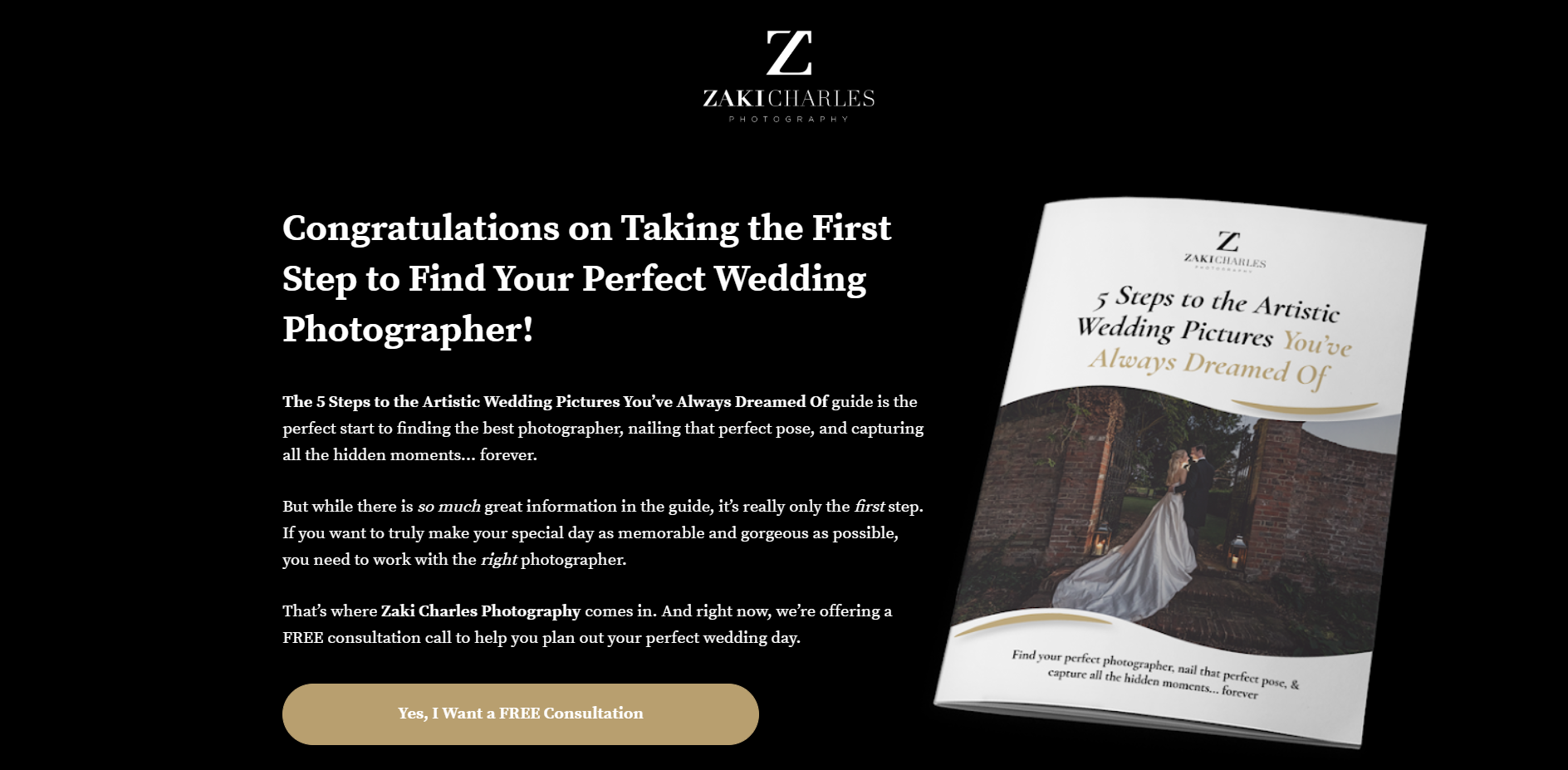
Let’s take a look at this lead magnet.

It’s a guide for brides to learn how to hire the perfect photographer and get the wedding pictures they’re looking for.
Since this guide is for the wedding and brides’ industries, it made sense to use an italicized font style.
Not using font styles like these…


And since this guide was downloaded from this photographer’s lead magnet landing page, both the guide and landing page had a similar font style.
But most people underestimate the power of font styles.
They think that when it comes to designing, fonts are not as important as the other elements of the design.
But the truth is, font styles and sizes should match your target audience.
According to Neil Patel:
“Typography is crucial because it can make the whole process of understanding and comprehending information effortless.”

For example, if an audience targeted is women between the ages of 50 and 60s, then a larger font size would make the most sense since it would make the reading experience more comfortable.
When choosing your font styles, Google Fonts are the best. And since the text must have good readability, I recommend you using font sizes between 11 and 16 points.
Step #5: Copy the Text from the Google Doc & Add It to Your Draft
This is another important step in the design process.
Whether your copywriter wrote the content of your lead magnet, or you did it yourself, the content must be accurately added to the tool you’re working with.
This is a step that we always ensure we don’t miss.
Because it has happened that sometimes when designers copy the text from the Google doc to Adobe Illustrator, some sections and headlines have been missed.
So we always compare the copy in the Google doc and the text in the finalized PDF to make sure any sections from the content weren’t missed.
Unfortunately, with some tools, you have to manually copy/paste the text and this makes it easier for sections to be overlooked.
And sometimes you also need to manually make fonts bold or italic because when you copy them from the Google doc and paste them to the tool, the formatting is reset.
Step #6: Read the Content & Empathize With the Value Proposition to Find & Create Relevant Images
No one will download your lead magnet if the design isn’t empathetic.
Let me ask you a question.
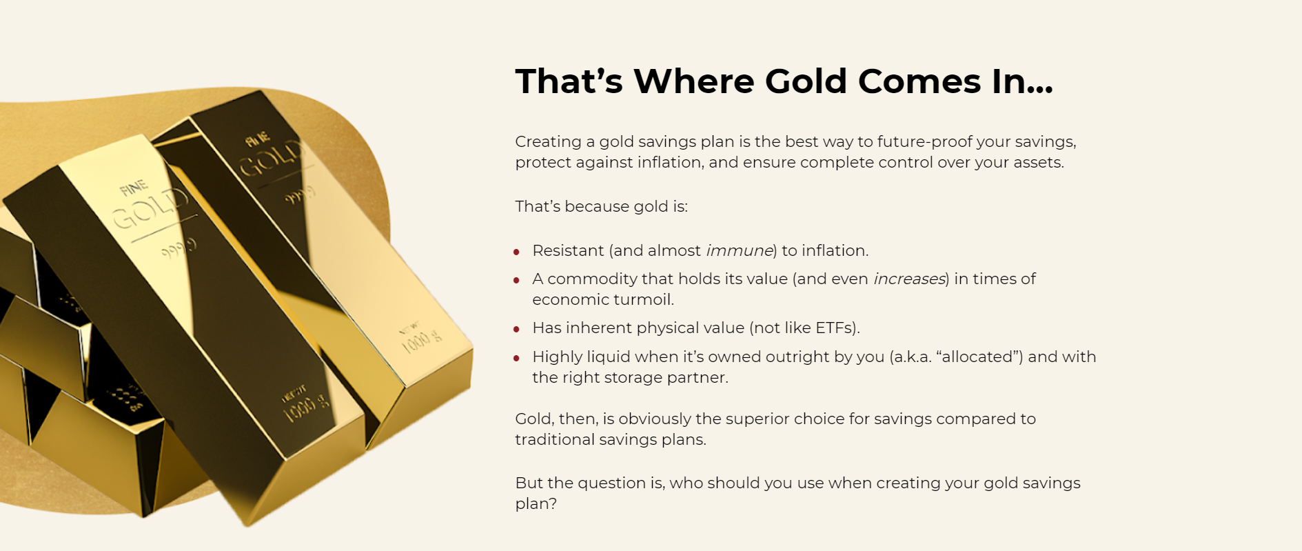
What do these illustrations make you think?

They’re too busy and have a lot of elements that don’t feel integrated, right?
They were illustrations for a gold investment company that provides gold saving plans.
If you were to invest in gold and you see those illustrations you probably wouldn’t trust the website very much, would you?
Fortunately, the design evolved and turned into this…
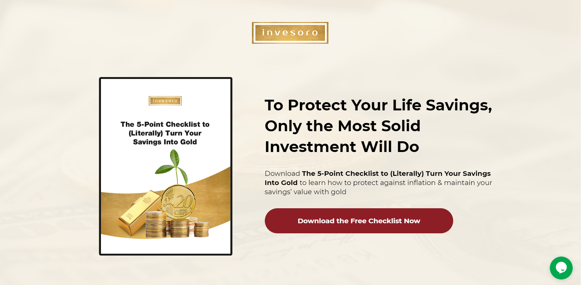
The design improved dramatically, didn’t it?
I doubt people looking to invest in gold wouldn’t take this service too seriously after seeing seaweed around money.
What I’m saying is, you need to create a design that feels integrated and that resonates with your target audience.
You need to create a design where all elements feel like a part of the whole. Where people will feel identified with by simply seeing the cover.
So start by targeting your audience.
Begin by choosing an image for your cover.
Remember the guide this wedding photographer was offering to brides?
The cover had a picture of a couple on their wedding day.

It completely targets the right audience.
No one in the food industry would feel identified with it. Only brides.
That being said, one of the best practices we follow at Growbo when designing lead magnets for our clients is to add the logo, a clear headline, an eye-catching image, and a sub headline that supports the value proposition from your headline.
Here’s an example of it.

See how the cover is easy to digest and its content is clear and flows?
By simply reading the text and seeing the illustration, you understand it is a cleaning service provider.
And if you add stock photos, consider adding the ones that look less like stock images. Where the people don’t look like models.
See the difference between the images below?

Which one looks more natural?
You guessed it! Neither.
Also, look for images where the people shown are your target audience.
For example, if you’re targeting dentists, add images of people wearing dentists’ gowns. Not a group of people wearing jeans.
Or if you’re targeting men between their 50 and 60s, use images of older male adults. Don’t add images of teenagers or women in their 50s.
Sounds basic but I’ve found this a surprisingly typical zero multiplier that kills conversions.
So take some time to read the content of your lead magnet. And ask yourself what is the value proposition? Who is the target audience?
That’ll help you add value to your lead magnet through the design.
And never forget to use high-res images.
Using low res images is another zero multiplier that kills conversions.
Can you see the difference in the quality in the images below?

Of course you do and so do your prospects.
Unsplash, Pixabay, and Freepik are the best free tools for downloading high-res photos and the ones we use all the time.
The last one is actually better if you’re a premium member because you have access to more images.
For adding emojis, Emojipedia is the best high-res library.
For adding mockups, Mockupworld is the best tool. We add mockups all the time for the lead magnet landing pages we create for our clients.
It makes the lead magnet look like an actual physical product.
And for adding icons, Flaticon.
However, I recommend not adding too many images or illustrations per page in your lead magnet. Otherwise your lead magnet design will look like something like this...

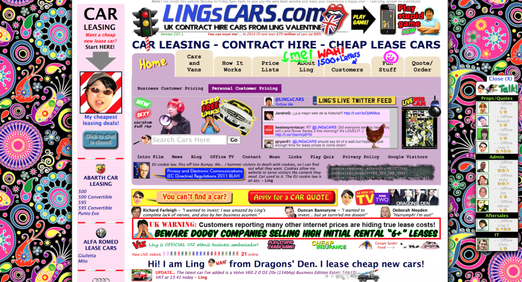
So add one image per 1 or 2 pages.
You don’t want to make your design look overcomplicated and overwhelming. Keep it minimalist and simple.
Take a look at the examples below.
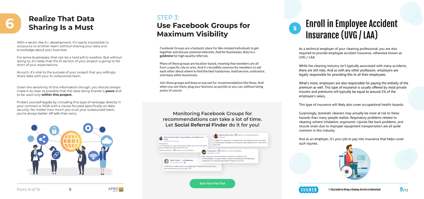
See how few design elements were added and that actually helped the design look even more premium?
Step #7: Make Each Main Section of Your Content Start on a New Page
Let me show you what I mean with an example.
Isn’t it better to start reading a page that starts with a headline like this...
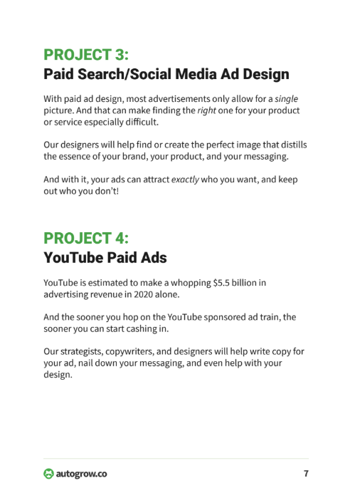
Rather than this...

See how the text kind of interrupts the flow of the reading?
Aesthetically, it will make your lead magnet design look much more organized if you start each page with a headline or subheadline instead of breaking a paragraph.
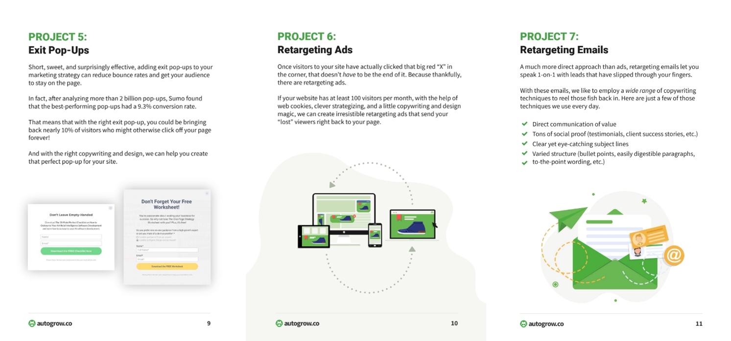
This’ll make the reading process smoother and more pleasant for the reader.
Step #8: Optimize All Images With This Tool
A great design is not all about beautiful images and illustrations.
Yeah, that’s part of it, but it’s also about adding high-quality images.
I mentioned briefly above how your images must be high-resolution.
Using low res images will only make your design (and your business) look cheap and mediocre.
And who’s going to want to buy from someone who looks cheap?
You guessed it, no one!
That’s why you want to optimize each of your images for the highest resolution possible.
And for this, the best tool to do so is Tinypng.
It reduces the file size of your PNG files but images remain large so the quality of the images is not lowered.
Step #9: Optimize Your Lead Magnet
Optimizing your lead magnet is a key part of your conversion strategy.
This lets you identify potential areas of improvement that could be holding your prospects from downloading it.
For instance, make sure all your CTA buttons clearly state the action you want your prospects to take.
In fact, 70% of B2B small businesses don’t even have CTA buttons in their websites according to Delhi School of Internet Marketing.
All CTA buttons should be aligned with the next steps you want prospects to take down your funnel.
For example, if you want them to learn more about your business, then a CTA button to learn more would be the way to go. Not “sign up”, right?
Make sure the Law of Alignment from the 11 Laws of Sales Funnel Physics is followed.
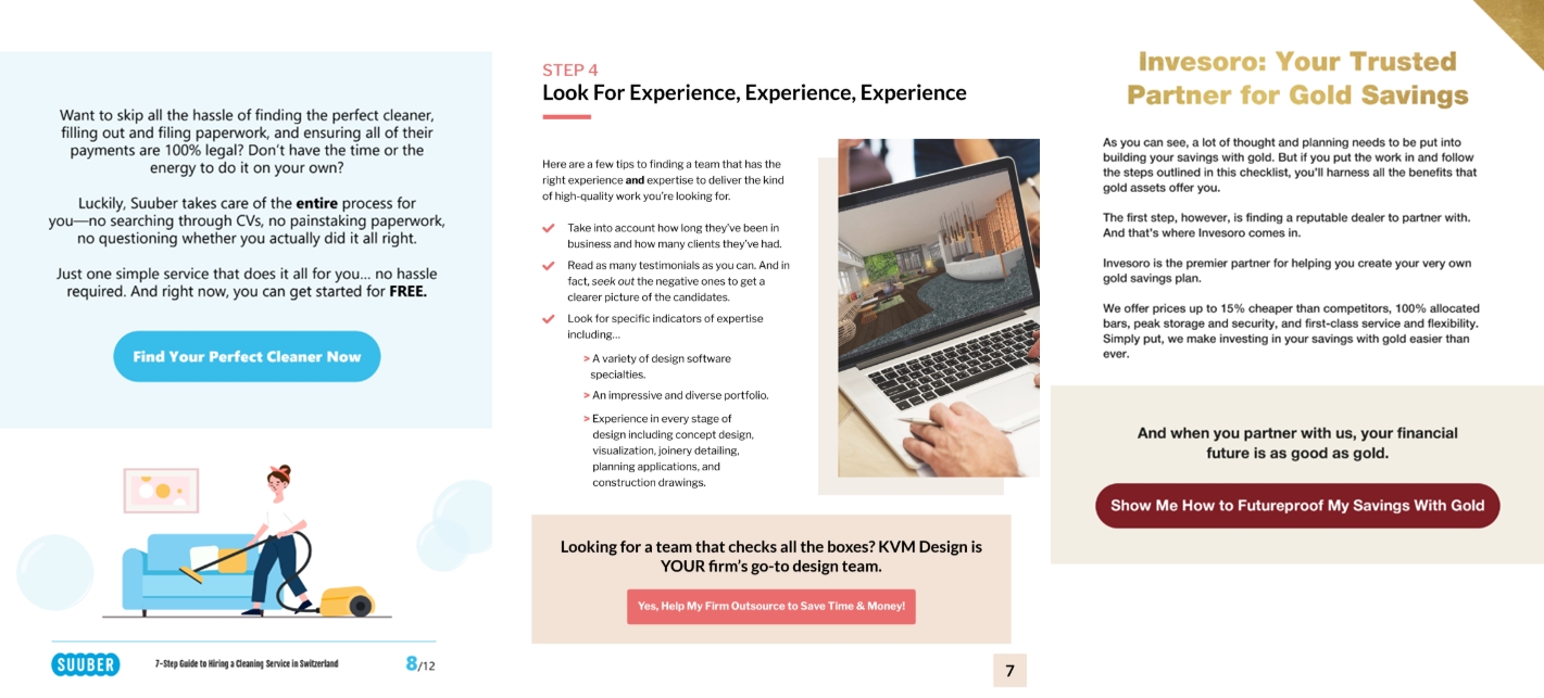
Also, make sure your buttons actually look like clickable buttons. For instance, add rounded corners.
And last but not least, use high-contrasting colors that make your buttons stand out like the ones in the examples below.
Bonus Step #10: Design a Landing Page to Promote Your Lead Magnet
A landing page is a separate webpage that acts as the final sales page for your lead magnet.
Links and call-to-actions will lead readers to this page, and it’s now your job to convince them they should officially opt-in.
With a landing page, you have more room to convince users they should opt in and receive your lead magnet.
There’s more opportunity to use testimonials, vanity stats, and promotional content to make the sale.

Have a headline that clearly tells the user exactly what they want to hear.
Then, include text that explains why the user needs your lead magnet right now.
Finally, choose a bold call-to-action button that screams at the visitor.
The landing page is your final attempt to get visitors to opt in for your lead magnet. So make sure you design it well.
Conclusion
Download the “Ultimate Guide to Creating a Lead Magnet Design in 9 Steps” so you won’t forget to take action on it later. Click here to download it now.
Those are the 9 steps to take to create your lead magnet design and boost conversions:
- Choose Which Type of Lead Magnet Aligns Best With Your Offer
- Create the Content for Your Lead Magnet
- Use the Best Tool to Create Your Lead Magnet Design
- Choose the Font Style & Size That Feels Integrated With the Design
- Copy the Text from the Google Doc & Add It to Your Draft
- Read the Content & Empathize With the Value Proposition to Find & Create Relevant Images
- Make Each Main Section of Your Content Start on a New Page
- Optimize All Images With This Tool
- Optimize Your Lead Magnet
- BONUS: Design a Landing Page to Promote Your Lead Magnet
They can be done in less than 8 hours, and best of all, you don’t need the input from an expert designer.
And of course, if you need help with your lead magnet, good news!
We recently launched Growbo’s marketplace. Check it out.
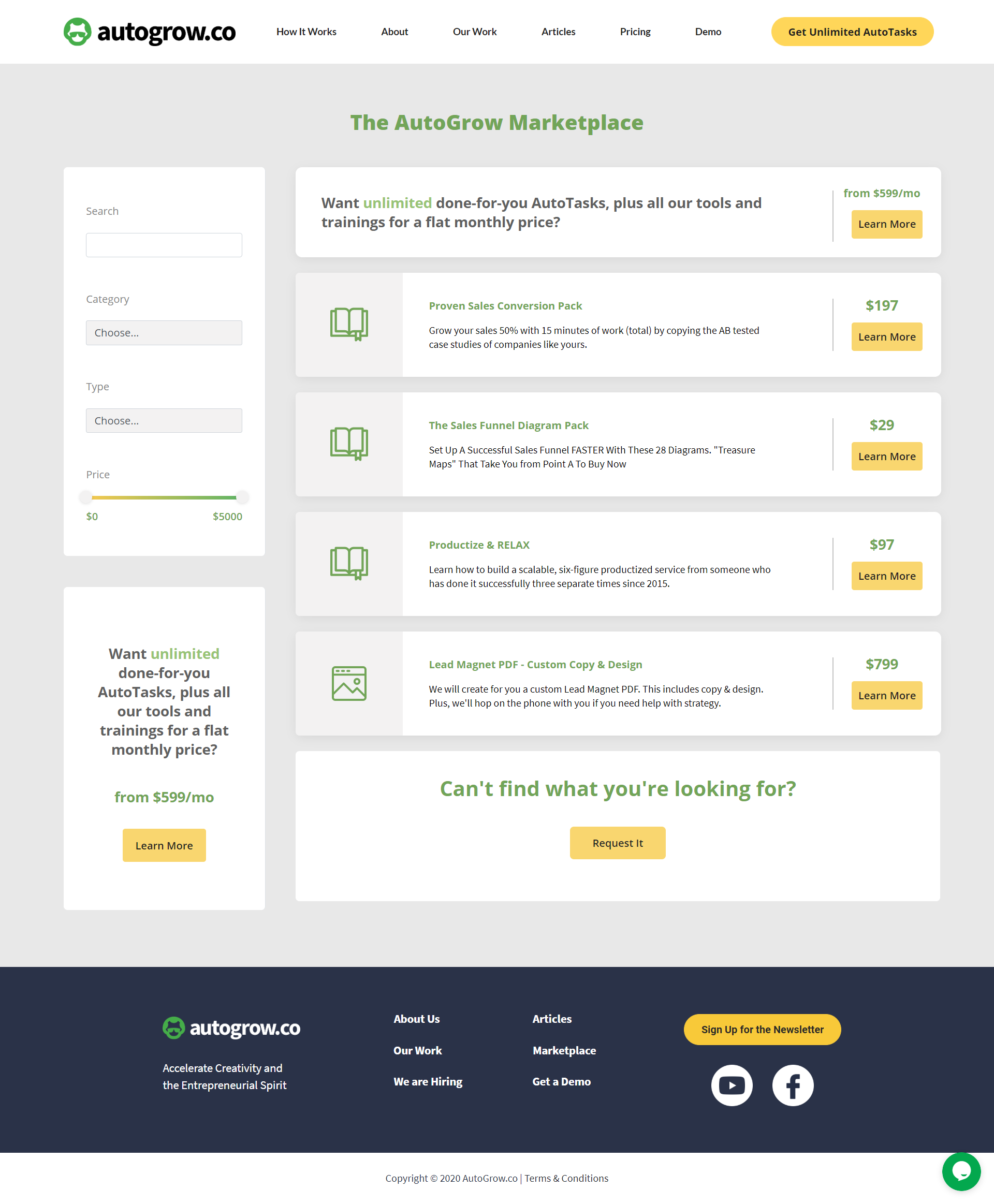
In it, you can find all of our info products, tools, and training.
Plus, if after reading this article you don’t feel very enthusiastic about creating your own lead magnet, no worries, Growbo’s got your back.
We can create a perfectly customized lead magnet for your business—no matter your industry. All for a fixed price.
But if you feel confident you can nail that high-converting lead magnet design, here are all the steps in a nutshell.
Now tell me something, have you tried designing something in the past?
Have you tried any of the steps listed in this article?
Which ones do you think are more effective?
Let me know in the comments below.
Keep Growin’, stay focused,


