9 Examples of Bad Landing Pages (And How to Fix Them)
Halloween might be over, but that doesn’t mean we’re out of spooky stories.
Have you ever stumbled upon a horrible landing page that you just knew wouldn’t get your money?
As marketers, we’ve all seen them. We even feel bad sometimes because we can tell what the landing page is trying to accomplish, but we can clearly see it’s not working.
When I started Growbo, before we had a sales funnel in place, I used to hustle for client leads at networking events.
At one event, I did a live presentation on good landing pages versus bad landing pages.
The example of bad landing page I shared had graffiti in the background, the text was unreadable and the page itself looked like it was designed in 1992.
But that’s not the type of landing page I’m talking about when I say “horrible” here.
I’m talking about landing pages that have a clear purpose and marketing goal, but are just horrible at getting their point across for conversions’ sake.
So today, I’m sharing 9 of these examples of bad landing pages, and the “spooky” conversion lessons we can learn from them.
I’ll also be sharing ways you can fix these landing page blunders if you’re mimicking them on your own pages.
Ready, Freddy? ;)
Discover common landing page mistakes through real examples and learn how to fix them. This article analyzes 9 landing pages from well-known brands, highlighting critical errors in design, CTAs, and user experience that could be hurting your conversion rates.
Table of Contents
- Chase.com - Multiple CTA Confusion
- Frontier Communications - Poor Design Elements
- MultiTouch - Generic Content Issues
- Zendesk - Homepage Landing Page Problems
- Big Barker - Content Overload
- SAP Software Solutions - Cluttered Layout
- Loup - CTA Overload
- Advanced Hair Studio - Poor Organization
- The Content Folk - Missing CTAs
Want to get all your marketing and funnel work done—without the headaches of hiring a team? Download our free guide: 33 Marketing Projects You Can Delegate to Growbo and discover how to save 100+ hours a month, grow faster, and scale without the overhead.
These painful design and UX mistakes will sabotage your landing pages—watch this teardown to see what not to do.

Bad Landing Page Example #1. Chase.com - A Lesson in CTA Overload
According to a 2023 HubSpot study, landing pages with a single CTA have a 13.5% higher conversion rate than those with multiple CTAs.
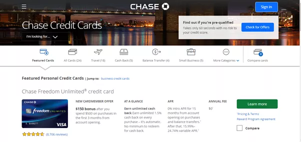
Chase's landing page demonstrates a classic example of overwhelming visitors with too many options and competing calls-to-action.
The page features multiple CTAs with identical styling - from credit card offers to login buttons - creating decision paralysis for visitors.
As you can see, this landing page is offering way too much. It’s overwhelming how much is being shown at once.
First, there’s Chase’s credit card offer with the “learn more” button. Yet over to the right, there’s the login screen for current customers. Note that the login button is the same style and color which dilutes the effectiveness of the other call-to-action buttons.
Below those two areas, a customer can browse savings accounts, checking accounts, credit card availability, home lending and car loans.
It only gets worse from there.
Key Takeaways:
- Focus on a single primary CTA per landing page
- Use distinct visual hierarchies for different user paths
- A/B test your landing pages with varying CTA placements
Bad Landing Page Example #2. Frontier Communications - When Clever Design Hurts Conversion
According to WordStream, clear and straightforward CTAs can increase conversion rates by up to 32% compared to clever or ambiguous messaging.
Frontier Communications offers bundled television, phone, and internet services, but their landing page demonstrates how creative design elements can hinder rather than help conversions.
The page's main issue lies in its confusing word bubble design element, which prioritizes creativity over clarity in communicating the service offerings.
The "buy now" CTA creates friction in the user journey, as service subscriptions typically require more information and consideration before purchase.
Key Takeaways:
- Prioritize clarity over creativity in landing page design
- Match CTA language to the customer's stage in the buying journey
- Use straightforward messaging that clearly communicates your value proposition
Bad Landing Page Example #3. MultiTouch - Generic Content That Fails to Convert
According to Marketing Experiments' 2024 study, landing pages with specific, benefit-focused headlines convert 58% better than those with generic messaging.
MultiTouch, an automated marketing software company, demonstrates how generic imagery and weak headlines can undermine landing page effectiveness.
Their main landing page could use some nurturing, featuring a stock photo of a man in a suit that adds no value to their message.
The headline "marketing simplified!" fails to communicate unique value, while important features are buried beneath confusing graphs and data visualizations.
Key Takeaways:
- Avoid generic stock photos that don't add value
- Create headlines that communicate specific benefits
- Prioritize key features over decorative elements
Bad Landing Page Example #4. Zendesk - Homepage as Landing Page Mistake
According to MarketingSherpa, dedicated landing pages have an average conversion rate 40% higher than homepages used as landing pages.
Zendesk, a leading CRM company, made a critical error by redirecting their Google AdWords traffic to their homepage instead of a dedicated landing page.
The homepage contains numerous navigation options, footer links, and newsletter signup forms, creating multiple exit points that dilute the intended conversion path.
The generic headline fails to communicate Zendesk's unique value proposition, missing an opportunity to connect with visitors who clicked through their paid ads.
Key Takeaways:
- Create dedicated landing pages for paid advertising campaigns
- Remove navigation elements that could distract from the primary conversion goal
- Ensure your landing page headline aligns with your ad messaging
Bad Landing Page Example #5. Big Barker - When Content Overwhelms Conversion
According to Nielsen Norman Group, landing pages that exceed the optimal content length see a 50% drop in visitor engagement after the first scroll.
Big Barker, a specialized dog bed retailer, demonstrates how excessive content can overwhelm visitors and hurt conversion rates.
Their landing page suffers from information overload, featuring oversized fonts and more than 40 customer reviews that force users to scroll extensively.
The page layout resembles a newspaper article rather than a conversion-focused landing page, burying critical CTAs beneath layers of content.
Key Takeaways:
- Keep landing page content concise and focused on key benefits
- Position CTAs prominently above the fold
- Limit social proof to 3-5 most impactful testimonials
Bad Landing Page Example #6. SAP Software Solutions - Resource Page Disguised as Landing Page
According to Content Marketing Institute's 2024 study, landing pages with focused content and clear hierarchy convert 88% better than resource-heavy pages.
SAP Software Solutions, despite being a major brand in analytics and cloud platforms, created a landing page that functions more like a cluttered resource center.
While the page's initial headline and image effectively communicate their service offering, the rest of the page drowns visitors in an overwhelming array of links that resemble spam rather than valuable navigation.
Key Takeaways:
- Keep landing pages focused on a single conversion goal
- Move resource links to a dedicated resources section
- Maintain clear visual hierarchy that guides visitors to primary CTA
White-label our entire marketing department—portal, fulfillment, automations, and more.
Bad Landing Page Example #7. Loup (formerly ShipCarsNow) - CTA Overload Evolution
Landing pages with a single focused CTA see conversion rates up to 13.5% higher than those with multiple competing CTAs based on an Unbounce study.
When operating as ShipCarsNow, this vehicle transport company's landing page suffered from severe CTA overcrowding, featuring seven competing calls-to-action.
The page scattered attention between multiple offers, including a free price quote and a 10% year-end rebate program, creating decision paralysis for visitors.
Their rebranding to Loup brought a significant improvement, demonstrating how simplifying your landing page can enhance user experience and conversion potential.
Key Takeaways:
- Focus on one primary CTA per landing page
- Ensure your value proposition is immediately clear
- Use rebranding opportunities to optimize user experience
Bad Landing Page Example #8. Advanced Hair Studio - The Non-Functional CTA Trap
According to UX Design Institute's research, non-functional or misleading CTAs can increase bounce rates by up to 78% and damage brand trust.
Advanced Hair Studio, an Australian hair loss treatment provider, created confusion with a prominent but non-functional coupon button offering $350 off their services.
The landing page suffers from poor organization, with detailed therapy descriptions that belong on dedicated service pages cluttering the main conversion path.
The misleading coupon CTA creates false expectations and potentially erodes visitor trust, a critical factor in healthcare-related services.
Key Takeaways:
- Ensure all CTAs are functional and deliver on their promises
- Organize detailed service information on dedicated pages
- Maintain trust by avoiding misleading promotional elements
Bad Landing Page Example #9. The Content Folk - When CTAs Go Missing
Based on research, landing pages without clear CTAs experience an average conversion rate 76% lower than those with prominent, action-oriented buttons.
The Content Folk, an Australian content marketing agency, created a visually striking landing page that fails to drive action due to the absence of a clear call-to-action.
While the page features an aesthetically pleasing pink and purple gradient design, its vague "say hi" button fails to communicate value or urgency to potential clients.
The abstract wheel image, while visually interesting, fails to convey concrete benefits or services to visitors looking for content marketing solutions.
Key Takeaways:
- Include clear, action-oriented CTAs that communicate value
- Balance aesthetic design with practical functionality
- Use imagery that reinforces your service offerings
Conclusion
You know what's scarier than Halloween? Landing pages that drive potential customers away. Through our analysis of these nine real-world examples, we've seen how even major brands can stumble when it comes to conversion optimization.
Here's what this means for you: The data shows that dedicated landing pages convert 40% better than homepages, and pages with single CTAs outperform cluttered alternatives by up to 13.5%. These aren't just numbers; they're opportunities for your business to capture more leads and sales.
Let me show you the essential takeaways from our landing page horror stories:
- Focus on a single, clear call-to-action to avoid decision paralysis
- Keep content concise and focused on your primary conversion goal
- Create dedicated landing pages for specific campaigns instead of using your homepage
- Ensure all CTAs are functional and deliver on their promises
- Maintain clear visual hierarchy that guides visitors to take action
You might be wondering how to put all these best practices into action without getting overwhelmed.
Here's where it gets exciting: for less than your daily coffee budget - just $7 for 7 days - you can have our expert team at Growbo transform your marketing projects from horror stories into success stories.
Think about what this means for your business. With your trial, you'll get unlimited access to our complete marketing services.
Let's turn those conversion nightmares into sweet dreams of success, start your $7 trial today and see how Growbo can transform your marketing results. No long-term commitment required - just pure marketing magic for 7 full days.
Have you encountered any landing page horror stories of your own? Share them in the comments below! Your experience might help fellow marketers avoid the same conversion-killing mistakes.
Keep Growin’, Stay Focused,


