Stop Losing Sales: 13 Checkout Tips That Work

Is your online checkout process driving customers away?
A customer finds the perfect product on your site, adds it to their cart, starts the checkout process... and then disappears.
Sound familiar?
Every day, countless sales slip away during checkout. I've watched store owners struggle with this same problem for years.
I remember Lani, a boutique owner who couldn't figure out why her online sales were low. Her products were great, her prices right, but something wasn't working. Then she watched her mom try to buy something from her store. The checkout process was so confusing that even her own mother gave up.
After helping hundreds of stores fix their checkout problems, we've learned that most solutions are simpler than you'd think. The key is knowing exactly what to change.
In this article, you'll discover:
- The hidden checkout barrier that's making your customers leave (and the 3-minute fix that keeps them buying)
- Discover the mobile checkout secret that top stores use to keep shoppers happy
- Learn the trust-building formula that makes customers feel instantly secure
- Uncover the form design trick that cuts checkout time in half
- Master the recovery method that saves almost-lost sales
Ready to turn your checkout from a conversion killer into a sales machine? Let's dive into these proven solutions that will help more customers complete their purchases.
If you want to get your marketing work done for your business (or for your clients’), then you HAVE to learn more how you can delegate unlimited marketing projects & tasks without the headaches of hiring. Download this free guide: 33 Examples of Marketing Projects You Can Delegate to Growbo
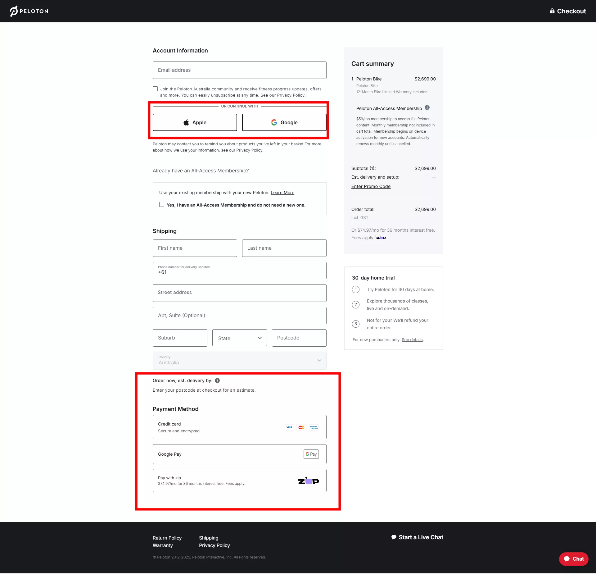
Checkout Tip #1. Single-Page Simplicity
You know that feeling when you're ready to buy something online, but the checkout process seems to go on forever? Your customers feel the same way. That's why single-page checkout design has become so important for online stores. According to Baymard Institute, the average cart abandonment rate hits 70% in 2023, but there's good news - you can fix this.
Let's look at what happens when you streamline your checkout to a single page. Drip's research shows that businesses can reduce mobile abandonment rates by up to 82% just by implementing a one-page checkout. Think about that for a moment - you could keep 8 out of 10 customers who would have otherwise left.
Here's how you can make single-page checkout work for your business:
- Place all essential fields on one screen, grouped logically
- Show a clear order summary at the top
- Include payment options directly visible
- Add a prominent 'Purchase' button
The key to making this work is understanding what your customers actually need to complete their purchase. You don't want to overwhelm them with unnecessary fields. Focus on collecting only the essential information needed to process the order. This means asking for shipping details, payment information, and contact details - nothing more.
When you implement single-page checkout, you'll notice something interesting about how customers respond. They're more likely to complete their purchase because they can see exactly what's required of them right from the start. No surprises, no unexpected steps, just a clear path to completing their order.
Key insights from this section:
- Single-page checkout can reduce mobile abandonment by 82%
- Collect only essential information to speed up the process
- Keep all elements visible and accessible on one screen
As you plan your checkout redesign, remember that simplicity leads to better results. Next, we'll look at how to organize these form fields effectively to make the process even smoother for your customers.
Checkout Tip #2. Strategic Field Organization
The way you arrange form fields on your checkout page directly impacts how easily customers can complete their purchase. Think about it like organizing your desk - when everything has its logical place, work becomes easier. The same principle applies to your checkout form design.
As explained in Growbo's guide on white space in design, proper spacing between form elements isn't just about aesthetics - it's about making information easier to process. When you give your form fields room to breathe, customers can focus better on what they need to fill out. Strategic use of white space can increase form completion rates by making the process less overwhelming for your customers.
Here's how to organize your form fields effectively:
- Group related information together (shipping details in one section, payment in another)
- Use clear visual separation between different information groups
- Keep labels close to their corresponding fields
- Maintain consistent spacing throughout the form
The order of your form fields matters just as much as their arrangement. Start with the easiest information first - usually the customer's name and email. This creates momentum and makes customers more likely to complete the entire process. As they move through the form, gradually introduce more complex fields like shipping and payment details.
You'll want to pay special attention to field alignment. Left-aligned labels work best for most checkout forms because they're easier to scan.
Key insights from this section:
- Group related fields together to create a logical flow
- Use white space strategically to reduce visual complexity
- Left-align labels to improve completion speed
Now that you've organized your form fields effectively, let's look at how automatic form filling can make the checkout process even faster for your customers.
Checkout Tip #3. Autofill Implementation
Every extra second your customers spend typing their information increases the chance they'll abandon their purchase. That's where smart autofill features come in. You can help your customers complete their checkout faster by implementing intelligent form filling that remembers and suggests their information.
According to WebFX's latest research, autofill features reduce form completion time by up to 53%. Think about what this means for your business - cutting checkout time in half could significantly boost your sales. The key is implementing autofill in a way that feels helpful rather than intrusive.
Here's what effective autofill implementation includes:
- Browser-based autofill support for basic information
- Address verification and suggestion systems
- Previous purchase information recall
- Smart field prediction based on initial input
When you implement autofill features, focus on the most commonly filled fields first. Start with name, email, and address information - these are the fields customers fill out most often. Make sure your autofill system works across different devices and browsers to provide a consistent experience for all your customers.
Security remains a crucial consideration when implementing autofill. You should always give customers control over their saved information. Include clear options to manage saved data and make it easy to update or remove stored details when needed.
Remember to test your autofill implementation thoroughly. Check how it performs on various devices and browsers. Pay special attention to field formatting - addresses, phone numbers, and dates often have different formats across regions. Your system should handle these variations smoothly.
Key insights from this section:
- Autofill features can cut form completion time by more than half
- Focus on commonly used fields for maximum impact
- Balance convenience with security and user control
Now that we've covered how to make forms fill themselves, let's look at optimizing your checkout for mobile users - where quick form completion becomes even more critical.
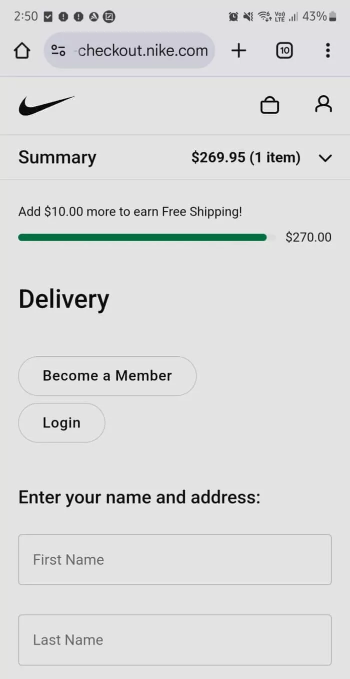
Checkout Tip #4. Mobile-First Design Principles
Your customers are increasingly shopping on their phones, making mobile checkout optimization crucial. When designing your checkout process, starting with mobile users in mind helps create a better experience for everyone.
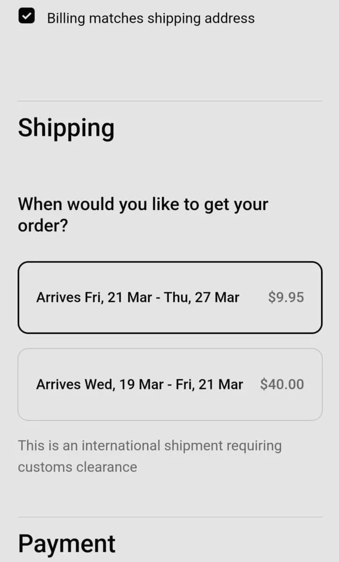
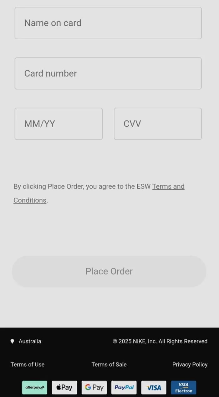
The numbers tell the story clearly. According to Statista, mobile users spend an average of $100-105 per transaction, showing significant buying power. However, they're also more likely to abandon their cart if the checkout isn't mobile-friendly. This is Nike's checkout page:
Top of the checkout page
Middle of the checkoout page
Bottom of the checkout page
Here's what makes a truly mobile-friendly checkout:
- Large, easy-to-tap buttons (minimum 44x44 pixels)
- Full-width input fields
- Native number pads for phone and card details
- Minimal keyboard switching
Focus on making text easy to read without zooming. Use clear, legible fonts at least 16 pixels in size. Ensure enough spacing between clickable elements to prevent accidental taps - this small detail makes a big difference in user experience.
Checkout Tip #5. Trust Signals and Security Indicators
When customers reach your checkout page, they need reassurance that their information is safe. This becomes even more important as online fraud concerns continue to rise. Growbo's research on trust signals shows that visible security elements can increase conversion rates significantly.
Place security badges strategically throughout your checkout process. Include them near sensitive information fields like credit card inputs. The key is making security visible without being overwhelming. Show SSL certificates, payment security logos, and trust seals where they matter most.
Consider these trust-building elements:
- Security badges near payment fields
- Customer reviews and ratings
- Clear return and refund policies
- Contact information for support
Remember to keep these elements subtle but visible. Too many security badges can actually make customers suspicious. Strike a balance between reassurance and professionalism.
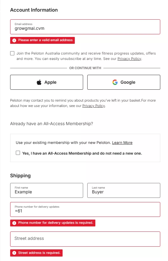
Checkout Tip #6. Real-Time Validation
Nothing frustrates customers more than submitting a form only to find errors after the fact. Real-time validation helps customers complete forms correctly the first time, reducing frustration and abandonment.
According to Nielsen Norman Group, immediate feedback can reduce form errors by up to 22%. Implement validation that shows both errors and successes as customers type. Green checkmarks for correct entries can be just as important as red error messages.
Effective real-time validation includes:
- Clear error messages that explain how to fix issues
- Instant format checking for emails and phone numbers
- Card type detection as numbers are entered
- Address verification as details are typed
Make sure your error messages are helpful and specific. Instead of "Invalid input," tell customers exactly what's wrong and how to fix it. For example, "Please enter a valid email address with @ symbol."
Key insights from these sections:
- Design for mobile first with easy-to-tap elements
- Place trust signals strategically near sensitive fields
- Use immediate, helpful validation messages
Next, we'll explore how to help customers recover when errors do occur, making the checkout process even smoother.
Checkout Tip #7. Error Recovery Systems
Even with the best validation, customers sometimes make mistakes. Your checkout process needs a clear, helpful way to fix errors when they occur. Think of it as having a friendly store clerk who points out exactly what needs attention.
When errors happen, preserve all correctly entered information. Nothing frustrates customers more than having to start over. A good error recovery system helps customers fix mistakes without losing their progress. This simple feature can significantly reduce abandonment rates.
Here's what effective error recovery includes:
- Clear highlighting of problem fields
- Specific instructions for corrections
- Auto-scroll to error locations
- Data preservation for correct entries
Make sure error messages appear near the relevant fields. Avoid technical language - instead, use clear, friendly directions like "Please add your apartment number" rather than "Address field incomplete."
Checkout Tip #8. Progress Visualization
Customers want to know where they are in the checkout process. A clear progress indicator helps set expectations and reduces anxiety about how long the process will take. According to Growbo's checkout optimization guide, progress indicators can improve completion rates by showing customers the finish line.
Your progress visualization should be simple and clear. Avoid complex animations or unclear markers. The goal is to show customers exactly where they are and what's left to complete. This creates a sense of momentum and achievement as they move through the checkout.
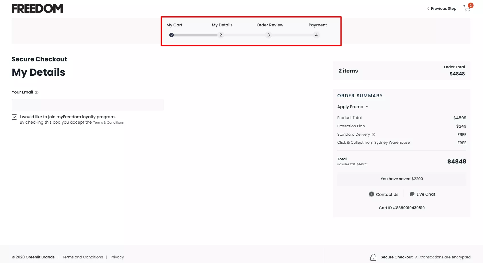
Essential elements of progress visualization:
- Simple, clear progress bar
- Current step highlight
- Remaining steps preview
- Estimated time to complete
Consider adding micro-progress indicators within longer sections. For example, show sub-steps when collecting shipping and payment information.
Checkout Tip #9. Payment Method Diversity
Different customers prefer different ways to pay. According to Statista, desktop users spend an average of $159 per transaction, while mobile users average $100-105. Offering various payment options helps capture sales across all devices.
The key is balancing variety with simplicity. Too many options can overwhelm customers, but too few might exclude potential buyers. Focus on the payment methods your target audience uses most frequently.
Essential payment options to consider:
- Major credit cards
- Digital wallets (PayPal, Apple Pay, Google Pay)
- Buy now, pay later services
- Local payment preferences
Display payment options clearly with recognizable logos. Order them by popularity to help customers quickly find their preferred method. Consider adding explanatory text for newer payment options.
Key insights from these sections:
- Help customers recover from errors without starting over
- Show clear progress to reduce checkout anxiety
- Offer relevant payment options without overwhelming choice
Next, we'll explore how smart defaults can make the checkout process even more efficient for your customers.
Checkout Tip #10. Smart Defaults and Predictions
Smart defaults save your customers time by intelligently predicting their likely choices. These predictions, based on location data and common patterns, can significantly speed up the checkout process.
Smart defaults can reduce checkout time by up to 30% according to studies. The key is making accurate predictions while still giving customers easy ways to change incorrect assumptions.3
Effective smart default implementation includes:
- Country selection based on IP address
- State/region pre-selection
- Shipping method suggestions based on location
- Common phone number formats by country
Remember to make all default selections clear and easy to change. Highlight pre-filled fields so customers know what's been automatically completed for them.
Checkout Tip #11. Guest Checkout Optimization
Forcing account creation is a major conversion killer. According to Wiser Notify, removing mandatory account creation can reduce abandonment rates by 24%. Your customers want to complete their purchase quickly, not sign up for a new account.
Make guest checkout your default option, but highlight the benefits of creating an account. The best approach is offering account creation after the purchase is complete. This way, customers can focus on their immediate goal - completing their purchase.
Essential elements of guest checkout:
- Prominent guest checkout option
- Minimal required fields
- Clear benefits of account creation
- Post-purchase account option
Consider offering special incentives for account creation after purchase, such as a discount on their next order or exclusive access to deals.
Checkout Tip #12. Contextual Helper Text
Helper text guides customers through complex parts of your checkout process. According to Nielsen Norman Group, well-designed helper text can reduce form errors by up to 37%. The key is providing help exactly when and where it's needed.
Your helper text should be clear and concise. Focus on preventing errors rather than just explaining how to fix them. Place help text where customers will see it before making common mistakes.
Effective helper text placement:
- Next to complex form fields
- Under security-sensitive areas
- Near payment information fields
- Alongside shipping options
Use progressive disclosure for detailed help. Show basic instructions by default, with options to reveal more detailed information when needed. This keeps the interface clean while providing support when necessary.
Key insights from these sections:
- Use smart defaults to speed up checkout while maintaining flexibility
- Make guest checkout prominent and easy to use
- Provide clear, timely help text to prevent errors
Next, we'll look at how to make the final review and confirmation process smooth and reassuring for your customers.
Checkout Tip #13. Streamlined Review Process
The final review step is your customer's last chance to confirm their purchase details. Make this step clear and reassuring. A well-designed review page helps customers feel confident about their purchase and reduces support inquiries later.
A clear review step can increase final conversion rates . The key is showing all important information while making modifications simple and straightforward.
Essential elements of an effective review page:
- Clear order summary with images
- Easy-to-spot edit buttons
- Total cost breakdown
- Delivery information preview
Make sure customers can easily modify any detail from the review page without losing other information they've entered.
If you want to get your marketing work done for your business (or for your clients’), then you HAVE to learn more how you can delegate unlimited marketing projects & tasks without the headaches of hiring. Download this free guide: 33 Examples of Marketing Projects You Can Delegate to Growbo
CONCLUSION
Building an effective checkout process takes careful planning. The good news? You don't have to figure it out by yourself.
Here are the key changes that will improve your checkout success:
- Switch to a single-page checkout design
- Add smart autofill to speed up form completion
- Make your checkout mobile-friendly
- Place security badges near payment fields
- Offer guest checkout as the default option
Many business owners know these improvements can boost sales but lack the time or technical team to implement them. That's where Growbo comes in.
You can try our complete marketing team for just $7 for 7 days. We'll handle everything from checkout optimization to ongoing marketing tasks - all done for you by experienced professionals.
Think about it: for less than your morning coffee, you get a full marketing team ready to improve your checkout process and handle all your marketing needs. No contracts, no hiring hassles, just reliable support when you need it. Book a call today to get started.
What's your biggest checkout challenge? Share it in the comments - we'll help you find a practical solution that works for your business.
Keep Growin,’ Stay Focused,

Image Credits:
https://bellroy.com
https://www.thereformation.com
https://www.nike.com/
https://www.onepeloton.com/
https://prismplatinum.com/