9 Quick Ways to Fix Your SaaS Landing Page

Creating high-converting SaaS landing pages isn't as complex as you might think. Yet, most companies struggle to get it right.
Remember the last time you visited a SaaS website and felt confused about what they actually do? You're not alone.
We've helped hundreds of SaaS companies fix their landing pages. The pattern is always the same: talented teams build great products, but their pages don't connect with visitors.
Like James, who launched his team collaboration tool last month. Despite having an excellent product, his page wasn't getting sign-ups. Three simple changes to his landing page doubled her conversion rate in just two weeks.
Most SaaS pages make these common mistakes:
- Focusing on features instead of solving problems
- Creating pages that load slowly on phones
- Making sign-up too complicated
- Using confusing tech language
In this article, you'll discover:
- The "3-Second Rule" that keeps visitors reading your page
- Learn the mobile-first secret that cuts bounce rates in half
- Discover the trust-building formula that turns skeptics into customers
- Master the "One-Click Method" that makes sign-ups effortless
- Uncover the testing framework that shows exactly what your visitors want
Ready to make your landing page work harder for your SaaS business? Let's dive into the most important part - crafting your perfect hero section.
If you want to get your marketing work done for your business (or for your clients’), then you HAVE to learn more how you can delegate unlimited marketing projects & tasks without the headaches of hiring. Download this free guide: 33 Examples of Marketing Projects You Can Delegate to Growbo
Design Quick Fix #1. Craft a Problem-Solution Hero Section
Your hero section is the first thing visitors see on your landing page, and you have just seconds to make it count. Recent data shows that a well-crafted value proposition can increase conversions by 124%. This significant boost happens when you clearly show visitors how your SaaS product solves their specific problems. Check out this article on how to craft winning value propositions.
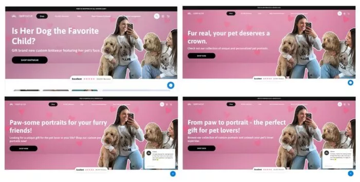
Start by identifying your customers' main pain points. This means testing different versions of your hero message until you find what resonates most with your audience. Take a look at Crown and Paw testing variations of the headline to know which is better aligned with its target audience.
You'll want to position your solution above the fold - the area visible without scrolling. Studies indicate that 80% of users spend 90% of their time looking at information above the fold according to Nielsen Norman Group. Make this space count by including three key elements: a clear headline stating the main benefit, a supporting subheadline explaining how you deliver that benefit, and a strong call-to-action button.
Key Components of an Effective Hero Section
- Clear, benefit-focused headline
- Supporting subheadline with specific value points
- Strong call-to-action that stands out
- Relevant hero image or video
- Trust indicators (if space allows)
Remember to keep your message simple and direct. Focus on one main message rather than trying to communicate everything about your product at once.
Key Takeaways from This Section:
- Focus on a clear, benefit-driven value proposition above the fold
- Test different versions of your hero message systematically
- Keep your message simple and focused on one main benefit
Now that you've optimized your hero section, let's look at how to create a frictionless user journey that guides visitors toward conversion.
Design Quick Fix #2. Design a Frictionless User Journey
When visitors land on your SaaS page, every second counts. Data shows that a mere 1-second delay in page response can reduce your conversions by 7% according to Bigcommerce. This means you need to create a smooth, intuitive path that guides users from their first impression to taking action.
Start with your visual hierarchy. Place your most important elements where users naturally look first - typically in an F-shaped pattern. It means
- First read across the top
- Then read a bit more down the page
- Finally just look down the left side
According to the UX Mag, “The F-pattern can not only encourage users to stay on your website, it will also cause them to see what else your site has to offer. ”
Your mobile experience needs special attention since 82.9% of landing page visits now come from mobile devices according to Hostinger. This means designing with a mobile-first approach, ensuring all crucial elements are easily accessible on smaller screens.
Essential Elements of a Frictionless Journey
- Clear navigation structure
- Logical content progression
- Optimized page loading speed
- Mobile-responsive design
- Minimal form fields
Focus on reducing steps to conversion. This means removing unnecessary form fields, minimizing clicks, and placing call-to-action buttons where users can easily find them.
Speed optimization is crucial for maintaining user attention. Tests show that pages loading within 2 seconds have an average session duration 42% longer than slower pages. Use compressed images, minimize code, and leverage browser caching to keep your page running smoothly.
Key Takeaways from This Section:
- Prioritize page speed and mobile responsiveness
- Create clear visual hierarchies that guide users
- Minimize steps to conversion
With your user journey optimized, let's explore how to build trust through strategic social proof in the next section.
Design Quick Fix #3. Implement Strategic Social Proof
Social proof directly impacts your conversion rates. Adding well-placed testimonials can increase conversions by 34% according to Arct Net. But it's not just about having testimonials - it's about using them strategically to build trust at key decision points in your user's journey.
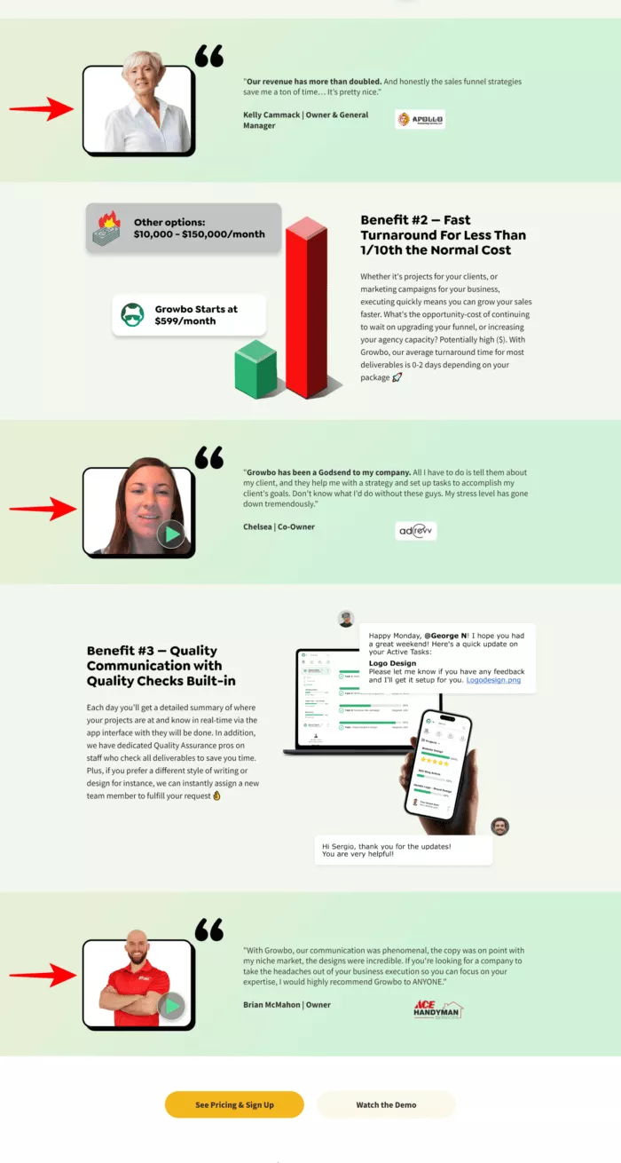
You need to focus on quality over quantity. Studies show that specific, results-focused testimonials perform 2.3 times better than generic praise. Include real metrics, company names, and user titles when possible. This is how we at Growbo spinkled our testimonials on our page:
Effective Social Proof Elements
- Customer testimonials with specific results
- Trust badges from recognized organizations
- Client logos and case studies
- User statistics and growth metrics
- Third-party review platform ratings
Other social proof we added to our homepage:
Design Quick Fix #4. Create Compelling Feature Demonstrations
Your feature demonstrations need to show, not tell. Video content can increase landing page conversions by 86% according to VWO. Focus on creating clear, benefit-focused demonstrations that help users visualize your solution in action.
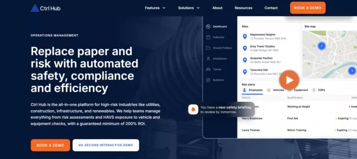
Proper content hierarchy in your demonstrations matters significantly. Start with your core features, then progress to more advanced capabilities as users scroll down. Ctrl Hub's video exactly shows you this:
Key Elements of Effective Demonstrations
- Short, focused video tutorials
- Interactive product previews
- Step-by-step feature walkthroughs
- Clear benefit statements
- Simple setup instructions
Design Quick Fix #5. Deploy Smart Lead Capture
Your form design directly impacts conversion success. Data shows that forms with 4 fields achieve optimal conversion rates of 30% according to Hubspot. Keep your forms simple and only ask for essential information.
Smart automation in your lead capture process makes a significant difference. Companies using automated capture systems saw completion rates improve by 40% (read more about optimizing forms here). This includes features like auto-fill capabilities, smart validation, and progressive profiling.
Effective Lead Capture Elements
- Minimal required fields
- Clear error messages
- Mobile-friendly input design
- Smart form validation
- Progress indicators for multi-step forms
Design Quick Fix #6. Optimize Your Pricing Strategy
Your pricing presentation can make or break your conversion rates. Studies show that strategic pricing displays can increase conversions by 41% according to PriceIntelligently. The key is creating pricing tiers that clearly communicate value while reducing decision friction.
Value-based pricing approaches outperform cost-plus models by 73% in SaaS environments Focus on communicating the outcomes your product delivers rather than listing features. Companies highlighting ROI metrics in their pricing sections saw signup rates increase by 52% compared to feature-focused competitors.
Psychological pricing techniques remain highly effective. SaaS companies implementing strategic price anchoring saw conversion improvements of 36% (SaaS Pricing Lab). Position your preferred plan in the middle of three options to leverage the "center-stage effect" that drives users toward your target pricing tier.
Effective Pricing Strategy Elements
- Clear, benefit-focused tier comparisons
- Highlighted "most popular" or "best value" options
- Annual discount incentives with savings clearly displayed
- Money-back guarantees and risk-reduction messaging
- Transparent pricing with no hidden fees or surprises
- ROI calculators for enterprise or high-ticket offerings
- Limited-time promotions for urgency (when appropriate)
Design Quick Fix #7. Implement AI-Driven Personalization
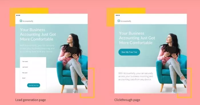
Personalization makes a measurable difference in your conversion rates. Studies show that personalized landing pages increase conversions by 200% according to Instapage. This means showing different content to different user segments based on their needs and behaviors.
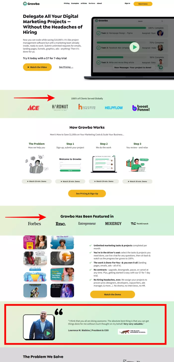
Start with dynamic content delivery. This includes adjusting headlines, feature highlights, and calls-to-action based on user characteristics like industry, company size, or previous interactions. This example shows the 2 different landing pages with 2 different intents.
Key Personalization Elements
- Industry-specific messaging
- Role-based content
- Behavior-triggered elements
- Geographic customization
- Visit history adaptation
Design Quick Fix #8. Optimize Technical Performance
Your landing page's technical performance directly impacts your success. Mobile optimization alone can improve conversion rates by 89%. Focus on Core Web Vitals and loading speed to keep visitors engaged.
Speed optimization needs to be your priority. Tests show that pages loading in 1 second have 3x higher conversion rates compared to slower pages. Pay attention to image compression, code optimization, and server response times to maintain optimal performance.
Technical Optimization Checklist
- Core Web Vitals compliance
- Mobile responsiveness
- Image optimization
- Code minification
- Server response time
Design Quick Fix #9. Set Up Conversion Analytics
Proper analytics setup helps you make data-driven improvements. Focus on tracking key metrics that indicate user engagement and conversion potential.
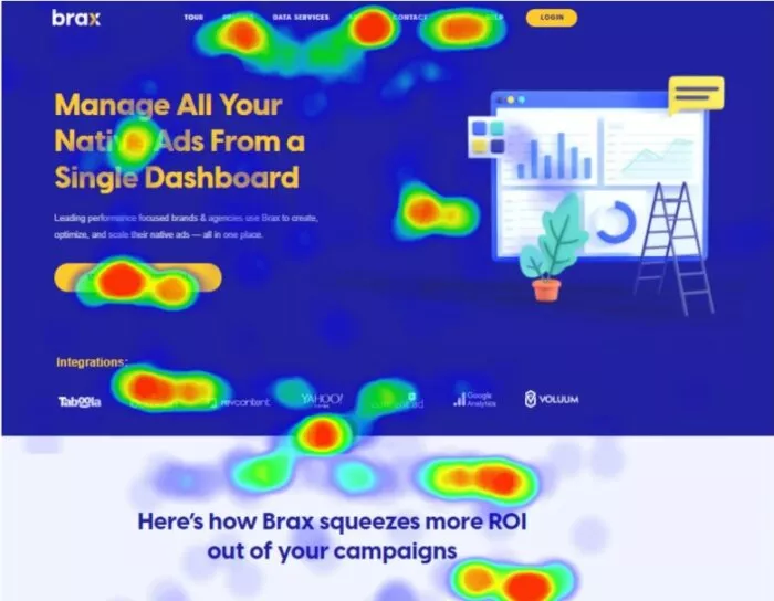
Heat mapping and user journey analysis provide crucial insights. Track where users click, how far they scroll, and where they might encounter friction in the conversion process.
Essential Analytics Metrics
- Conversion rate by source
- User flow analysis
- Heat map data
- Form abandonment rates
- Page scroll depth
By implementing these strategies systematically, you can create a landing page that not only attracts visitors but converts them into valuable customers.
If you want to get your marketing work done for your business (or for your clients’), then you HAVE to learn more how you can delegate unlimited marketing projects & tasks without the headaches of hiring. Download this free guide: 33 Examples of Marketing Projects You Can Delegate to Growbo
CONCLUSION
Landing page success isn't about flashy designs or complicated strategies. It's about doing the basic things really well.
Here are the exact steps that work right now:
- Write your hero section like you're explaining your solution to a friend
- Build your page for phones first - that's how most people will see it
- Show real customer stories near the top of your page
- Focus on just one main benefit that matters most
- Try different versions to see what your visitors prefer
You know what I hear most often? "This all makes sense, but who has time to do it?" I get it. You're busy running your business.
That's why we're offering something special: Try our complete marketing team for just $7 for 7 days. We'll help you:
- Build landing pages that actually work
- Handle all your marketing tasks
- Test and improve your results
Get started by booking a call now.
Which of these landing page tips are you struggling with? Share below - we would love to help you figure it out.
Keep Growin,’ Stay Focused,

Image Credits:
- https://www.nngroup.com/articles/scrolling-and-attention-original-research/
- https://www.optimonk.com/headline-a-b-testing/
- https://uxmag.com/articles/the-f-pattern-understanding-how-users-scan-content
- https://www.ctrl-hub.com/
- https://unbounce.com/landing-page-articles/what-is-a-landing-page/
- https://www.brax.io/blog/eyes-on-the-prize-know-where-your-viewers-look-and-click-with-heat-maps