313 Case Studies Analyzed Taught Me These 5 Key Insights

On December 31st, 2018 I took a pen and jotted down a list of ideas in my journal…
These were info products I wanted to create in 2019.
One of them was a simple, itty-bitty tripwire. Simple, no big deal...
The idea was a high quality, “curated collection” of conversion case studies.
Then, later in 2019, I started to create it. And I ended up analyzing hundreds of conversion rate optimization (CRO) case studies.
So I soon realized there was no way this curated collection could be just some cheap tripwire.
After all, a curated collection of 313 statistically credible and easy-to-copy case studies with video walk-thrus isn’t easy to come by.
But why am I telling you this?
Because before I created what would become the Proven Sales Conversion Pack, I thought I knew a “solid” amount about digital persuasion, CRO, etc..
And I thought I knew how to sell products and services online.
But there was SO MUCH more to learn…
Creating this info product gave me some sort of a “gift”—like X-Ray vision or “Conversion Sunglasses” (or maybe more like a conversion PhD...).
Anyway, this “gift” will let you see proven patterns (and bottlenecks) towards converting more leads.
So I’m going to share 5 of those truly profound (yes, really) conversion rate optimization (CRO) insights. And here’s the overview for your reference:
- Conversion Rate Optimization Insight #1: Tweaking “money-points of leverage” on your website can lead to immediate spikes in conversions.
- Conversion Rate Optimization Insight #2: Your sales funnel is only as good as your ability to see your website “through the eyes of your customers.”
- Conversion Rate Optimization Insight #3: Small conversion tweaks unlock big sales revenue.
- Conversion Rate Optimization Insight #4: The “Laws of Sales Funnel Physics” WORK—but I discovered something new.
- Conversion Rate Optimization Insight #5: How to instantly grow your sales right now: make it easy, make it seen, make it clear.
Plus I’ll give you 3 reasons why you won’t find anything else out there quite like it.
Ready to start seeing a spike in lead conversions? But first…
In a rush? Want to download this article as a PDF so you can easily take action on it later? Click here to download this article as a PDF guide.
A Quick Word About the 313 Conversion Optimization Case Studies Analyzed...
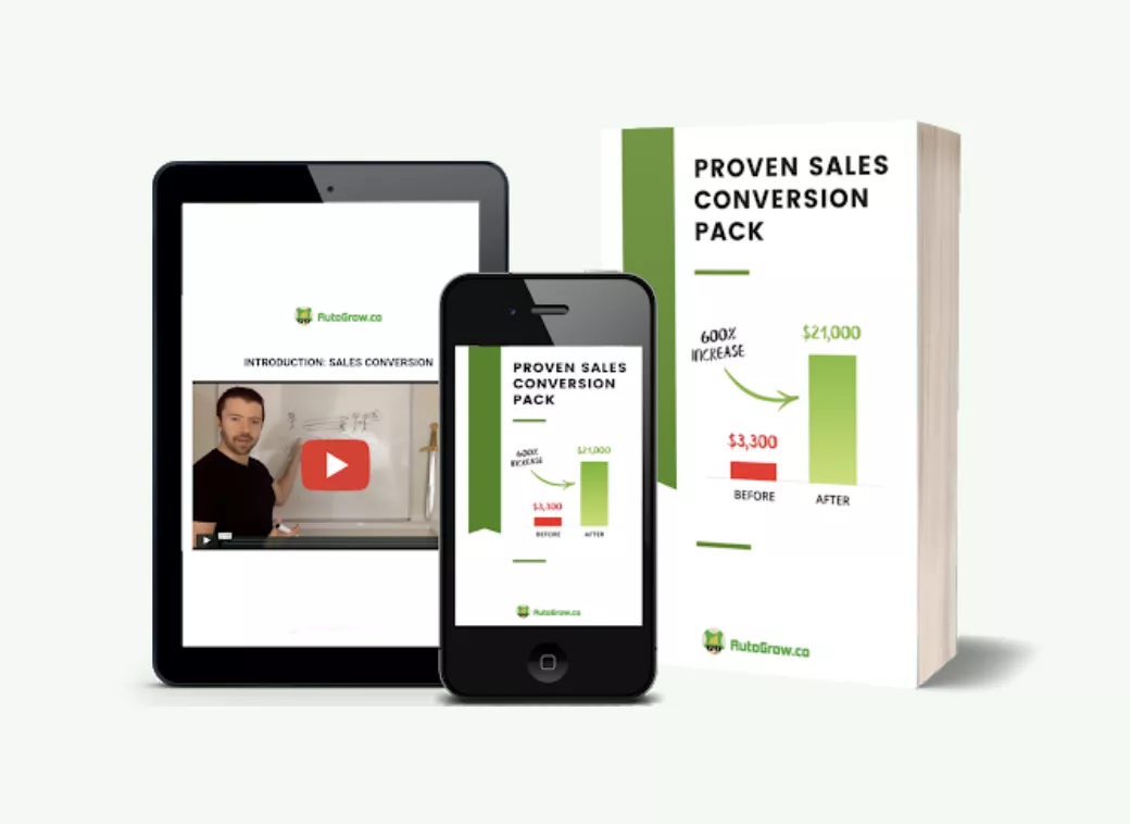
The collection of case studies my team and I analyzed in the Proven Sales Conversion Pack is hard to come by.
It’s unique. And it’s incredibly valuable, whether you’re a business owner, a lone wolf marketer, or a big-wig agency.
Here are 3 reasons why you won’t find anything else out there quite like it.
1. It’s Statistically Credible – The cases inside are not...
“Oh hey, we made the button green and we think leads went up! Whoo! Time to tell the world!…”
Nope. The conversion rate optimization insights inside this resource are built on sound scientific principles that are backed up by real, hard data.
2. Easy-to-Copy – The conversion optimization techniques outlined inside these case studies are clear. They’re simple. And they’re highly actionable. And if you want more sales or to convert more leads or email subscribers, all you have to do is apply them to your own website or marketing.
3. Easy-to-Learn From – From 100s of 1,000s of words, I condensed down all 313 case studies covering a variety of niches. Businesses in the health and fitness industry, digital marketing, ecommerce, info products, SaaS, membership sites, B2C and B2B professional services, travel, entertainment, and more. I make a simple-to-understand analysis of “why they work” and “how to copy” each success pattern for your business.
So if you want to dive deep into these 313 conversion rate optimization case studies, I’d encourage you to check out what the Proven Sales Conversion Pack has to offer you.
You can even watch the 15-minute walkthrough on the page to have a closer look.
Alright, let’s get on to the top 5 key insights I learned from studying these 313 case studies.
Conversion Rate Optimization Insight #1 – Like a Boulder at the Edge of a Cliff, Tweaking “Money-Points of Leverage” on Your Website Can Lead to Immediate Spikes in Conversions
As I began my journey to find and analyze each of the 313 high-quality case studies over the last month (with the help of my team), success patterns began to emerge…
As a kid, I was always (weirdly) good at recognizing patterns and organizing ideas and observations.
I remember when I was about 6, my mom put out this mixed dish of red and green M&Ms for Christmas.
Without anyone asking me, I separated and organized them by color to make a festive pattern for the holiday.
Fast forward about 25 years.
As I made my way down the list of case studies, I noticed how it was almost always the same website areas that unlocked the biggest gains.
These areas were the Call-to-Action (CTA) buttons. These things…
For example, I found that the text on any CTA button was frequently a “money-point of leverage”.
In other words…
Imagine you want to break through a wall that’s holding you back from getting where you want to go. You’ve got two options:
- The fist of a little kid who thinks he’s really strong if he makes a muscle, and is really enthusiastic about it…
- Or a train traveling at 120 MPH.
Making changes to your CTA button is like using a speeding train to break through that wall to get to the “money” (leads, sales, email subscribers) on the other side.
Whereas with the kid, he’s a funny little guy with a “mean” karate chop—but it’ll be a while before he breaks down that wall.
So that’s what a “money-point of leverage” is. It’s the speeding train of conversions.
Here are 3 case studies I found that reflect this truth:
- Changing generic CTAs leads to 36.3% additional sign-ups
- Changing the CTA and homepage length results in 73% more leads
- Change in CTA button’s color results in 35.81% increase in sales like in the example below
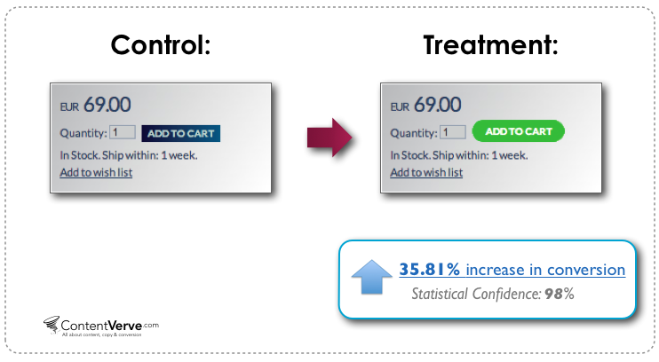
It’s also worth mentioning that I found cases where other small changes in the CTA led to enormous conversion rate increases.
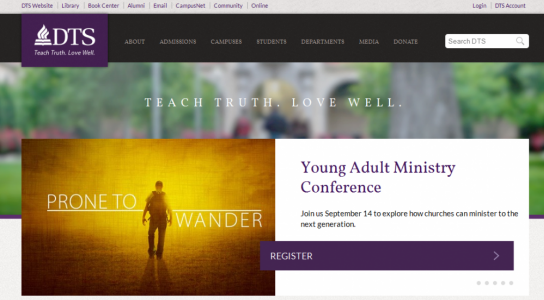
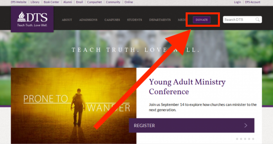
Cases like this, where simply highlighting the CTA in the navigation bar improved a seminary’s conversions by a whopping 190%.
Before:
After:
But that’s just one point of leverage available to you when you’re optimizing your website for more sales.
Here’s the full list of areas I’ve identified based on the data (so far).
You should focus on these areas or elements in your funnel for immediate and maximum impact:
- CTA Buttons
- Image choice
- The text and area immediately above or below your CTA buttons
- Pricing presentation
- Navigation area
- Headlines and value proposition
- Limits on opportunity
- Design layout
- Forms and form fields
- Checkout page
- The text size of your value proposition and service/product benefits
- Pop-ups
Conversion Rate Optimization Insight #2 – Your Sales Funnel Is Only as Good as Your Ability to See Your Website “Through the Eyes of Your Customers”. Here’s How to Do It…
By the time I reached #25 in the curated collection of the 313 conversion optimization case studies, another pattern came into focus…
The better you can understand your audience and incorporate their feedback, the higher your conversion rate will be.
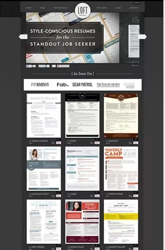
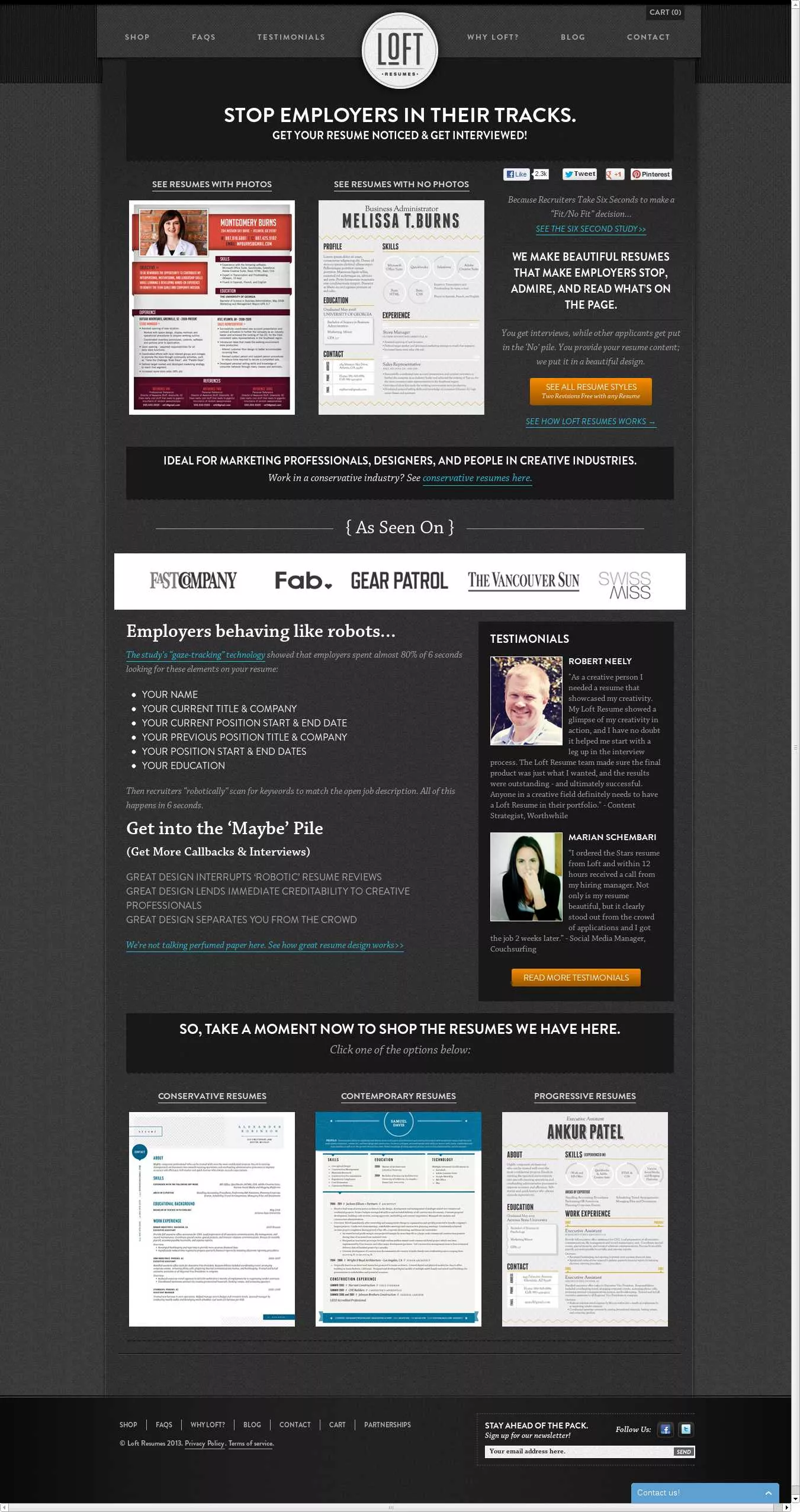
For instance, one case study we looked at involved a professional resume company improving their conversion rate by 64.8%. They did that by incorporating customer feedback into their homepage redesign.
Here’s what it looked like before…
And here’s what it looked like after...
Now, if you want to grow your conversion rate rapidly, and with minimal effort, take this insight to heart:
It’s not what you know that matters, it’s what you know and have forgotten to act on.
Why do I say that?
Some years ago, when Growbo was an agency, I took on a fairly demanding client.
He gave me 60 days to “prove my mettle” and get some results for his membership website.
In that time, I grew his sales conversion rates by 603%. And I netted over $10,000 revenue the first week after the new funnel was launched.
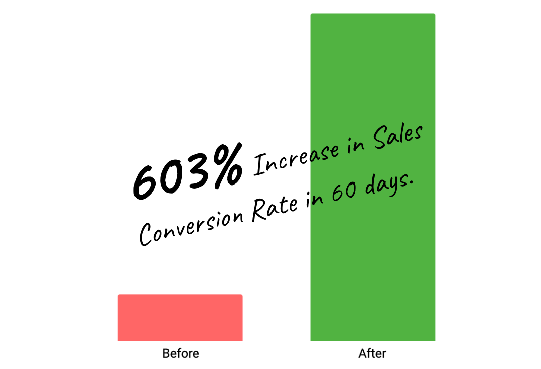
The client wants to stay anonymous, but here is what I can share about his business:
- Business Size: Small business, virtual team, 3 employees
- Type of Business: B2C / “pro-sumer” / membership site
- Market Niche: Hobbyist, Photography
- Traffic: Over 100,000 monthly site visitors
To achieve these results I did something simple which I’ve neglected (“forgotten”) to do with Growbo’s products funnel…
- I surveyed the client’s audience with a simple, 3 question form (~40 minutes of work).
- I got on the phone with 15 people who filled out the survey and were open to talking (~90 minutes of work).
- While on the phone, I asked questions to understand who they were and made a “super light” (not pushy at all) sales pitch for the membership product. I recorded the calls and took notes (~60 minutes of work to analyze the call notes).
Conducting this kind of research to understand potential customers took about 3 hours of total work.
50% of the insights or sales-boosting tactics I applied to this client’s revamped sales funnel came from reading the survey responses.
The other 50% came from talking to people on the phone.
For example, I was able to identify:
1. Problem #1 – From the surveys, I learned that a large segment of the audience didn’t even know that the site had a membership offer. And if they didn’t know, of course they would have never bought!
(Sidenote: you wouldn’t believe how common this is. More on this later…)
2. Problem #2 – From the phone calls, I learned about the identity, demographics, and personal stories of the people we wanted to sell to.
The website copy and design didn’t reflect any of those points at all.
Listening to people not only let me identify the above problems, it allowed me to empathize with the target customer.
This is what inspired me to improve their landing page copy and design—and, in turn, we saw the 600% sales conversion rate optimization.
With the case studies in the Proven Sales Conversion Pack, I saw the same kind of research being done, over, and over, and over again by the agencies and consultants who published them.
And that research is actually very easy to do—but so many entrepreneurs and marketers don’t do it!
Instead, we read about the research and instead of implementing the change, we just move on to the next shiny object. We hunt for that “ultimate secret” endlessly.
And I’m guilty of doing this too at times.
In short, the key insights here are:
- To sell bigger and better to every potential customer or client, you must better understand them.
- Surveys, heatmap tools, user testing, and yes, even 5-10 minute phone calls let you empathize with your audience. You get to see and feel your buying process through your customers’ eyes.
When you get this level of insight, it’s like obtaining a compass that points straight at the “buried treasure” on your website.
Conversion Insight #3 – Small Conversion Tweaks Unlock Big Sales Revenue. But BIG changes? Well, That’s Another Story…
About 60% of the case studies I analyzed didn’t make the cut for one reason or another (see the criteria I listed in the intro to this article).
As I filtered through these, I began to notice another “big” pattern that ran through all the case studies…
I was already categorizing them in a number of ways so customers can find the right tactic or tweak to grow their sales.
Example:

One of the categories was the size of the change.
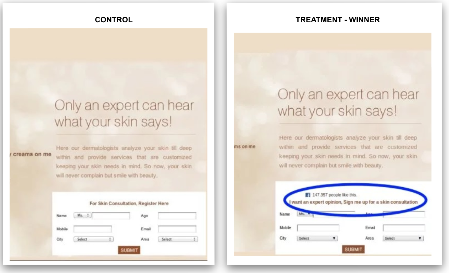
Some case studies only involved a small tweak. A simple change, like adjusting a headline, or replacing one image with another one…
Example:
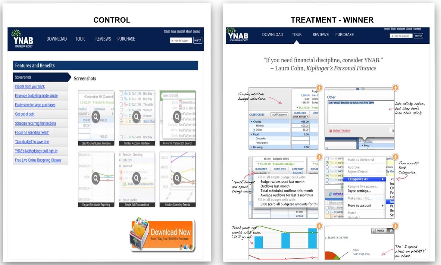
On the other hand, the other half of the case studies involved big changes.
It wasn’t one element being tweaked, but several—or in some cases a major redesign.
Like this:
Here’s what I noticed that I want you to know:
It didn’t matter if the change was big or small.
In fact…
There was ZERO relationship between how “hard” the optimization had to be done, and the conversion increase.
This is amazing when you think about it because I know a lot of us think that more effort means more results.
But that’s not what the data says!
Don’t get me wrong, I’m not saying a low-quality website design is going to help you (it won’t).
But allow me to prove the point further…
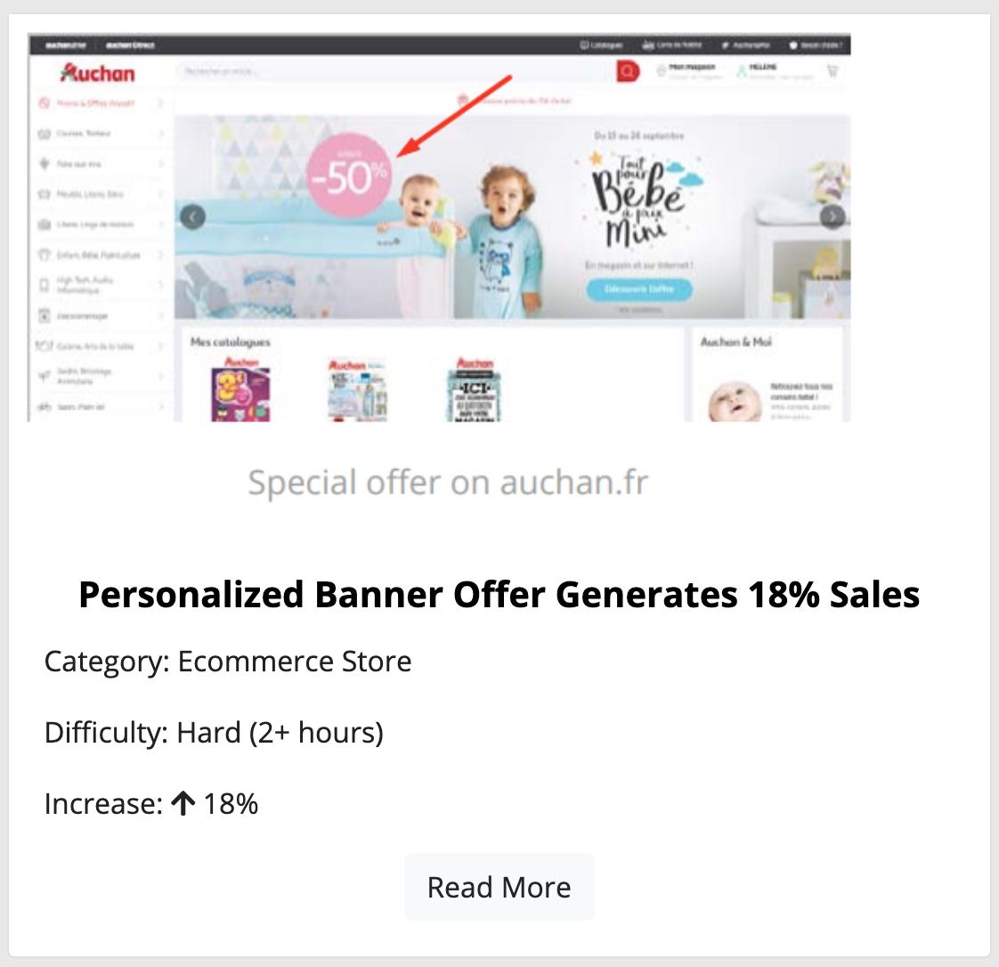
There is one example from the pack titled...
- (A) “Personalized Banner Offer Generates 18% Increase In Sales”
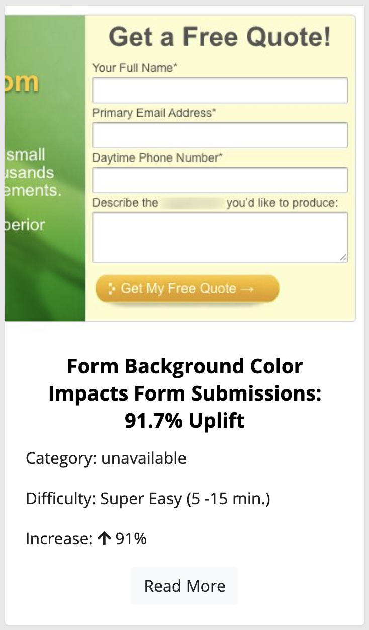
And here’s another example titled...
- (B) “Form Background Color Impacts Form Conversions: 91.7% Uplift.”
For case study A, I rated this as “Hard” (2 hours or more of work) based on the details of the study. And based on my background as a web developer and former agency owner.
For case study B, I rated this as “Super Easy” (5-15 minutes of work) based on knowing that it would only take a few minutes to copy.
Yet, you can see how the “easy” change had a much larger relative impact than the more difficult-to-implement change—almost 5X higher.
Here’s one more example of the power of this from my personal experience here at Growbo.
When I first started vetting case studies, one of the first proven patterns I observed was the need to reassure customers who are about to buy.
Note: I talk more about this in one of the 20 videos inside the Proven Sales Conversion Pack.
A case study inspired me with a simple idea that got big results.
So, I decided to try it.
I had a few minutes to spare.
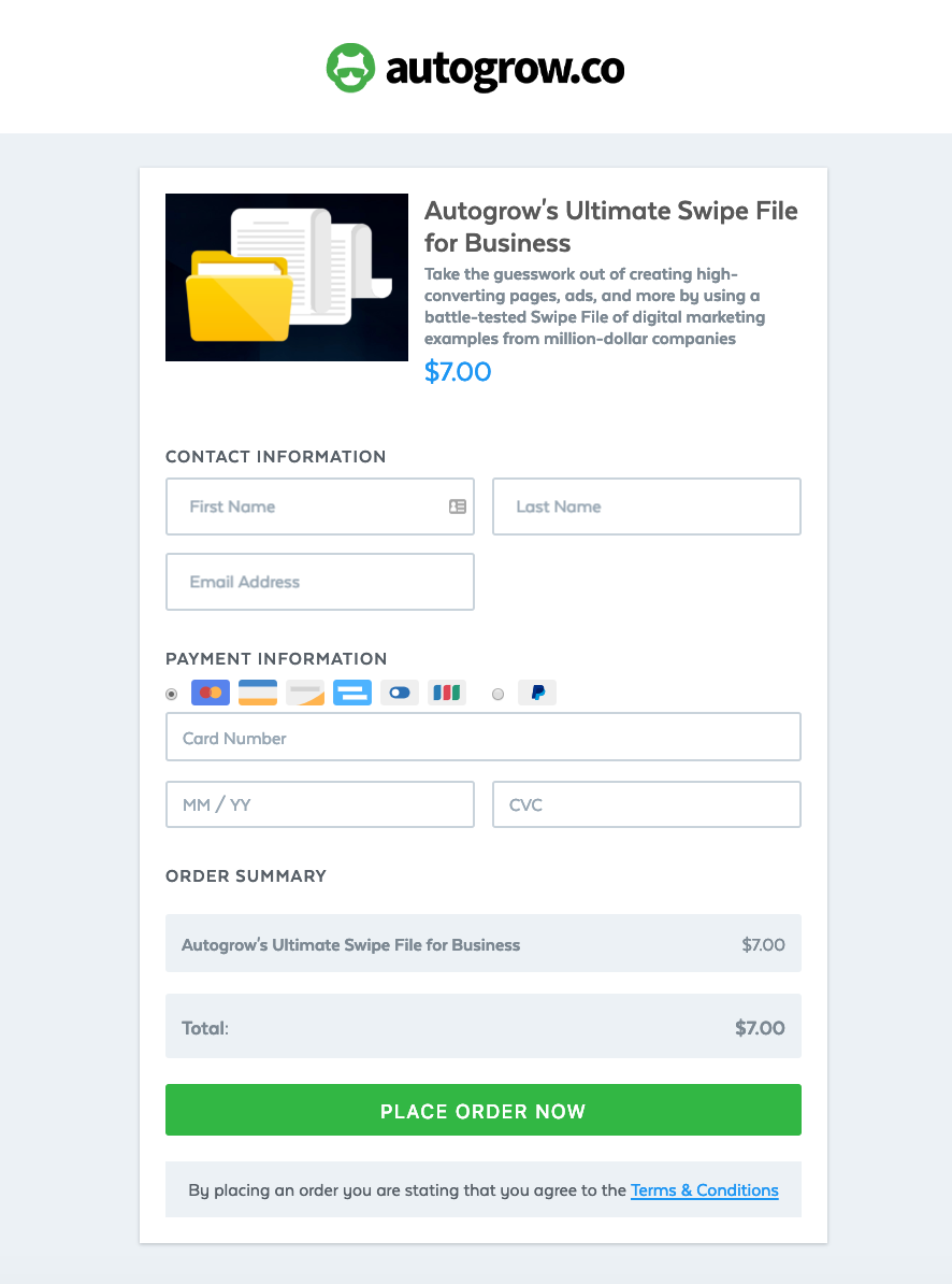
I opened up our checkout app (SamCart), went to the page for our swipe file tripwire, one of our popular products in terms of sales volume.
I made a tweak to the page that emphasized security and our guarantee.
It took me 5 minutes to implement the change.
The result?
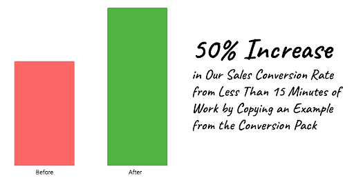
That 5-minute design tweak drove 50% more sales that year (99% statistical significance).

This is our least expensive product, and partly for that reason the conversion rate was already pretty good before the change.
Now? Sales are 50% higher (and I even let the test run longer than needed to be sure).
Here’s what the checkout page looked before the tweak…
And after...
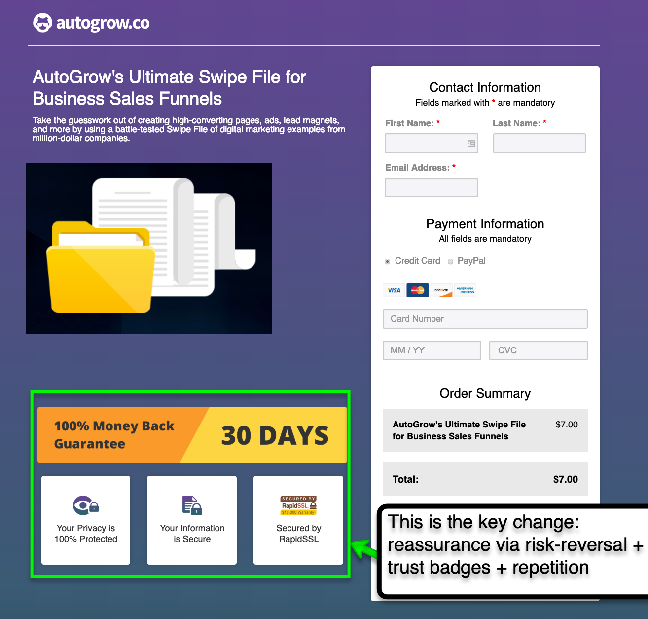
The result of this tiny change was this...
That’s not all though, because…
Naturally, the next thing I went ahead and did was to implement the same tweak to all of our other checkout pages.
As a result of the changes, conversion rates for all other products are showing a positive increase between 10-40%.
All that from less than 15 minutes of total work and knowing what to focus on, thanks to the Proven Sales Conversion Pack.
Conversion Insight #4 – The “Laws of Sales Funnel Physics” WORK—But I Discovered Something New.
Some years ago, I hosted a webinar titled “The 7 Laws of Sales Funnel Physics”.
I received extremely positive feedback on the content of it.
Every single person who replied to our post webinar survey reported they were “likely” or “very likely” to recommend it.
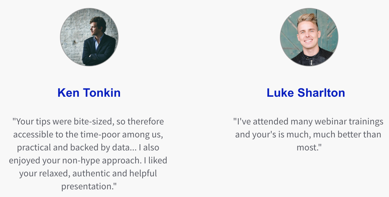
I’m showing you that the content I presented back then was legit.
I’m doing this so you’ll be more likely to take to heart the next insight I’m about to share with you…
You see, when I reached case study #255 in creating “The Pack”, I realized two things.
Thing #1:
The theory behind those original 7 Laws of Sales Funnel Physics is no longer a theory.
It is rock solid, now with hundreds of credible examples to support them.
BUT…
Thing #2:
As I had started to make more connections and see more patterns, I had confirmation of something else that was equally powerful:
There were more laws at work than the ones I originally theorized...
11 actually.
And now, based on the verified data, I’ve added in the remaining 4.
I’ve tried to uncover others, but there appears to be nothing else that falls outside of these 11 laws as to what causes traffic, leads, and sales within your (or anyone’s) marketing funnel.
The 11 Laws cover everything.
And they’re now based on the 313 of conversion rate optimization case studies I analyzed and reviewed.
Not to mention the fact that the laws (and the Proven Sales Conversion Pack in general) are all backed up by my 12+ years experience as an entrepreneur and digital marketer.
Here are the 11 Laws of Sales Funnel Physics that I discovered through the data.
(Note that I can’t teach the Laws and how to use them in a few lines of text. But, for the moment, this gives you a simplified view of the principles at work for what I’m about to tell you next…)
- Law of Visibility – If it isn’t seen, it won’t sell.
- Law of Confidence – Customers want what they see as popular or trustworthy.
- Law of Repetition – Say it again, and again (but don’t be uncool in the way you do it).
- Law of Clarity – Be clear (not clever) in your copywriting to convey understanding.
- Law of Friction – Difficulty, unnecessary “mental load”, or distraction holds customers back from converting.
- Law of Alignment – Match potential customer preferences (both conscious and unconscious).
- Law of Loss – People act more often based on potential losses than potential gains.
- Law of Maximization – People want to maximize their benefits, if risk of losses are mitigated.
- Law of Emotion – We buy for reasons unrelated to value like a desire for status, kindness, or guilt.
- Law of Scale – To grow bigger (i.e. more website traffic), you must leverage that which already has distribution. This law will probably earn its own product in the future since traffic is very different from conversion…
- Law of Range – Presenting the same offer different ways, or different pricing packages, or more total offers means more sales.
There you have it, the 11 Laws of Sales Funnel Physics in a nutshell.
Again the point I want to get across to you is this:
- Growth is not “voodoo”. It’s not something that requires “ancient knowledge” or some secret trick. Instead…
- Growing your leads, sales, and profits is much easier when you see how the Laws explain the why behind each and every success story from the Proven Sales Conversion Pack…
Conversion Insight #5 – How to Instantly Grow Your Sales Right Now: Make It Easy, Make It Seen, Make It Clear.
I had reached the finished line.
I completed writing my condensed analysis (why it works / how to copy it) for all 313 case studies in the vetted collection.
Naturally, I popped on some music and did a victory dance with my wife in the kitchen :)

Now I want to give you my final insight for creating this product and the in-depth research it required…
Continuing off the last section about the Laws of Sales Funnel Physics, here are the 3 laws that popped up as the most common reasons why sales increased.
(If you need a refresher on what these Laws mean, scroll up to the previous section)
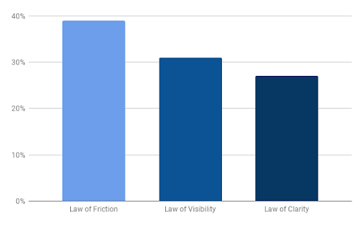
1. Law of Friction – In 39% of case studies analyzed, decreasing website friction was a key factor in growth. This is often achieved by increasing “customer empathy” as shown in insight #2 above.
2. Law of Visibility – In 31% of case studies analyzed, increasing visibility for a key element (e.g. a CTA button) was a key factor for growth. You can relate this to insight #3 above, how there’s a lack of relationship between effort (difficulty to implement) and the size of conversion results.
3. Law of Clarity – For 27% of case studies analyzed, increasing clarity was a key conversion factor because customers need to know what they’re buying and why it is valuable.
As for the other Laws of Sales Funnel Physics, they were observed less often probably because they are more difficult to practice.
Like the “Law of Range” for example...

Range was cited the least of all the laws for the “why it worked” factors in the case studies because it means you need to come up with brand new pricing, or new products and services to sell.
Not easy!
The good news here is that it’s easy to start seeing results right now on your site.
To take advantage of this insight you need to do the following:
- Delete distracting content. Create a more intuitive, focused layout for your sales funnel.
- Make sure the important stuff gets seen. Increase visibility for your primary CTA button for instance. It sounds “obvious” but so many people neglect to do it precisely because it is “obvious” and easy.
- Make sure people “get it.” Remove any confusion by making clear statements about what you’re offering and what to do next.
Of course, these powerful insights are a starting point.
You’re going to need a proven resource you can copy, like a compass that points you to buried treasure…
Conclusion
Download the “313 Case Studies Analyzed Taught Me These 5 Key Insights” so you won’t forget to take action on it later. Click here to download it now.
It’s been a mini-journey to make this product.
I am in awe of the mountain of insights I’ve learned from going through the process despite being an experienced entrepreneur and digital marketer…
- Like a boulder’s potential on the edge of a cliff, there are many “money-points of leverage” on your website. Tweaking these will immediately grow your leads and sales.
- Your sales funnel is only as good as your ability to deeply understand your customers.
- Small conversion tweaks can unlock big sales revenue. But the data also shows there is NO relationship between how difficult the change is, and the growth results you get. For instance, 15 minute tweaks can convert for you more leads and revenue than complicated, 40+ hours of redesign work.
- The “Laws of Sales Funnel Physics” give you a framework for understanding “why” something converts.
- Grow your sales now by doing a few critical things to lubricate your sales funnel: make it easy for customers to flow through your funnel, make sure the offer is seen, and make it clearly understood.
That being said…
If you found the insights I shared with you in this article valuable, then you will love the Proven Sales Conversion Pack.

It’s like $300,000,000 (literally) in lead gen / sales growth packed into a:
- Simple, searchable and visual format so you can find relevant insights for your business right away.
- Easy to learn from and draw inspiration from.
- Easy to copy with supporting videos, where I walk you through the top 20 proven tactics and related case studies.
With the Proven Sales Conversion Pack, there is no need to guess any more about how to grow your sales.
Just copy what the data tells us, because it’s already proven to work.
It’s that simple.
Now, which of the insights above did you find the most useful? Those of you that have already used the Proven Sales Conversion Pack, did you find any other insights worth sharing? And how have the case studies inside helped you scale your business?
Let me know in the comments below.
Keep Growin’, stay focused.


