How to Outpace the Industry Average for Website Conversions

You’ve probably put a lot of precious time and effort into your website.
Maybe you’re feeling pretty great about it. And maybe you’re even seeing a massive uptick in visitors.
The good news is it’s paying off!
Right?
Not so fast...
How many people visited your site this last month?
Now, how many of those visitors opened their wallets and turned into paying customers?
:::Crickets:::
I know the feeling.
When I first launched Growbo’s website, it was such a rush to see the number of visitors spiking as we gained traction.
It was an exciting feeling, sure. But the next step is where the real excitement began…
You see, when your website is designed and optimized to automatically convert visitors into customers, it’s exhilarating. A utopia—some might say ️...
So if you’re looking to shift the heavy lifting of manufacturing sales over to your website, you’ve come to the right place.
Because in this article, I’ll be sharing:
- 3 super easy ways to optimize your website in order to make prospects take out their credit cards (or PayPal, Zelle, etc.).
- Why it’s important to understand the average website conversion rate in your industry.
- And how to conduct competitor site audits to ensure your business outperforms the competition.
Even though Thanksgiving is over, you’ll be thankful you read this post. Now let’s start by answering this overlooked question...
In a rush? Want to download this article as a PDF so you can easily take action on it later? Click here to download this article as a PDF guide.

Why Is It Important to Understand the Average Website Conversion Rate in Your Industry Anyway?
The answer to this question is super simple.
You need to understand the average website conversion rate in your industry in order to be higher than that average. Then and only then you’ll be able to stand apart from the competition.
Because let’s face it, who wants to be average or below it anyway?
You always want to be the best dancer, the best student, the best Thanksgiving turkey maker. Heck, I was even trying to beat my uncle at who could peel potatoes the fastest over the holidays.
My point is, we want to be the best at everything we do.
So don’t you want your business to outperform the others in your industry?
That’s what I thought!
So to start outperforming other businesses in your industry, here’s a breakdown of eCommerce business conversion rates by industry from IRP Intelligent Commerce...
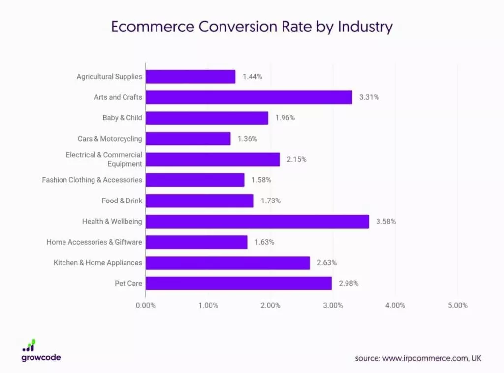
As you see, arts and crafts have the highest conversion rate of 4.01% followed by electrical and commercial equipment with 2.7%.
According to Invesp, the average conversion rate of eCommerce websites is 2.86%.
And that average eCommerce website conversion rate in the U.S. stands at 2.63% compared to the global website conversion rate of 4.31%.
Now, some businesses strive to convert at 2X or 3X the industry average. And this is because they know that higher conversion rates mean more revenue.
That’s kind of obvious. But let’s see the conversion rate and revenue growth in the graph below….
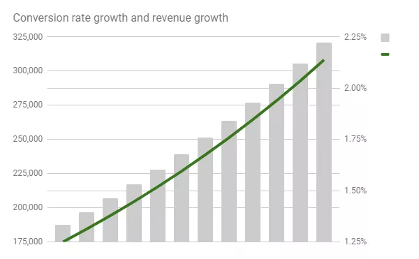
As you see, there really isn’t much standing between your business and those numbers, is there?
And do you know what causes that growth line to go up?
Just a few funnel optimization tweaks that help you boost your conversions.
Also, conversion design tactics for landing pages that you can implement in a snap.
All you need to do is understand who in your industry is outperforming you right now. And optimize your website for higher conversions.
That way you can take a page from their book and write a better story.
Now, which is the average website conversion rate for your industry?
Once you know the average conversion rate in your industry, it’s time to focus on getting a hammer and beating it!
3 Easy Ways to Optimize Your Website & Make Leads Open Their Wallets
Why does your website need to be optimized anyway?
This question is a no-brainer but I’m going to address it anyway.
Optimization is a process that all your landing pages and elements on it must go through at some point.
Just like a person, your landing page needs certain elements to be alive.
For example, a person needs oxygen and blood to live.
Well, in that same vein, your landing page needs copy and design to convert.
If any of those vital elements (oxygen, blood, copy, and design) are removed, then there won’t be any pulse.
And in the case of your landing page, the pulse is the leads it converts.
So if your website isn’t converting any leads, then your landing page needs an intervention—surgery.
And guess what surgery means on your website?
You guessed! Optimization.
You need to make sure all your landing pages that have no pulse and don’t convert are analyzed. That way you can diagnose the problem.
This will let you determine where your landing page is leaking leads and money.
And then, and only then when you optimize or fix those problems, your business will be able to breathe again and see conversions rise.
Some marketers consider certain elements to be more important when optimizing your site than others.
For example, HubSpot shows that the most important factor (76%) in the design of a website is for it to be easy to skim through.
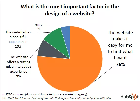
But the truth is, all elements in your website matter when it comes to conversions and optimization.
And if you need help optimizing your site, there are easy tips for landing page optimization that you can start applying today.
But if you don’t have the time to do it yourself, then reach out to Growbo.
We are masters in the art of optimizing websites so you can get the results you’re after.
Ok, without any further ado, let’s talk about the first way you can improve your website’s conversion rate...
Way #1 to Improve Your Website's Conversion Rate: Remove Friction From Your Sales Funnel
One of the 11 laws of sales funnel physics is the Law of Friction.
This law says that the easier you can make the buying experience for an interested buyer, the more likely he/she will buy.
For example, when a user navigates through your site, they have goals. Those goals can be reviewing your products, buying, getting educated with your content, etc.
And when you don’t know your potential customer’s goals or how your website is “blocking” these customers from buying, that’s friction.
Friction is anything that you (mistakenly and on purpose) do to make your prospects not click the buy button.
It can be something as simple as adding unnecessary form fields for the prospect to download your lead magnet.
Or it could be adding too many steps in your website for the prospect to simply buy your tripwire at the checkout page.
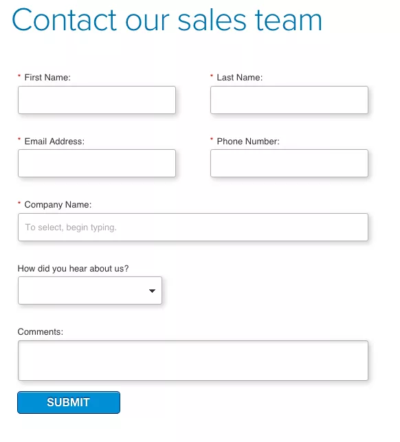
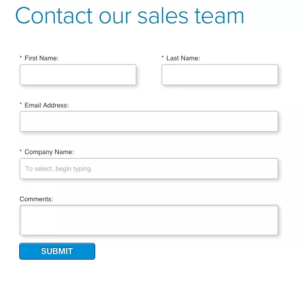
In this case study from our Proven Sales Conversion Pack, you can see how by removing 2 form fields from an opt-in form, form completion spiked by 1,864.2%.
Impressive huh?
Before….
After...
Removing friction from your funnel works like a charm!
This massive result was caused by a small yet significant change of removing just 2 out of 7 form fields.
Can you believe it?
It worked because the market preferred to be sold on the product offer via email and did not want to get on a call or give out their phone number.
Therefore, removing the phone number field (which was required) was a major misalignment.
And reducing the total number of form fields simply eliminated a lot of friction (“should I give a real phone number or a fake one?”).
So what you need to do to improve your conversion rate is remove friction from anywhere in your funnel where you think you’re leaking leads.
In the example above, ask yourself what fields does your form really need in order to be effective so that it converts at a high rate with minimum friction—while still sending you quality leads.
Eliminate unnecessary form fields—the ones that will make prospects exit the page.
Further, how does your prospect prefer to be sold or contacted for your product?
Maybe do not ask them for a phone number. Because people are very protective of their time and their phone numbers.
So empathize with the end-user who’s on your website and understand what’s their end goal on your site and what’s stopping them from accomplishing it.
Way #2 to Improve Your Website's Conversion Rate: Leverage Social Proof All Over Your Website
I’ve talked plenty of times about social proof and its power to persuade prospects to buy.
Because social proof simply sells.
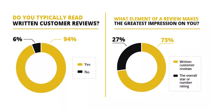
In fact, according to Fan & Fuel, 97% of consumers rely on social proof during a buying decision. And 92% will hesitate to purchase if there are no customer reviews.
On top of that, 94% of people admit they read customer reviews.
Now, you may be wondering “Hey Matt, but how do I leverage social proof on my website?”
So now that you know that not having social proof on your site could be potentially hurting your conversions, it’s time to leverage it!
How?
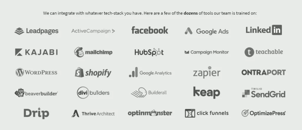
You see, any form of social proof—testimonials, trust badges, customer reviews, security seals, ratings, awards (I got out of breath there for a second)—anything will help you improve your average website’s conversion rate.
See how we leverage it on our own site?
All you have to do is, first, ask customers and clients for reviews and testimonials (if you don’t have any). And look for vanity stats, any certifications your business has, or anything that can add credibility to your business.
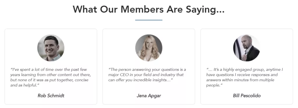
And if you don’t have any of those, easy peasy.
Just look for other similar vanity stats to reference.
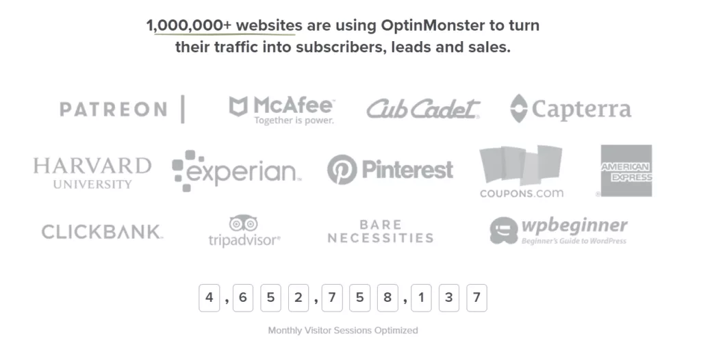
For example, you can search for relevant quotes from historical figures or even large brands who have written an article on a related topic.
Quote them and include their picture or logo.
This is what’s known as “borrowed social proof.” And even though it may not be about you in particular, it still gives you and your site a healthy boost of legitimacy.
A word of caution, though: relevance is key here.
You can’t just take famous people’s pictures or companies’ logos if they don’t fit in your landing page. Make sure they relate to what your company is or does.
Then add that social proof in strategic places of your landing page, and voilá.
You’ll be leveraging the power of social proof.
Way #3 to Improve Your Website's Conversion Rate: Track & Analyze Your Site Visitor’s Behavior
When you track and keep an eye on your prospects’ behavior through your site, you’ll be able to identify which landing pages get the most attention and time from those visitors.
And this will let you put more focus, time, and money into it.
Why?
Because if for example, let’s say you discover that your site visitors are spending a good chunk of time on your checkout page but don’t buy.
Then, your checkout page is more likely to need some optimization to see why prospects are not hitting the buy button.
Or for example, if you see that most of your traffic is going to a specific blog post, then you should probably be optimizing your content and write more articles about that specific topic.
According to Spinutech, some important metrics that you should also track when analyzing your site visitors’ behavior are:
- Traffic
- Bounce Rates
- Pages/Session
- Average Session Duration
- Conversions
- Click Through Rates
The bottom line is you need to understand where you’re losing visitors so you can take action and fix that problem.
And of course, for this, there are plenty of website analytics and sales funnel tools to track your visitor’s behavior.
And there’s also a cool case study from Nabler that features a client who was struggling with a significantly high exit rate of over 75% on their top selling product.
And after their web analytic consultants started auditing the client’s entire website performance, they were able to analyze and identify the problem areas.
These problems were related to design, usability, and call-to-action buttons to increase eCommerce website conversion rates.
And after using Google Analytics and performing several A/B tests on their landing page, they were able to see the following results:
- Exit rate on the landing page product came down from 75% to 37%.
- Products category to product view’s conversion improved by 36%.
- Product view to cart addition conversion improved by 24%.
- The product’s landing page conversion rate improved by 34%.
So again, if tracking and analyzing our site visitors’ behavior isn’t something you’re very interested in doing or simply don’t have the time to do it, reach out to Growbo and we’ll give you a hand with that.
Finally, How to Conduct Competitor Site’s Audits to Ensure Your Business Outperforms Your Competition
So what is a competitor site audit?
Don’t freak out. I know it sounds complicated but it isn’t.
It’s just what it sounds like.
It’s taking a page from the book of someone who’s outperforming you and finding potential areas you can simply improve and beat them.
So when conducting competitor site’s audits, make sure you analyze:
- The user experience on their website - Navigate through their entire site and see what the user experience is like. Is it friendly or complicated? Your user experience needs to be friendly and prospects need to get wherever they want to go without any friction.
- Quality of the copy - Read their copy and see if it’s persuasive or salesy. Your copy must be persuasive enough to sell. And if you need help with that, there are incredibly useful copywriting techniques to capture leads.
- Pricing, perks, free trials, free shipping, loyalty programs - Take a look at how they’re displaying their pricing packages—or do prospects need to request a quote? Do they offer free trials? Is that causing people to sign up easier for their service?
- Discounted products or services - Are they taking advantage of scarcity and urgency? Make sure to add it to your site too because if prospects see that your product is about to be sold out, they’ll act faster because of FOMO.
- Chatbot - If your competitor is outperforming you and they have a live chat widget on their site, chances are that’s part of their high conversions. So make sure to implement one on your site too.
And some questions that can help you with this site audit process are:
- What is your competitor doing really well?
- Where do they have a significant edge on you?
- In what areas is this competitor a threat?
- Are there market opportunities that your competitor has identified and you overlooked?
All these will give you an idea of why your competitors’ websites are outperforming yours and what you need to improve.
But it’s not only about analyzing the data.
It’s about taking action.
Gather the data, analyze it, and take action. Because analysis is where the magic happens.
You begin looking for patterns and trends in strengths, weaknesses, opportunities, and threats (SWOT analysis).

You notice where gaps exist in your current strategy and you adjust the trajectory of your business.
And then, and finally then when you take action, is when you’ll see the magic in your conversions really happen.
Conclusion
Download the “How to Outpace the Industry Average for Website Conversions” so you won’t forget to take action on it later. Click here to download it now.
So how do you think your website’s ability to convert sales measures up in your own industry?
Here’s a quick review of what you should do to begin optimizing your website for conversions to outperform the average:
- Remove friction from your sales funnel
- Leverage social proof all over your website
- Track and analyze your site visitor’s behavior
Now, after reading this article, you know that you don’t have to rely on a guess. You can find out for sure.
And knowledge is power.
With the information you extracted from this blog post, you’re more than ready to optimize your website so your business becomes the industry standard for high-performing conversions.
And if you don’t have the time or the capacity in your team to optimize your website and funnel in general, at Growbo we can take care of all of that for you.
We’re the car taking you wherever you want to go. And you’re the driving force behind it. Or simply put, the driver.
Now tell me something, which parts of this article were most helpful for you? Have you identified areas where you’re leaking leads and sales?
Let me know in the comments below.
Keep Growin’, stay focused.


