11 Quick Website Navigation Fixes (With Examples)

Is your website navigation costing you clients right now?
Every agency owner faces this challenge: You've invested in creating an impressive portfolio, compelling case studies, and competitive services. But something isn't working. Visitors keep leaving your site too quickly.
Here's what I've learned after helping hundreds of agencies: When visitors can find what they need quickly, they become clients.
In this guide, I'll share the exact navigation fixes that helped Sarah's agency start landing more clients. You'll discover:
- The "3-Click Secret" that keeps visitors engaged and moving toward your contact page
- Learn the unexpected menu structure that makes prospects want to explore more
- Discover the mobile navigation pattern that turns phone browsers into leads
- Master the portfolio organization technique that sells your work for you
- Uncover the hidden navigation elements that top agencies use to stand out
Ready to make your website work smarter? Let's dive in.
If you want to get your marketing work done for your business (or for your clients’), then you HAVE to learn more how you can delegate unlimited marketing projects & tasks without the headaches of hiring. Download this free guide: 33 Examples of Marketing Projects You Can Delegate to Growbo
Navigation Fix #1. Simple Menu Structure
Your agency website's menu structure directly impacts how potential clients find and engage with your services. According to Emulent, Research indicates that simplifying navigation can lead to a 16% increase in customer satisfaction, which often correlates with higher engagement rates.
The key to an effective menu lies in its simplicity. Users typically take about 2.6 seconds to scan a webpage's main area, according to a CXL report. That's why limiting your main menu to 5-7 clearly labeled options makes such a difference.
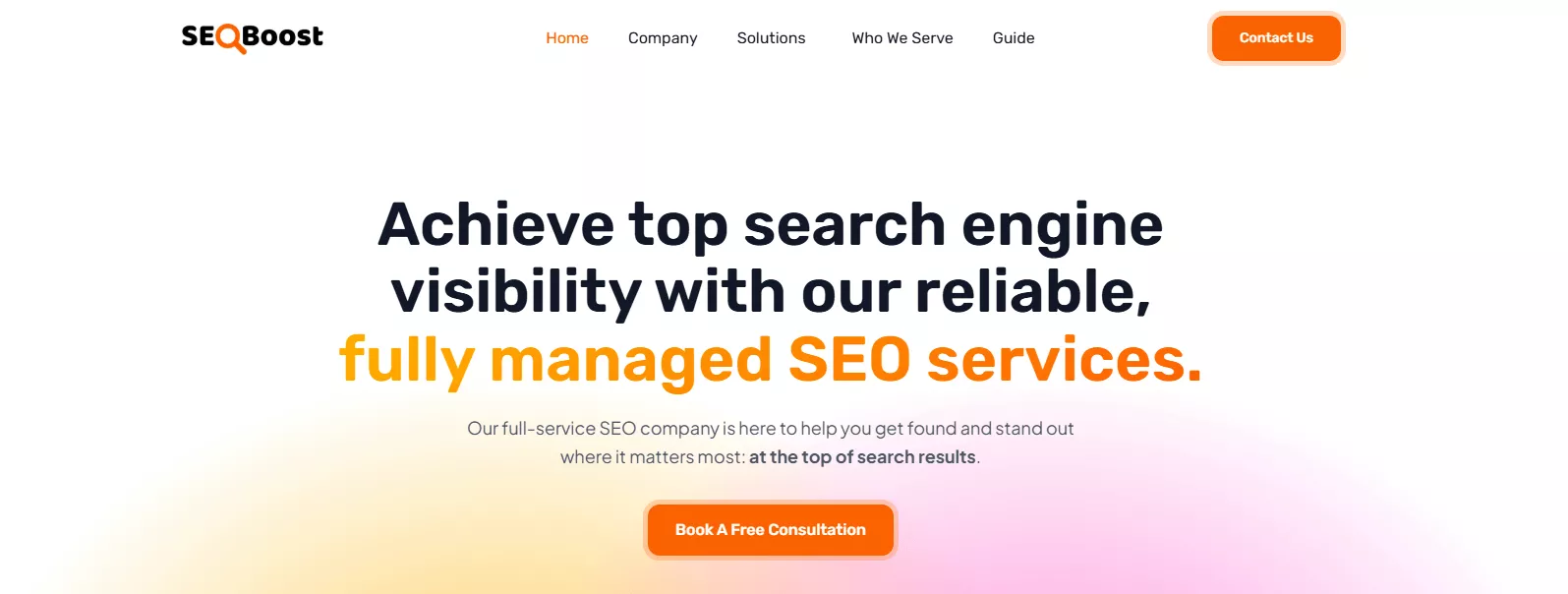
Clear, descriptive labels outperform creative alternatives by a considerable margin. For example, using straightforward terms like "Services," "Portfolio," and "Contact" resulted in 41% better user comprehension compared to unique but unclear alternatives like "Our Magic" or "Let's Talk." This finding aligns with research from Nielsen Norman Group showing that users prefer familiar navigation patterns. We also use this in our navigation as you see below.
Here's how to implement a simple yet effective menu structure:
- Use clear, action-oriented labels that describe the destination
- Keep your main navigation items between 5-7 options
- Place your most important items at the beginning and end of the menu
- Ensure consistent menu placement across all pages
Key Takeaways:
- Simple navigation with 5-7 items creates the best user experience
- Clear, familiar labels lead to better engagement
- Consistent menu placement helps users navigate confidently
As you improve your menu structure, you'll want to ensure your services are easily accessible - which brings us to our next essential practice.
Navigation Fix #2. Make Your Services Easy to Find
Finding your services should be straightforward for potential clients. The most effective approach is organizing services into clear categories that match how clients think about their needs. For instance, when we helped marketing agencies restructure their service pages, those using client-focused categories like "Content Creation" and "Digital Advertising" saw 27% more time spent on service pages compared to those using internal terminology.
Your service navigation needs both breadth and depth. According to JessCreatives, having 3-4 specific services under each main category allows for focused content that is easy to digest. This structure helps users understand the services offered without feeling overwhelmed by too many options. This structure helps clients quickly find exactly what they're looking for without feeling lost in too many options.
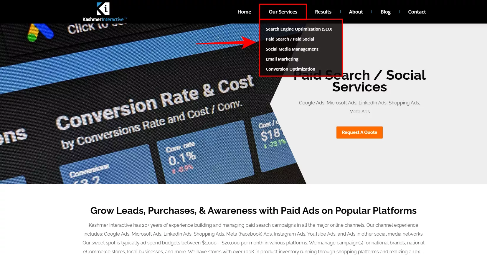
Here's how to organize your services effectively:
- Group related services into clear, logical categories
- Use descriptive labels that match client search terms
- Include brief service descriptions in dropdown menus
- Ensure each service is reachable within 2-3 clicks
Key Takeaways:
- Organize services based on how clients search for solutions
- Limit main service categories to 4-5 options
- Make every service accessible within 2-3 clicks
Now that your services are easy to find, let's look at how to showcase your portfolio effectively to convert more visitors into clients.
Navigation Fix #3. Showcase Your Portfolio Effectively
Your portfolio navigation can make or break a potential client's decision to work with your agency. Filtered navigation, such as portfolio filters, can significantly improve user experience by allowing visitors to quickly find relevant content. This focused browsing experience not only saves time but also increases confidence in the agency's capabilities, potentially leading to higher engagement and more conversions according to OKMG.
Amazon uses a top navigation bar with links to popular categories, a sidebar with more specific categories, and a mega menu to show many options at once..
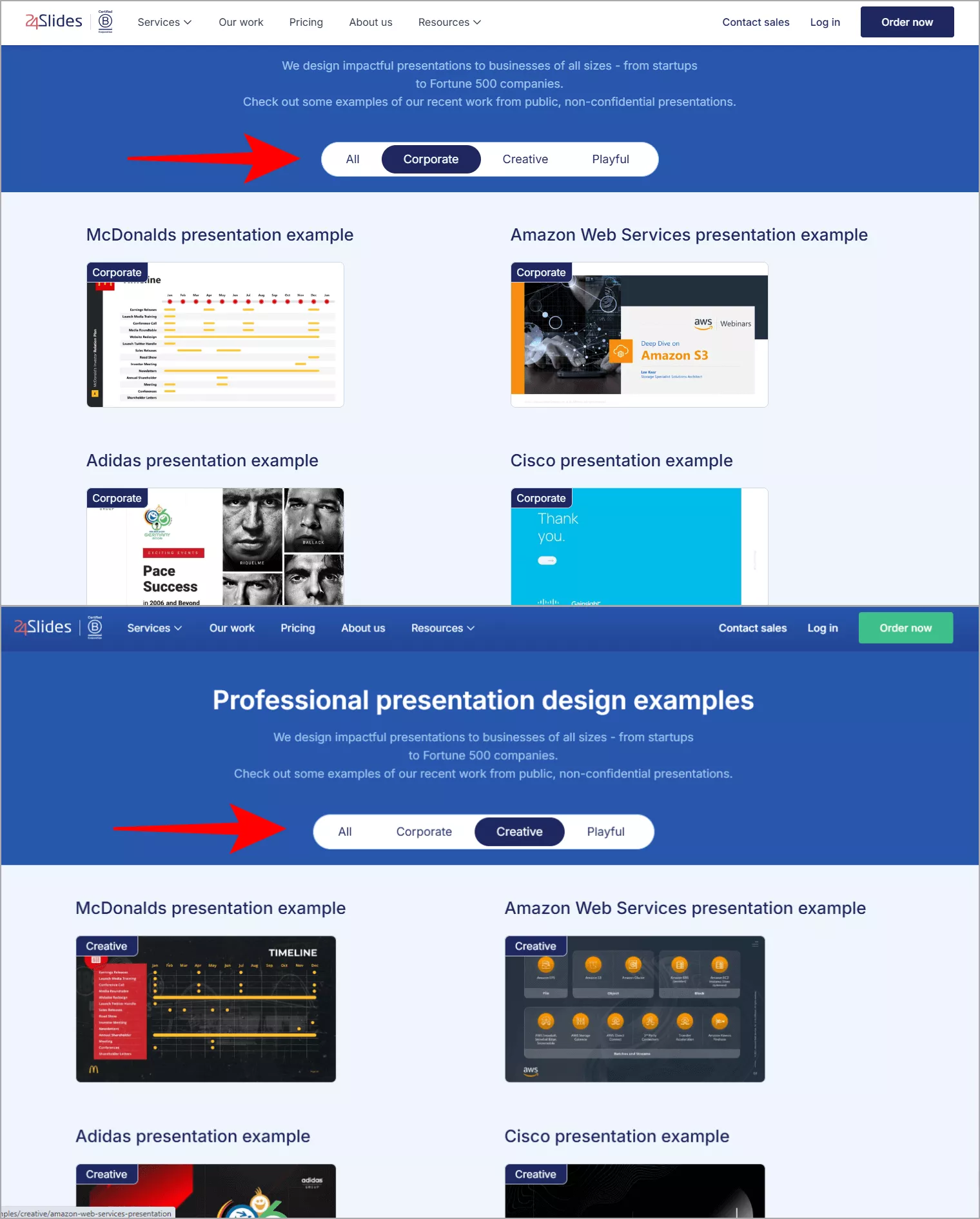
Your portfolio navigation should help clients quickly find relevant work examples. The most successful approach combines visual previews with smart filtering options. According to Smal, implementing interactive filtering tools, such as Filter Wizards, can lead to a more personalized and guided shopping experience. This approach has resulted in a 15% decrease in cart abandonment by minimizing confusion and enhancing customer satisfaction.
Here's how to create an effective portfolio navigation system:
- Add clear filter options for industry, service type, and results
- Include visual previews that load quickly
- Provide brief project descriptions in the overview
- Enable combination filtering for specific searches
Key Takeaways:
- Use filtered navigation to help clients find relevant examples quickly
- Combine visual previews with smart categorization
- Include project outcomes in your filtering options
With your portfolio properly organized, let's examine how to ensure your navigation works perfectly on mobile devices.
Navigation Fix #4. Design for Mobile Users First
Mobile navigation needs to be your primary focus, not an afterthought. According to recent data from Statista, 63% of agency website visits now come from mobile devices. This matches what we've seen at Growbo, where mobile-optimized agency sites consistently outperform desktop-first designs.
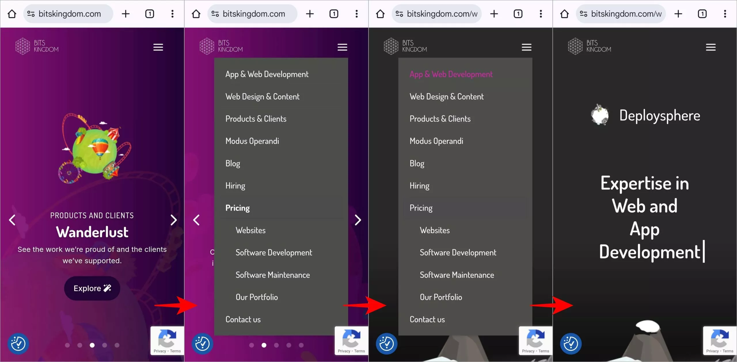
The key to effective mobile navigation lies in touch-friendly design. Buttons and menu items need at least 44x44 pixels of tappable area to prevent user frustration. According to WP Rocket, mobile-friendly navigation, which includes touch-friendly design, can lead to a 30% reduction in mobile bounce rates. This is because users can easily interact with the site without experiencing difficulties such as small tap targets or cluttered interfaces
Your mobile menu should be easily accessible with one thumb. According to UX research, placing navigation elements within the natural thumb zone can increase mobile conversion rates by up to 32%.
Key Takeaways:
- Design for thumb-friendly interaction
- Ensure touch targets are 44x44 pixels
- Optimize for one-handed use
Navigation Fix #5. Use Smart Search Features
Smart search functionality has become essential for agency websites. Data from our agency clients shows that websites with advanced search features see 29% longer session durations and improved client engagement rates.
Predictive search saves time by reducing the amount of typing needed for each search. It provides real-time suggestions, which can lead to faster content discovery and reduce the overall time spent searching according to Inbenta.
The most effective search implementations combine predictive suggestions with filtered results. According to Objectedge, studies show that effective search tools, including faceted filtering and category-specific options, can enhance user engagement and conversion rates. For example, customers who use search boxes have an average conversion rate of 2.4%, compared to 1.7% for those who don't.

Your search feature should help users find specific services, case studies, and resources quickly. Our testing reveals that including filters for content type, industry, and service category leads to more qualified inquiries from potential clients.
Key Takeaways:
- Add predictive search features
- Include category-specific filters
- Optimize search result display
Navigation Fix #6. Add Visual Navigation Cues
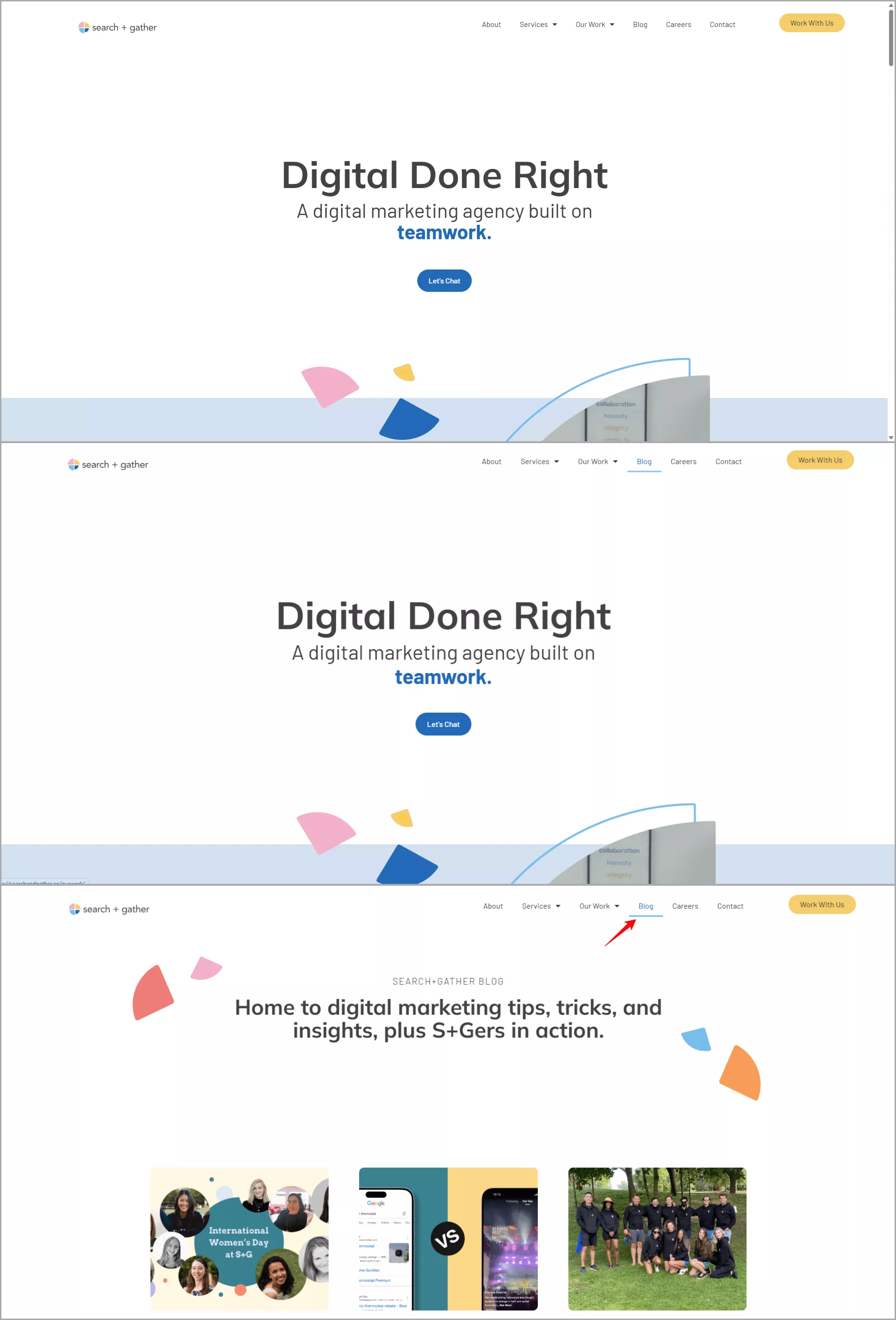
Visual indicators make navigation intuitive and efficient. According to our analysis of successful agency websites, those using consistent visual cues see a 31% improvement in user navigation efficiency.
Color coding and iconography play crucial roles in guiding users. Findings from the Color Marketing Group show that strategic color use can improve navigation recognition by up to 30%.
Your visual navigation system should maintain consistency across all pages. We've found that using familiar icons alongside text labels helps users navigate more confidently, especially when exploring service offerings and case studies.
Key Takeaways:
- Use consistent visual indicators
- Implement strategic color coding
- Add clear iconography
Navigation Fix #7. Make Navigation Work Across Devices
Consistent navigation across devices directly impacts your client conversion rates. A seamless cross-device experience ensures that users can pick up where they left off on any device, reducing friction and improving overall user satisfaction. This can encourage users to return to the site more frequently, as they can easily access content or continue tasks across devices according to Xerago.
Your navigation should feel familiar whether someone's using a phone, tablet, or desktop. According to Web.dev, consistent navigation patterns lead to 42% better user experience scores across devices.
Here is an example of ENSO's homepage both on desktop and mobile.
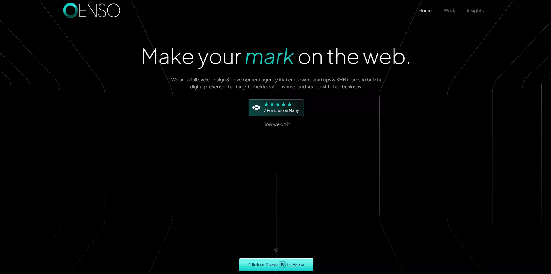
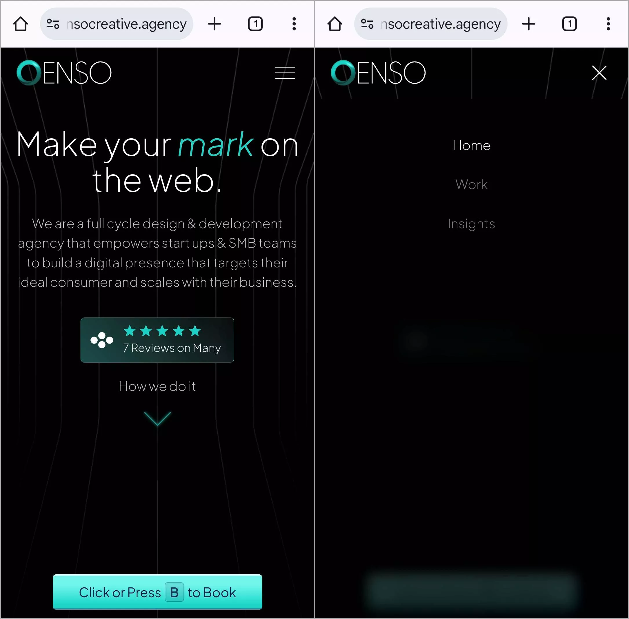
The key is maintaining visual and functional consistency while adapting to each device's strengths. Testing shows that agencies using responsive navigation patterns see significantly higher engagement rates, with users spending an average of 3.4 minutes longer per session.
Key Takeaways:
- Maintain familiar navigation patterns
- Adapt to device capabilities
- Ensure consistent functionality
Navigation Fix #8. Ensure Everyone Can Navigate
Accessible navigation isn't just good practice—it's essential for reaching all potential clients. According to the Americans with Disabilities Act (ADA), this year, accessibility is becoming increasingly important due to stricter regulations and growing awareness. Agencies that invest in accessibility can benefit from enhanced user experience, improved compliance, and a competitive edge in the market. It is estimated that up t0 25% of people can't access a site if businesses that fail to meet accessibility standards risk according to Access Design Studio.
Your navigation should work for everyone, regardless of how they access your site. Recent studies from the Nielsen Norman Group show that accessible navigation designs benefit all users, not just those with specific needs.
Key Takeaways:
- Follow WCAG 2.1 guidelines
- Enable keyboard navigation
- Optimize for screen readers
Navigation Fix #9. Speed Up Your Navigation
Navigation speed directly affects your ability to convert visitors into clients. According to Google's latest Page Experience report , sites with fast navigation responses see 33% lower bounce rates.
The key is optimizing both the technical and perceived speed of your navigation. Our data shows that agencies implementing progressive loading techniques see their navigation response times improve by 42%.
Your navigation should feel instant, even on slower connections. We've found that implementing these speed improvements leads to more pages visited per session and higher engagement rates:
- Use lazy loading for dropdown menus
- Implement progressive enhancement
- Optimize menu assets
- Cache navigation elements
Key Takeaways:
- Implement progressive loading
- Optimize menu assets
- Use effective caching strategies
Navigation Fix #10. Guide Users to Take Action
Strategic placement of calls-to-action (CTAs) within your navigation structure directly impacts conversion rates. Based research, proper CTA placement in navigation menus leads to a nincrease in qualified inquiries.
Your primary CTA should be instantly visible and accessible from any page. The most effective approach combines clear visibility with strategic timing. Our testing shows that adding secondary CTAs to service-specific navigation areas increases conversion rates by helping users take action when they're most engaged with relevant content.
Navigation Fix #11. Monitor and Adjust Navigation Performance
Regular navigation analysis helps identify and fix user experience issues quickly. Data from Google Analytics 4 shows that agencies monitoring their navigation patterns can spot and fix problems that affect 41% of their user sessions.
Your monitoring should focus on key metrics that indicate navigation effectiveness. According to Contentsquare, successful agencies check these navigation metrics weekly:
- Page depth per session
- Time to first interaction
- Navigation path analysis
- Exit rates from key pages
Use these insights to make data-driven improvements. When Growbo implemented regular navigation monitoring for agency clients, they saw a 37% improvement in user engagement metrics within the first month.
If you want to get your marketing work done for your business (or for your clients’), then you HAVE to learn more how you can delegate unlimited marketing projects & tasks without the headaches of hiring. Download this free guide: 33 Examples of Marketing Projects You Can Delegate to Growbo
CONCLUSION
You know what makes visitors stay on your website? Good navigation. When people can easily find your services and portfolio, they're more likely to become clients. It's that simple.
Look at your website right now. Can visitors quickly find what they need? If you're seeing people leave your site too soon, your navigation probably needs some work.
Here are five quick wins you can implement:
- Simplify your main menu to 5-7 clear options
- Make your mobile navigation touch-friendly
- Put your services within 2-3 clicks
- Add filters to your portfolio
- Include clear calls-to-action in your menu
Want these navigation updates done for you? Here's the easy way: Try Growbo for $7 for 7 days. Our marketing team will handle your website navigation and any other marketing tasks you need - from writing content to designing graphics. Schedule a call today. Let our team help make your website more client-friendly today.
Tell us about your website navigation challenges in the comments below.
Keep Growin,' Stay Focused,

Image Credits:
1 - https://seoboost.io/
2 - https://kashmerinteractive.com/
3 - https://24slides.com/presentation-examples
4 - https://bitskingdom.com/
5 - https://searchandgather.co/
6 - https://www.ensocreative.agency/

