How to Get More Downloads for Your Lead Magnet (9 Proven Tips w/ Examples)

Remember the weird and uncertain time in your life…
No, I'm not talking about the 2020 Corona-pocalypse (Hah!...?)
😆
I’m talking about when you were a teenager.
Back then you were awkwardly trying to get by and fit in, right?
And you wanted to be “accepted” by the cool kids from your classroom to become their friends.
But then you remembered something… That juicy secret only you knew about and that everyone wanted to know!
So what did you do?
You bribed those kids (kind of like an “opt-in bride” AKA a lead magnet). You offered them a peek of that secret they were dying to know.
Suddenly, you had their interest and attention.
The same thing happens in digital marketing with lead magnets.
Your website visitors come to your site and instantly leave if they don’t see something they feel compelled to take action on.
And if you don’t offer anything to your prospects, they might never try your products or services at all.
In today’s article, I’ll show you…
- Why bribing your site’s visitors with a lead magnet is critical to converting them into paying customers.
- The best 9 proven-to-convert tactics to get more people to download your lead magnet.
- Real-life examples of websites and businesses that have applied these tips and seen their conversions shoot sky-high as a result.
Let’s start “bribing” your audience with something juicy they want—grow downloads for your lead magnet like crazy.
Lead Magnets: Your Golden Ticket to Convert
A lead magnet is a free offer you show to your website’s visitors in exchange for their contact information.
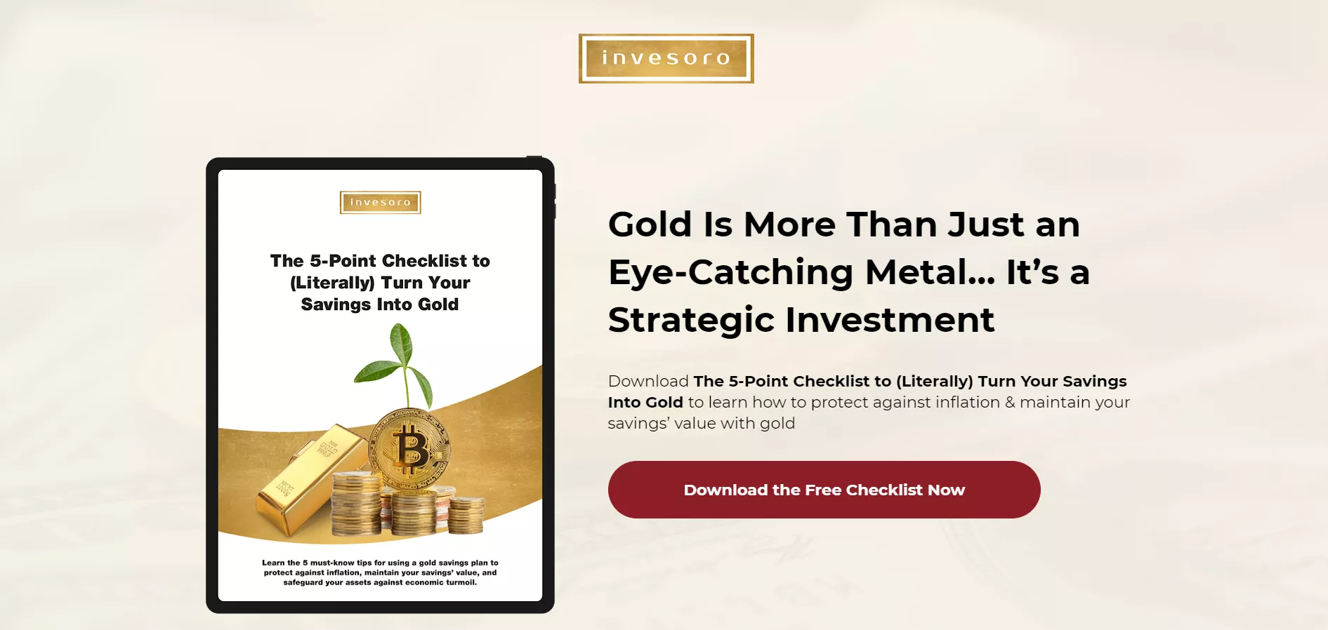
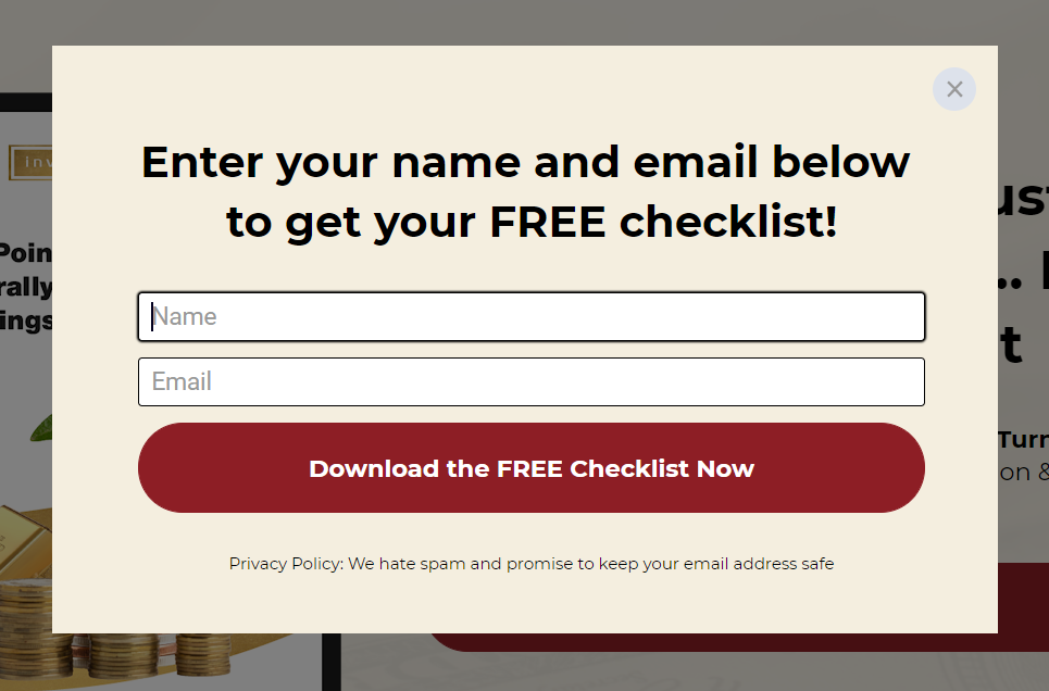
The same way a magnet attracts metal, a lead magnet attracts prospects. That’s where the name comes from, duh...
Magnet: give people something valuable for free + Lead: so prospects can give you their contact info in return.
If you offer your site’s visitors something for free, you’ll create an irresistible offer few would say no to.
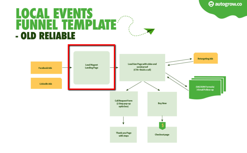
And in most well-constructed sales funnels, the lead magnet offer is the first step.
The first step to start converting. The first step to start nurturing relationships with prospects. And the first step to start selling.
A lead magnet is always the proven-to-convert first step in the customized sales funnels that we at Growbo create for our clients.
It’s the first step in local events sales funnels:
And the first step in SaaS sales funnels:
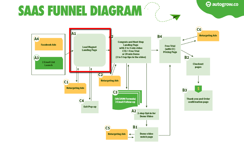
And for eCommerce sales funnels:
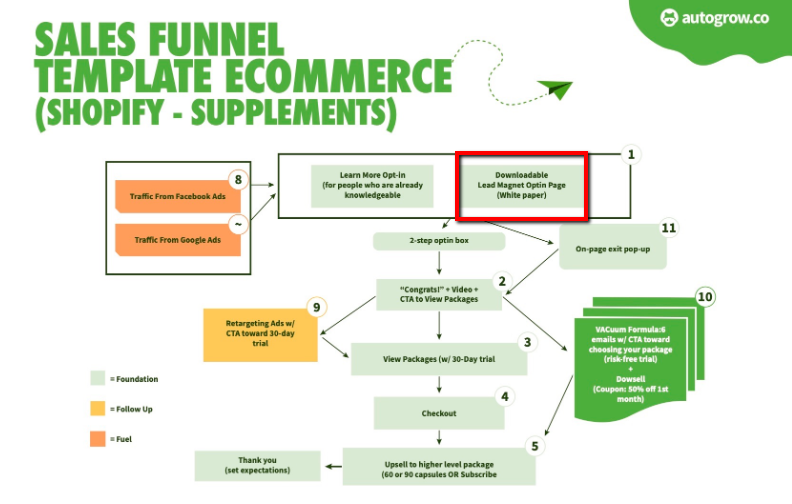
And for real estate coaching sales funnels:
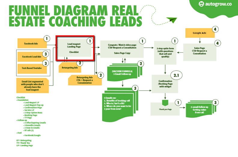
And for high-ticket coaching sales funnels:

By offering your lead magnet in the first stage of your funnel, you build (and grow) your email list with prospects that are interested in your products or services.
It’s not only about offering something for free though. It also has to actually add value to the prospects. Otherwise, they won’t want it in the first place and they won’t return to your site.
See how in the example below, this website explicitly highlights the benefits the reader will get from downloading their guide?
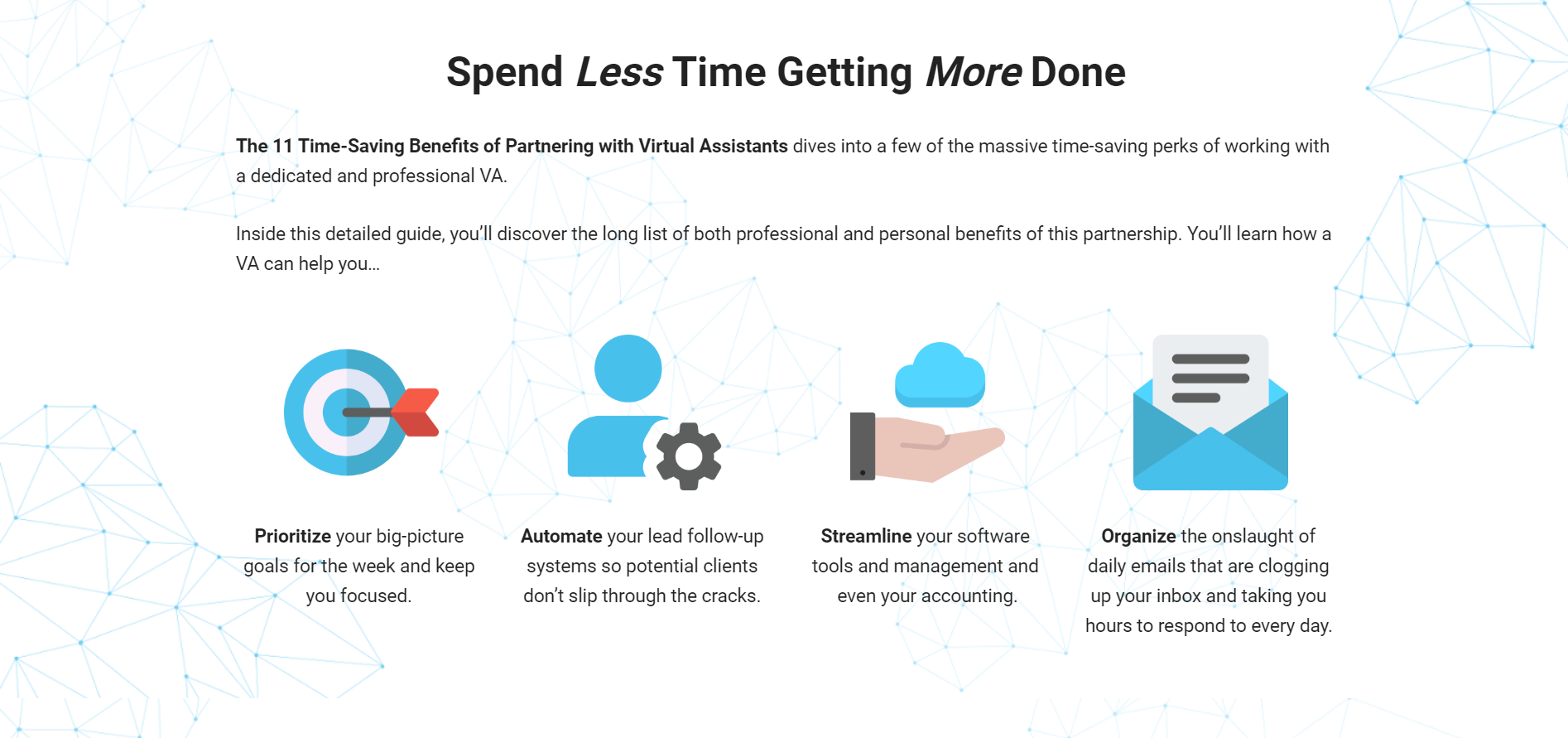
You see, most people won’t freely volunteer their contact information. But, if they get something valuable in return, they’ll gladly give you their email address.

If you already know how to create a killer lead magnet or if you’re already offering one but don’t get as many downloads as you should, this article is the perfect guidance you need.
And if your lead magnet offer is one from the list below, you’re on the right path to converting:
- Checklist
- Demo Videos
- Guide
- Report
- Cheatsheet
- Spreadsheet
- Case Study
- Toolkit/Resource List
- Webinars
- Video Training
- Templates
- Recipes
- Discount
- Audio File
- Cookbook
- Swipe Files
- Tutorial
- Quiz/Survey
- Transcripts
- Assessment/Test
- Printable Poster
- Catalog
- Desktop Wallpaper
There may be nothing wrong with your lead magnet per se (as long as it’s valuable and high-quality). The problem is more likely to be with how you’re advertising it.
But that’s why you’re reading this article. Because you need to find out what you’re doing wrong, and of course, how to fix it.
Let’s take a look at these proven-to-convert tactics so you can apply them today. You don’t need the expertise of a professional designer. You can do these tweaks by yourself and see conversions rise instantly.
1. Include the Word FREE
The word “Free” has a psychological appeal. It attracts people because we naturally gravitate towards getting things that are cost-less.
And we’re naturally loss-averse creatures too. We hate losing things (food, money, time, anything). In fact, our aversion to loss is so predictable that it’s the core foundation of Law #7 of Sales Funnel Physics: The Law of Loss.
It’s why “Free” is so powerful and so attractive.
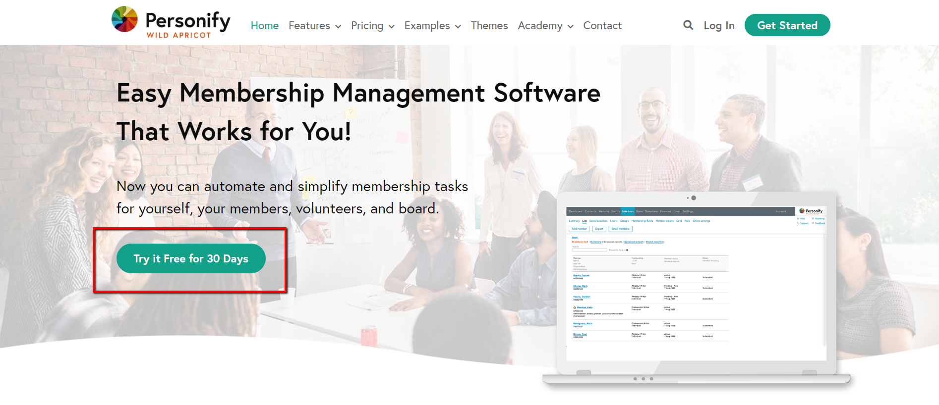
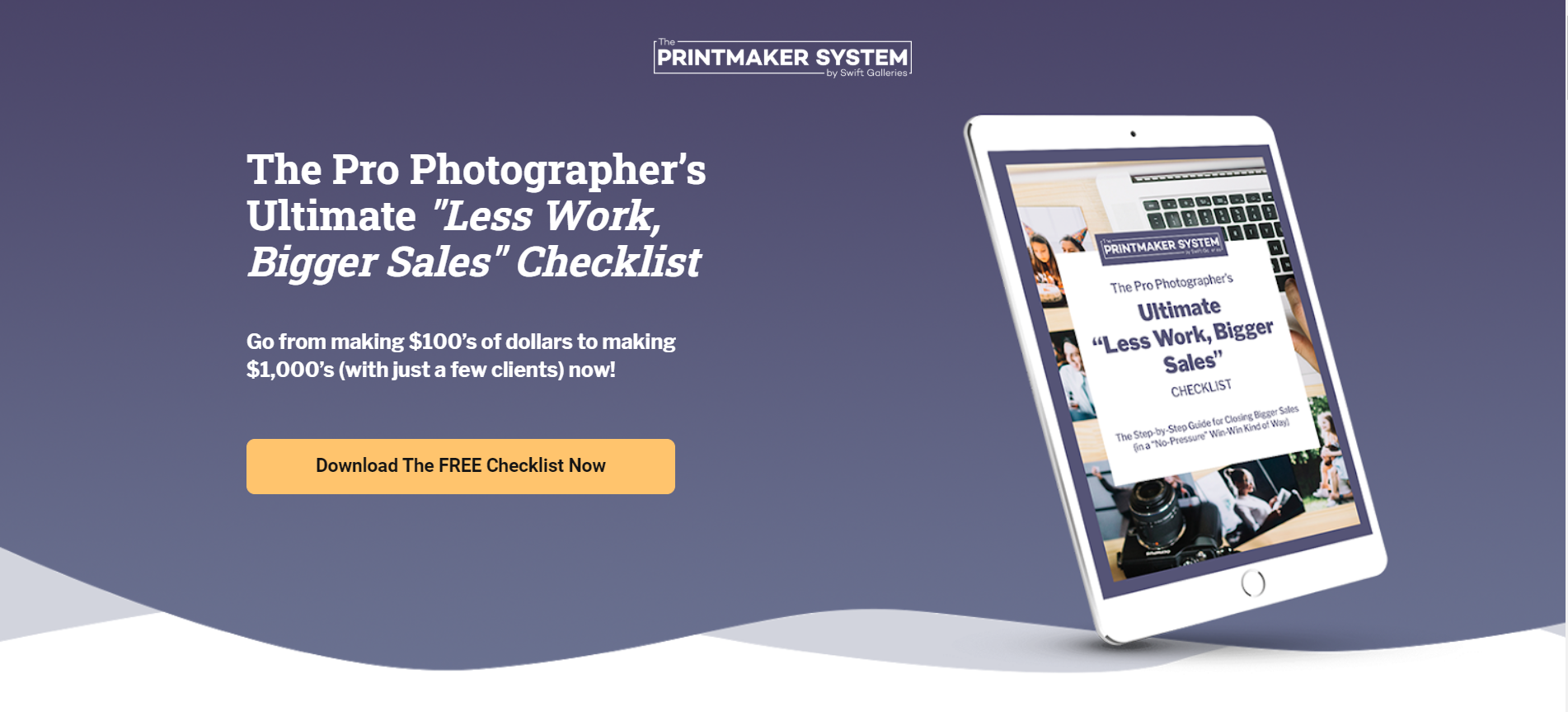
But whatever you offer to prospects for free must be valuable. It must be useful, educational, and/or entertaining.
Some people are very skeptical about free offers.
My sister is one of them.
Every time I give her something (for free) she automatically asks me “Mariana, what’s wrong with that that you’re giving me?”
And my answer is always the same: it’s valuable.
When prospects visit your website and see your offer, they may wonder the same things as my sister.
So explain to them why your lead magnet is free.
And of course, add the word “Free” across your website.
Here’s an example of a lead magnet landing page where the word “Free” was wisely used.


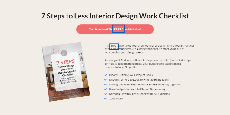

Because remember one of the Laws of Sales Funnel Physics, the Law of Repetition? What gets repeated gets remembered.
So don’t be shy and add that powerful word across your website. Here are some ideas of where to add it:
- On your CTA buttons
- On your copy in the lead magnet landing page
- On your footer
- On your navigation
- Headlines
- Email subject lines and email body copy
- Headings
- Ads
And adding the word "Free" in CTA buttons can increase opt-in rates by 131.22%. In fact, that’s exactly what happened on the website below.
Before…

After…
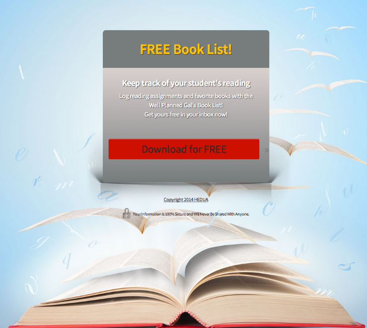
Changing the CTA button text from “Download Now” to “Download for Free” boosted conversions.
And Professor of psychology and behavioral economics at Duke University, Dan Ariely, explains how people change their behavioral patterns when they’re offered something for free.
He says that the word “Free” isn’t just an indicator of price. It’s also an emotional trigger that’s often irresistible.
So, emphasize that your lead magnet is for free. Let prospects know that they don’t have to spend money on it. Rather, they’ll get value and will benefit from it.
2. Focus on Your Target Audience
Your lead magnet must be highly targeted like in the example below. It’s clear that the offer is directed to entrepreneurs.
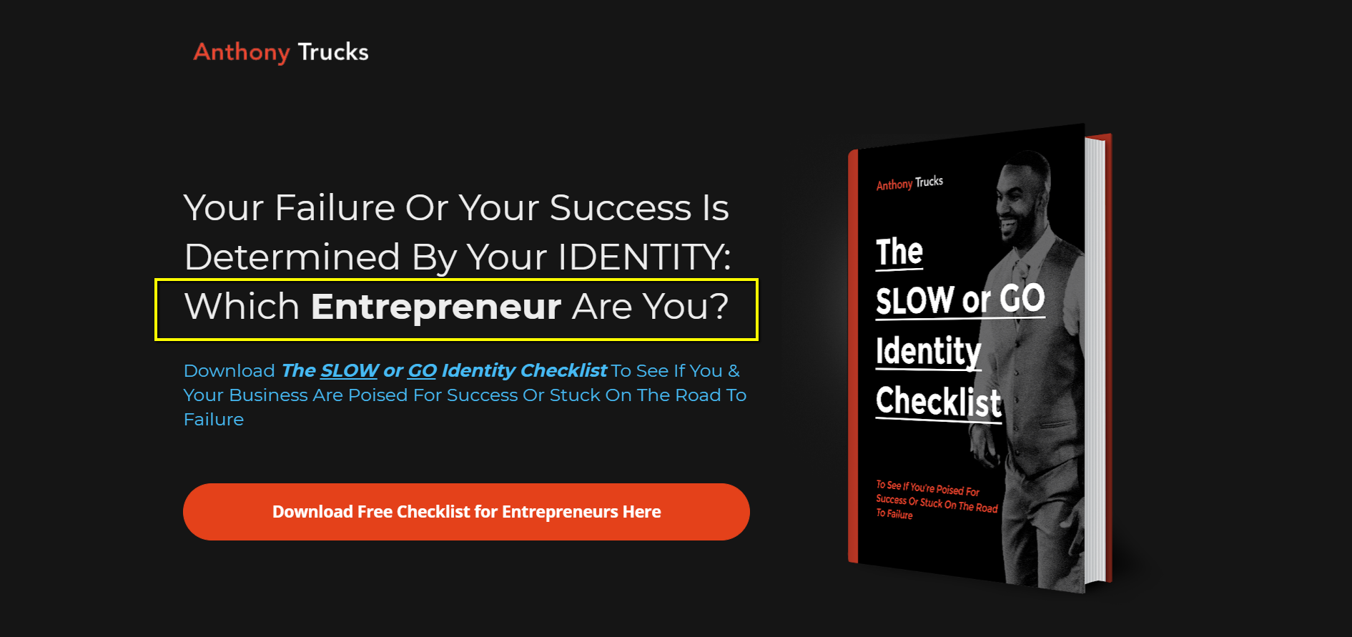
For instance, don’t offer a generic resource. A generic resource could help capture leads, sure. But it may not help convert them because those leads aren’t really relevant to your business.
Focus on your target audience. Know who they are and what they need.
In the example below, see how it’s super clear that the checklist is for interior designers?
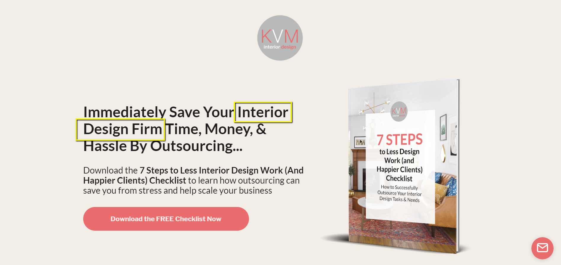
A targeted lead magnet is a safe bet. Why? Because it will attract the right people.
You need relevant leads that you can later convert into paying customers.
So write very specific and clear copy that can segment your audience and qualify your leads. And start by nailing that headline (like in the example above). Make it clear enough so that just by reading it, people can trust you and download your lead magnet without having to read more about your offer.
For instance, a former client of our service was offering a commoditized type of service. He works with web design agencies and startups. His business helps them to turn their Photoshop designs into a well-coded WordPress website that looks good on mobile and desktop.
He came to us (partly) because he was offering a generic type of lead magnet that wasn’t converting. It was something like “7 Steps To Scale Your Startup Business Online” guide.
But what was wrong with his lead magnet offer?
- First, the alignment was off. He was targeting startups when he really wanted to target web design agencies. And since startups are early-stage companies, they are more likely to not have the money to afford a service like that.
- Second, his proposal was too generic. “Scale your business” was giving prospects the wrong expectations. He was simply not thinking from his customers’ perspective and wasn’t attracting the right leads.
So what you gotta do is think from your customer’s perspective based on Maslow’s Hierarchy of needs—first physiological (food, water, etc.), then safety, and then love.
The faster you understand how your products or services will be solving money, time, and efficiency problems for your prospects, the more confident they will feel about your offer.
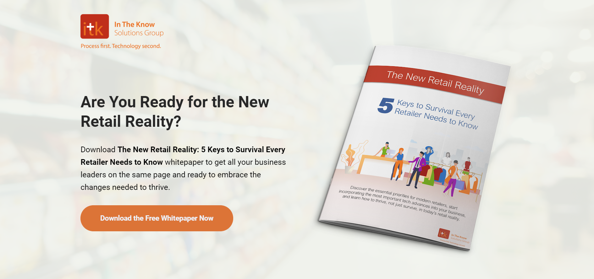
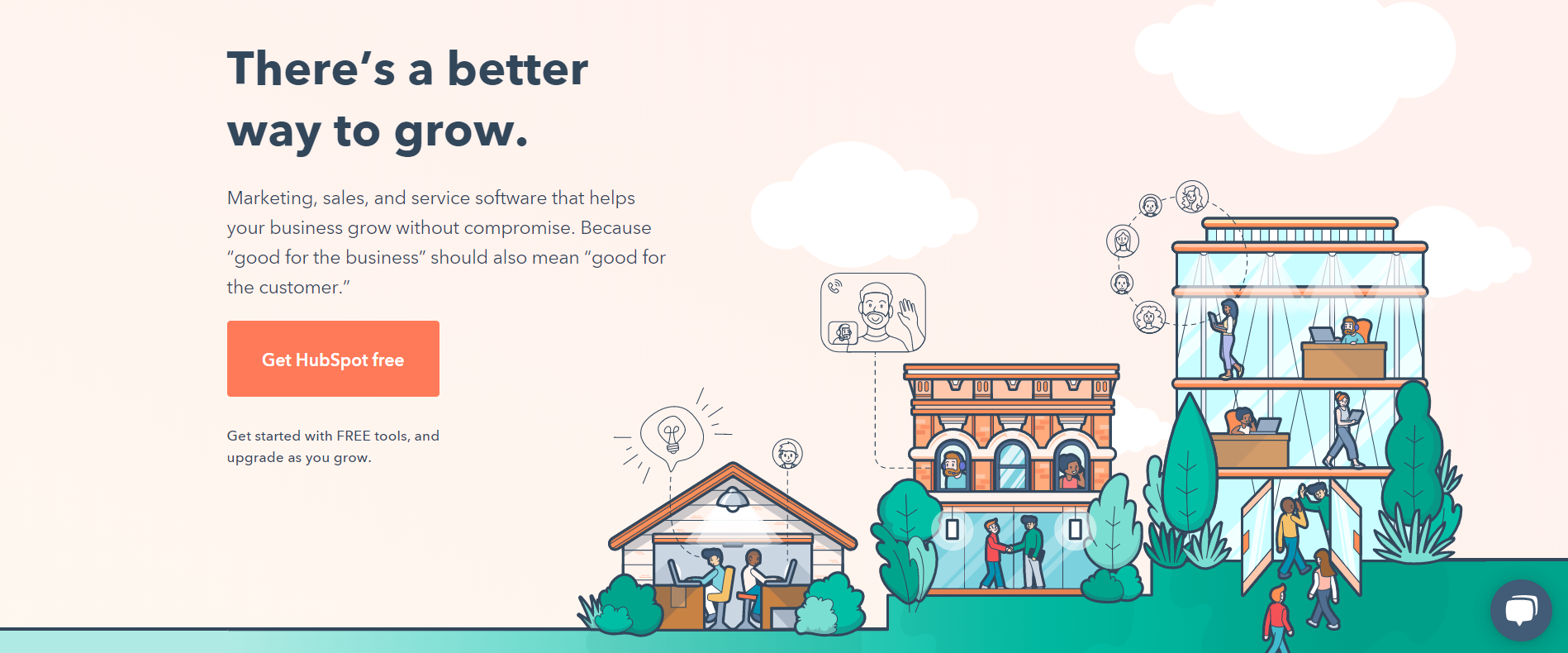
Here are some examples of clear headlines that will help you qualify your audience and get more quality downloads for your CTA buttons.
3. Create an Open Loop
When you focus on what your audience needs, it’ll be easier for you to qualify leads and filter out the bad ones.
As I previously said, your interest should be for the right people to download your lead magnet. Not everyone. Because the leads who convert will be the ones truly interested in your core offer.
For this, focus on writing a clear and compelling headline for your lead magnet. And create what’s called an “open loop.”
An open loop is basically a teaser of what’s to come that keeps people reading your copy, clicking through your website, or in this case, downloading your lead magnet.
Open loops can be salesy (“5 proven acne cures doctors don’t want you to know about”) or subtler, like in the headline example below.
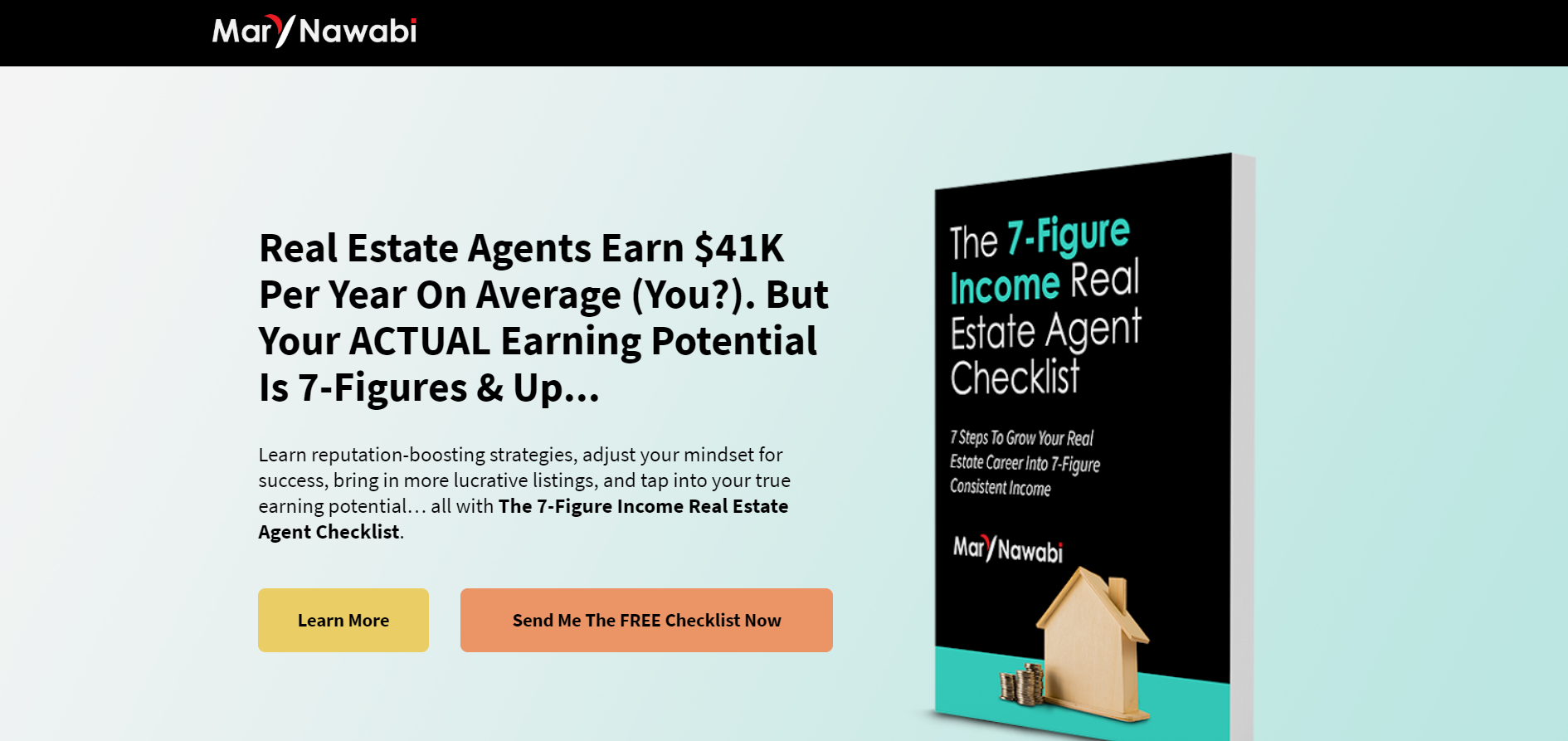
Creating an open loop with your headline is nothing but giving prospects a hint of what they’re going to get by downloading the lead magnet.
Open loops are great for listing out the benefits your lead magnet will give readers. Have a look at some open loops bullet points listed on the lead magnet landing page below.
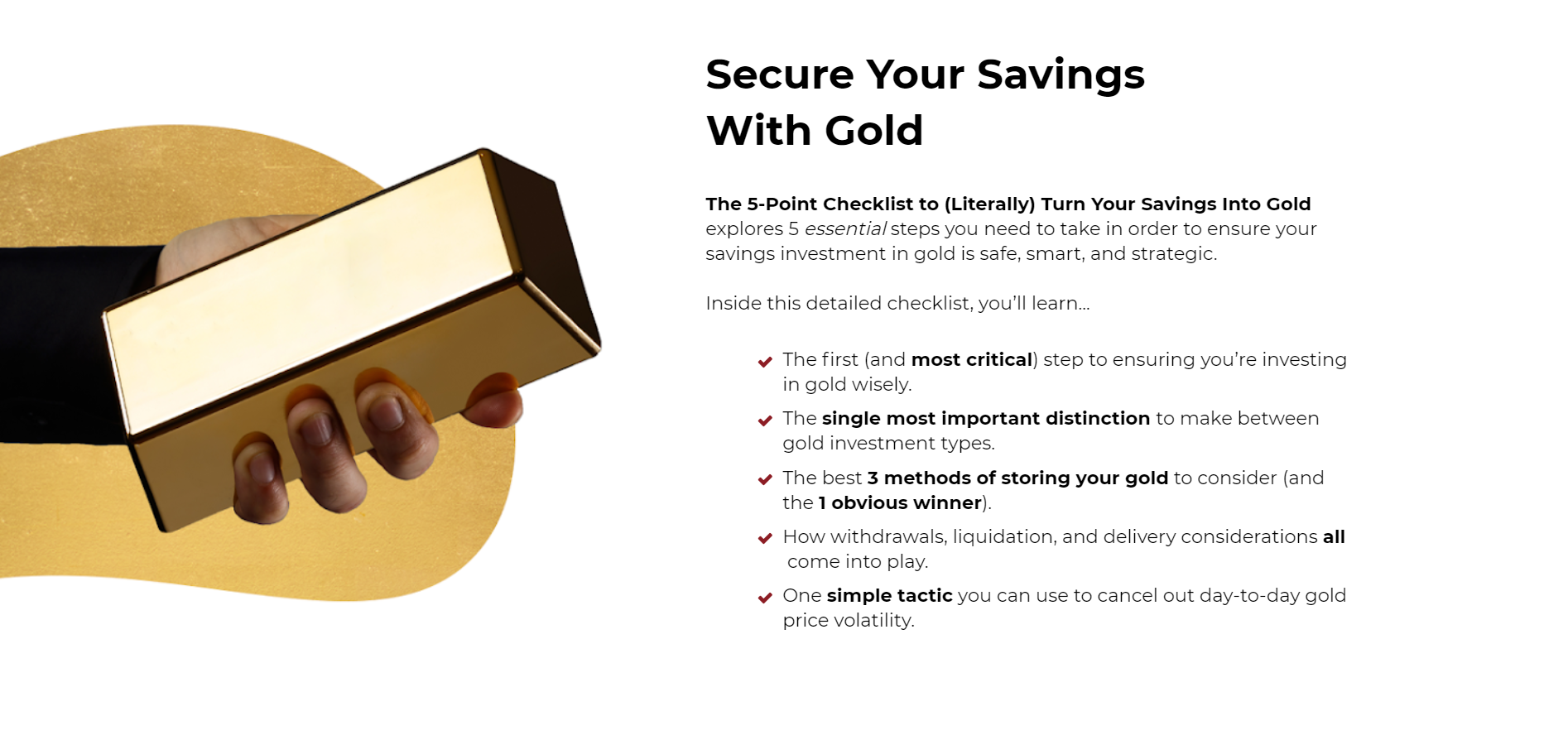
For example, give a 10-step checklist on how to “go paperless and automate your workflow” if you’re a software agency vendor. Or “how to adjust your diet and lose weight in the first 2 weeks” in the case of a health coach.
4. Add Noticeable, High-Contrast Colors for the CTAs
Using colors for your CTA buttons not used anywhere else on the landing page is fundamental to getting them clicked on.
If you’re using a light palette color for your web design, then use a dark and bright color for your buttons.
See how in the example below the color choice for the background was a dark one? And then the button is light blue.

If your CTA buttons don’t contrast, they’ll get ignored.
For instance, a button like the one in the example below won’t get clicked because it blends with the background color and it doesn’t look like a clickable button either.

And don't forget to use the tried-and-true button format that we, at Growbo, love…
BABBs—Big-Ass (big on-page) + Bold (strong color contrast) + Buttons (easily recognized as a clickable button, with rounded corners).

That’s the best way to make your prospects not ignore the path they need to take down your funnel.
If you use colors that pop, that contrast, and that you didn’t use anywhere else on your landing pages, I guarantee prospects will click on your buttons immediately.
5. Add Exit Pop-Ups for the Last Attempt
An exit pop-up is added with one intention: to give prospects one last attempt to click on your offer. It appears on the user’s screen when they’re about to leave your site.
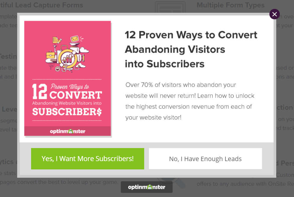
This is your last chance to keep your prospect on your page.
If your site’s visitors land on any of your landing pages, scroll down to check out your latest blog posts or products, and find nothing of interest, they’ll move the mouse toward the exit button in the corner of the browser.
And that’s when the exit pop-up appears.
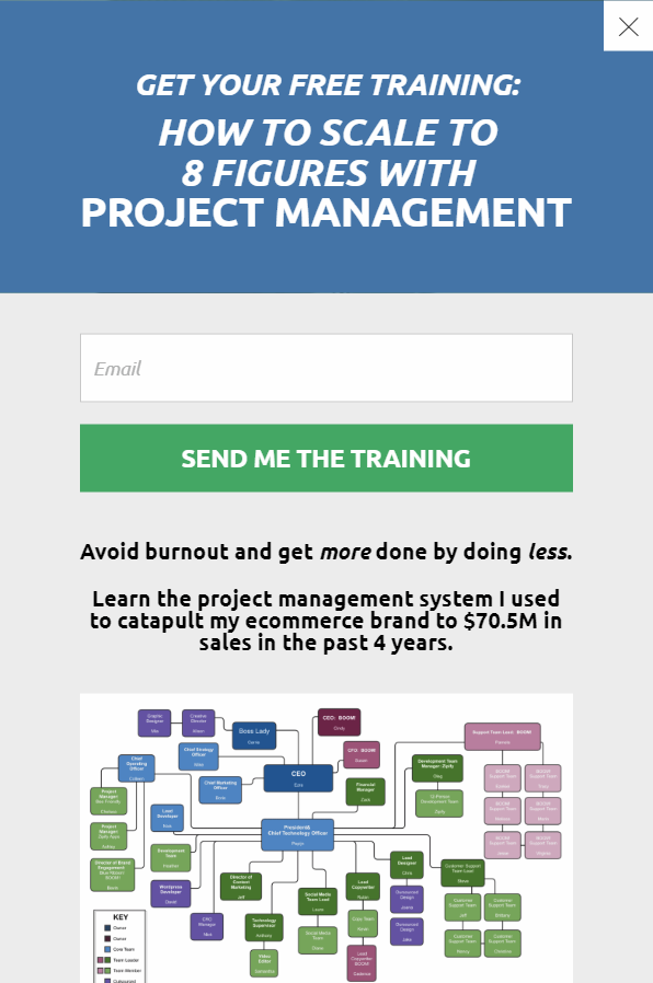
Adding an exit pop-up to your site helps you capture a potential client right as they're about to leave and make them click on that irresistible “Download” button.
6. Add Clear Text on Your CTA Buttons
The Law of Clarity comes into play here—be clear, not clever.
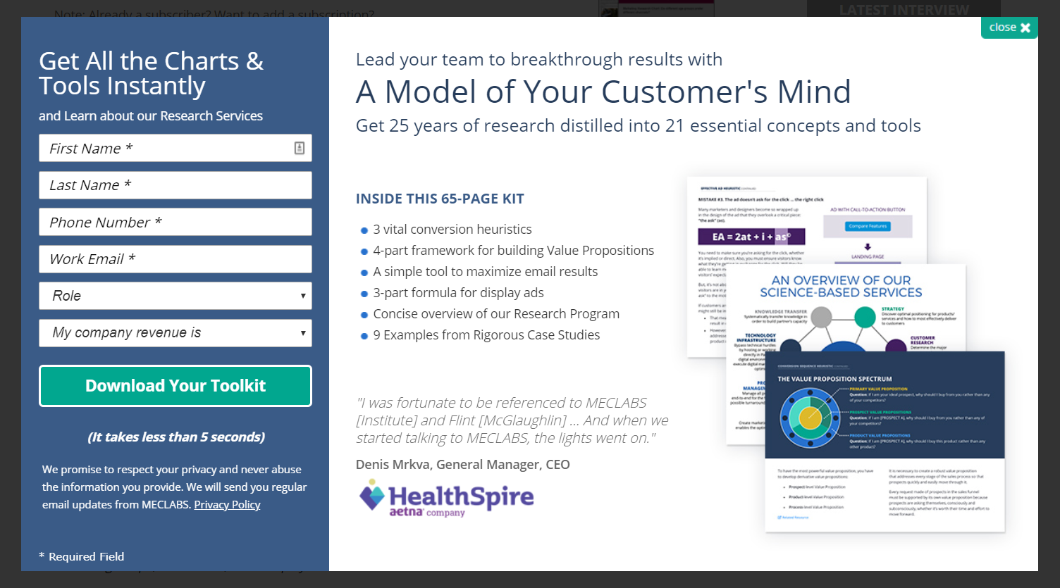
“Download Your Toolkit” sounds pretty clear to me.
So don’t apply this Law of Sales Funnel Physics only to your headlines and copy. Your CTA’s text must be clear as well.
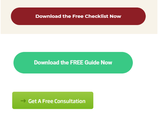
If you don’t clearly explain the next action that your prospects should take to continue down your funnel, how do you think they’ll do it?
Your CTAs must clearly indicate to prospects what to do next—a clear command or action. Take a look at the examples below…
See how the commands are clear? See how the prospect knows exactly what the next step is?
7. Use the Law of Alignment
Aligning your CTA buttons doesn’t mean to align them left or right. It means that that which clearly lines up with other landing pages and with your prospects’ expectations is more likely to sell.
Alignment refers to meeting expectations. It refers to offering your site’s visitors whatever they’re expecting to see and read about when they visit your landing pages. Alignment deals with your customers’ intentions, questions, or context—and guides them through your funnel.
If you’re meeting people’s expectations, then you’re in alignment with your offer and your potential buyers’ preferences.
And if you aren’t (as so many entrepreneurs, busy business owners, and startups are), it can mislead your customers. And as a result, they won’t buy from you.
Set the right expectations for your prospects with your CTA buttons’ text.
And what does that mean? It means you must clarify to your site’s visitors what steps come next after they take a specific action on your page.
So get the strategy to convert leads right, and you’ll get results. Don’t focus so much on the tactics.
8. Apply the Law of Visibility
Again, remember the Law of Visibility here—what gets seen, converts.
If you bury your CTA buttons somewhere on your landing pages, they won’t get clicked.
Your CTA buttons must be visible.
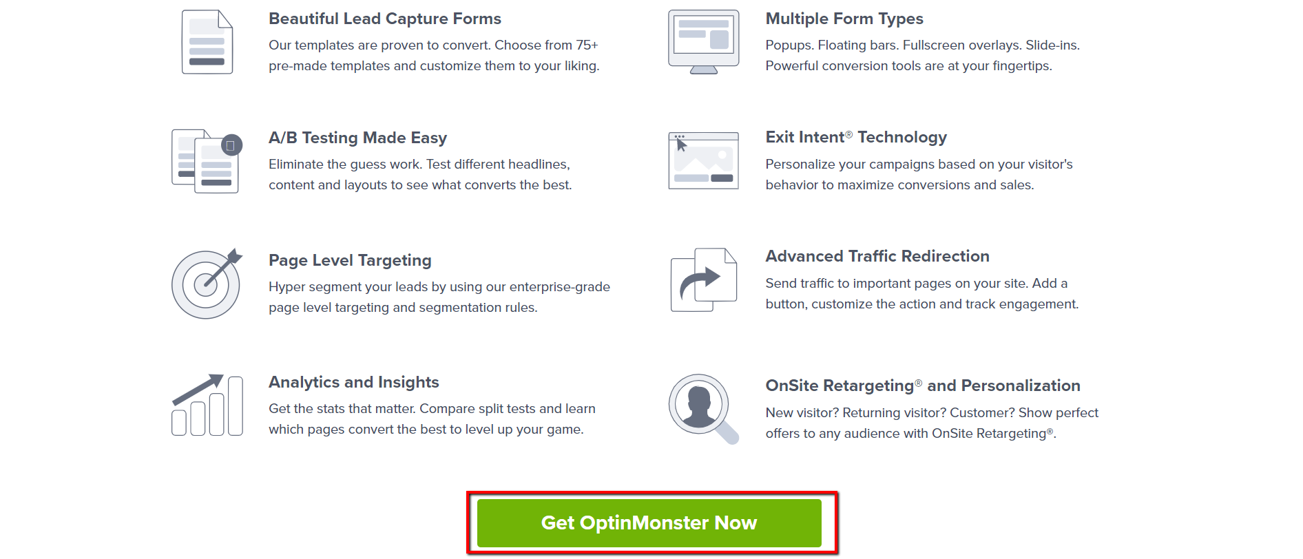
They must be prominent so prospects can easily click on them.
For instance, these are some good places to add your CTA buttons to get more downloads:
- In your copy in the lead magnet landing page
- On your footer
- On your navigation
- Below section headlines
- Throughout your emails (and above the fold)
- On sidebars
- On exit pop-ups
9. Reframe the Offer
If you’re not getting your lead magnet downloaded, chances are you need to tweak it.
This could be because: 1) your tone isn’t aligned with your audience, 2) your offer isn’t clear enough, or 3) the design isn’t really appealing.
For this, evaluate your lead magnet—its content, title, and design.
Be critical about it. Is the title clear? Is the design aligned with the topic? Is the tone right for the audience?
Ask yourself the following questions:
- Is the title clear?
- Is the design compelling?
- Does it set the right expectations in prospects?
- Is the value proposition from the lead magnet landing page clear?
At this point, prospects have not downloaded your lead magnet yet. All they see is your lead magnet landing page or sidebar widget (wherever you’re placing the offer). They see a preview of the cover of it in a mockup. So you need to make this sneak peek they get actually worth it.
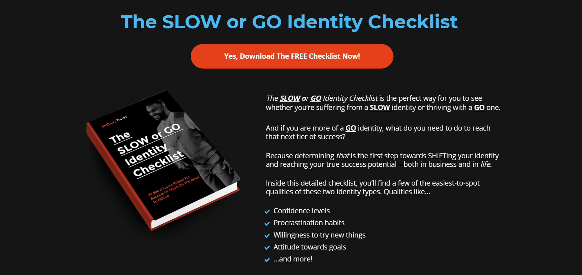
If needed, emphasize the value your lead magnet provides to whomever downloads it. Enhance its benefits and features.
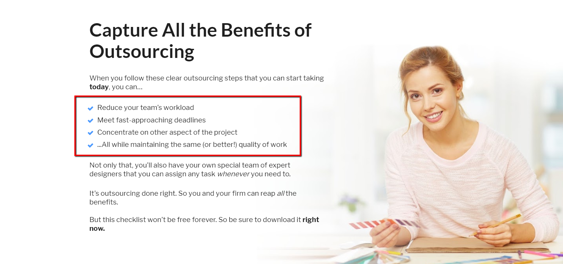
People are highly persuaded by benefit-focused copy.
And that’s part of the BFA formula we use at Growbo for writing compelling copy to catapult conversions.
When our copywriter creates a lead magnet landing page, he writes the Benefits first, Features second, and Advantage last in the form of easy-to-digest bullet points.
With this formula, readers instantly see how these features can benefit them without needing to read the full landing page.
Conclusion
Crafting the perfect CTA button is one thing. But getting the right people to click on it is another one.
Your lead magnet offer won’t be magically downloaded. You must show your potential customers where to click, how to do so, and what value they’ll get with it.
Show them why your lead magnet is worth being downloaded. Show them how they’ll solve “x” problem for their business by downloading your lead magnet. And show them why they should continue down your funnel until they become paying customers.
As a reminder, these are the 9 proven-to-convert tactics you can apply today and start seeing conversions rise in no time.
1. Include the Word FREE
2. Focus on Your Target Audience
3. Create an Open Loop
4. Add Noticeable, High-Contrast Colors for the CTAs
5. Add Exit Pop-Ups for the Last Attempt
6. Add Clear Text on Your CTA Buttons
7. Use the Law of Alignment
8. Apply the Law of Visibility
9. Reframe the Offer
All you have to do is execute each step right until you start seeing the results you’re aiming for.
But if you’re a busy business owner or you simply don’t have the time to do them yourself, reach out to Growbo.
We can get any digital marketing task done for you. All you need to do is contact us and we’ll take care of your digital marketing projects while you are waiting at home until the Coronavirus disappears.
Now tell me something, what’s your current conversion rate for your lead magnet? And which of these techniques are you going to start using to bring in more conversions?
Let me know in the comments below.
Keep Growing, stay focused.
Mariana Lessmann


