Don’t Let These 5 Giant Marketing Mistakes Ruin Your 2020

You’d think that by now, most established big-name companies would’ve figured out which marketing strategies work and which fall flat.
I mean, it’s 2020! And people have been selling to each other for thousands of years by now.
But the truth is, there are actually a lot of marketing mistakes that companies are still making. And the results are often lost clients, fewer sales, and a tarnished brand reputation.
Tone-deaf tweets, awkward logos, commercials that just plain miss the mark... When big business marketing efforts fail, it’s a learning opportunity for everyone else.
That’s why today, I’ll look at the top 5 marketing mistakes made by some surprisingly big-name companies. I’ll also point out 15 real-life examples of each of these mistakes. That way, you can refine your marketing strategies so you can bring in more leads and sales than ever in 2020.
So let’s get to it!
Marketing Mistake #1: Not Understanding & Testing All Your Target Markets
The very first lesson of marketing 101 is truly, deeply, and fundamentally understanding your audience.
- What are their hobbies? Their goals? Their desires?
- What keeps them up in the middle of the night?
- And what are the kind of thoughts that lull them back to sleep?
If you want to sell your product to anyone, you’ve got to know what makes them tick. And you’ve got to be able to speak to them on a level that they relate to.
Only then can you target them effectively.
So when major brands make major audience targeting mistakes, it’s hard not to notice. And one of the biggest marketing blunders for global brands is not testing their new campaigns with international audiences.
Example 1: Pepsi’s China Snafu
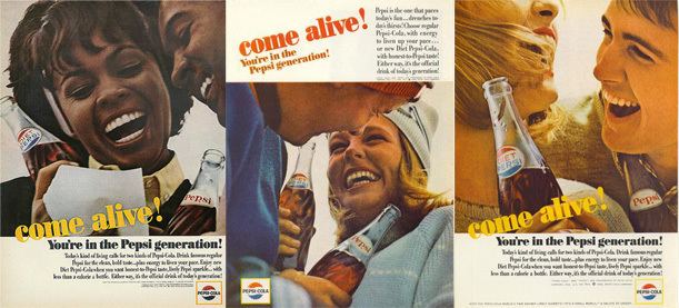
Image from Alchetron
Pepsi—one of the world’s most beloved colas. And although we all know it can never dethrone king Coca Cola, it still has one of the biggest international audiences the world has ever seen.
The problem, however, comes when Pepsi slogans don’t translate well for these other audiences.
For example, their “Come Alive!” campaign featured English ads like, “Come alive! You’re in the Pepsi generation!”
Sounds great, right?
Well, poor translation led this campaign launched in China to instead read, “Pepsi brings your ancestors back from the grave!”
Example 2: Puff’s Accidental R-Rated Marketing

Image from Puffs
Everyone knows Puffs tissue paper, right? Well, they hit a bit of an unexpected (and randy) snag when trying to market to international audiences.
You see, “puff” doesn’t have the same wholesome meaning everywhere that it does here. In Germany, for instance, it’s another word for a brothel—definitely not the kind of connections you’d like to draw when all you’re trying to do is blow your nose.
And marketing fail bonus points—”puff” is also a highly derogatory term for homosexuals in Britain. Again, probably not the kinds of connotations a tissue company is looking to conjure up.
Example 3: Ford Pinto’s “Tiny” Problem
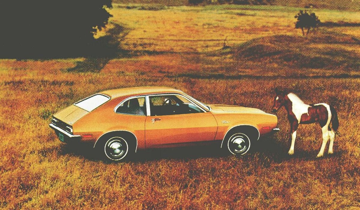
Image from Hemmings
The Ford Pinto was an incredibly successful model that became an iconic emblem of the 70s in the United States.
And like any company trying to capitalize on a big win, Ford tried to advance into other geographical markets.
The problem, however, came from the country of Brazil. While “pinto” is a kind of small, spotted or calico horse (small but powerful just like the Pinto car, get it?), the word is also slang in Brazil for “tiny male genitals.”
Yikes.
And they wondered why sales were disappointing in that market. In any case, Ford soon figured out the problem and later renamed the model to Corcel, which translates to “horse” in Portuguese.
Key Takeaway: Do your target market research!
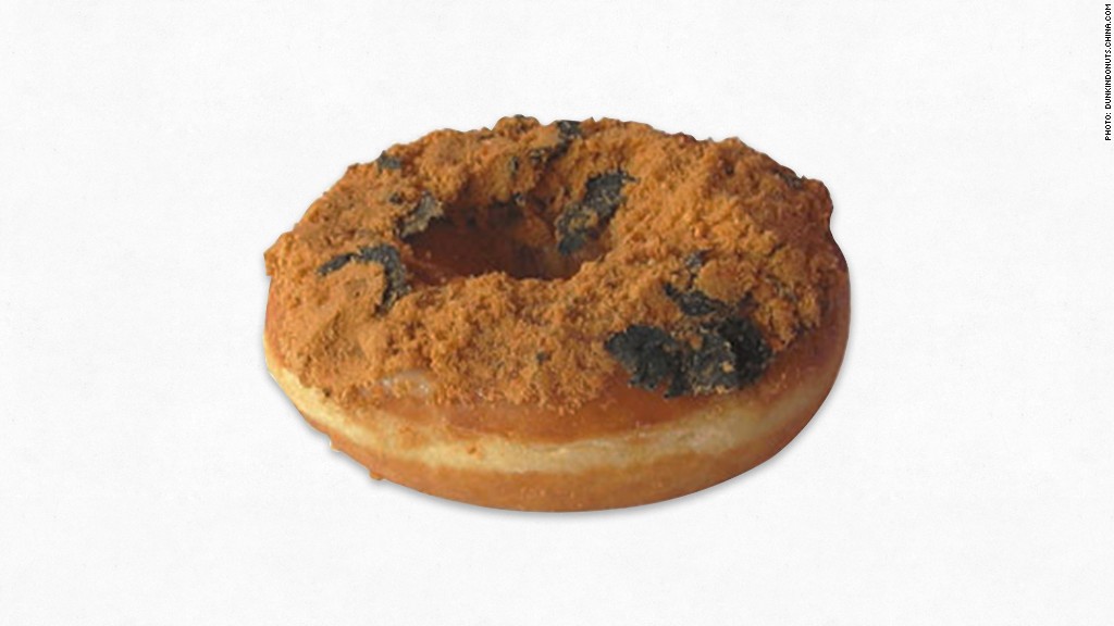
Image from CNN
If you are going to expand into new territory, you must do your audience research beforehand.
Rather than taking the easy way, really take the time to understand what makes this new market different from the one you’re used to.
Take a page from Dunkin’ Donuts, who in honor of International Donut Day, released a dried pork and seaweed donut in their China-based stores.
It may not be exactly what the U.S. thinks of as a tasty breakfast treat, but it certainly resonates with other audiences around the world.
Marketing Mistake #2: Developing a Product that Doesn’t Match the Brand
Brand extension is s a clever technique for creating new products for your company and draping the social clout of your brand over them in order to get them to sell better.
Toothpaste companies do it with toothbrushes. Weber does it with seasoning spices. And Reese’s peanut butter cups did it with cereal (a bit surprising but MAN are they good!).
When done well, it can lead to a massively successful and entirely new product line for your company. And diversifying your product lines can lead to huge upselling opportunities (when you know how to upsell the right way, that is).
But when done poorly, it can lead to serious marketing disasters. And those are a lot of fun to read about.
So here are the top 3 brand extension fails.
Example 1: Colgate’s Frozen Dinners (Bleh…)
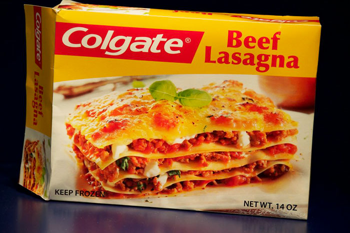
Image from eBaumsWorld
Colgate, one of the biggest names in dental care products, is all about keeping your teeth minty fresh and oh-so-clean. But when they tried their hand in the frozen dinners market, it left a bad taste in most people’s mouths.
Don’t get me wrong. This was the height of the frozen meal boom in 1982. Everyone had caught the tv dinner bug by that time, and a lot of other companies had the same idea and were able to capitalize on it successfully.
But what Colgate failed to do was change the branding before launching the product. And consequently, anyone enthralled by the mouth-watering picture of stuffed lasagna just could not get past the idea that it might taste more spearmint than beefy.
Unsurprisingly, this product didn’t last long.
Example 2: Harley Davidson’s Half-Baked Idea
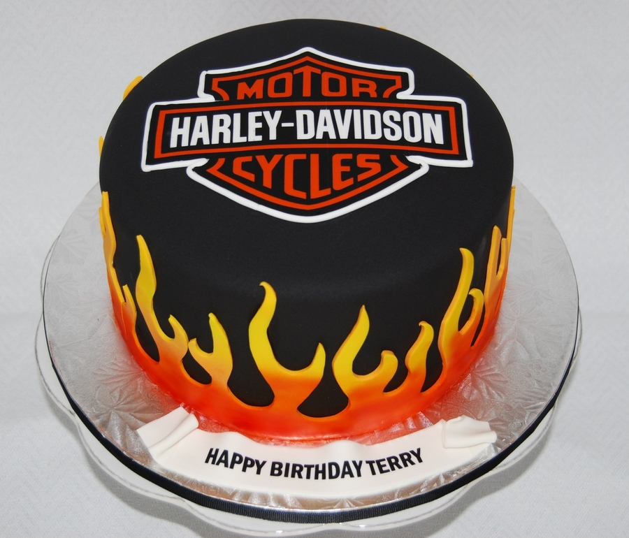
Image from Cake Central
What do you think of when you imagine Harley Davidson? Leather, grit, freedom, all around badassery. Right?
Well, believe it or not, those core values don’t translate too well into cake decorating. What? No… can’t be true!
If you need any actual proof of this idea, take a look at Harley Davidson’s foray into cake decorating.
For most Harley enthusiasts, the clash of road warrior values with the daintiness of cake decorating was just too much to get over. And in fact, their cake decorating kit was later deemed the “worst brand extension” ever after a survey from branding experts Tipping Sprung.
Example 3: Dr. Pepper Marinade (Yup, Really)
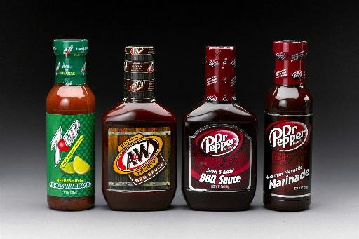
Image from The Post and Courier
The thing with this one is that without the brand name on them, they might actually be kind of tasty. I’ve been known to use a bit of citrus to marinate a chicken breast. And I do like 7up…
But when you add the fact that these are soda brands into mix, it makes these (possibly tasty) marinades infinitely more unappealing. Let’s keep the soft drinks in our glasses and off of our plates.
Key Takeaways: Be wary of straying too far from your original product.
Brand extension can be successful.
Dyson went from vacuum cleaners to desk fans and hair dryers based on their mastering of airflow systems.
As a digital marketing platform, Mailchimp went from email marketing to Facebook advertising.
Callaway brought in loads of dough from turning their loyal golf club fans into fans of their footwear and apparel branches.
The thing is, they knew their market and what their product did well. They didn’t offer products that just…
- Fit the same hole (Colgate)
- Slapped their brand onto a product that didn’t match their company values (Harley Davidson)
- Seemed like a strange and unnecessary fit for their original product (Dr. Pepper)
So the key takeaway here is to be careful when creating a new product line. If it’s too far off from your original, it just may fall flat in the eyes (and mouths) of your target market.
Marketing Mistake #3: The Logo Design is… Questionable
Logo design is an art form. You need to find that perfect mix of clean imagery and brand representation in order to create a truly memorable logo that people will respond to.
However, that’s easier said than done. And unfortunately for these businesses below, their pursuit of that perfect logo stopped them from taking a step back and realizing, “Hey, that doesn’t look right…”
Check out the 3 biggest logo design fails.
Example 1: “And the gold for most confusing design goes to…”
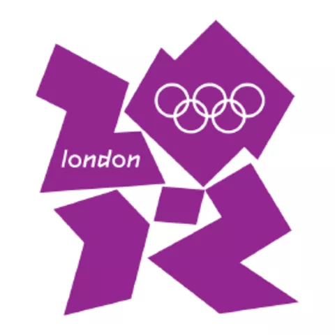
Image from The International Olympic Committee
What the heck is that?
That’s what a lot of people were saying when London unveiled its long-awaited logo for the 2012 Olympics.
Some people complained it looked like a swastika. Others threatened to boycott the Olympics entirely since they thought it spelled out “Zion.”
In the end, nearly everyone could agree, the logo was a confusing hodgepodge of jagged purple chunks—not exactly a logo all nations could feel united under.
To make matters worse, the logo reportedly cost a staggering £400,000 to create!
You know what they say, everything’s more expensive in London.
Example 2: Talk About “Graphic” Design
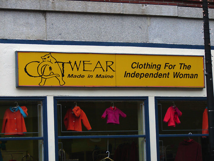
Image from Hiveminer
This one doesn’t need a whole lot of explanation to expound upon what’s so wrong with it.
And yes, you’re seeing that right: that’s a cat butt forming the letter “A” with a far too anatomically correct animal to be slapped on a storefront.
In an effort to stand out, this logo probably made a lot of innocent passersby feel pretty uncomfortable. And luckily, the owners had enough presence of mind to switch up the logo to the one below.
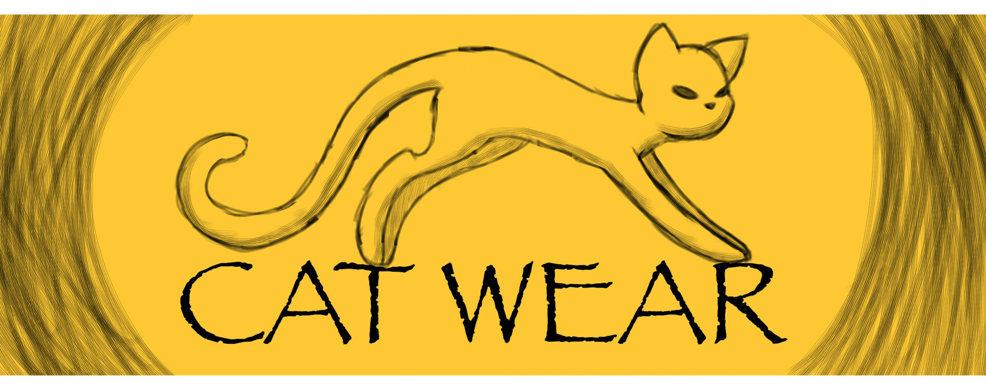
Image from ArtStation
Example 3: Spaces Matter
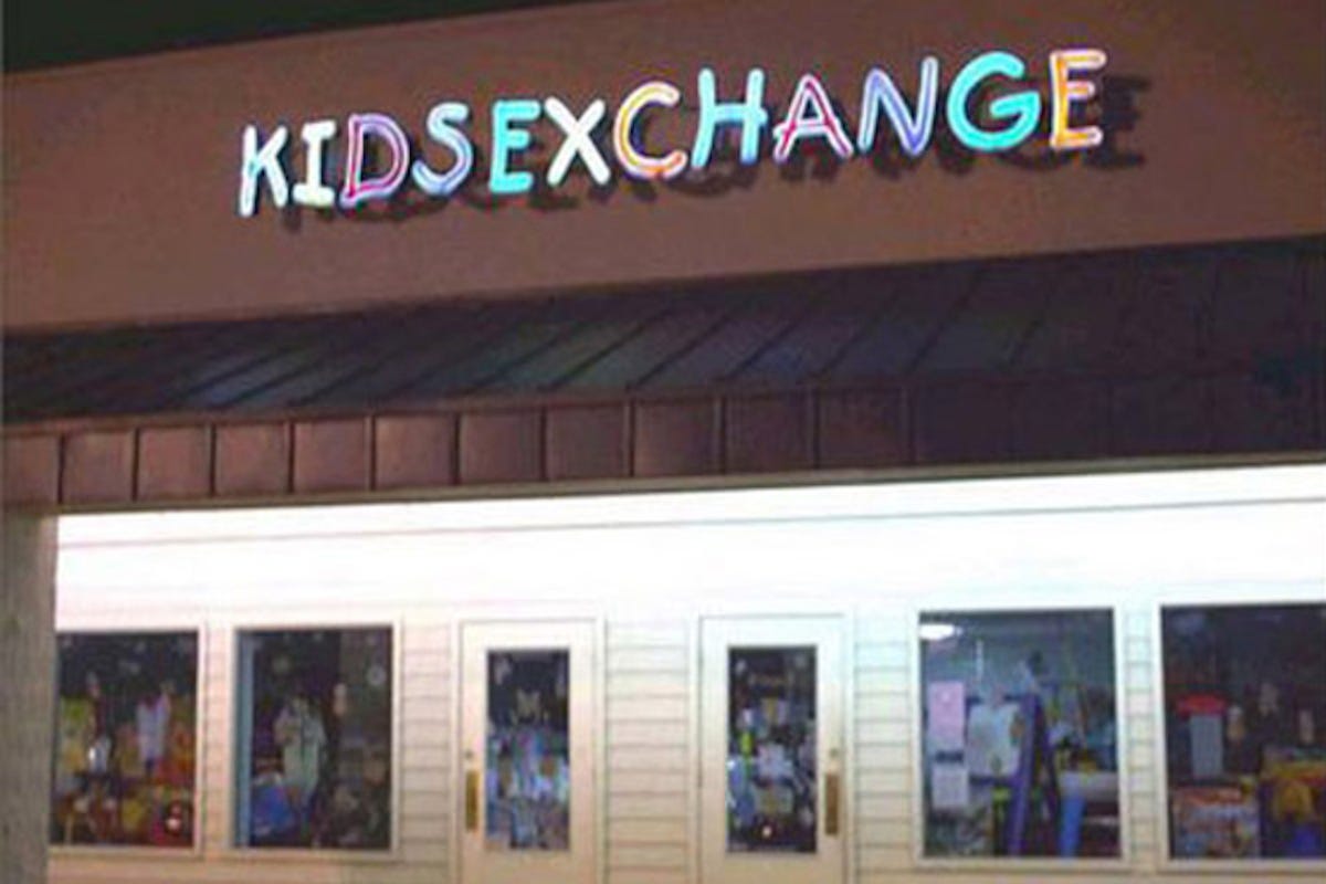
Image from FastPrint
This is a lesson that a lot of vanity license plate holders can learn from: be careful when you remove spaces from phrases.
Because sometimes, the end result is conveying a way different message than you were trying for.
This poor business (called Kids Exchange), learned that lesson the hard way when they put up their store name without the right amount of spacing between the words.
Key Takeaways: Nail your design!
Getting your design just right is absolutely key to the success of your business and your product. And no, we’re not just talking about web design (though getting that right is critical too!).
Your unique look, your feel, your personality, your trustworthiness—they all come through in your logo once you’ve designed it right.
In fact, we recently went through a bit of a logo redesign ourselves. And one lesson we learned was that cleanliness and clarity are some of the most important qualities for making a logo that sticks in people’s minds.
And the fact that it doesn’t have a cat butt in it helps too ;).
Marketing Mistake #4: Using Unauthentic Messaging
Today more than ever, authenticity is vital for creating an effective marketing campaign. But even more importantly, authenticity is vital for avoiding massive internet backlash.
Consumers have gotten exceptionally skilled at pointing out and blasting unauthentic messaging, especially thanks to the likes of Facebook and Twitter.
It seems like almost every day there’s a new viral movement to hold some big-name brand accountable for an insensitive slip or a tone-deaf comment. Sometimes that outrage is justified. Sometimes it isn’t.
Either way, the key to building trust among your audience is by using authentic messaging. What does your brand truly stand for? What are your goals? Do you practice what you preach?
You’d better be sure that 1) you’ve got the answers to those questions, and 2) your ads match up with reality. Because if not, you’re bound to face a wave of backlash that your brand might not recover from, just like the examples below.
Example 1: Kendall Jenner’s Pepsi Fiasco
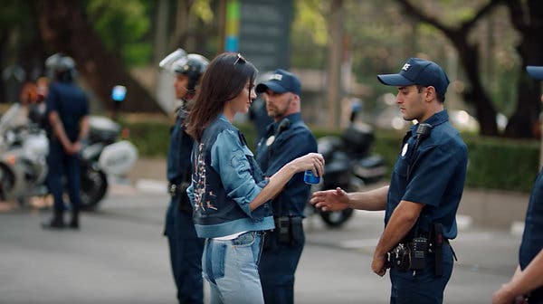
Image from New York Times
No conversation about inauthentic messaging would be complete without Kendall Jenner’s infamous Pepsi commercial. Remember this one?
Let me set the stage: there is a group of causeless protesters marching through the streets. They’re holding signs with vague words like “Love” and “Join the conversation” (though we never see what that conversation is about). And they end up marching past Kendall Jenner’s photoshoot.
Seemingly inspired, Jenner then joins the protests, marches to the front lines, and hands a Pepsi to the police holding the protesters back. “It is Pepsi,” the ad seems to say, “that can bring us all together.”
Barf.
The internet outrage was huge in response to this commercial, and rightfully so. It seemed as if Pepsi was co-opting the Black Lives Matter protests that were so widespread at the time and looking to capitalize on it. That’s strike 1.
Strike 2 was the fact that they didn’t actually make any real statement about their views on the topic. And people saw through this facade almost immediately.
And strike 3 was trivializing the issue so much that a simple soft drink could really help solve all the complex problems underlying racial tensions in America.
Pepsi removed the ad and apologized just one day afterward. But by then, the damage was already done. People took to Twitter to vent their frustrations and hold the brand accountable.
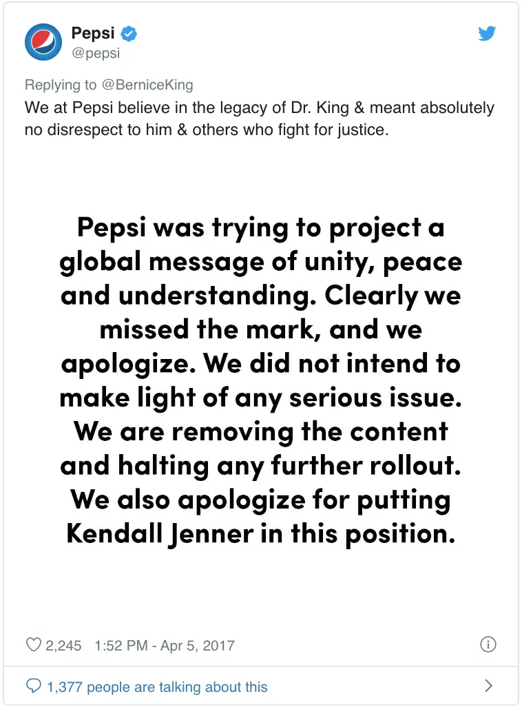

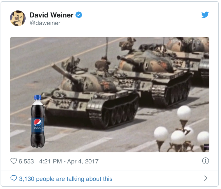
Needless to say, Pepsi’s ad was a complete failure.
Example 2: The King of Inauthenticity

Mental health is a serious problem in the United States today. So when brands reach out to try to make a difference and start the conversation about it, it’s usually a good thing.
Because the more people know, the more likely they’ll be to get the help they need.
It’s what they call “cause marketing”—where your brand’s good efforts towards a cause actually help promote your business. It’s why companies donate to charities, sponsor fundraisers, and in most cases, do good in the world.
That was the idea Burger King had going into their #FeelYourWay campaign. This campaign was focused on furthering mental health awareness. They even partnered with Mental Health America, a leading mental health awareness organization.
And to be honest, the commercial is good (have a look at it above). There are a few problems with how Burger King handled it though.
First, BK’s brand values aren’t exactly aligned with better mental health. Nutritionally deficient food doesn’t really contribute to feelings of well being or self-confidence.
On top of that, Burger King doesn’t do much to support the mental health of its own employees either. Mental health benefits for a fast-food job? Doubtful.
Finally, the commercial ends with specially branded meals that are supposed to match your feelings. They’re called Real Meals. And they come in:
- Pissed
- Salty
- Blue
- DGAF
- YAAAS
It’s a blatant cash grab that is clearly banking off of mental health awareness. Not cool Burger King.
Example 3: Mastercard’s Tone-Deaf Challenge
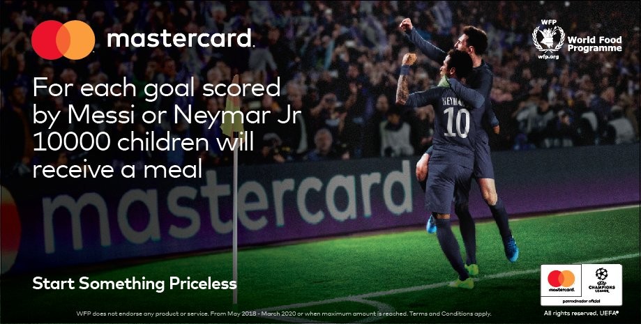
Image from Campaign
In 2018, Mastercard had an idea: for every goal scored by Lionel Messi or Neymar da Silva Santos, Jr. (a.k.a. Nymar Jr.) during the World Cup, it’d donate 10,000 free meals to starving children in Latin America.
Starving children get meals for free: what’s not to love, right?
Well, the problem here is Mastercard inadvertently gamified the very serious problem of childhood starvation.
Sure, they’re donating to help solve a major problem. But they’re also showing that they are willing to contribute to this problem… but only if a ball rolls into a net a certain number of times within a few hours.
Not quite giving it the gravity it deserves, huh?
People, unsurprisingly, were outraged. The campaign was called crass, tone-deaf, and downright selfish. As The Times chief football writer Henry Winter summed it up, nobody likes the idea of Mastercard “turning the World Cup into the hunger games.”
In response, Mastercard dropped the campaign and instead donated a whopping 2 million meals instead.
Sounds like this story has a happy ending after all.
Key Takeaways: Be Authentic!
If your business is fighting for a cause, you need to be sure that your fight is more about treating the problem than getting more sales for your company.
Practice authentic marketing.
Say what you believe. Don’t commit to a cause that you don’t really support.
And most importantly of all, back up your convictions with real action.
Offer your employees mental health care benefits if you’re passionate about mental well being. Donate without gimmicks to eradicate injustice. Be the change you claim you support.
Because when you do that, people will stop and take notice.
Marketing Mistake #5: Trying to Cash In on a Tragedy (Seriously?)
Last but not least, it should go without saying that trying to use a tragedy to your business’ benefit is a major marketing mistake. Possibly one of the biggest ones out there.
There are ways, of course, to show your organization’s support in times of national turmoil or a catastrophe. But when any whiff of salesmanship is involved, it can have absolutely disastrous consequences for your business.
And frankly, it should have absolutely disastrous consequences for your business.
Take a look below at 3 times businesses made the marketing mistake of trying to use a tragedy to their advantage.
Example 1: The Twin Towers Mattress Sale

I’m going to be quick about this one because...I mean, just watch the video.
Offering a sale based on what is our country’s most violent terror attack is one thing. But making light of it with the two men in the back knocking over the towers of mattresses? What were they thinking?
The store manager tearfully apologized for the video, admitting “It was stupid.”
But even still, how do you recover from that?
Example 2: Kenneth Cole’s Cairo Tweet
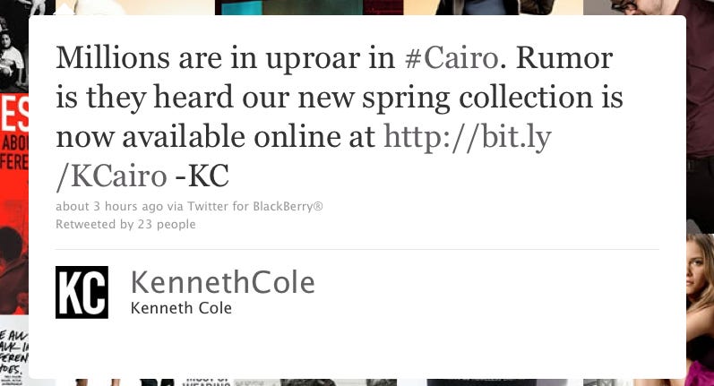
Image from Business Insider
In 2011, Egypt was seeing scores of protests break out over increasing police brutality. Millions of protesters took to the streets. And in the end, 846 people were killed and over 6,000 were left injured.
This, as you can see, is serious stuff.
Then in walks Kenneth Cole, an American fashion house, with what I’m sure they thought was a clever little tweet. “Millions are in uproar in #Cairo. Rumer is they heard our new spring collection is now available online…”
Outrage ensued, of course. And eventually, Cole apologized. And people are still buying their stuff.
But still, you’ve got to wonder: what were they thinking?
Example 3: Facebook’s VR PR Faux Pas
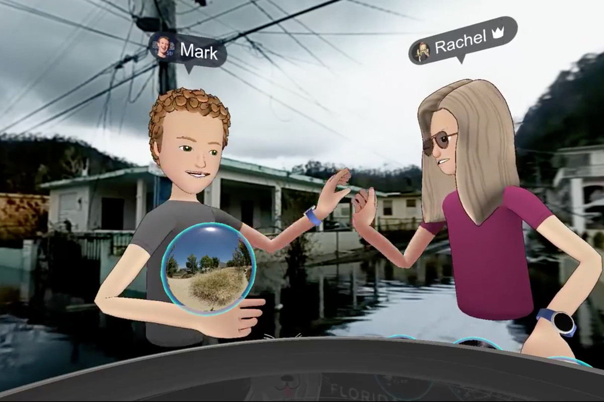
Image from Vox
2017’s Hurricane Maria ravaged the island of Puerto Rico. With months of decimated infrastructure, an estimated $91.61 billion in losses, and nearly an estimated 3000 in direct and indirect casualties, the event was absolutely devastating.
So when Mark Zuckerberg used the opportunity to show off Facebook’s VR capabilities, it raised a few eyebrows.
Now, it wasn’t the fact that they were using VR to get a better idea of the damage. In fact, seeing the outcome of the hurricane for the tragedy it really was can be viewed as a noble effort, especially since the media was downplaying the seriousness of it at the time.
What was a mistake was inserting happy cartoonish digital avatars in the VR presentation. Not quite the right mood to match an entire island being left in tatters and its inhabitants living without power or food for months.
Key Takeaways: When you deal with tragedy, be careful.
The most important thing to remember as a business dealing with tragedy is that you should always do so with authenticity.
Don’t seek any sort of benefits. Offer legitimate help without trying to call too much attention to it. Take the time to listen on social media rather than trying to be heard.
And more than anything else, show a bit of humanity.
People will respond to it. And even if they don’t, getting them to shouldn’t be the point anyway.
Conclusion
So there you have it!
5 massive marketing mistakes that you can learn from and 15 real-life examples that you should do anything to avoid imitating.
- Not Understanding & Testing All Your Target Markets
- Developing a Product that Doesn’t Match the Brand
- The Logo Design is… Questionable
- Using Unauthentic Messaging
- Trying to Cash In on a Tragedy (Seriously?)
Hopefully, this article has helped you feel a little more confident about what you should and should not do to ensure your business’ marketing is a massive success.
And if nothing else, hopefully it was a bit of fun looking and the marketing mistakes blunders of some big-name companies too.
What other marketing mistakes have you seen lately? Do you have any other examples of mistakes you’ve seen too?
Let us know in the comments below!
As always,
Keep funnelin’, stay focused.
Alex T.


