Building the Perfect Landing Page: 37 Conversion Optimization Case Studies

I once read an article that was critical of conversion case studies.
It said most conversion or AB test case studies are basically…BS.
In other words: you shouldn’t believe everything you read online!
(Duh.)
You might say: “But why, Matt? The case studies I read show me fancy bar charts and numbers…”
That’s a good question. Why aren’t they reliable?
The answer is because the confidence levels (stats term) are either not high enough to bet on (i.e., not greater than 95% confidence) or are simply not reported at all!
In fact, in doing research for this article, a majority of the examples we found didn’t report them.
So, today, I’m doing something special for you to address this problem.
I’ve compiled together a list the most reliable conversion case studies out there.
These are the ones that share all their data with you (sample size, lift percentage, conversion metrics, etc.), and have a statistical confidence rate of 98% or higher.
Now, that’s not to say conversion optimization case studies with a 95%-96% confidence rate aren’t useful—they are—but if you’re looking to case studies as a source of inspiration, you want to pay closest attention to the case studies with 98%-99% statistical significance.
To give you a good grasp of both types of case studies, I’ve gathered up several dozen for you—14 with a statistical confidence rate of 95%-96%, and 23 with a 98% or higher confidence rate.
These case studies are packed full of useful stats, insights, and I’ve included screenshots so you can see the winning and losing variations for different pages tested.
I’ve also linked to the source for each case study, in case you’re interested in reading more.
Let’s dig in.
Want to own this article? Click here to download it so you can reference it later.
Case Studies with a 95%-96% Confidence Rate
Case Study #1: Kiva Improves Conversion Rate by Nearly 12% with FAQs List, Social Proof, and Statistics
Non-profit Kiva wanted more first-time visitors to donate after visiting their landing page. Yet their original landing page wasn’t really converting at the rate they wanted it to. Here’s the page for comparison purposes.

It’s a solid landing page, but Kiva wanted to add credibility, so they put more information about themselves in the form of statistics.
Then they ran an A/B test to determine which page was preferable. At a confidence rate of 95%, Kiva users preferred the second page.

Once the second page replaced the first, there was an 11.5% jump in donation revenue. This was reported with a confidence rating of 95%.
Key Conversion Takeaway: A/B testing is always a useful way to see which version of your landing page will convert better.
Case Study #2: Paperstone Sees 10% Conversion Just by Showing Shocking Prices of the Competition
UK office supplier Paperstone had an interesting approach to driving up conversions. They used the competition.
Here was the first version of their landing page:
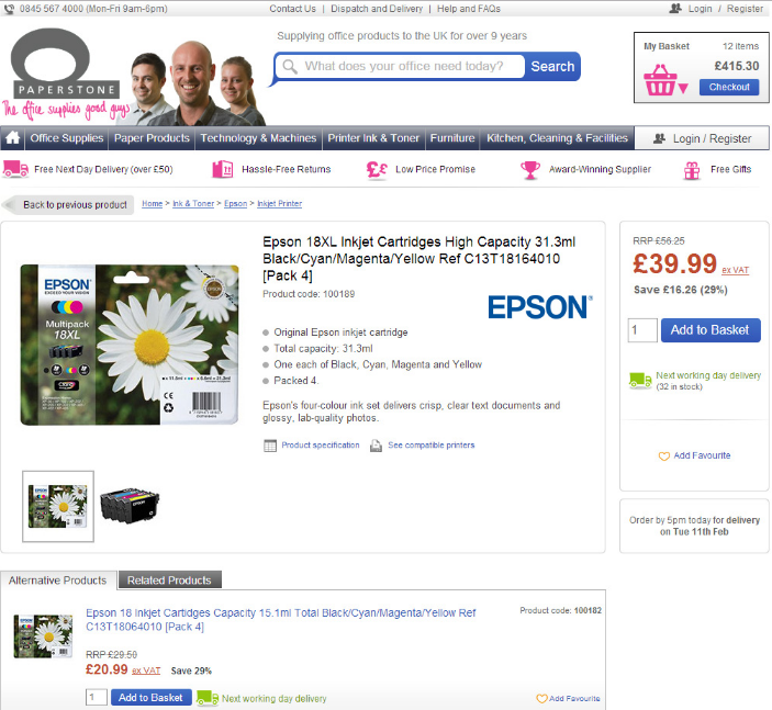
Here’s the second one. This one compares the prices of competitors like Staples and Viking, proving that Paperstone’s prices for the ink cartridges are considerably cheaper.
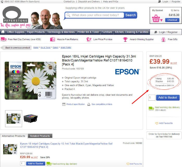
Paperstone also performed an A/B test. For a two-week span, over 12,000 unique visitors saw the second variation of their landing page.
At a confidence rate of 95%, conversions were up 10.7% once Paperstone started showing competitors’ prices.
Key Conversion Takeaway: If you offer the same product at a better price, don’t be afraid to involve your competitors. It may work to your advantage.
Case Study #3: Viadeo Gets Nearly 30% More Conversions with a Few “Magic Words”
Viadeo, once known as Soocial, is a job recruitment service and app. They managed to score a conversion rate of 28% by adding two simple words to their CTA encouraging people to sign up.

Any guesses what those two words were? Simple.

“It’s free.”
Who doesn’t love freebies? This was such a swift conversion rate that Viadeo reported a 95% confidence rate with its higher conversion numbers.
Key Conversion Takeaway: Sometimes a simple change to the way you’re offering a giveaway or freebie is enough to increase conversions to your landing page.
Case Study #4: Conversions Increase Nearly 100% for DHL Through A/B Testing
Global shipping company DHL is already a pretty well-known brand, but they wanted more conversions.
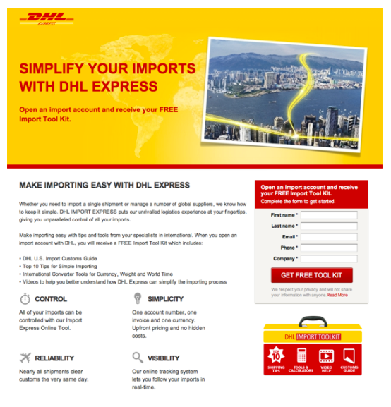
Their original landing page was image-heavy at the expense of their sign-up form. DHL was interested in seeing what they could do differently, so they A/B tested their landing pages, both the one featured above and this one below.
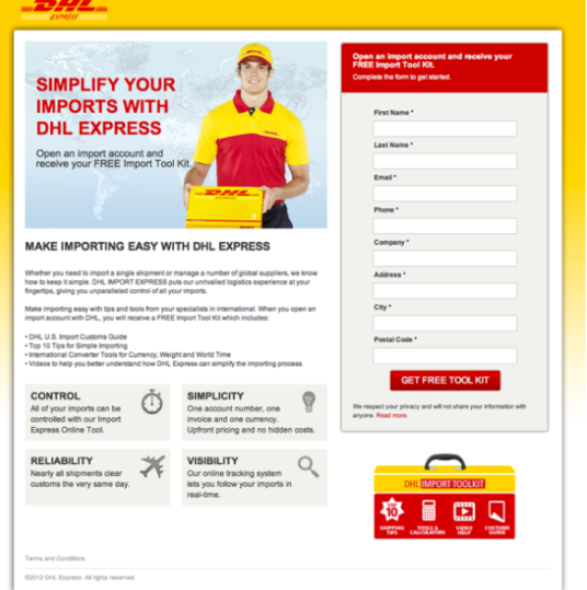
There were a few subtle differences, but that was enough for DHL to convert at more than 98%. The testing results were at a 95% confidence rate as well.
The two biggest differences were 1) pushing up the sign-up form so it was more prominent on the page, and 2) touching on the human element with a replacement image of a courier instead of the cityscape.
Key Conversion Takeaway: Sometimes your landing page is perfect, but the arrangement of elements isn’t converting as highly as you’d prefer. Rearrange the page and A/B test.
Case Study #5: Kaya Skin Clinic Earns 22% Spike in Conversions with a Targeted CTA
Beauty brand Kaya Skin Clinic was getting plenty of appointments booked by phone, but not as many through its website. To attract more attention to its online booking, Kaya decided to use social integration and rewrite its landing page copy.
Here’s the first version of their landing page.
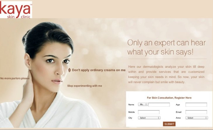
Then they moved to this.

Social sharing was then added to the sign-up page.

Between the social sharing and rewriting their CTA, Kaya Skin Clinic earned 70% more conversions and 22% more sales at a confidence rating of 98%.
Key Conversion Takeaway: Be as specific as you can in your CTA, make it more human-sounding. And try to add in some social proof to entice users to sign up.
Case Study #6: NuFace Gets 90% More Orders by Offering Free Shipping
Skincare brand NuFace, which specializes in anti-aging products, reviewed its analytics to discover why online sales were slumping. It turns out some customers had reservations about buying anti-aging products online.
Let’s compare landing pages to see how NuFace solved this unique issue.
Here’s the original:
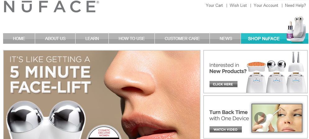
And the revised landing page:
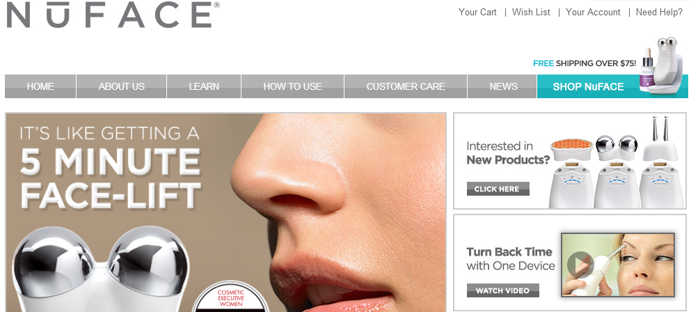
The change is small, but on the top upper half of the page, NuFace decided to offer free shipping to hopefully entice those reticent, would-be customers.
Once they did that, NuFace had a 7.3% increase in average order volume and 90% more orders than before they provided free shipping. This case study also has a 96% statistical confidence rating.
Key Conversion Takeaway: Sometimes reluctant customers need a gentle push in the form of free shipping. This may decrease the rate of cart abandonment.
Case Study #7: SAP Decides Whether to Segment or Go with the Crowd
Enterprise application software provider SAP ran its own in-house case study. It focused on the German version of its website, specifically the landing page and homepage.
Over 20,000 users over five industry verticals in three months engaged in the case study.
SAP then had to decide which version of its landing page it would choose.
There was Version A, which had a more generic CTA and website copy but an interesting image.
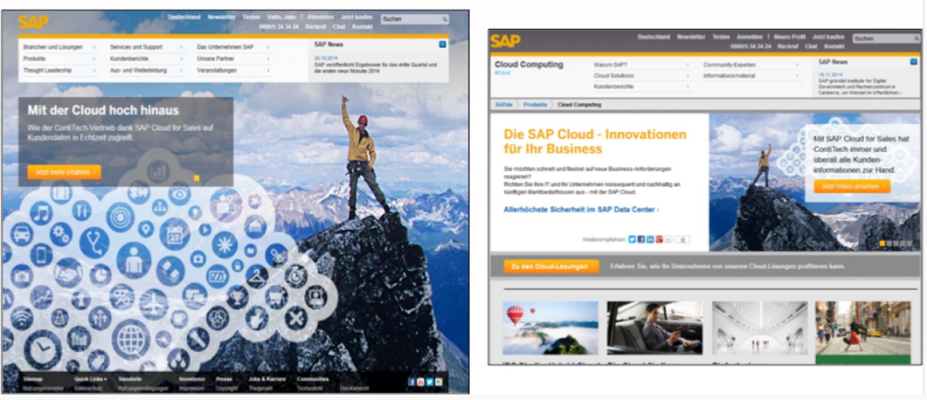
Then there was Version B, which was less generic and segmented according to audiences (in this case, banking).

At a confidence rating of 95%, Version B won by a landslide.
Key Conversion Takeaway: Targeted landing pages that are specific to segments of your audience will almost always convert better than generic landing pages.
Case Study #8: GoCardless Again Proves the Importance of Wording, Enjoys a 139% Increase in Conversions
UK online debit company GoCardless was in the demo process of its new product. They decided to put out an early version of the product.
The company pondered ways to get higher conversion rates, such as wording their CTA as either “Watch a Demo” or “Request a Demo.”
Here are both versions of the CTA in action.
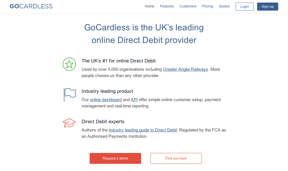
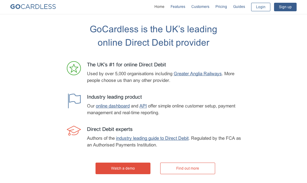
Through A/B testing, GoCardless discovered that “Watch a Demo” was the preferred wording. How preferred? GoCardless had more than 139% more conversions by swapping their CTA alone. They reported a confidence rating of 95%.
Key Conversion Takeaway: If you have CTA copy variants, compare them through A/B testing.
Case Study #9: Next-Day Shipping Feature Leads to 41% Sales Boost for Smiley Cookie
Smiley Cookie lets you send cookies to your loved ones online. It’s an interesting concept, but Smiley Cookie wasn’t quite sure what its customers cared most about.
On that note, they reviewed various value propositions and then used that data to rework their landing page.
Here was the original page in testing:

Here were the five variations Smiley Cookie considered:

The most users responded to the “Order Today > Ships Next Business Day” variant. Reporting at a confidence rating of 95%, Smiley Cookie had 41% more sales, a per-visit value of $3.78, an average order value of $29.95 and a conversion rate of 12.6%.
Key Conversion Takeaway: Split testing doesn’t always have to be between two options. As you know by now, subtle wording can make a world of difference, so test as many variations as need be.
Case Study #10: KABAM Gets 17% More Conversions by Changing Cursor Formation
Mobile gaming company KABAM tested its paid search traffic to determine if they’d respond better to a form you had to click before filling out, or a form with the cursor automatically active on page-load.
Here’s the form you had to click to fill out:

Here’s the form that had the cursor active on page-load:
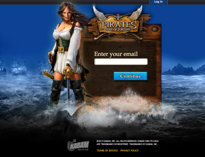
The latter was the winning landing page formation. KABAM had a 95% confidence rating and 17% more conversions.
This was such a significant case study, that in 2014, WhichTestWon gave KABAM the Gold Ribbon in its Online Testing Awards.
Key Conversion Takeaway: Even if your form has only one form field, there’s still a way to optimize it by having the cursor active upon page-load. Short-form pages with simple themes or messages like KABAM’s should try testing this out.
Case Study #11: Multichannel and Direct Sales Increase after weBoost Redesigns Its Website
Cellular signal booster company weBoost wanted to convert more users by redesigning its homepage. At the time, the homepage had a lot of cognitive load, which is the amount of information that working memory can hold at one time. This could turn some would-be customers away.
Take a look for yourself.

The homepage was also pretty amateur, as illustrated by the stickman. Once weBoost employed this homepage, they started seeing major conversions.
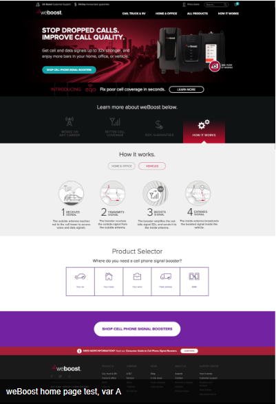
Of those who visited the homepage weBoost saw 41.4% more completed orders at a 96% confidence rating.
Key Conversion Takeaway: Company reputation matters. A polished, clean, professional homepage or landing page will often lead to more sales than a shoddily-designed one.
Case Study #12: Water Brand Culligan of New Hampshire Gets More Conversions with “Get a Quote” CTA
Water treatment company Culligan of New Hampshire was currently using the CTA “Get Pricing” on its landing page. They were curious if swapping the wording to “Get a Quote” might inspire more traffic.
Here’s what they were working with.
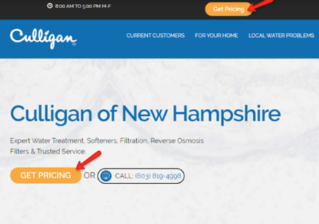
This was the subtle, but effective word switch.
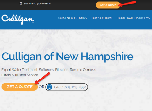
At a confidence rate of 96%, Culligan of New Hampshire had form submissions spike by 104% after changing their CTA button.
Key Conversion Takeaway: Be as specific with your CTAs as possible. Offering someone a quote tells them exactly what they’re going to get.
The “Get Pricing” CTA button here was more vague: would the lead be brought to the pricing page or would they have to fill out a form and get a quote? That ambiguity can hurt conversions.
Case Study #13: Glasses Company Felix + Iris Gets Higher Conversions by Explaining Its Process
Glasses brand Felix + Iris offers a Fit Kit. This lets users try a free pair of glasses for a limited time to determine whether the glasses are a good fit.
That said, the company wasn’t sure if its “Get Started” CTA was converting as effectively as it could have. Take a look.

To remove any ambiguity, Felix + Iris added details about its multi-step process for a clearer understanding of how their process works.

Then they made the CTA clearer.

In all, this CTA change gave Felix + Iris 71.6% more conversions at a 95% confidence rating.
Key Conversion Takeaway: If your process isn’t clear from the onset, be more specific with your CTA. “Get Started” can be a bit too vague. “Get Started” with what? Communicate the action you want each user to take clearly on your CTA.
Case Study #14: Dr. Muscle App Gets 46% More Conversions with Video
The Dr. Muscle app, which was once called SixPackAbsExercises.com, is all about earning six-pack abs for men.
Carl Juneau, the personal trainer behind the app, wanted to increase conversions on the CTA button on his website, which would lead users to a video (the next step in his funnel).
The initial CTA said, “Next Page Read Sample of Book,” but that wasn’t converting as well as he liked.
Carl tested two new versions of CTAs. The first read “Watch Video Preview” while the second read “Watch My #1 Abs Exercises on Video.” The first variation had a 14.2% conversion rate, making it the winning CTA.
But Carl didn’t stop there. He ran another A/B test on his long-form sales letter. This was two years in the making but still needed work.
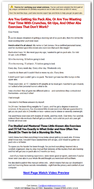
The first variation included a video from founder Carl, who personally showed how these exercises were performed.
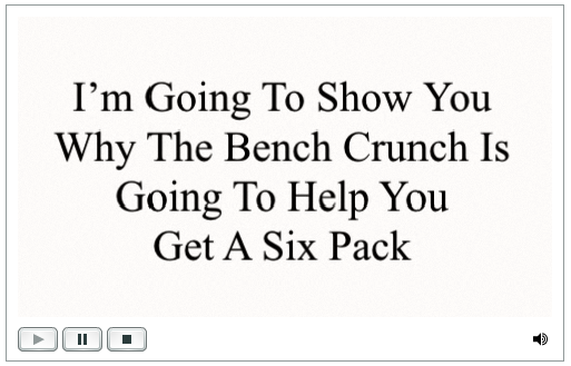
The second variation did not have the video. In all, 46.2% of those who watched the video would then move on to the pricing/guarantee page, with 96% statistical confidence.
Key Conversion Takeaway: Don’t underestimate the power of a well-placed video on your sales page for increased conversions.
Case Studies with a 98-99% Confidence Rate
Case Study #15: TruckersReport Earns Nearly 80% More Conversions to Landing Page Through More Funnel Conversions
Truck driver job network TruckersReport is all about connecting users, but their email opt-ins were low, hovering at 12.1%.

In an attempt to fix this, TruckersReport tried altering the top of their funnel. They needed to figure out which issues users were struggling with on the original landing page. They did five tests in all.
The first test determined that too many form fields might have prevented users from completing the form.

The second test reviewed whether using customer survey language directly from the drivers would convert better.

The third test temporarily removed the job match page. Instead, users would opt in, be redirected to the new page, and then see a progress bar of their registration.
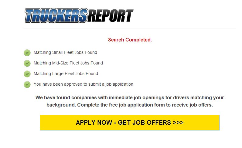
As a fourth test, TruckerReport also rewrote some headlines.
Some of these touched on a driver’s sense of autonomy, like “You can get a driving job with better pay, but of course, you’re free to choose.”
Others listed benefits, while others were listed in a question format. TruckerReport also came up with a simple headline at this time: “Get a truck driving job today with better pay.”
For the last test, TruckerReport made alterations to its landing page, making it shorter and simpler.

Below were several versions of the page. The third variation had the best results, with a conversion rate of 21.7% and an opt-in rate of 44.7%. This was reported with a 99.9% rate of confidence.

Key Conversion Takeaway: Don’t be afraid to give your landing page an overhaul, testing whether it’s the headlines, copy, images or page placement that are hurting your conversions.
Case Study #16: TV Show VeggieTales Changes Checkout Funnel for More Revenue
Kids’ TV program VeggieTales may be an incredibly well-known show (even most adults have heard of it), but they still weren’t bringing in as much revenue as desired.
Here’s a preview of their old checkout page.

VeggieTales felt the page had too many distractions that could otherwise captivate a customer’s attention, leading to cart abandonment. They decided to remove the checkout page’s top navigation.

Once the navigation was removed, revenue per checkout page visitor jumped by 14.3%. VeggieTales also enjoyed a 38% spike in revenue per visitor sitewide at a confidence rating of 98.1%.
Key Conversion Takeaway: Check your pricing page. Are other menus and sidebars distracting your customers from finalizing their purchase? If so, it may be time to make a change.
Case Study #17: Rasmussen College Goes Mobile, Sees Nearly 300% Spike in Leads
Rasmussen College in Minnesota, Illinois and Florida optimized their website for mobile, but they weren’t seeing as many leads on their mobile site as they were on their desktop version.
They decided a new landing page was in order.
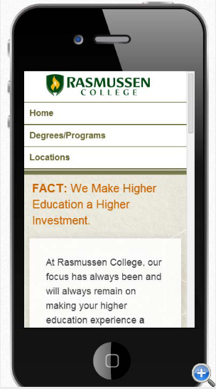
For comparison purposes, here was version A of their mobile site:
Version B was a stand-alone mobile site with a hero shot and iconography.
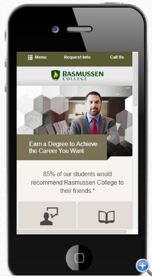
Of the two, version A won. Version B was definitely ‘prettier’ with the nicer layout and big icons, but removing the icons took away some of the extra steps involved.
Also, they used keyword data to make the user experience more personalized in version A, which was a definite game changer.
Rasmussen College saw a 256% jump in leads from using version A, at a 99.9% confidence level.
Key Conversion Takeaway: Sometimes the ‘prettier’ version isn’t the highest-converting version. The only way to know what works best is to test both versions.
Case Study #18: Flying Scot Parking Gains 35% More Conversions by Deleting Excess Form Fields
Glasgow Airport parking resource Flying Scot Parking had a rather busy landing page in its original iteration.
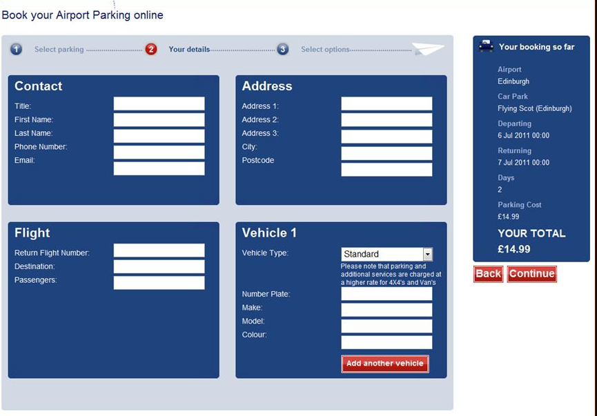
They wanted more conversions, so they decided to cut a lot of the questions out of their landing page, simplifying their forms fields like so.
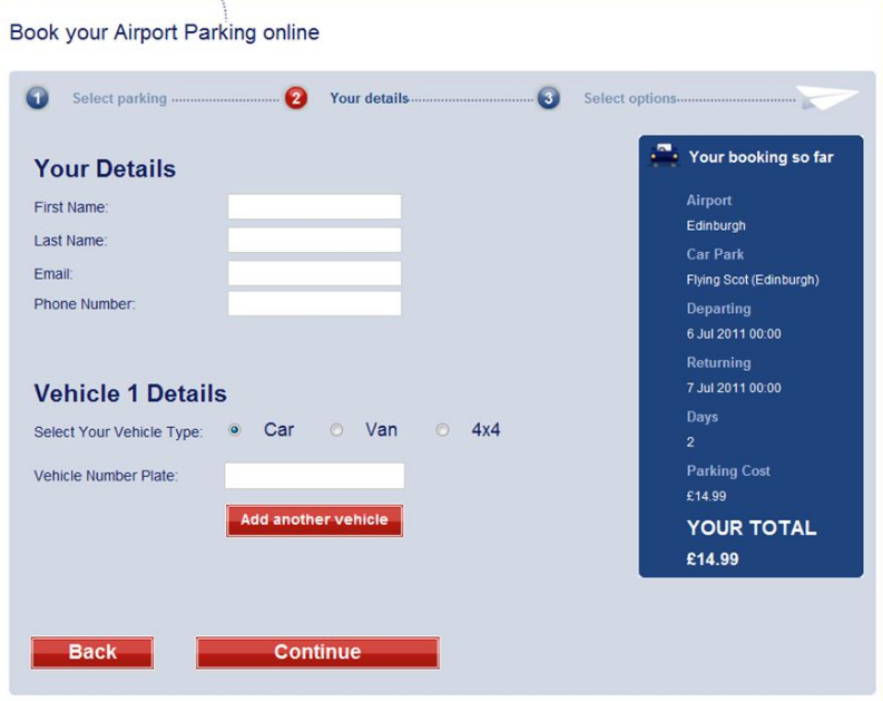
The updated landing page looked a lot more streamlined and easier to use. Customers must have agreed, because form submissions spiked by 35% after the newer landing page was introduced.
Not only that, but 45.4% more site visitors progressed to the next step on the website, which was booking with Flying Scot Parking. The test had a statistical confidence of 99%.
Key Conversion Takeaway: Asking too many questions can bog down any potential customer. Limit your questions and form fields to only the most important queries.
Case Study #19: Meebox Earns More Revenue by Showing Discounts
Netherlands cloud hosting company Meebox, like many companies, sought to bring in more revenue. Ironically, they did so by showing discount information.
This was the original version of their landing page.

Here is the second variation with the discount information.

By letting users know how much money they’d save by booking with Meebox, the company had a 51.9% conversion increase, a 46.2% spike in average order value, and a 121.6% jump in revenue. This was all with a 98% confidence rate.
Key Conversion Takeaway: Like I mentioned in a case study above, users love to know they’re saving money. If you can show them exactly how much, they may choose to buy from you over a competitor.
Case Study #20: Comfort Keepers Switches Call Logo Button, Gets Nearly 80% More Phone Calls
Assisted living resource Comfort Keepers has an audience that is mostly comprised of women, typically in their 50s or older.
Using Optimizely for this test, Comfort Keepers decided to switch the location of its call icon. Nearly 5,000 site users participated in the two-week study.
In the original version of the Comfort Keepers’ website, the call icon was right at the top of the page. It also showed up again at the bottom of the page.

For the study, the second logo was removed.

It turns out more users wanted the second call logo button. By adding it to both the top and bottom of the page, there was a 74.3% increase in phone calls at a confidence rate of 99%.
Key Conversion Takeaway: Depending on your audience, sometimes repeating small elements, like buttons, at the top and bottom of your page will attract more business.
Case Study #21: Bag Servant Creates Social Proof, Brings in More Revenue
Purse and bag retailer Bag Servant thought that by establishing credibility and trust in their website, they could inflate their click-through rate.
They did this by creating social proof. The company already had more than 4,000 followers on Twitter, so they decided to highlight that in an effort to encourage other users to try Bag Servant.

The company then went even further. They had also received a WOW Badge for their level of service, so they replaced their social share button with their badge of honor.
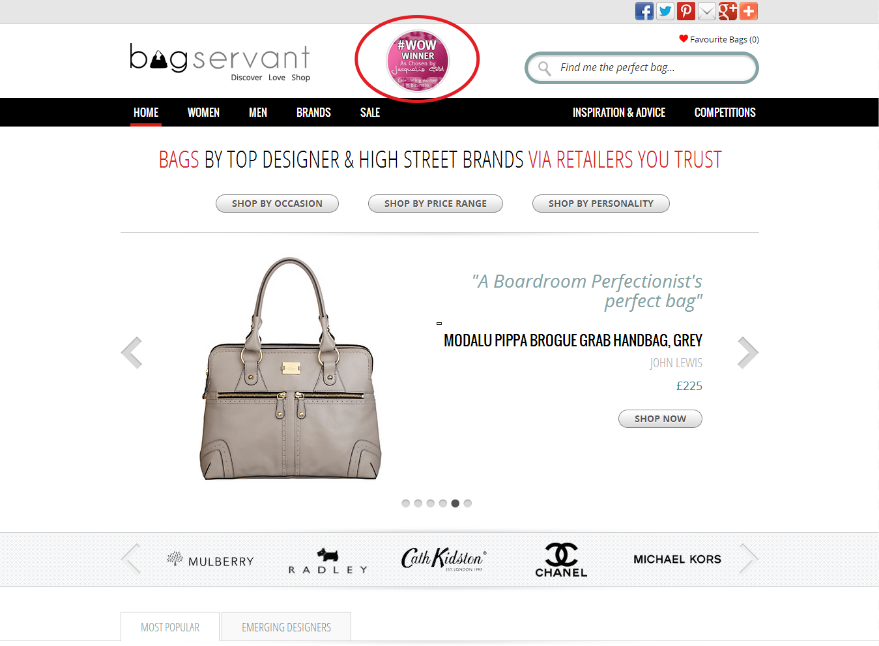
This did the trick.
Bag Servant had a 60.4% increase in product exploration, a 72.1% improvement in visits to affiliate partner sites (which had 98% statistical confidence) and a 10.3% jump in site engagement.
Key Conversion Takeaway: Users want to know why they should trust you, and social proof is a good way to establish that trust. If you can’t use badges for your company, display positive social proof or customer reviews if you have them.
Case Study #22: 160 Driving Academy Determines Its Audience Prefers Real Photos of Real Users
Illinois truck-driving course 160 Driving Academy also helps its students find jobs, so selling its course is important. Most site users would find the phone number or use the homepage contact form to learn more or enroll.
That said, 160 Driving Academy wanted to see if they could improve two things: the conversion rates of the forms on their website, and the amount of visits to their Registration page (which you would land on after clicking “Register for Classes” on their homepage).
So they contacted internet marketing company SpectrumInc for help.
SpectrumInc started out by testing the images on 160 Driving Academy’s site. It initially had a stock photo on the homepage.

Then they switched it to a photo of a real student instead:
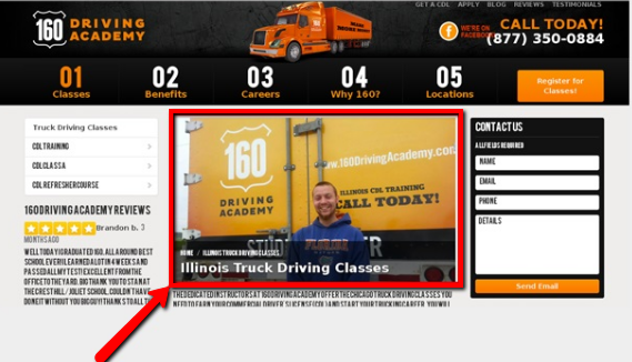
160 Driving Academy achieved its goals with a simple picture swap. All results occurred at a confidence rate of 98%.
The company reported a 38.4% increase in site registrations, as well as a conversion boost of 161%. There was just a 2% chance this occurred randomly without the picture change.
Key Conversion Takeaway: Social proof is incredibly important in driving conversions. If you can, always choose a real photo over a generic stock photo.
Case Study #23: SweatBlock Adds CTAs, Specificity, and Messaging Hierarchy to Its Homepage, Gets Nearly 50% More Sales
As one of the top antiperspirants available on the Internet, SweatBlock already has plenty of traffic. That said, they wanted to increase their revenue, so they decided to follow the Problem-Agitate-Solve, or PAS Formula, to do it.
Part of SweatBlock's strategy was adding more specific CTAs, as well as messaging hierarchy. Messaging hierarchy is a way of positioning your brand so it answers the question “what’s in it for me?” with benefits of the product or service.
Here are their three homepages for comparison:

Of those three variations, the second and third produced the most sales. There was 49% more paid conversions with Variation B, which showed a woman, and 46% more paid conversions with Variation C, which showed a man. These results were reported with a confidence rating of 99%.
Key Conversion Takeaway: Longer homepages or landing pages can benefit from following the principles of messaging hierarchy to keep copy organized and targeted. Also, using the Problem-Agitate-Solve formula makes it easier to structure your homepage, rather than it being a guessing game with a bunch of random elements.
Case Study #24: By Adding Paid Plan Upgrades, Ecwid Gets More Traffic
SaaS business Ecwid specializes in online retailer payment solutions, management and store setup. The company is quite successful, with merchants in more than 175 countries. Small businesses are especially fond of the “add-on store builder” feature.
Ecwid wanted to draw more attention to its free plan, driving sign-ups. They also wanted to engage more users via their paid upgrades and incentivize users to pay for these.
They decided to perform a four-week test. The main differences to their landing page were the introduction of a progress indicator as well as a clearer onboarding process explanation.
Here’s what the landing page looked like:

Here’s what it was changed to:

After the four weeks were up, Ecwid reported more paid account upgrades (21.3%), more users getting through all the registration steps (28.4%), more traffic to the “Get Paid” step (17%) and more attention on the “Create Store,” “Geo-Settings,” and “Configure Shipping” steps (12% overall), with 98% statistical confidence
Key Conversion Takeaway: Progress bars are powerful in getting users to take and complete an action. They allow users to clearly see how much time and effort they’ll need to put into taking action, and they’re more incentivized to complete their progress.
Case Study #25: Dallas Theological Seminary Earns Clickthrough Rate of 190% by Putting More Attention on the Donate Button
Evangelical nonprofit organization Dallas Theological Seminary, like many nonprofits, sought to increase donations. They thought their biggest roadblock was the arrangement of page elements on their landing page.

DTS thought the donation button didn’t stand out enough, so they made one subtle, but powerful change.

They made the donation button purple to catch more attention.
This small change yielded 860% more donations, even from those with “lower motivation.” For all other customers, click-through was up by 190% with a statistical significance of 98%.

Key Conversion Takeaway: If you want to draw attention to a certain CTA or button on your landing page, try making it stand out more than the others.
Want to own this article? Click here to download it so you can reference it later.
Case Study #26: The Next Web Determines That Sharing the Number of Deals Available Drives More Conversions
Tech publisher The Next Web performed an in-house study to determine ways to get more people to visit its e-commerce store, which is simply called Deals.

In an attempt to draw more people to click on their “Deals” section, without taking away from their other sections, The Next Web added a numerical value to the number of “Deals” available.

They developed an algorithm that would randomly display a number between 100 and 110 for each visitor, making sure the number was always closest to the number of deals available.
This little change alone, at a confidence rating of 99%, garnered 257.8% more clicks to The Next Web’s e-commerce store.
Key Conversion Takeaway: Adding a tangible number like The Next Web did here quantifies the value you’re providing. This incentivizes people to click without taking too much away from the other sections you want them to click on.
Case Study #27: Brookdale Living Earns Thousands of Dollars in Monthly Revenue with a Landing Page Image Instead of a Video
Senior living solutions resource Brookdale Living had a Find a Community page on its website, but at the time there was very little to it. It didn’t have a conversion offer, content, testimonials or graphics.
In short, there was little here to engage a user.

To fix this, Brookdale started by using a stock photo of an elderly woman, as seen here.
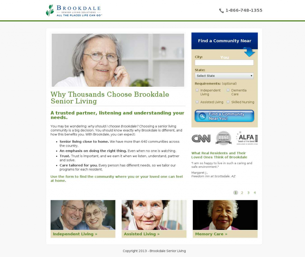
The photo was soon done away with. In its place, they embedded a video with real seniors who had good things to say about Brookdale’s services.
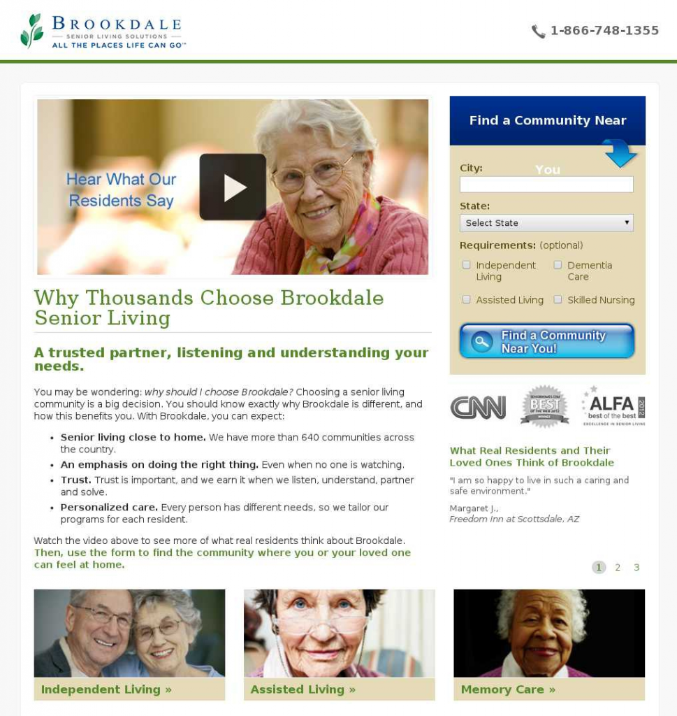
Somewhat surprisingly, more users preferred the landing page with the photo versus the one with the video. This could have been because Brookdale was already an established brand, and people already knew what they wanted when visiting, making video more of a distraction.
In all, more than 30,000 users over a two-month span chose the first variation over the second, achieving a statistical confidence of 99.9%.
There were 0.9% more searches on the Find a Community page with the video landing page and 3.9% with the image. This brought in an increased monthly revenue of about $106,000.
Key Conversion Takeaway: Know your brand and audience. There’s no question that video can help conversions in the general sense, but you’ll need to test to see whether it works for you.
Case Study #28: Adding “Popular Products on Top Funnel Page Increased Revenue Per Visitor
Ebuyer, a leading online electronics retailer in the UK, used the help of HP Optimost to run a three-week split test to see if they could incentivize bargain hunters to buy.
Ebuyer thought adding a social proof element to the page would increase purchases and overall revenue.
They tested a vertical “popular products” navigation window on the right side of the page to allow visitors to go straight to top-selling product pages.
Version 1:

Version 2:

While the team thought the social proof element would help, it didn’t actually help conversions. The nav bar turned out to be more of a distraction, and while overall sales volume increased, sales revenue did not.
Meaning more people were buying, but they weren’t spending enough.
Although Ebuyer would not share the totals their testing yielded, the case study reports that version B was the winner, and that they had "substantial" revenue per visitor at a confidence rating of 99%.
Key Conversion Takeaway: If your business is selling e-commerce products, remove unnecessary distractions that take away from the buyer’s decision process to make a quality purchase.
Case Study #29: Caffeine Informer A/B Tests Dropdown Mobile Menu Copy, Finds Words Convert Better Than Symbols
Caffeine Informer is an online resource about all things caffeine, including the amount of caffeine in food and beverages, and even overdose calculators.
They were using what’s called a hamburger dropdown menu.
This icon is also commonly referred to as a list icon. Here it is for reference.

Here’s what Caffeine Informer changed the hamburger icon to:

This A/B test included more than 240,000 unique users on Caffeine Informer’s mobile site. Of those visitors, the dropdown labeled “menu” saw 20% more unique visitors clicking than the hamburger menu at 99% statistical confidence.
Key Conversion Takeaway: Symbols can sometimes do more harm than good.
If a user is confused as to what a symbol means, they probably won’t go near it. Conversely, including plain language like the word “menu” is much more easily understood.
Case Study #30: Majestic Wine Gets 201% More Conversions Through A/B Testing
UK wine retailer Majestic Wine sells to customers all over the world. The company wanted to focus on wedding planners who needed wine, since this portion of Majestic Wine’s audience was underperforming.
The company narrowed down the reasons they thought this was happening, like too many outbound links on Majestic Wine’s webpage. They thought perhaps this was too distracting and preventing users from finishing the enquiry form.

Majestic Wine decided to add an explainer video to their landing page, write copy that explained more about their wedding services and delete most of the outbound links.

Then they made some final tweaks to their landing page:
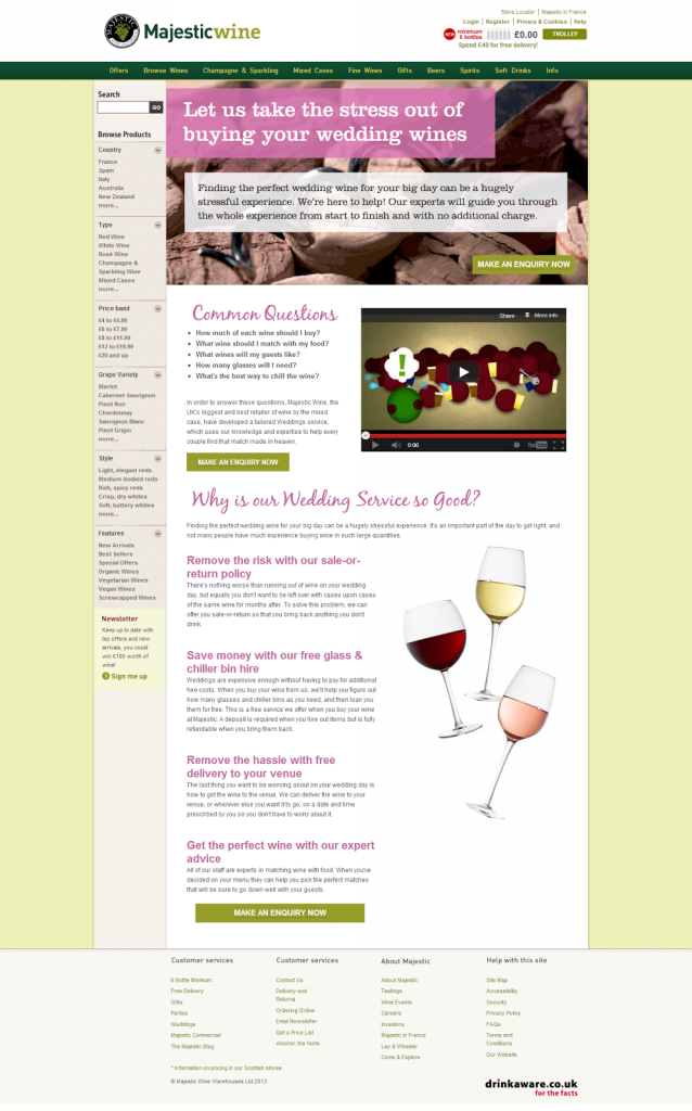
Through A/B testing the first two versions of the site, Majestic Wine had an enquiry form submission rate of 201%. This was with a 99.9% confidence rating.
Once Majestic Wine presented the third and final version of the landing page, they received even more forms (36.9% more) by removing a distracting PDF download button.
Key Conversion Takeaway: This has been mentioned before, but it bears repeating: the fewer distractions on your landing page, the better. Try to make your page clean and include as few outbound links as you can.
Case Study #31: Gemm Learning Finds Fewer Users Would Prefer to Be Called
With ADD, APD, dyslexia and reading learning programs online, Gemm Learning keeps their site purposely simple. Yet they had a pertinent question, and it was whether to keep the “should we call you?” option in their submission form.
Gemm Learning had already retooled its landing page in 2013—that case study is here. But Gemm’s page still needed a few tweaks.
They decided to A/B test the form with and without the “should we call you?” option. Here’s the first variation, without the call option:

Here’s the second variation, with the call option:

Gemm Learning reported its findings at a confidence rating of 99%. They found that 70.4% more people were likely to finish the form without the phone call option.
This is because, due to the nature of Gemm Learning’s business, it’s implied that phone contact could occur since a customer has to give their phone number while filling out the form.
Key Conversion Takeaway: Don’t bash customers over the head with too many options. If you’re asking for their phone number, you don’t have to ask if you can call them.
Case Study #32: MedienReich Computer Trainings Gets Nearly 41% More Engagement by Pushing Its Best-Selling Products to Its Homepage
Based in Germany, MedienReich Computer Training is a software training course company. Some of their software products are very popular, so the company decided to outline these on their homepage.
Over 20 days, MedienReich changed the “course categories” section to “best-selling courses”.
Here are the two pages: the control and the one with the best-sellers, including InDesign, Photoshop, AutoCAD and Excel:

With a 106.4% jump in year-on-year homepage value, MedienReich realized the second variation was the winner. With a 99.9% confidence rating, the company had a 40.9% boost in homepage engagement as well.
Key Conversion Takeaway: If you have best-selling products, show what they are specifically for better audience engagement.
Case Study #33: White Card Courses Earns 32% More Conversions with Above-the-Fold Trust Badges
Australia’s White Card Courses teaches construction workers how to operate machinery and other elements of the job, including safety. Students earn certifications and learn to do their jobs under the standards of the National Code of Practice of Australia.
Here was the first version of their homepage:
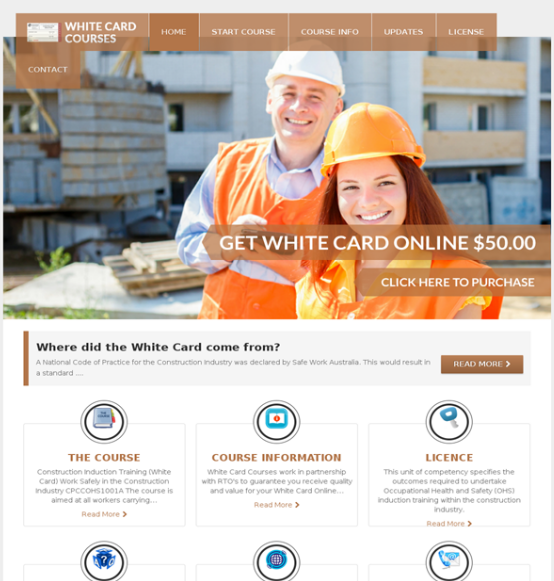
White Card Courses decided to implement three changes to their homepage.
The first was to include guarantee badges with the hero image to generate trust. They also wanted a new subheadline background and CTA color.
Last, they wanted to change the text of the CTA. It was “Click to Purchase,” but they made it “Start Now” instead.
Here are those changes in action:
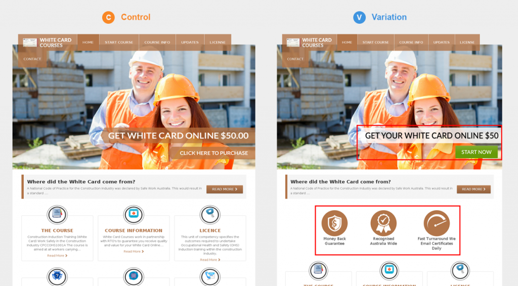
Those three changes led to more clicks to the payment page (20.9%) and more visits on that page (32%) with a 99% confidence rating.
Key Conversion Takeaway: Trust badges establish your company’s authority, so add them if you can.
Also, while changing the CTA button to “Start Now” might seem a bit vague (as we’ve seen with other examples here), it’s better than “Click to Purchase” in this case. People aren’t going to be clicking to purchase anything when they first land on your site. They’ll want to browse around to see what you’re offering first.
Case Study #34: Maplesoft Cuts Back on Design Elements, Gets More Conversions
STEM education resource Maplesoft once had a pretty cluttered landing page, as you can see here:

The company thought that by cutting back on all the clutter and making an easier-to-digest design that they could increase engagement.
So they started from scratch.
They created a new visual theme, rewrote all the copy, redid the navigation, and made a modal popup that reduced page clutter, like form elements. They also moved some lesser elements below the fold, like the hero video.
Here's what the finished product looked like:
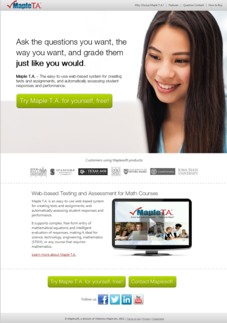

Maplesoft had a confidence rating of 98% with its promising results: conversions were up by 633.1% and engagement spiked 45.1% higher.
Key Conversion Takeaway: Sometimes it takes a major change like Maplesoft’s website facelift to see better conversions.
Case Study #35: Tourism Company Gets 35% More Leads with Navigation Testing
An unnamed tourism company wanted to attract more visitors to its website with interactive content. They decided to A/B test two versions of its site navigation to see which would engage visitors the most.
Here’s the site navigation they originally had:

Here are the two variations:


Treatment A was the winning landing page. Its simplified navigation led to a nearly 35% spike in click-through rates. The tourism company reported its findings at a confidence rate of 99%.
Key Conversion Takeaway: Complicated, lengthy navigation can distract users and prevent them from seeing other elements on the page you’d rather they’d engage with. Keep your navigation short and simple.
Case Study #36: The McClatchy Company Uses Catapult Clicks, Gets More Site Engagement
News and print publication The McClatchy Company wanted to test whether its “Buy & Sell” navigation label was better than its “Classifieds” label.
They used Adobe Target for A/B testing purposes. More than 417,000 site users participated in a 26-day study.
One version had the “Classifieds” label:

The other had the “Buy & Sell” label instead:

It turns out users preferred the “Classifieds” text, as it earned 75% more clicks with a statistical confidence of 99%.
Key Conversion Takeaway: Use familiar language when you can. Anyone who reads a newspaper knows what to expect when they click “Classifieds.” That may not be as true for “Buy & Sell.”
Case Study #37: LoginRadius Gets 52% More Conversions with Social Login Option
SaaS customer identification management platform LoginRadius did its own test to drive more eBook landing page conversions. Their test involved adding a social login to three of their eBook landing pages over two weeks.
Here was the original landing page:

Here is the one with the social login option:

The addition of the social logins led to a 52% jump in conversions. LoginRadius reported this at a confidence rate of 99%.
Key Conversion Takeaway: With so many users on social media today, social logins are a viable option for many landing pages.
Want to own this article? Click here to download it so you can reference it later.
Conclusion
We’ve listed a lot of different case studies here, including some that might be contradictory.
For example, as a business owner looking to boost conversions, what should you do when one case study recommends re-designing your website so it’s more polished and branded, while another suggests ‘prettier’ designs don’t always convert?
Every business is different and serves different audiences. The best answer to that question is to try a few A/B split tests to see for yourself what your audience prefers.
In all, these case studies provide a ton of useful ways to start testing different elements on your sites and landing pages.
Not only that, but now that you know what data to look for in a conversion optimization case study (e.g. high statistical confidence), you’ll know what to look for when validating the next one.
To review:
- A/B testing is always the best way to know what your specific audience would prefer. Figure out which elements you want to test, and see which boosts your conversions.
- Know your audience. While a landing page video could convert well for some businesses, it doesn’t work for everyone.
- Always use clear, targeted CTAs and copy over generic content like “Get Started”. It will resonate better with your audience.
- If you have actual photos of people using your product or service, use those over generic stock photos.
- Sometimes your audience will cling to what’s familiar, so don’t overthink your button titles, especially in your navigation bar. See the McClatchy Company newspaper example, where leaving the menu item labeled “classified” was preferred over changing it.
Which of these landing page case studies resonated with you most? Why? Which changes do you plan to make to your own landing page after reading this? Let me know in the comments.
Keep Hustlin’, Stay Focused,
—Matt


