17 Best Sales Funnel Examples to Help You Scale Faster

Back when "sales funnel" wasn't even a common search term, I was a new entrepreneur looking for answers.
The problem?
There were no good resources about building effective sales funnels. So I created one, and it quickly became the #1 ranked guide on the topic.
Today, as entrepreneurs and marketers, we're still chasing that perfect sales funnel - one that converts visitors into happy customers. And now, I've expanded this guide to show you exactly how successful companies do it with their sales funnels–
The examples below converted an estimated $636.5 billion in sales just this year. To replicate their success, it's not about fancy tools–it's about following key (sometimes subtle) steps that take your funnel to the next level.
Table of Contents
- SaaS Sales Funnel Example #1 — Netflix
- SaaS Sales Funnel Example #2 — Tawk.to
- SaaS Sales Funnel Example #3 — Help Scout
- Productized Service Sales Funnel Example #4 — Growbo
- SaaS Sales Funnel Example #5 — Basecamp
- SaaS Sales Funnel Example#6 — Dropbox
- SaaS Sales Funnel Example #7 — Crazy Egg
- SaaS Sales Funnel Example #8 — SharpSpring Ads
- SaaS Sales Funnel Example #9 — Grasshopper
- Service Funnel Example #10 — Bench.co
- SaaS Sales Funnel Example #11 — Mailchimp
- SaaS Sales Funnel Example #12 — Leadpages
- SaaS Sales Funnel Example #13 — Drift
- SaaS Sales Funnel Example #14 — Wufoo
- eCommerce Sales Funnel Example #15 — Amazon
- SaaS Sales Funnel Example #16 — Slack
- Personal Coaching Sales Funnel Example #17 — Tony Robbins
If you want to get all marketing (and sales funnel!) work done for your coaching, SaaS, eCommerce, startup, agency, or professional services business—without the headaches of hiring a team—then you
What is a Sales Funnel? How Does It Work (to Print Your Money)?
But before we dive into this list of most effective sales funnel examples to convert more customers and clients, we should briefly discuss something...
We’ve defined sales funnels before, and even offered a free, downloadable sales funnel template.
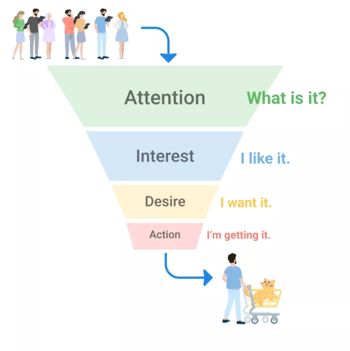
A sales funnel is "a series of steps designed to guide visitors toward a buying decision. The steps are composed of marketing assets that do the work of selling, like landing pages and email."
The traditional funnel stages include awareness, interest, decision, and action, with some marketers adding nuanced stages like consideration and retention.
SaaS Sales Funnel Example #1 — Netflix
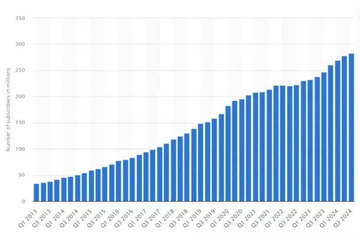
Netflix is the most popular video streaming service in the world. Research from Statista shows that as of the third quarter of 2024, Netflix has had 282.72 million subscribers. It earned $33.72 billion in annual revenue in 2023 with 90% coming from subscriptions.
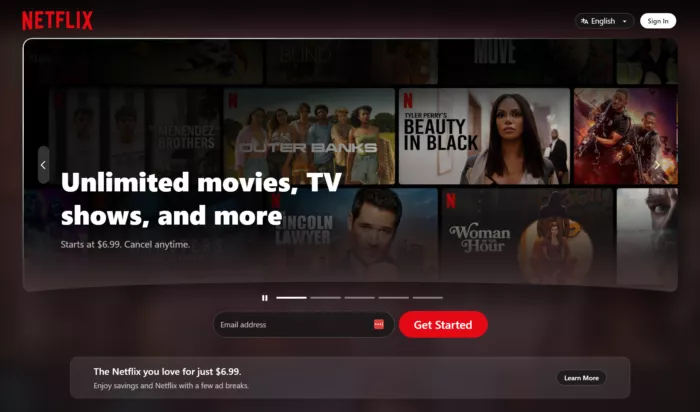
Their site’s design is very simple too.
There’s not a lot of confusing copy and you know exactly what you’re getting when you sign up.
They also emphasize that you can cancel any time and not be locked into a contract.
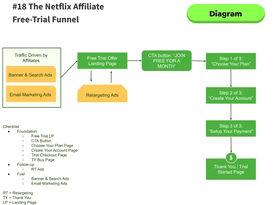
Steps in Netflix’s Sales Funnel
Traffic: Organic, paid ads, social media content
Homepage: their homepage clearly explains how you can cancel your monthly subscription anytime. They emphasize this risk reversal because they are a recurring monthly-based subscription.
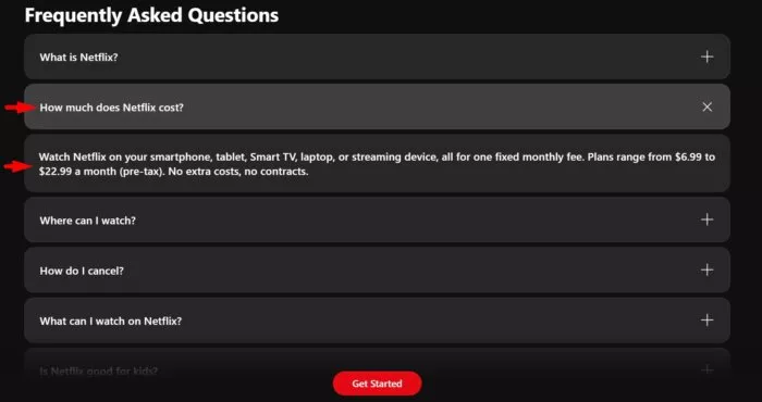
Pricing Page: you can scroll right down to the FAQ section and find the pricing info.
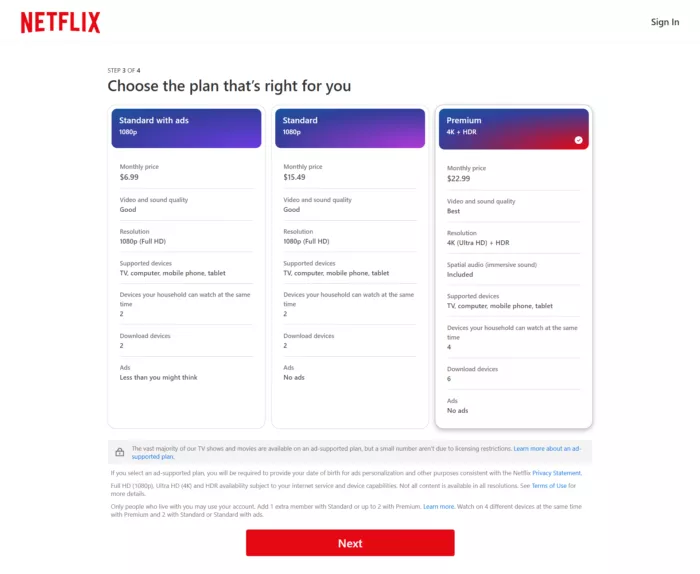
By default, Netflix selects the Premium plan for you (which is a very smart move). You can downgrade if you want though.
Why Netflix’s Sales Funnel Works
You have multiple payment options: gift card, credit card, and PayPal.
All major credit cards are accepted.
You can also go back and edit your contact information so you’re not locked in.
There’s an emphasis on security which is great because people are naturally risk-averse.
It’s very focused on the end consumer. And they answer consumer questions cleanly and clearly with the least amount of text needed.
What Makes Netflix’s Funnel Unique
Netflix can rely on the power of its brand. Everyone knows Netflix.
You can also contact them by phone.

Not a lot of web-based companies share their phone numbers. This just builds trust even further.
eCommerce Sales Funnel Example #2 — Tawk.to
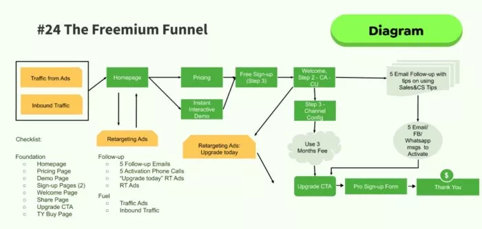
Tawk.to demonstrates a masterful approach to the freemium model in the live chat software space.
Their sales funnel begins with a viral marketing component — their chat widget displays "Powered by Tawk.to" on free versions, creating organic awareness.
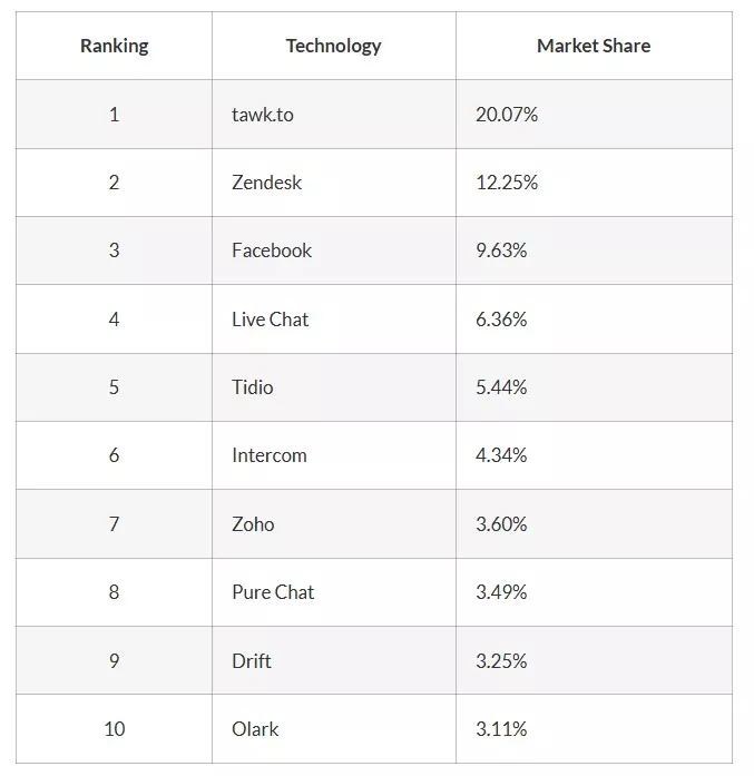
According to OpenView's SaaS Benchmarks Report, freemium models can increase user acquisition by up to 50% compared to traditional pricing models. Tawk.to has leveraged this quite effectively because they are ranked #1 in the competitive live chat software space. They have even surpassed established competitors like Zendesk and Intercom.
Tawk.to is freemium and they are give away more value. Just by focusing on their product, they were able to grow because the growth component was built into usage.
A study by Profitwell shows that companies using freemium models with strategic upsell paths see a 60% increase in lifetime value in converted customers.
Steps in Tawk.to’s Sales Funnel
Traffic: organic, referral (due to its virality) and organic search
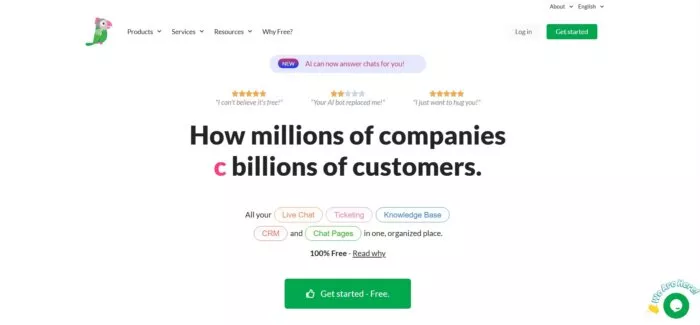
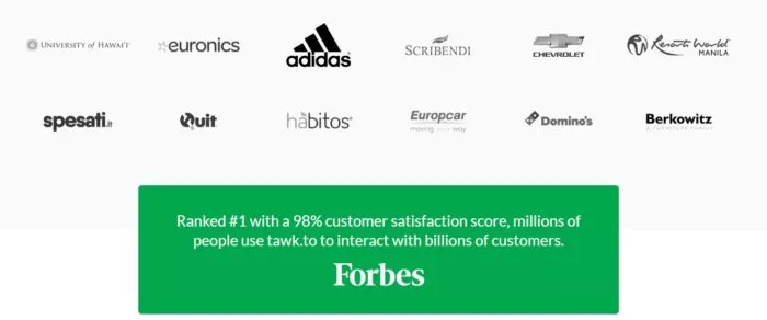
Homepage. Its homepage is clean and simple. It takes pride in being ranked #1 with 98% customer satisfaction score.
Tawk.to lets anyone try their complete chat system without asking for money or even a credit card. This makes people curious and excited to explore all the features.
Why Tawk.to’s Sales Funnel Works
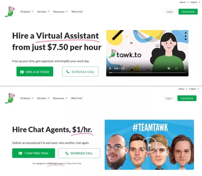
It’s core product is completely free and it creates truest wit this free offering. It makes it easier for users to upgrade after experience its full capability. It has a natural upsell path: user experience before paying, offering white label for brand consistency, and premium support for scaling needs.
SaaS Sales Funnel Example #3 – Help Scout
Help Scout is a dedicated customer support platform that offers helpdesk and customer interaction solution using email and live chat solutions. This year, Help Scout's revenue hit $36.2M.
The designs and animations feel emotional.
Plus there's some brand logos added at the fold to emphasize social proof to website visitors.
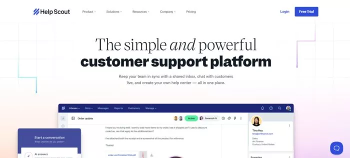
Help Scout offers their free trial and invites leads to sign up with email or sign up with Gmail.
The designs and animations feel emotional.
The copy is easy to read. The design is simple. Nothing is interfering with the copy. There’s no messy background.
There’s also a clear CTA to sign up for the trial and lots of social proof.
It may be below the fold, but it’s still high enough that it’s easy to see.
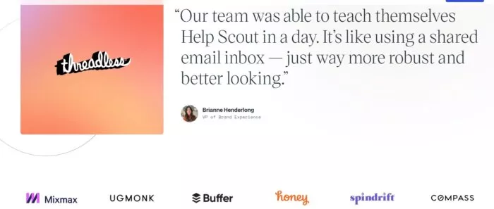
In general, it's prime for a great user experience. And according to GoodFirms, 84.6% of web designers believe the biggest mistake small to medium-sized businesses make is making the website too crowded.
But Help Scout avoids that common pitfall.
Let’s dive right in to Help Scout’s sales funnel.
Steps In Help Scout's Sales Funnel
Traffic: blog or resources page.
Homepage: Help Scout’s homepage is clean, visually attractive, and has great contrast. There’s plenty of social proof and clear CTAs.
Pricing Page: There are 3 pricing tiers on their pricing page: Standard, Plus and Pro, and a CTA to start their free trial. They’re exercising the Law of Visibility (one of the key Laws of Sales Funnel Physics) by emphasizing the blue CTA. You can clearly see how the “Standard” and “Pro” CTAs are white while “Plus” CTA is highlighted (probably because they want more people to try that package).
Why Help Scout's Sales Funnel Works
Overall, Help Scout has a beautiful design. Their message and services seem pretty clear. They’re doing all the right stuff to address the basics.
Their blog is great. They have some fantastic resources with nice graphics. They have a lot of high-quality content overall. It’s super original with a clean layout.
You can easily learn more about the team. They also have a strong lead magnet with a CTA to download their tool kit.
Help Scout once just offered helpdesk services. Today, they’ve expanded their offerings to include a research component and a data library.
Productized Services Sales Funnel Example #4 – Growbo
Growbo has transformed the traditional agency model into a streamlined, productized service. Our approach combines the flexibility of custom marketing services with the scalability of SaaS platforms.
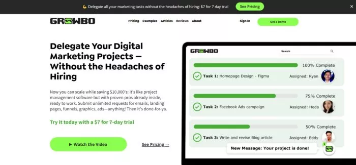
We crossed 7 figures in 2021 for the first time as a business, 100% bootstrapped. We're a multi million dollar company in terms of aggregate revenue.
You can submit unlimited requests for email sequence copy, landing page copy and design, graphics, ads strategy, lead magnets—anything! Then it's done-for-ya.
We also offer digital marketing strategy (including custom-created SaaS sales funnels, eCommerce sales funnels, coaching sales funnels, local events sales funnels, marketing funnels, etc.) that help automate our clients’ sales or client lead gen, get them better quality prospects, and let them own a sales pipeline packed full of clients).
Because you know that when it comes to creating funnels and implementing sales funnel strategies, Growbo is the one (like many of our happy clients have stated).
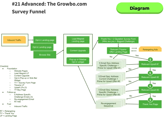
And here is what Growbo’s sales funnel looks like.
Traffic: we get a lot of organic traffic, ads, word of mouth, and referrals from Growbo’s weekly newsletters and articles.
Homepage: the main call to actions on our homepage are (1) to see pricing and sign up for our $7 for 7-day trial, and (2) to watch the demo video to see how Growbo works before booking a free consultation. Our newsletters and articles all lead back to our homepage and/or pricing page.
Pricing: we include Growbo’s 4 different packages with a detailed breakdown of which skill sets each package includes. We also include the pricing for each package—which are Teleport, Fly, Run, and Walk. We also offer our new White Label Features to clients who sign up for Run or a higher package.
Why Growbo’s Funnel Works
We have very clear copy in all of our landing pages. We clearly explain what Growbo can do for our clients. We also specify who isn’t a fit for Growbo.
We clearly specify what each of our packages include (skill sets, turnaround times, number of tasks we can work at a time, pricing, work samples, etc.).
We also give leads the opportunity to book a call with one of our sales specialists so that they can learn more about what we do and what we don’t before they sign up.
Also, we offer a $7 for 7-day trial so that clients can try us out and get a better sense of how we help them grow their businesses.
We give clients peace of mind by not locking them in with long-term contracts. Growbo’s clients can cancel, upgrade, and downgrade at any time.
SaaS Sales Funnel Example # 5 – Basecamp

Basecamp is a project management platform that helps manage companies’ projects, work, and communication in one place. Basecamp's revenue is reported to reach $280M in 2024 reflecting the increasing user base of the platform.
They continually test new designs. And the copy focuses a lot on problems they can solve for their customers.
Basecamp’s website also feels very personal. And they emphasize their social proof in plenty of unique ways.
Emotion is involved in this funnel. They’re not just a tool. This is something that the buyer identifies with.
Steps in Basecamp’s Sales Funnel
Traffic: blog, PR, organic search.
Homepage: in addition to their social proof, they show their product “in action”. They put a face on their logo for an emotional tie-in.
30-day free trial: Basecamp is free to try (they offer a free 30-day trial). For visitors’ peace of mind you don’t have to fill in your credit card information initially when you sign up. They keep their pricing info super simple and clear. It’s not the typical pricing page with 3 different packages.
Why Basecamp’s Funnel Works
Its design emphasizes their customers’ testimonials and social proof. They also promote how it’s free to sign up, and let’s face it, who doesn’t love free stuff?

What Makes Basecamp’s Funnel Unique
Every company wants to solve problems for their customers. And Basecamp speaks to their customers on a very natural, real level.
They also incorporate their social proof in very creative ways. This is what I call bite-sized, unique ways of baking in social proof.
They also keep A/B testing new graphics on their homepage. They don’t just keep one. This is amazing.
And this could mean that you always have to be constantly changing because the market is also changing. So continuous A/B testing is important if you have the traffic for it.
Where Basecamp’s Funnel Could Be Better
I think that adding pictures of real people for their testimonials might make the user experience even more personal. Because actually, human faces increase website conversions.
This is because people love seeing faces, especially in testimonials.
In fact, according to one case study adding real images to your website can improve subscription rates by 34.7%.
SaaS Sales Funnel Example #6 – Dropbox
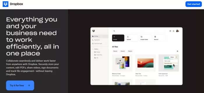
Dropbox is a SaaS-based cloud storage platform that allows users to store, share, and access files from any device. The company reached $2.5B in 2023 and ranks #2 in the file sharing software market.
The main CTA on their homepage is to get started with their 30-day free trial. It also offers a free plan with limited storage space.
Steps in Dropbox’s Sales Funnel
Traffic: direct traffic is the main source, organic and referral
Homepage: their homepage has several clear CTAs to sign up for their free trial across the page, some product explanations, and a few testimonials.
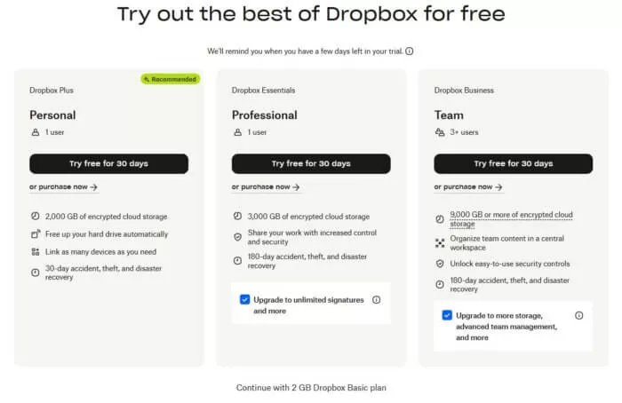
Free Trial Sign-up: after clicking on the free trial CTA button, there is a free trial sign-up form displayed that requires you to enter your email address. You are shown the other plans if the free 2GB storage is not enough for you. It also incentivizes users through its referral system.
Why Dropbox’s Funnel Works And What Makes It Unique
The simple UI design and smooth onboarding which they continuously polish and optimized.
They created a strategy where users could earn extra storage by referring friends. Both the referrer and the referree got bonus space. Morever, shared folders required other users to join creating a virality for using Dropbox.
As users grow their storage needs over time they end up sharing Dropbox with teams they are in, and eventually require business features that matches the pricing plans that Dropbox offers.
Where Dropbox’s Funnel Could Be Better
The brand connection is a little bit weak. With the focus of AI which changes over time, it is unclear if that’s diluting their value proposition.
What differentiates them now from GoogleDocs if they shift their focus to searching for documents. There is a lack of social proof on the homepage of Dropbox. Although it a popular platform, it could lose trust from new enterprise customers or people can’t differentiate it with its competitors.
Why Dropbox’s Funnel Works And What Makes It Unique
Users typically start with personal use, grow their storage needs over time, end up sharing Dropbox with teams they are in, and eventually require business features – each step matching a pricing tier. This organic progression, combined with the viral nature of file sharing, creates a self-perpetuating growth engine.
Where Dropbox’s Funnel Could Be Better
There is a lack of social proof on the homepage of Dropbox. Although it a popular platform, it could lose trust from new enterprise customers or people can’t differentiate it with its competitors.
SaaS Sales Funnel Example #7 – Crazy Egg
Crazy Egg is an analytics platform that tracks and optimizes website visitor behavior. In 2024, its revenue reached $6.3M.
Its sales funnel is huge.
They have a great blog with high-quality content. And their sales funnel starts at their blog.
This means most of their traffic is coming from inbound sources like Google.
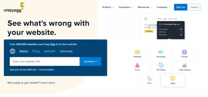
They have a clear call to action on their homepage to get people to sign up for their free 30-day trial.
Steps in Crazy Egg’s Sales Funnel
Traffic: from referrals, organic, blog, and ads. They display a pop-up at the bottom of their blog posts and homepage for their free 30-day trial. If you sign up for their free trial, you will be redirected to their pricing page. And if you sign up for their email list, you will actually remain on the Crazy Egg’s blog page afterward, keeping you engaged with even more content.
Homepage: they require you to add your website URL in order to sign up
Pricing: when visiting the pricing page, all packages are displayed with their 30-day free trial CTA.
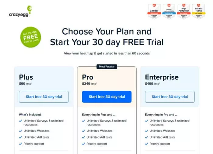
Checkout form: The pricing page has a similar aesthetic to the rest of the site.
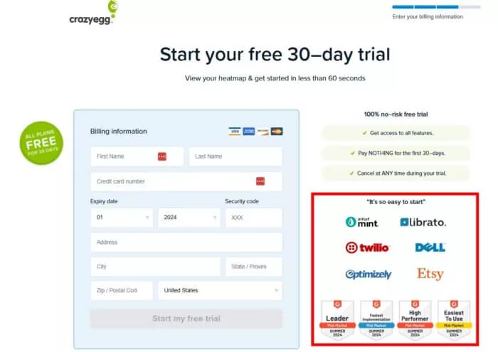
Their checkout page has light copy with an emphasis on social proof. The language is simple, no jargon.
And after you select your pricing plan, the final step is to add your billing information.
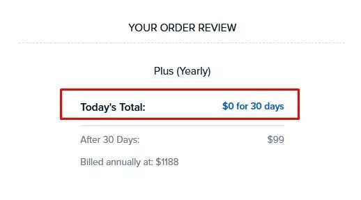
Crazy Egg assures you on their checkout page that you won’t be charged within the first 30 days because of their free trial.
They also include the benefits from signing up and emphasize the “no-risk free trial” to give customers peace of mind.
Why Crazy Egg’s Funnel Works And What Makes It Unique
According to Neil Patel, Crazy Egg has consistently doubled its conversions and revenue year over year.
The focus of the funnel’s design is on simplicity. There’s not a lot of copy. And instead, there’s a focus on strong visuals.
In the past, their landing pages’ design was much heavier on the copy and in explaining the benefits of the service.
Instead of bombarding the customer with information, Crazy Egg keeps the info light.
However, the copy is clear so customers know what they’re getting before they submit their email address.
SaaS Sales Funnel Example #8 – SharpSpring Ads
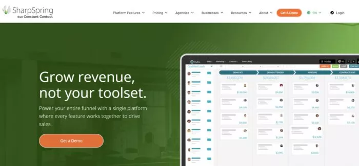
SharpSpring Ads has tweaked its design since they were acquired by Constant Contact in 2021. Constant Contact's peak revenue in 2023 was at $331.7M
Its website design has improved significantly. There are real people featured on the homepage, an explainer video and graphics.
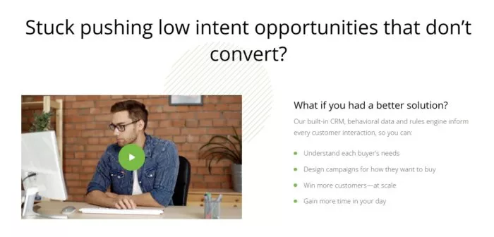
Their pricing page is not easy to find. You have to scroll all the way down to their footer to find their pricing page.
But they have a clear CTA to sign up for their free trial.
Let’s dive into their sales funnel to learn more.
Steps in SharpSpring Ads’ Sales Funnel
Traffic: organic search, partner/agency referrals, direct traffic
Homepage: their primary CTA is to sign up for their free trial and they lack social proof (even though they have a section for showcasing testimonials, this does not show any testimonials).
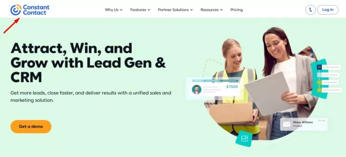
Pricing Page: when clicking on any of the CTAs from the homepage inviting prospects to get started, they will be redirected to a sign up demo landing page where prospects will learn which package is a better fit for them before opening their account. Moreover, since it is under Constant Contact, SharpSpring Ads’ is not displayed which can confuse someone visiting the page.
Why SharpSpring Ads’ Funnel Works
Overall, they have good social proof. They showcase Neil Patel as one of their testimonials which can appeal to potential customers.
But their pricing page is not visible. You have to schedule a demo call first.
Customers are always wondering how much a service or product costs so this definitely adds some friction (one of the 11 Laws of Sales Funnel Physics) to their funnel.
SaaS Sales Funnel Example #9 – Grasshopper
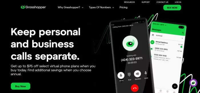
Grasshopper is a virtual phone system that helps small business owners to have a phone number for their company.
This can be used on existing landlines or cell phones. We are a customer of Grasshopper for years now. We even wrote about our customer appreciation experience with the company some time ago.
Grasshopper's total revenue in 2023 was $25.9M with more than 150,000 customers.
Steps in Grasshopper’s Sales Funnel
Traffic: from PR, blog, and ads.
Homepage: their copy is clear (see Law of Clarity, from our 11 Laws of Funnel Physics Framework). They have a CTA for prospects to sign up for their 7-day free trial. And they even have an FAQ section for people to learn more about Grasshopper before signing up.
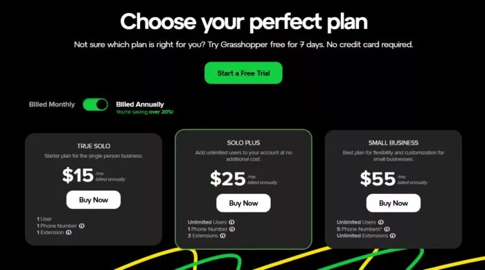
Pricing Page: their pricing page is very clear. Their different plans are compared with each other in terms of pricing and features. Also, their free trial plan is advertised on their pricing page through a “Start a Free Trial” CTA.
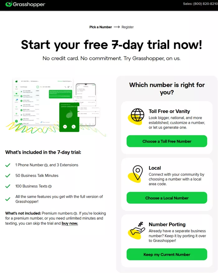
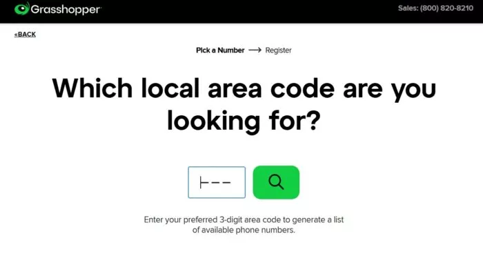
Sign-up Form: first, you have to choose a phone number to register with Grasshopper. You can get a local number and a toll-free number. And then, the landing page prospects are redirected to, is the sign-up and billing page.
Why Grasshopper’s Funnel Works
Grasshopper has made some design changes, color combinations, and they’ve tested other elements that have actually improved their overall site experience.
They even cut down on their sales funnel so it converted better.
What they’re doing is clearly working. Even years later they haven’t changed their site much. The offer is still the same, just presented in a different way. They are constantly calibrating to the market via their continuous internal AB testing. In fact, they are testing it as we are editing the article.
They have CTA, copy and benefit
What Makes Grasshopper’s Funnel Unique
Grasshopper’s logo and brand character (a grasshopper, of course) are still worth noting.
Their product is easy to use. And they continue to stick with a design that speaks to the simplicity of their product. Part of their client retention too is that Grasshopper sends out a personalized note to its clients which we mentioned earlier.
Where Grasshopper’s Funnel Could Be Better
They could still appeal to their audience better.
Average website conversion rate increases when you have a contact number on your site.
Sales Funnel Example #10 – Bench.co
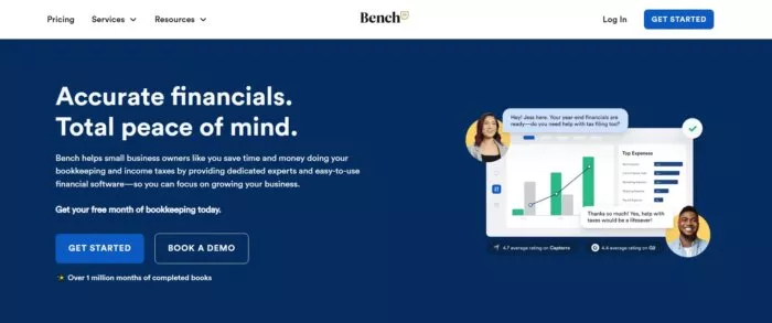
Bench.co has modernized bookkeeping services through their online platform. Their approach combines human expertise with software efficiency, creating a hybrid service model that appeals to small business owners.
The company reached $54.9M in revenue in 2024.
A recent Quickbooks study shows that 40% of small business owners spend over 80 hours annually on bookkeeping. Bench.co's solution directly addresses this time sink through their productized service model.
Steps in Bench.co’s Sales Funnel
Traffic: content marketing, focusing on clear, jargon-free explanations of financial concepts, social media and partnerships
Homepage: The homepage is easy to understand and highlights that the majority of its customers are small business owners. The call to action is clear on the home page. It has big testimonials on what value you get as business owners.
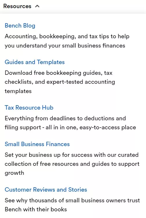
Resources: It contains a lot of resources for people wanting to learn or understand accounting and finance
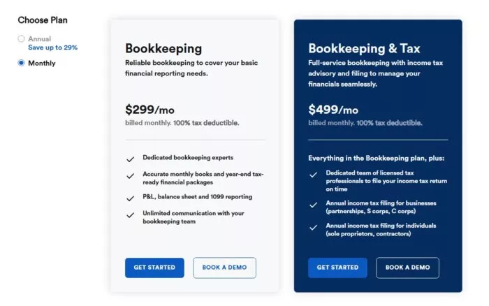
Pricing Page: It offers transparent pricing and a free trial month without committing.
Why Bench.co’s Funnel Works
They showcase how their combination of human expertise and software can save business owners valuable time.
Their blog page is consistent in terms of their visuals which translates to a professional, thoughtful business. The copy just flows and clear.
It is an easy sign up process. It gives you an option to book a call or see the demo data.
Where Bench.co’s Funnel Could Be Better
The headline could be better.
There is a misalignment in their homepage and sign-up page that should be addressed.
Again, their testimonials are great and can be used to price anchor their starting price.
They should have emphasized the free month for bookkeeping or communicated it anywhere on the site to convert more sales (see Law of Visibility, from our 11 Laws of Funnel Physics Framework).
They can add a satisfaction guarantee near the point of purchase as part of risk reversal.
After signing up, there is no option to upgrade to pay.
I recommend removing DEI as part of the website because it is distracting and creates friction. It can bring negative results that divide people.
SaaS Sales Funnel Example #11 – Mailchimp
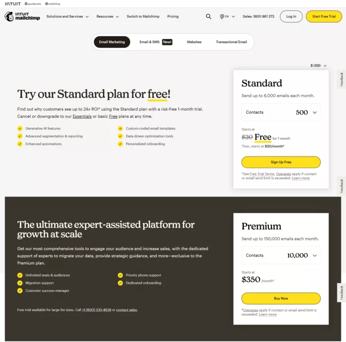
MailChimp is an email marketing tool. It used to offer Freemium but now, they offer a free trial with a limited number of contacts (500, to be exact!). They actually grew their business significantly when they decided to go freemium.
According to Datanyze, Mailchimp owns 67.54% of the email market share and it's ranked #1. The $800M company was acquired by Intuit in 2021.
Steps in Mailchimp’s Sales Funnel
Traffic: organic, direct from emails, blogs, and word of mouth.
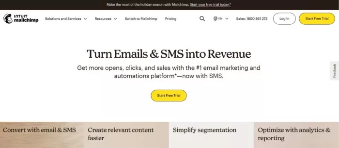
Homepage: their homepage is the first step of their sales funnel. Their branding line is aspirational marketing. It’s about identity, freedom, and self-expression—ideas that are bigger than a product. It’s likely that this method converts better and is more persuasive. These companies are established, and through A/B testing are embracing these aspirational marketing ideas.
Pricing/Features Page: on MailChimp’s pricing page, the focus is on getting you signed up for free for 30 days, with an email, username, and password. They want to get you up and running and start using their product as soon as possible.
Why Mailchimp’s Funnel Works
One of the best features they have is advertising how many millions of people are using their service. It’s a great example of social proof on their terms.
What Makes Mailchimp’s Funnel Unique
The interactive pricing page for calculating a prospect’s price is awesome. I think it’s definitely unique.
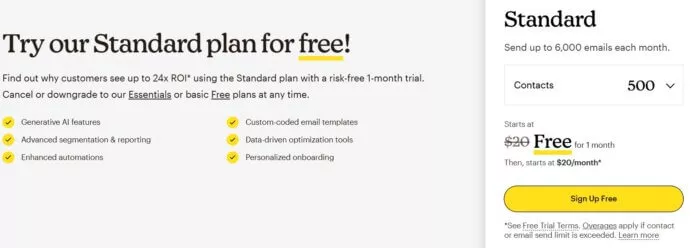
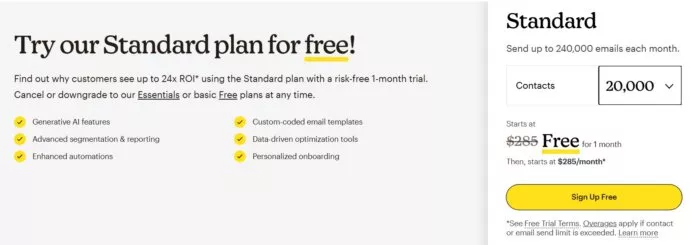
When you put in how many subscribers you have, it will instantly quote you the exact price.
The simplicity of the pricing is also good. It’s really based on how many email subscribers you have.
The aspirational marketing stands out on the homepage.
MailChimp really doesn’t talk at all about sending emails. It’s more about getting you in the door to use the product.
They actually barely mention the fact that email marketing with their services can grow your business. They don’t focus more on results rather than on getting more sales or leads.
SaaS Sales Funnel Example #12 – Leadpages
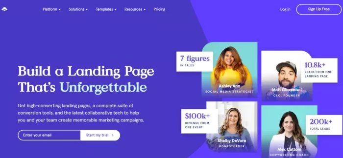
As a landing page builder, Leadpages is showing you the product right upfront.
They show you how the product works and how easy it is to use. They also have a very popular blog, which is where their sales funnel starts.
Leadpages estimated annual revenue is currently $7.8M and is among the top 3 best landing page builders.
Steps in Leadpages’ Sales Funnel
Traffic: organic search, direct traffic and referral from affiliates, integration partners and blogs
Homepage: Leadpages’ CTA to start their free trial is found across their entire website.
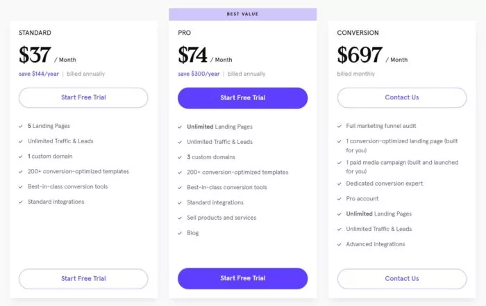
Pricing Page: the pricing page is very clear. All packages are compared to each other. As a matter of fact, in this conversion rate case study from the 313 analyzed in the Proven Sales Conversion Pack, providing price comparison on a landing page can increase conversion rate by 10%.
Why Leadpages’ Funnel Works
They put a heavy emphasis on their funnel for annual sign-ups. There are steep discounts offered if you sign up for the whole year instead of just monthly.
SaaS Sales Funnel Example #13 – Drift
Drift is a B2B conversation platform that helps companies engage with website visitors and potential customers in real-time. It hit $135M in revenue at the end of 2022.
Steps in Drift’s Sales Funnel
Traffic: blog, referrals, organic, affiliates.
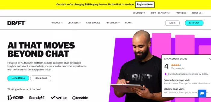
Homepage: the homepage is incredibly simple. The background is plain white and there is one image of a real person. They have a CTA to “Get a Demo” and to “Take a Tour”.
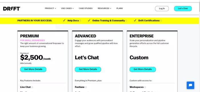
Pricing Page: their pricing page showcases their 3 pricing packages with each of their different features. You also get to chat with customer support if you click on “Get More Details” if you have more questions before choosing your package.
Why Drift’s Sales Funnel Works
Drift’s sales funnel is effective because of its easy, direct path to set up.
They only ask for your email address to start using their service. And once you sign up, you can use the service right away.
Their free version doesn’t include as much as the paid version, however, you can use it for free as long as you’d like.
Plenty of companies do free trials, but few offer totally free services.
For some smaller companies, they might never need to pay for Drift. Others may try the free version and decide to pay for more features, moving further down the funnel.
Sales Funnel Example #14 – Wufoo by Survey Monkey
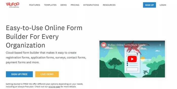
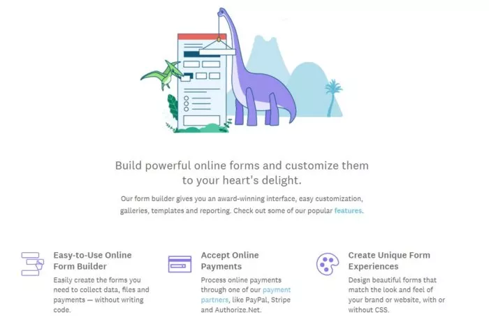
Wufoo’s design is very simple. If anything, it feels a bit light.
They emphasize the dinosaur and cartoonish aspects of their brand. And I think that has been a smart move because it adds personality to their site.
Steps in Wufoo’s Sales Funnel
Traffic: blogs, referrals, organic, affiliates.
Homepage: their homepage is very simple with few colors and illustrations.
Pricing Page: Wufoo’s pricing page is very simple and clear. There are 4 pricing options to choose from, plus their free trial.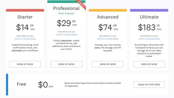 Free Sign-up: signing up is simple. You just need to create a username and password. Once you get in and start using their tools, you’ll have to upgrade. The free account limits the number of forms you can use. When you hit that limit, you’re instructed to upgrade. Otherwise, your account won’t work.

Free Sign-up: signing up is simple. You just need to create a username and password. Once you get in and start using their tools, you’ll have to upgrade. The free account limits the number of forms you can use. When you hit that limit, you’re instructed to upgrade. Otherwise, your account won’t work.
Why Wufoo’s Funnel Works
Wufoos’ funnel works because their copy is clear. There is some unique branding as far as their logo and subtle dinosaur elements.
In their introductory video, they’re showing you exactly what the application looks like, as if in a demo.
The language in the copy is also informal and casual. This makes the reading experience a pleasant one.
And finally, there’s also lots of social proof from well-known brands that everyone is familiar with.

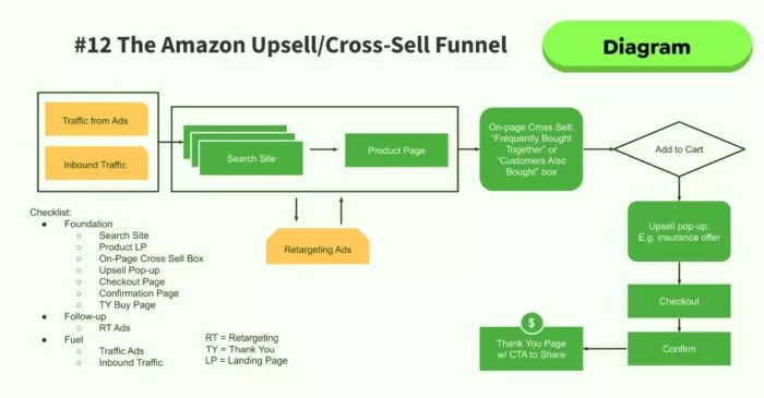
Sales Funnel Example #15 — Amazon
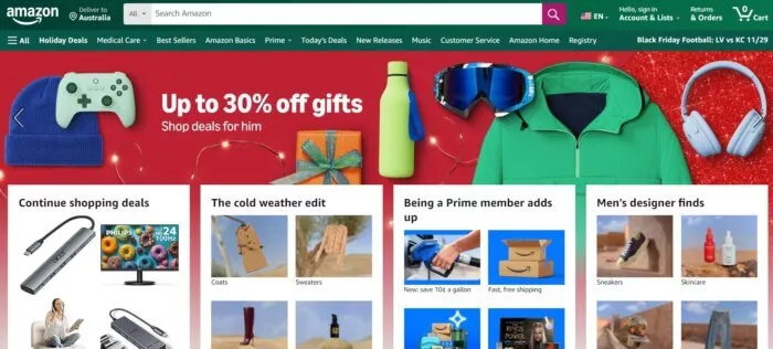
Amazon is a global e-commerce platform offering a vast array of products. It's revenue for the third quarter is at $159B.
The homepage varies from one visitor to another since it is based on personalized recommendations.
It has over an estimated 310 million active users worldwide so imagine its reach across products and its associated services.
Steps in Amazon’s Sales Funnel
Traffic: organic, ads, word of mouth, social media presence, email marketing.
Homepage: they’re not afraid to go heavy on the images and multiple calls-to-action because of the nature of their business: they want to be the everything online store.
Search / Browse: The experience is organized in such a way that it enables you to browse between departments or search and compare across numerous products. On top of that, you have Amazon’s Choice Products, the deals pages and today’s Deals section.
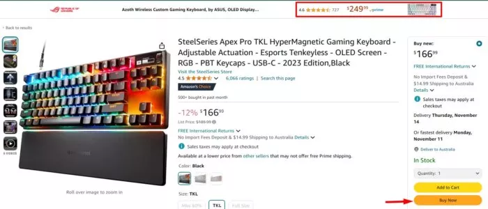
Products and Pricing: it allows you to review prices, specifications, and reviews before purchasing the product.
Purchase: It has a one-click “Buy Now” option which heavily reduces friction (see Law of Friction from our 11 Laws Funnel Strategy Framework). It has multiple payments available and add on selection.
Why Amazon’s Funnel Works
Amazon makes product discovery easy. It builds trust with the lots of social proof available, such as (mostly) transparent reviews and ratings (doesn’t seem to apply with rating movies they produced though lol), and it reduces purchase friction. In a subtle way, it also upsells you through its recommendations and ads.
But above all? The trust was pre-build before people even reached the page via the strength of awareness of the Amazon brand.
Sales Funnel Example #16 – Slack
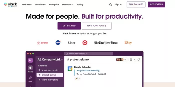
Slack is a collaboration and communication platform for teams or organizations. They say “80% of the Fortune 500 companies” use Slack to communicate internally and with customers. It generated a revenue of $5.9B last year, reflecting its position in the digital communication space.
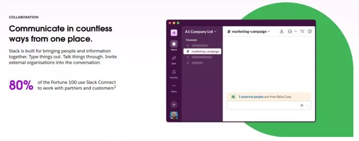
Nice social proof
The animation / demo on the homepage gives you a glimpse of what Slack can do. It makes early adoption frictionless with its free offer (use it free for as long as you like, but it's a freemium offer so if you need more resources after a certain point, then you need to pay).
Very smart freemium model: get employees in medium and larger orgs to try and adopt your tool into their workflow… then the more it speads the more useful it is… the more it is used and the more people using, the sooner (and more likely) your company will naturally “need” to pay for it – because your team is already on it and they can accomplish and do more if you just start paying.
Steps in Slack’s Sales Funnel
Inbound Traffic: invitations from team members, word of mouth, blog, organic search
Homepage: the home page is easy to navigate with the call to action prominent in the different parts of the page. Its headline is focused on team collaboration. It also highlights the brands / companies that use Slack showing that it’s a trusted brand.
Sign-up Form: when you click on their purple CTA button to sign up, the sign-up form is displayed and asks you for your email before starting to create your workspace.
Freemium “Bottom-Up” Up-Sell: once you’re signed-up for a free account, you’re moved into their freemium upsell part of the funnel. See my note above labeled “very smart freemium model.”
Why Slack’s Sales Funnel Works
Slack's sales funnel begins with multiple entry points, primarily driven by word-of-mouth referrals and team member invitations. The free tier serves as the primary entry point, offering users access to essential features including basic messaging, file sharing, and limited integrations.
When teams expand and hit the limitations of the free account, they receive subtle but clear notifications about upgrading to unlock full functionality of Slack.
Coaching Sales Funnel Example #17 — Tony Robbins
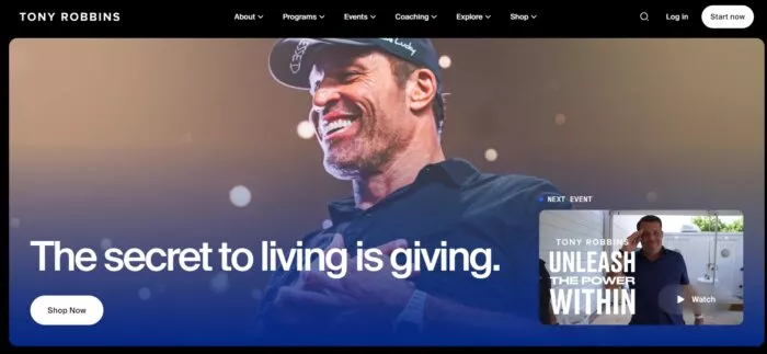
Like him or hate him, Tony Robbins is a world famous motivational speaker and life coach. He is one of the most prominent figures in the personal development and self-help industry.
His sales funnel is designed to move people from free content to increasingly expensive and exclusive offerings, with each level providing more personal access to Robbins and his team.
Steps in Tony Robbins’ Sales Funnel
Top of funnel primary traffic source(s): It’s across the board for this one. Ads, word-of-mouth, social media, podcast… The least emphasized or focused-on top part of the funnel appears to be SEO.
Free webinars, on-site videos, and downloadable content: The content typically focuses on practical tips for financial freedom, relationship improvement, and personal transformation.
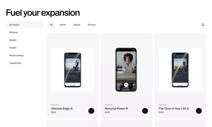
Homepage: the home page is filled with images of in-person and virtual events that Tony and his team conduct. The Call to Action “Start Now” takes you to a quiz and the results determine the events you can attend and the available products and programs that meet your needs.
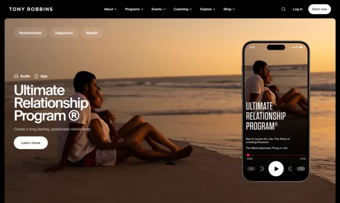
Shop: His books, typically priced between $15-30, serve as comprehensive introductions to his methodology, with titles like "Awaken the Giant Within" offering complete frameworks for personal change that give readers a taste of his full system. These are often promoted through strategic bundles or limited-time offers. The next tier includes specialized digital programs priced between $200-1,000, which focus on specific life areas like wealth management, relationships, or productivity.
Why Tony Robbins’ Sales Funnel Works
His sales funnel succeeds in establishing his credibility with the free and high impact content which resonates with people, builds the relationship.
He then has the small offerings in the form of books and courses that provide enough value to justify the next purchase - which is the complete system.
The funnel works because it's built on a (promoted and engineered by design) word-of-mouth feedback loop - enough people claim to get genuine results at each level to create a continuous stream of powerful testimonials and word-of-mouth promotion, feeding the top of the funnel with pre-sold prospects who arrive already believing in the value of his higher-tier offerings.
Fun point to think about: many self-help personal brands, whether they actually help people achieve results in their life or not, are successful to the extent that they convince people they’ve helped them. This persuading of the customer they got value is part of the funnel, after the sale. Perhaps I’m just being cynical though but some people call that being realistic ;-) I have no idea if Tony’s programs are legit or not, but I can tell you this does happen in the selling self-help / coaching industry a lot. Part of it is because of incentive mis-alignment and lack of “skin in the game” as Nassim Taleb says. But I digress.
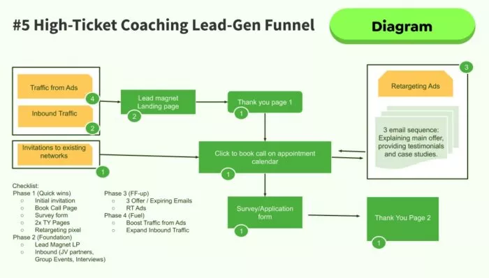
Final Note: Tony’s funnel is A LOT to try to model into your own business all at once. A more down-to-earth and easy-to-copy (tactically) version of a coaching funnel is modeled in diagram form for you below. Enjoy.
Conclusion
If you want to get all marketing (and sales funnel!) work done for your coaching, SaaS, eCommerce, startup, agency, or professional services business—without the headaches of hiring a team—then you must download this free guide:29 Examples of Marketing Projects You Can Delegate to Growbo to save you 100’s of hours per month, grow revenue, and scale faster.
After analyzing these 17 successful sales funnel examples from industry leaders like Netflix, Amazon, and Tony Robbins, we've uncovered the proven strategies that drive marketing automation and digital marketing success. Whether you're struggling with lead generation, conversion optimization, or scaling your marketing efforts, these examples provide a roadmap for building high-converting sales funnels.
Here are the key takeaways from these top-performing sales funnel examples:
- Simplicity is effective - The most successful funnels, like Dropbox and Slack, keep their user journey clear, direct, and friction-free (freemium), resulting in up to 40% higher conversion rates.
- Social proof matters - From Netflix's subscriber count to Basecamp's testimonials, showing social proof can boost conversions by up to 34%.
- Clear pricing and value proposition - Whether it's Mailchimp's interactive pricing calculator or Growbo's transparent packages, successful funnels make it easy to understand what you're getting.
- Strategic free trials - Most successful SaaS and service companies use free trials or freemium models to reduce adoption friction and increase customer lifetime value.
- Multiple entry points (BUT…) - The best sales funnels capture leads through various channels, from content marketing to word-of-mouth referrals, creating a consistent flow of qualified prospects… But, when they were just starting they likely made one channel convert really well for them. I recommend you do the same.
- The product matters most - No matter how amazing your sales funnel, how high the conversion rate, it won’t matter if your product is defective or in general if you do not deliver on your promises. Make your product great, perhaps one of the best grow hacks (guaranteed to also increase your conversion rates coincidentally too!). The product is the centerpiece of your funnel. All must be aligned with it and true.
Don't waste thousands of dollars and countless hours trying to implement these strategies on your own. Growbo's done-for-you marketing platform helps you complete your entire sales funnel process - from creating landing pages and email sequences to designing high-converting graphics and managing your marketing campaigns.
Which of these sales funnel strategies are you currently struggling with? Share your biggest funnel challenges in the comments below, and our team will provide personalized recommendations. Plus, tell us about a successful funnel element you've implemented - your insights could help fellow marketers overcome similar challenges!
Keep Growin, Stay Focused,

Image Credits:
- https://www.owox.com/blog/use-cases/aida-funnel-steps/
- https://www.statista.com/statistics/250934/quarterly-number-of-netflix-streaming-subscribers-worldwide/#:~:text=Netflix%20had%20around%20282.7%20million,compared%20with%20the%20previous%20quarter.

